3D buttons with CSS3
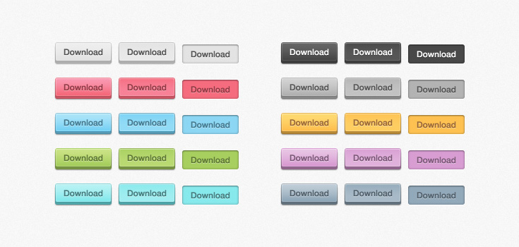
Hello, dear habradrug! Today we will learn how to create volumetric CSS3 buttons! They are based on Orman Clark's popular Free Fri PSD for its Premium Pixels website. We will try to create a copy of these buttons using CSS with a minimal amount of HTML code.
Author's note: Orman kindly allowed us to encode any of his freebies, so wait for more tutorials in the future!
')
SEE DEMO
We will start by creating a new HTML document. It will be based on the HTML5 boilerplate so that we have a convenient starting point. Now we will add a list with links. That's basically all, thanks to CSS3 for not having to use extra divs and spans.
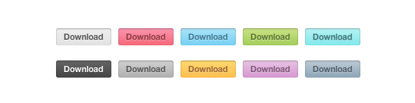
Each item in the list we assign a class of 'buttons'. And since Orman used different colors, we will assign each button its own color as a class.
That's all we need at this stage.
Before you do gradients, rounded corners, etc., you need to take care of the basic rules. Nothing fancy, plain CSS2:
Now apply the rules for different colors. For example, for gray. All other colors can be viewed in the demo.
You should have something like this. It looks pretty solid, if in the yard in 2008
If you look closely at the end result, you will see that there is a thin line around the perimeter of the entire button. To implement this effect, we will use the pseudo-elements : before and : after .
When adding color, the buttons look much better.
Now let's get to the immediate part of CSS3. Let's start with rounded corners:
Naturally, the elements : before and : after also need rounded corners.
Finally, we will apply the gradients, the inner shadow and the shadow for the text. To avoid bugs in IE6, add state: visited.
Our end result is not so bad!
In its design, Orman also provided for the state: active. Therefore, we simply have to add it to our code.
We will place this part of the code under the rules for different colors.
Here's what we get:
So, we have created nice CSS3 buttons that work in all modern browsers. But what about Internet Explorer 8 and below. These browsers have no support for text shadows or gradients.
To solve this problem, we can use the Modernizr javascript library, which can determine if your browser supports CSS3 and HTML5. The library does not fix the problem, it only offers an alternative style.
First, we will create our own version of Modernizr, so as not to carry huge javascript. This can be done on their website . As soon as we insert javascript into our document, it is necessary to define the rules of different classes for the alternative style. We will use images for those browsers that do not support border-radius and gradients.
So we got pretty cross-browser CSS3 buttons. You may find that there is too much code for 10 buttons, but this is just a demonstration of what CSS3 can or cannot do. You can do anything with it! I hope my lesson was useful, thank you for your attention!
DEMO | SOURCES | Jsfiddle
PS I am happy to hear all the comments about the translation.
Author's note: Orman kindly allowed us to encode any of his freebies, so wait for more tutorials in the future!
')
SEE DEMO
Step 1: Create an HTML Document
We will start by creating a new HTML document. It will be based on the HTML5 boilerplate so that we have a convenient starting point. Now we will add a list with links. That's basically all, thanks to CSS3 for not having to use extra divs and spans.
Each item in the list we assign a class of 'buttons'. And since Orman used different colors, we will assign each button its own color as a class.
<ul class="buttons"> <li><a href="#" class="button gray">Download</a></li> <li><a href="#" class="button pink">Download</a></li> <li><a href="#" class="button blue">Download</a></li> <li><a href="#" class="button green">Download</a></li> <li><a href="#" class="button turquoise">Download</a></li> <li><a href="#" class="button black">Download</a></li> <li><a href="#" class="button darkgray">Download</a></li> <li><a href="#" class="button yellow">Download</a></li> <li><a href="#" class="button purple">Download</a></li> <li><a href="#" class="button darkblue">Download</a></li> </ul> That's all we need at this stage.
Step 2: Basic CSS Rules
Before you do gradients, rounded corners, etc., you need to take care of the basic rules. Nothing fancy, plain CSS2:
ul { list-style: none; } a.button { display: block; float: left; position: relative; height: 25px; width: 80px; margin: 0 10px 18px 0; text-decoration: none; font: 12px "Helvetica Neue", Helvetica, Arial, sans-serif; font-weight: bold; line-height: 25px; text-align: center; } Now apply the rules for different colors. For example, for gray. All other colors can be viewed in the demo.
/* */ .gray, .gray:hover { color: #555; border-bottom: 4px solid #b2b1b1; background: #eee; .gray:hover { background: #e2e2e2; } } You should have something like this. It looks pretty solid, if in the yard in 2008
Step 3: Double Frames!
If you look closely at the end result, you will see that there is a thin line around the perimeter of the entire button. To implement this effect, we will use the pseudo-elements : before and : after .
a.button { display: block; float: left; position: relative; height: 25px; width: 80px; margin: 0 10px 18px 0; text-decoration: none; font: 12px "Helvetica Neue", Helvetica, Arial, sans-serif; font-weight: bold; line-height: 25px; text-align: center; } a.button:before, a.button:after { content: ''; position: absolute; left: -1px; height: 25px; width: 80px; bottom: -1px; } a.button:before { height: 23px; bottom: -4px; border-top: 0; } When adding color, the buttons look much better.
/* */ .gray, .gray:hover { color: #555; border-bottom: 4px solid #b2b1b1; background: #eee; } .gray:before, .gray:after { border: 1px solid #cbcbcb; border-bottom: 1px solid #a5a5a5; } .gray:hover { background: #e2e2e2; } Step 4: Some CSS3 Magic
Now let's get to the immediate part of CSS3. Let's start with rounded corners:
a.button { display: block; float: left; position: relative; height: 25px; width: 80px; margin: 0 10px 18px 0; text-decoration: none; font: 12px "Helvetica Neue", Helvetica, Arial, sans-serif; font-weight: bold; line-height: 25px; text-align: center; -webkit-border-radius: 3px; -moz-border-radius: 3px; border-radius: 3px; } Naturally, the elements : before and : after also need rounded corners.
a.button:before, a.button:after { content: ''; position: absolute; left: -1px; height: 25px; width: 80px; bottom: -1px; -webkit-border-radius: 3px; -moz-border-radius: 3px; border-radius: 3px; } a.button:before { height: 23px; bottom: -4px; border-top: 0; -webkit-border-radius: 0 0 3px 3px; -moz-border-radius: 0 0 3px 3px; border-radius: 0 0 3px 3px; -webkit-box-shadow: 0 1px 1px 0px #bfbfbf; -moz-box-shadow: 0 1px 1px 0px #bfbfbf; box-shadow: 0 1px 1px 0px #bfbfbf; } Finally, we will apply the gradients, the inner shadow and the shadow for the text. To avoid bugs in IE6, add state: visited.
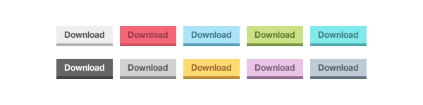
/* */ a.gray, a.gray:hover, a.gray:visited { color: #555; border-bottom: 4px solid #b2b1b1; text-shadow: 0px 1px 0px #fafafa; background: #eee; background: -webkit-gradient(linear, left top, left bottom, from(#eee), to(#e2e2e2)); background: -moz-linear-gradient(top, #eee, #e2e2e2); box-shadow: inset 1px 1px 0 #f5f5f5; } .gray:before, .gray:after { border: 1px solid #cbcbcb; border-bottom: 1px solid #a5a5a5; } .gray:hover { background: #e2e2e2; background: -webkit-gradient(linear, left top, left bottom, from(#e2e2e2), to(#eee)); background: -moz-linear-gradient(top, #e2e2e2, #eee); } Our end result is not so bad!
Step 5: We have not forgotten anything?
In its design, Orman also provided for the state: active. Therefore, we simply have to add it to our code.
We will place this part of the code under the rules for different colors.
/* ACTIVE STATE */ a.button:active { border: none; bottom: -4px; margin-bottom: 22px; -webkit-box-shadow: 0 1px 1px #fff; -moz-box-shadow: 0 1px 1px #fff; box-shadow: 1px 1px 0 #fff, inset 0 1px 1px rgba(0, 0, 0, 0.3); } a.button:active:before, a.button:active:after { border: none; -webkit-box-shadow: none; -moz-box-shadow: none; box-shadow: none; } Here's what we get:
Step 6 (optional): Older browsers
So, we have created nice CSS3 buttons that work in all modern browsers. But what about Internet Explorer 8 and below. These browsers have no support for text shadows or gradients.
To solve this problem, we can use the Modernizr javascript library, which can determine if your browser supports CSS3 and HTML5. The library does not fix the problem, it only offers an alternative style.
First, we will create our own version of Modernizr, so as not to carry huge javascript. This can be done on their website . As soon as we insert javascript into our document, it is necessary to define the rules of different classes for the alternative style. We will use images for those browsers that do not support border-radius and gradients.
/* MODERNIZR FALLBACK */ .no-cssgradients a.button, .no-cssgradients a.button:visited, .no-borderradius a.button, .no-borderradius a.button:visited, .no-generatedcontent a.button, .no-generatedcontent a.button:visited { background: url(images/sprite.png) no-repeat 0 0px; height: 32px; width: 82px; } .no-cssgradients a.button:hover, .no-borderradius a.button:hover, .no-generatedcontent a.button:hover { background: url(images/sprite.png) no-repeat 0 -32px; } .no-cssgradients a.button:active, .no-borderradius a.button:active, .no-generatedcontent a.button:active { background: url(images/sprite.png) no-repeat 0 -64px; bottom: 0; line-height: 35px; } .no-cssgradients a.gray, .no-cssgradients a.gray:visited, .no-cssgradients a.gray:hover { background-position-x: 0; } .no-cssgradients a.pink, .no-cssgradients a.pink:visited, .no-cssgradients a.pink:hover { background-position-x: -82px; } .no-cssgradients a.blue, .no-cssgradients a.blue:visited, .no-cssgradients a.blue:hover { background-position-x: -164px; } .no-cssgradients a.green,, .no-cssgradients a.green:visited, .no-cssgradients a.green:hover { background-position-x: -246px; } .no-cssgradients a.turquoise, .no-cssgradients a.turquoise:visited, .no-cssgradients a.turquoise:hover { background-position-x: -328px; } .no-cssgradients a.black, .no-cssgradients a.black:visited, .no-cssgradients a.black:hover { background-position-x: -410px; } .no-cssgradients a.darkgray, .no-cssgradients a.darkgray:visited, .no-cssgradients a.darkgray:hover { background-position-x: -492px; } .no-cssgradients a.yellow, .no-cssgradients a.yellow:visited, .no-cssgradients a.yellow:hover { background-position-x: -574px; } .no-cssgradients a.purple, .no-cssgradients a.purple:visited, .no-cssgradients a.purple:hover { background-position-x: -656px; } .no-cssgradients a.darkblue, .no-cssgradients a.darkblue:visited, .no-cssgradients a.darkblue:hover { background-position-x: -738px; } .no-cssgradients a.button, .no-cssgradients a.button:visited, .no-cssgradients a.button:hover, .no-cssgradients a.button:before, .no-cssgradients a.button:after, .no-borderradius a.button, .no-borderradius a.button:visited, .no-borderradius a.button:hover, .no-borderradius a.button:before, .no-borderradius a.button:after, .no-generatedcontent a.button, .no-generatedcontent a.button:visited, .no-generatedcontent a.button:hover, .no-generatedcontent a.button:before, .no-generatedcontent a.button:after { border: 0; } Conclusion
So we got pretty cross-browser CSS3 buttons. You may find that there is too much code for 10 buttons, but this is just a demonstration of what CSS3 can or cannot do. You can do anything with it! I hope my lesson was useful, thank you for your attention!
DEMO | SOURCES | Jsfiddle
PS I am happy to hear all the comments about the translation.
Source: https://habr.com/ru/post/137005/
All Articles