Browsers entangled in the block model for tables
 In the process of creating a new version of my JavaScript grid, I encountered a not very pleasant bug. And where the least expected ...
It would seem that in the courtyard of 2012, new versions of browsers are released, almost every month, and their manufacturers report on the introduction of even draft standards. As in such a situation, one could expect problems with “ancient” tablets and styles responsible for their sizes.
It seems that browser vendors in the race for the number of embedded drafts have forgotten that standards need not only to be supported, but also to be supported correctly and equally.
')
Introduction
Since the grid was decided to be completely rewritten under HTML5 (by abandoning the crutches for older versions of IE and fully utilizing the new CSS3 features), I wanted to make the grid look the same in all browsers, and looked like grids in desktop software (without jumping fonts, height lines, inline editing, etc.).
When I started to look closely at the details, I noticed that in Chrome, the rows of the tables for some reason were higher in height than in other browsers. I decided to find out what was wrong.
Testing
Made a small test page. On which are derived DIV (as a reference for comparison) and a table in which one cell (for our test is more than enough).
At the DIV block and the TD table cells, we expose the same size and border in CSS to be larger for clarity.
div, td{ width:100px; height:100px; border:25px solid #333; } We remove the border from the table itself. All margin and padding are reset, cellspacing too (tried the border-collapse property - the result is the same).
There are 4 examples on the page, with a standard block model (content-box) and using box-sizing: border-box, as well as with a specified width for the table and without it (it turned out, too, browsers have no consensus).
The latest releases of the main browsers took part in the testing:
- Chrome 16
- Firefox 9.0.1
- Internet Explorer 9
- Opera 11.61
The test was conducted on Windows 7 x64.
results
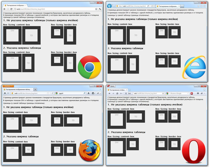
For the convenience of analyzing the results, I reduced the browser screenshots into a single image (clickable).

As you can see, the closest rendering result is shown when the border – box block model is enabled and the table width is set. In this case, we get the same rendering in 3 browsers out of 4. That Chrome bug has just surfaced because of which, I started this debriefing.
In the standard for W3C block model, browsers are divided into pairs. And, interestingly, the rendering in the content-box is the same for Chrome and IE9, and in the border-box, the identical “picture” is given by IE9 and Opera.
Also note that IE9 and Opera already use the box-sizing property without prefixes, unlike Chrome and FireFox.
Conclusion
How to deal with this until the optimal solution is not found, limited to a crutch for Chrome. For him, put less than the height of the cells.
Who are the dev-build browsers unsubscribe in the comments, how they behave.
Test page here .
Source: https://habr.com/ru/post/136960/
All Articles