24 Weeks Metro-Design for Windows Phone | # 1 Metro Design Principles and Metro Design Language
Principles of Metro Design
We usually use the word “Metro” as the name of the UI design style that Microsoft uses in its own platform and also suggests using developers and designers when creating applications for Windows Phone (in this series of articles I focus on Windows Phone). But let's get a little deeper into the essence of the term “Metro” and find out what it really means. To begin with, Metro is defined by two things: the principles of Metro-design and the language of Metro-design.
Metro design principles are pillars (usually abstract concepts) that guide the process of creating user experience in Windows Phone.
The language of Metro-design is a set of specific elements and rules of interaction with the application, visual design, use of movement and formation of the application flow ( translation of application flow ~ a set of application states and possible transitions between them to solve various tasks ).
')
An analogy of the relationship between principles and language can be such an abstract concept as "Love" (... principle), which can be expressed in one symbol, or a combination of six letters "L-b-o-v-b", which gives rise written form of the abstract concept of "love". I am sure that you could find an infinite number of other specific ways to express the concept of "love", including the sound of the word itself, photos or other metaphors.
The concrete manifestation of the concept is called language.
If we had a certain “ glass ” principle, and I would have to display it in three icons: a pencil (edit), an asterisk (selected), a cross (close) and a control like a button - they could be expressed, for example, visual language. If I gave this task to you, I am sure that you could have made other icons and controls.

The same icons and buttons within Metro-design and using such a principle as “ ruthless simplification ” (easy, clean) will look like this:

Thus, different principles give rise to different ways of expression, or languages.
Not so long ago I found this video here , I think it explains well what design principles are (architecture). In our case, the architecture is related to the principles of design , and the various cups that are shown in the video represent the design language .
From the examples above and after watching the video, you will realize that you can define or create different languages on the same principles. For example, if I would offer you the principle of "glass", I am sure that different people would express the icons and the button differently - all in accordance with the principle of "glass", but still differently. All this is because there is no single way of manifestation of the principle - their abstract nature means that they will be presented or interpreted differently by different people (more on this later in the Metro-design language section). It is a matter of implementing a design to achieve more (or less) successful interpretation of principles.
The design principles of Windows Phone are as follows:
Easy, simple, open, fast (ruthless simplification) / Fierce Reduction /
Content, not wrappers
Typography
Motion
Truly digital
Jeff Fong / - Principal UX Lead in Studio (a division of Microsoft) - one of the three designers (along with Jae Park / and Bill Flora /) Microsoft, who began to develop Metro before it was called Metro -design in such products as Media Center, Zune and others. If you want to learn more about the principles of Metro-design, please watch this fantastic session of Jeff . It covers all the principles in detail. In addition, below you will find a few ideas and my observations on the various design principles we use - I hope I can share this practical experience with you guys so that you can use them in your daily practice.
Ruthless simplification
It is usually assumed that this only applies to visual effects and how to make things look minimalistic. But this is not all - in practice, first of all, when designing an application, this principle should be applied to the application flow - and then apply it to visual effects. As a rule, we work diligently to make our user interfaces pleasant and clean, but we do not clear (with the same effort) unnecessary details from the application flow or the process that a user must go through to perform his tasks in our application. It's not enough to have a lined Metro UI, if users are asked to navigate through screens that they don’t need at all, or if the navigation logic is so complex that they can get lost in your application.
"Ruthless simplification begins with the flow of applications / interactions - and only after that applies to the design of the user interface."

"Ruthless simplification is not only about how to clean user interfaces, but, above all, about simplifying the application flow."
Content, not wrappers
(Trans. In the original, this principle sounds like “Content, not Chrome.” Chrome is a shell, an interface. In this context, it also includes elements of decor and decorations that do not carry the main semantic load.)
This legacy of “ruthless simplification” is more focused on the user interface and visual design — how it looks. The key point here is the recognition of the primacy over all information (content) - both in terms of consumption and in terms of creation. Usually we show Metro-design manifestations in scenarios of content consumption, but the principle “content, not candy wrappers” also applies to content creation scenarios. This principle reminds us that buttons, sliders, backgrounds, or their composition are not more important than the information we present to the user. Content is the user interface. You will find other design styles, where sometimes it seems that a designer wants borders or shadows, various decorations and complex backgrounds to be the star of his virtual scene - in Metro we believe that content (both in consumption and creation scenarios) is key figure.
“Information / content is at the forefront, not user interface elements or the interface itself.”
Typography
Typography, typography, typography ... When it comes to Metro, everything seems permeated with typography. Metro is not just about typography. Typography is no more important than photographs, images, icons, movement or sound. Remember the first two principles: information is at the forefront. If it makes sense to use typography to display information - use it, otherwise don't bother with it.
Typography can be beautiful when combined with design skills. For example, in Metro, we use fonts of various sizes and saturations to transfer structured information (a fine example below). And this is exactly what makes typography stand out from other means - it is not typography for the sake of typography, but typography as a very effective and flexible tool for transmitting structured information. She plays with icons, photography and other means in this particular area: structuring information . Structured information is information that has a hierarchy that shows order, and it helps the user prioritize the consumption of information. That is why we do not use bulleted lists in Metro - they are not needed if you use the correct size and saturation in preparing the text.
“Metro is not 100% typographic. Typography in Metro is just another way of presenting information. However, typography offers unique visual design possibilities for transmitting * structured information * to the user. „
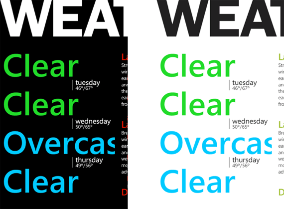
Excellent use of typography to transfer structured information.
Motion
We have already talked about how Metro was inspired by print styles. Mike Kruzeniski / Mike Kruzeniski /, Principal UX Lead in Studio: “ How printed design is reflected in the future of interaction (with the user) .” When the world moved from printed information to digital, a lot has changed. Our environment is no longer static paper. These are screens with dynamically changing pixels, which allows us to transmit motion. The question is how to use motion to help make information a basic element? First, we must recognize that, as in other cases, the movement is used for a specific purpose - to highlight information. Purposeless dynamic effects will create noise and distract the user from consuming information. On Windows Phone, we use motion to maintain the flow of the application and add depth to the experience of interaction. For example, when moving from one application to another, we use the dynamic turning effect (Turnstile) - this is a very aggressive effect that helps to convey the idea that we are moving the user "to another place." When we want to simply display new information in the same context, we can use something like a continuous movement (Continuum). This is a softer and less aggressive / dramatic movement that conveys to the user the idea that he will be presented with new information in the current context.
Watch this session by Jeff Arnold / - Sr. Motion Design Lead in Studio. He describes the movement in Metro more deeply.
“The task of the movement is to serve and encourage information to be at the forefront. Use motion to accentuate (or smooth out) the flow of your application. "
Truly digital
Jeff Fong / describes this principle in the best way possible: “It’s about honesty about what we design for a screen consisting of RGBA pixels and a screen with specific dimensions.” For example, imagine that we are creating an application for selling books so that we have to put the covers of the books for the user on the menu. A specific design style, such as in the iPhone, will create a metaphor from the physical world (for example, a bookshelf) to solve this problem. The bookshelf is great, it fits well with the task, the covers of the books on it look nice and even use wood texture to make it more “real.” This is an iconographic design style. He uses metaphors from the physical world in the digital world. In Metro, we try to be infographic. The principle of "truly digital" raises the question of the very need to put on the "wooden bookshelf" "images of book covers." After all, in the digital world, a tree is not a tree at all, but a set of pixels is a “fake”. If you take “books” from this “bookshelf”, they will not even fall due to the lack of gravity. So there is no need for a wooden shelf. Instead, remove the shell - completely unnecessary, taking into account the fact that we are talking about pixels.
Let me add some clarity: I'm not saying that one style is better or worse. I just show the difference. It’s just a different design style based on different design principles. There is nothing wrong. I understand that the translation of the metaphors of the physical world into the digital has been a hot trend of the last decade - after all, when users massively entered the digital world in 2000-2010 and quickly migrated to the PC world (Windows and Mac!), Tablets, smartphones - a sense of preservation their native "wooden shelf" was comfortable and familiar. I can fully understand this (and this applies in most cases). If you look at Windows XP or even Windows 7 or good old Windows Mobile 5 or 6.5, Microsoft also used this iconographic style, recreating metaphors from the physical world.
However, at Metro, we believe that users care more about being able to receive information than having “projections of objects of the physical world” in their phones.
“Design for screens that are made up of pixels, which in turn convey information. The law of the world does not exist. Sorry, Newton ... :). ”
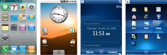
Examples of user interfaces with iconographic style. Recreation of objects of the physical world on a digital screen.
Metro Design Language for Windows Phone
Arming developers to create applications for Windows Phone, Microsoft could limit the announcement / story about the principles of Metro-design, but, of course, this would mean that developers would have to create their own design language and spend a lot of time on it. Creating a design language for such a modern device as a phone is a big deal and requires many hours of development, iteration, testing and testing on users. The Windows Phone design studio has created a very solid language that anyone can use.
Based on the principles of Metro-design, Microsoft offers the Metro-design language for Windows Phone. Using it will help you successfully create beautiful, compelling and consistent solutions for Windows Phone. The design language for Windows Phone is defined in the following categories:
Navigation. Layout. Composition. Typography.
Motion
Iconography
Images and photos
Themes and Personalization
Gestures and goals
User Interface Controls
Hardware capabilities
Services
App Store and Branding
Compared to principles that are abstract, language is concrete. Thus, there is a specific navigation system in Metro, called Hub & Spoke (you can read more here ). There is a specific set of gestures, such as pressing, double pressing, pressing and holding, shifting, compressing and stretching. There is a specific typographic style that uses the Segoe font in various saturations and sizes to convey structured information. There is a specific set of user interface controls, such as buttons, radio buttons and checkboxes, sliders, and other user interface metaphors. And there are implementations of specific metaphors of interaction with the application, such as Pivot, Panorama, and Page (Page).
All of these sets of specific elements are what constitutes the Metro-design language for Windows Phone. It is a rich, holistic, flexible and extensible design language.
But is this standard (out of the box) design language the only way to demonstrate the principles of Metro design? Not.
For example, can I use Helvetica or Swiss fonts in my Windows Phone application so that they stay in Metro? Of course! These and other grotesque (sans-serif) fonts can be used instead of Segoe.
We’ll talk more about how to use Metro outside of standard solutions, in future articles, and for starters, take a look at this article with Swiss-style graphic design lessons to get acquainted with some examples of print design that follow the same design principles as and Metro (except using movement and digital integrity). They look completely different than standard solutions using the Metro-design language for Windows Phone, but they are based on the same principles (for clarity: we are talking about examples from the printing industry). This may lead you to ideas about how the same principles can be applied differently and go beyond the proposed solutions out of the box.
3 Sources
The language of Metro-design for Windows Phone is defined in three main sources:
1. The Windows Phone UX Guidelines
2. The Windows Phone SDK - Library of Controls (and Silverlight Toolkit for Windows Phone)
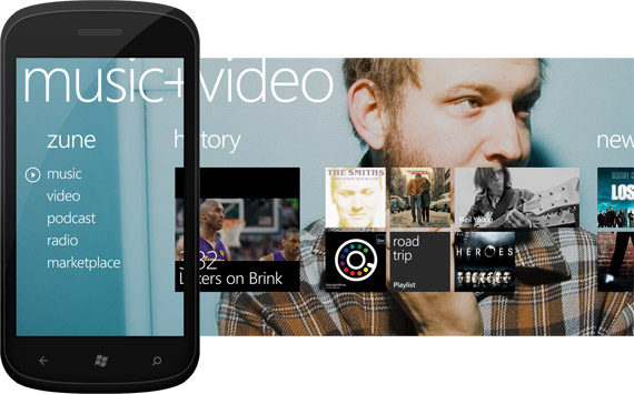
3. Applications and services built into Windows Phone (e-mail, text messages, “Contacts” section, “music + video” section, telephone applications)
These three sources (in theory) should implement and propose the same approaches. We are aware of some of the differences between them, and we are working on them.
The Windows Phone UI Guide is the design Bible for Windows Phone. This is a reference material, and we continue to work on it, keeping it relevant so that you can use it as a reliable source of information.
The Windows Phone SDK contributes to the definitions of the Metro-design language by providing developers and designers with many ready-made user interface controls for use in Visual Studio and Expression Blend.
Finally, one more thing that I think you will find really valuable. The third way to express the language of Metro-design for Windows Phone is Windows Phone itself! - in built-in applications and services that we all use: for example, e-mail, text messages, the "Contacts" section and local search. We call them design patterns. I don’t think that many developers and designers are thinking about it: you can learn from these design patterns and use them to create your own applications. Ideally, these templates should be documented in the Windows Phone UI Guide (this is in our plans :)). I did it myself many times: I ran a phone, went to the “Contacts” section or an email application and watched how they search or sort the list, or solve other tasks — after that I return to my tools (Expression Design, Expression Blend, Photoshop , Illustrator) and use these design patterns.
Next article | # 2 Windows Phone Application Design Process
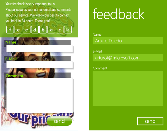
Translation of an article by Arturo Toledo (Arturo Toledo) , located at: http://ux.artu.tv/?p=179
Translation: Petrishko
Edits and clarifications of terms: kichik
PS Other materials about Metro in Russian are collected on MSDN in the « metro-design » hub
Source: https://habr.com/ru/post/136946/
All Articles