CSS3 Logo Design
Previously, we used software for graphic design, such as Photoshop for designing logos and icons. But now we can design almost everything using the features of CSS3. Designing logos and icons using CSS will increase the speed of loading your site.
Today we will discuss how to create a logo using the basic properties of CSS3.
')
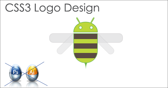
In this tutorial we will examine the logo below. Also, note that CSS3 properties are not supported by all browsers. Currently, all major browsers such as Chrome, Safari and Firefox support. For best results, check out the demo in Chrome or Safari (latest versions).

To design this logo, two basic properties of CSS3 were used.
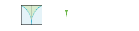
1. border-radius:
You probably noticed the use of rounded corners for the head, wings and some other places. For rounding corners, the CSS3 border-radius property was used.

This property will take two values. The first value will be the horizontal radius and the second value will be the vertical radius.
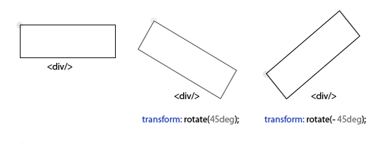
2. transform:
This CSS3 property will take many values, such as tilt, rotation, translation, etc., but for us to tilt, just use one value - tilt. As you may have noticed, the lower left and lower right wings are turning. For this, the transform: rotate (x degrees) property was used.
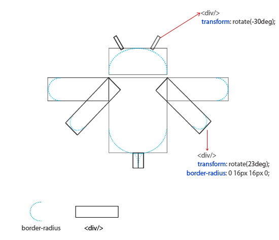
To design this logo, a DIV container was used everywhere and some CSS properties were applied. For convenience, we will divide the full logo into separate parts, such as the head, body, wings and tail. The image below gives an idea of the structure of the logo.
Head design . For the development of the head used containers. Below is the HTML and CSS for the head. The border-radius property was used to give the head a curved shape.
HTML:
CSS:
lower result

Body designing . The following HTML and CSS were used to design the body.
HTML:
CSS:
body look like this

Designing the wings . For the design of the wings used property transform: rotate () .
HTML:
CSS:
result

Designing the tail . Below is the HTML and CSS for the tail section.
HTML:
CSS:
finally the result
HTML:
CSS:
Original: CSS3 Logo Design by Srinivas Tamada
Demo
Download
Today we will discuss how to create a logo using the basic properties of CSS3.
')
In this tutorial we will examine the logo below. Also, note that CSS3 properties are not supported by all browsers. Currently, all major browsers such as Chrome, Safari and Firefox support. For best results, check out the demo in Chrome or Safari (latest versions).
Basic CSS3 properties
To design this logo, two basic properties of CSS3 were used.
1. border-radius:
You probably noticed the use of rounded corners for the head, wings and some other places. For rounding corners, the CSS3 border-radius property was used.
This property will take two values. The first value will be the horizontal radius and the second value will be the vertical radius.
2. transform:
This CSS3 property will take many values, such as tilt, rotation, translation, etc., but for us to tilt, just use one value - tilt. As you may have noticed, the lower left and lower right wings are turning. For this, the transform: rotate (x degrees) property was used.
Logo development
To design this logo, a DIV container was used everywhere and some CSS properties were applied. For convenience, we will divide the full logo into separate parts, such as the head, body, wings and tail. The image below gives an idea of the structure of the logo.
Head design . For the development of the head used containers. Below is the HTML and CSS for the head. The border-radius property was used to give the head a curved shape.
HTML:
<div class="head"> <div class="ant ant_left"></div> <div class="ant ant_right"></div> <div class="lefteye"></div> <div class="righteye"></div> </div> CSS:
#logo .head{ position: relative; height: 40px; background: #bdd73c; border-radius:60px 60px 0 0 / 50px 50px 0 0; border: 2px solid #6fb74d; } .head .ant{ width: 2px; height: 25px; background: #bdd73c; border: 2px solid #6fb74d; position: absolute; border-radius: 3px 3px 0 0; border-bottom: 2px solid #bdd73c; } .head .ant_left{ top: -22px; left: 15px; -webkit-transform: rotate(-30deg); -moz-transform: rotate(-30deg); -ms-transform: rotate(-30deg); -o-transform: rotate(-30deg); transform: rotate(-30deg); } .head .ant_right{ top: -22px; left: 73px; -webkit-transform: rotate(30deg); -moz-transform: rotate(30deg); -ms-transform: rotate(30deg); -o-transform: rotate(30deg); transform: rotate(30deg); } .lefteye, .righteye{ position: absolute; background: #fff; border: 2px solid #6fb74d; width: 10px; height: 10px; top: 15px; -webkit-border-radius:10px; -moz-border-radius:10px; border-radius:10px; } .lefteye{ left: 15px; } .righteye{ left: 65px; } lower result
Body designing . The following HTML and CSS were used to design the body.
HTML:
<div class="body"> <div class="strip brown"></div> <div class="strip"></div> <div class="strip brown"></div> <div class="strip"></div> <div class="strip brown"></div> <div class="strip last"></div> </div> CSS:
#logo .body{ overflow: hidden; border: 2px solid #6fb74d; margin-top: 4px; border-radius: 0 0 60px 60px; } #logo .body .strip{ height: 18px; background: #bdd73c; } #logo .body .brown{ height: 22px; background: #5a4a42; } body look like this
Designing the wings . For the design of the wings used property transform: rotate () .
HTML:
<div class="left_wings"> <div class="wing1"></div> <div class="wing2"></div> </div> <div class="right_wings"> <div class="wing1"></div> <div class="wing2"></div> </div> CSS:
.left_wings .wing1, .left_wings .wing2{ width: 100px; background: #e2e2e3; border: 2px solid #d1d0d1; border-radius: 16px 0 0 16px; position: absolute; } .left_wings .wing1{ height: 35px; top: 48px; left: 0; z-index: -1; opacity: .8; } .left_wings .wing2{ top: 80px; left: 20px; z-index: -1; opacity: .6; height: 25px; -webkit-transform: rotate(-45deg); -moz-transform: rotate(-45deg); -ms-transform: rotate(-45deg); -o-transform: rotate(-45deg); transform: rotate(-45deg); } .right_wings .wing1, .right_wings .wing2{ width: 100px; background: #e2e2e3; border: 2px solid #d1d0d1; border-radius: 0 16px 16px 0; position: absolute; } .right_wings .wing1{ height: 35px; top: 48px; left: 200px; z-index: -1; opacity: .8; } .right_wings .wing2{ top: 80px; left: 175px; z-index: -1; opacity: .6; height: 25px; -webkit-transform: rotate(45deg); -moz-transform: rotate(45deg); -ms-transform: rotate(45deg); -o-transform: rotate(45deg); transform: rotate(45deg); } result
Designing the tail . Below is the HTML and CSS for the tail section.
HTML:
<div class="tail"> <div class="tail_left"></div> <div class="tail_right"></div> </div> CSS:
.tail{ width: 16px; height: 40px; left: 143px; margin-top: -1px; position: absolute; background: #6fb74d; } .tail_left{ width: 8px; height: 40px; background: #fff; float: left; border-top-right-radius:16px 40px; } .tail_right{ width: 8px; height: 40px; background: #fff; float: left; border-top-left-radius:16px 40px; } finally the result
Final HTML and CSS
HTML:
<div id="logo_container"> <div id="logo"> <div class="head"> <div class="ant ant_left"></div> <div class="ant ant_right"></div> <div class="lefteye"></div> <div class="righteye"></div> </div> <div class="body"> <div class="strip brown"></div> <div class="strip"></div> <div class="strip brown"></div> <div class="strip"></div> <div class="strip brown"></div> <div class="strip last"></div> </div> <div class="left_wings"> <div class="wing1"></div> <div class="wing2"></div> </div> <div class="right_wings"> <div class="wing1"></div> <div class="wing2"></div> </div> <div class="tail"> <div class="tail_left"></div> <div class="tail_right"></div> </div> </div> </div> CSS:
body{ width: 100%; margin: 0; padding: 0; } #logo_container{ width: 300px; height: 200px; margin: 0 auto; position: relative; margin-top: 100px; } #logo{ width: 100px; margin-left: 100px; } #logo .head{ position: relative; height: 40px; background: #bdd73c; border-radius:60px 60px 0 0 / 50px 50px 0 0; border: 2px solid #6fb74d; } .head .ant{ width: 2px; height: 25px; background: #bdd73c; border: 2px solid #6fb74d; position: absolute; border-radius: 3px 3px 0 0; border-bottom: 2px solid #bdd73c; } .head .ant_left{ top: -22px; left: 15px; -webkit-transform: rotate(-30deg); -moz-transform: rotate(-30deg); -ms-transform: rotate(-30deg); -o-transform: rotate(-30deg); transform: rotate(-30deg); } .head .ant_right{ top: -22px; left: 73px; -webkit-transform: rotate(30deg); -moz-transform: rotate(30deg); -ms-transform: rotate(30deg); -o-transform: rotate(30deg); transform: rotate(30deg); } .lefteye, .righteye{ position: absolute; background: #fff; border: 2px solid #6fb74d; width: 10px; height: 10px; top: 15px; -webkit-border-radius:10px; -moz-border-radius:10px; border-radius:10px; } .lefteye{ left: 15px; } .righteye{ left: 65px; } #logo .body{ overflow: hidden; border: 2px solid #6fb74d; margin-top: 4px; border-radius: 0 0 60px 60px; } #logo .body .strip{ height: 18px; background: #bdd73c; } #logo .body .brown{ height: 22px; background: #5a4a42; } .left_wings .wing1, .left_wings .wing2{ width: 100px; background: #e2e2e3; border: 2px solid #d1d0d1; border-radius: 16px 0 0 16px; position: absolute; } .left_wings .wing1{ height: 35px; top: 48px; left: 0; z-index: -1; opacity: .8; } .left_wings .wing2{ top: 80px; left: 20px; z-index: -1; opacity: .6; height: 25px; -webkit-transform: rotate(-45deg); -moz-transform: rotate(-45deg); -ms-transform: rotate(-45deg); -o-transform: rotate(-45deg); transform: rotate(-45deg); } .right_wings .wing1, .right_wings .wing2{ width: 100px; background: #e2e2e3; border: 2px solid #d1d0d1; border-radius: 0 16px 16px 0; position: absolute; } .right_wings .wing1{ height: 35px; top: 48px; left: 200px; z-index: -1; opacity: .8; } .right_wings .wing2{ top: 80px; left: 175px; z-index: -1; opacity: .6; height: 25px; -webkit-transform: rotate(45deg); -moz-transform: rotate(45deg); -ms-transform: rotate(45deg); -o-transform: rotate(45deg); transform: rotate(45deg); } .tail{ width: 16px; height: 40px; left: 143px; margin-top: -1px; position: absolute; background: #6fb74d; } .tail_left{ width: 8px; height: 40px; background: #fff; float: left; border-top-right-radius:16px 40px; } .tail_right{ width: 8px; height: 40px; background: #fff; float: left; border-top-left-radius:16px 40px; } Original: CSS3 Logo Design by Srinivas Tamada
Demo
Download
Source: https://habr.com/ru/post/136923/
All Articles