How to improve the selection of countries from the list
I present to you the translation of an article entitled " Redesigning The Country Selector " by Christian Holst . Translated in the company UXDepot specifically for users of Habrahabr with the approval of the publication Smashing Magazine .
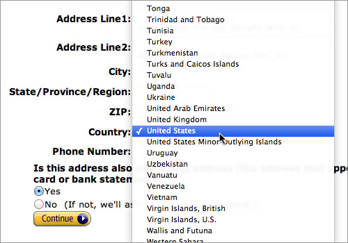
Country selection. Usually it occurs when you register on a new web service, place an order in the online store, or arrange participation in the conference. What usually is the choice of the country? Drop-down list with a list of all available countries.
One day, conducting extensive usability testing (about which we wrote on Smashing Magazine in April 2011. Translators' note: we translated this article too . Be sure to read :) we have consistently encountered several problems associated with choosing a country. Jacob Nielsen reported similar points in 2000 and 2007 when he tested drop-down lists with a large number of internal elements, for example, such as lists of states or countries.
')
So, this summer we decided to redesign the way to choose a country . This article describes four design phases that resulted in a ready-made solution (a free jQuery plugin included in the bundle).
First of all, let's take a closer look at the problems of using traditional selectors of countries.
Difficulties
Drop-down lists provoke usability problems when they (lists) are used as a means to select a country or state, for several reasons. Here are six main ones:
- Lack of review . It confuses even the choice of more than 20 unstructured options, not to mention the list of all countries of the world (according to ISO 3166, there are 249 countries).
- Unclear principles of sorting . When demonstrating a large list to users, first of all users try to understand the logic of sorting elements. But, since country selectors often contain from three to five of the most popular options at the top of the list, the logic of sorting elements is not always clear at first glance.
- Scrolling questions list . Many problems are also associated with scrolling large drop-down lists. If your mouse cursor is outside of the expanded list, then you will most likely scroll the entire page, hiding the list that you opened from the page. In other browsers, however, the expanded list will scroll as long as it is in focus, which will most likely lead to the input of erroneous data.
- Heterogeneous ways of presenting the list . Interfaces drop-down lists in different browsers and operating systems differ significantly from each other. For example, on Mac and Safari to scroll the list will ask you to use two arrows, and FireFox provides the traditional scrolling option. Now take your smartphone, and you suddenly find that the interface has changed dramatically again.
- Physical limitations . Mobile devices have serious limitations on the size of the screen - it is physically impossible to display a large list of countries. This slows down the selection process, which also causes inconvenience.
- Violation of the logical sequence . Virtually all users — even those who use the tab to switch between form elements — will use the mouse to interact with the drop-down lists, which will significantly slow down the interaction.
In sum, we have
All these usability problems are rather small, individually they do not impair the interaction of users with the drop-down selector of countries. But all together, taking into account other small usability problems, significantly damages the entire interaction process and ultimately leads to failures.
Considering all of the above, we have begun to redesign the standard drop-down selector of countries. Below are the four stages we have completed.
Stage 1. Keyboard entry versus scrolling
The easiest way to get rid of hundreds of list items and problems with scrolling is simply to replace the drop-down list on the input field to allow the user to enter the name of their country. This method only works if the user knows what to enter and where, because otherwise there will be no visual recognition effect (this will never work to indicate delivery options, since the user will have to guess the field names). But the “choice” of the country is well implemented by the text field because it is logical to assume that every user knows what country he lives in.
So, we have a text box. Although it is convenient on the one hand, it is bad for a courier who has to deliver the goods. The drop-down list offers a limited number of options, while the text field offers an infinite (the user can enter there whatever he wants). To limit the entry of values in the field (we are talking about the name of the country), which will be able to recognize the server part of our service, we should add an automatic substitution and acceptance of a limited set of options to the text field . This will allow us to provide data entry that is 100% satisfied with our server part (and our courier).

Today, most web users are familiar with auto-substitution functionality. Google has used this feature for its search field since 2008 (and since 2004 as an experimental feature).
Stage 2. Typos and their consequences
Replacing the list of countries with the input field with auto-substitution, we are faced with a new problem. Although the user knows the name of his country, he cannot know what our server part calls her. If a user resides in the US, is sealed, for example, “United States”, or decides to enter only part of the name, for example “America” (instead of “United States of America”), this will lead to an incorrect result.

The country entry field on the Apple website requires you not only to write the exact name of the country, but also the correct sequence of words in the name.
This is all due to the fact that the standard input field with auto substitution requires values, not only correctly typed, but also entered in the correct sequence.
Numerous web services, especially online stores, are geographically limited, and international users are well aware of this. Even large sites like Amazon, Hulu or Spotify have serious geographical restrictions on some or all of the services. If someone living in the US can expect his country to be on the list of supported, then a user from another country who cannot find his country on the list can leave your site before his typo is recognized.
In short, the country selector should address the issues of typing errors and the sequence of data entered. We achieve this by simply allowing independent comparison of the parts of the data entered.

Stage 3. When the Netherlands is called Holland.
The problem of typos and incomplete names, we decided. However, there is still another nuisance. Some countries have several common names (for example, the Netherlands is sometimes called Holland). Geographically, Holland belongs to the Netherlands, but at the time when ordinary people say that they “rested in Holland” , while the Dutch themselves usually say “Netherlands”.

When we require a user to enter a country name, we must consider all common spellings. Synonyms, local names, abbreviations and codes - all this must be taken into account. Normal auto substitution will not work if the user instead of Switzerland (Switzerland) enters Scweiz, Suisse, Svizzera or Svizra. The same will happen if instead of Germany they write DE.
From the point of view of ease of use, such errors are considered unacceptable, because these spellings are common and people will often enter them in fields with automatic substitution.
During the redesign of the country name input field, we added the ability to match several words with the resulting value.

Stage 4. When the United States is more popular than the United Arab Emirates
By entering the word “United” in the country selection field on the Apple website, you can observe the following picture:

The countries in this list are autosubstitution sorted alphabetically. But, since we no longer need to scroll through the list of countries, there is no reason for alphabetically sorting it would be more logical to sort it by popularity . Apple will certainly want to make the United States a higher priority, and behind them the United Kingdom and the United Arab Emirates. At the same time, the British newspaper may want to put the United Kingdom first.

In order to implement this principle, you can introduce the concept of the weight of the country. Initially, on all sites, all countries have the same weight, but then, with the advent of statistics of their introduction, the countries themselves will be sorted by frequency of choice.
Final Solution: Redesigned Country Selector
The result of all the stages was the creation of a revised country selector: it takes into account typing errors, various spelling features, synonyms and priority options.
It would be technically correct to call the resulting “text field with automatic substitution, taking into account partial matches, synonyms and priority results”. This is a bit cumbersome, so I just decided to call it a redesigned country selector. You can try it in this demo .
For those of you who own or work with a site that contains a country selector, I decided to make an open-source code. It is a simple jQuery plugin for improving drop-down menus (i.e. drop-down lists for country selection), turning them into advanced fields with automatic substitution for modern browsers. The plugin comes with instructions for use and FAQ . You can also view the project on GitHub and follow further updates of this solution.
.
PS from translators : I hope you enjoyed the article. We will be happy if you point us to errors in the translation so that we can correct them promptly. Write me in PM, please :)
PPS: Thank you netright for the link to an alternative solution .
Source: https://habr.com/ru/post/136334/
All Articles