Gorgeous Stickers with CSS3
Good day!
At one time it was necessary to make notes in the form of stickers for the website. As you understand, there wasn’t a big choice, and my choice fell on all of us, our favorite CSS3. With his appearance, the realization of the conceived was possible without any bicycle construction.So, my solution to the problem is under the cut. In fact, the moped is not mine. I was only given a ride.
This solution works in the latest browsers on the Webkit engine (Safari and Chrome), Firefox and Opera. In other browsers (read, IE) there is a chance to get a square yellow sticker without shadow and animation.
Let's start with the simplest option that will work in all browsers. In order to make a sticker, we will use HTML5 and CSS3, which is logical. And we begin with the usual HTML markup, in which we denote the texts and headings of our notes, which are essentially lists.
')
Please note that each note is a link, which is a good enough approach, because This means that if we click on our note, then in the case of a relevant link we can go to the page directly related to the note.
For example, I wrote down “buy a BMW X6” on Sunday (I would like to say hello to Boomburum , and by the link I’ve given the address where to find this car. Hehe!
CSS, to turn this list into yellow stickers is pretty simple:
This code is so trivial that it makes no sense to comment on it, because we here make standard manipulations. Such as getting rid of bullets in the list, assigning indents, etc.
By the way, here is the result:
This option will work in any browser. Even ( !!! ) in IE6. On this we will finish his support, because we need paint, not a monochrome rectangle. Right?
It's time to preukrasit our stickers. Let's add shadows to them and set the text of the notes like a handwritten font. For this we will use the Google Fonts API . And we will use the font under the name Reenie Beanie . The easiest way to use this API is to work with the Google Font previewer :
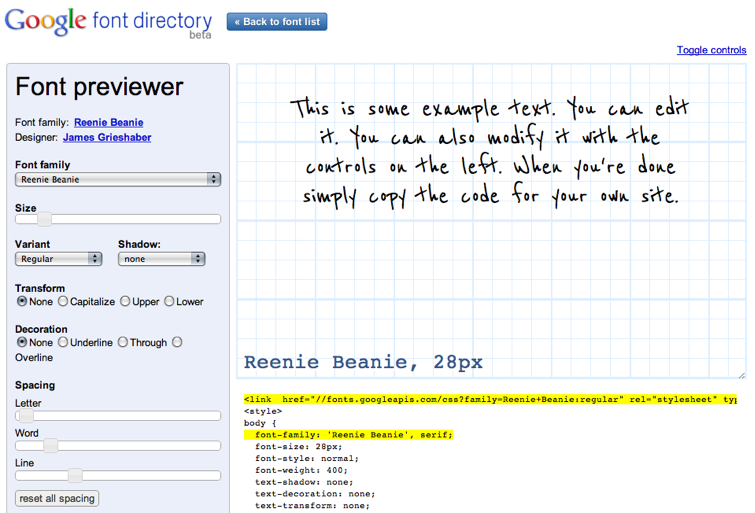
Using it, we get a piece of HTML code that we need to insert into our page in order to use the font. This option will be supported in all modern browsers:
<source lang = "html>
<link href = „ fonts.googleapis.com/css?family=Reenie+Beanie : regular“
rel = "stylesheet"
type = "text / css">
Then we need to indent from the headings to the notes so that our notes are readable. To introduce paragraphs with the newYear font. It should be noted that the font size should be large enough so that you can clearly see our Reenie Beanie .
And now let's set a shadow for our stickers. Yes, so that in all (except IE) browsers displayed:
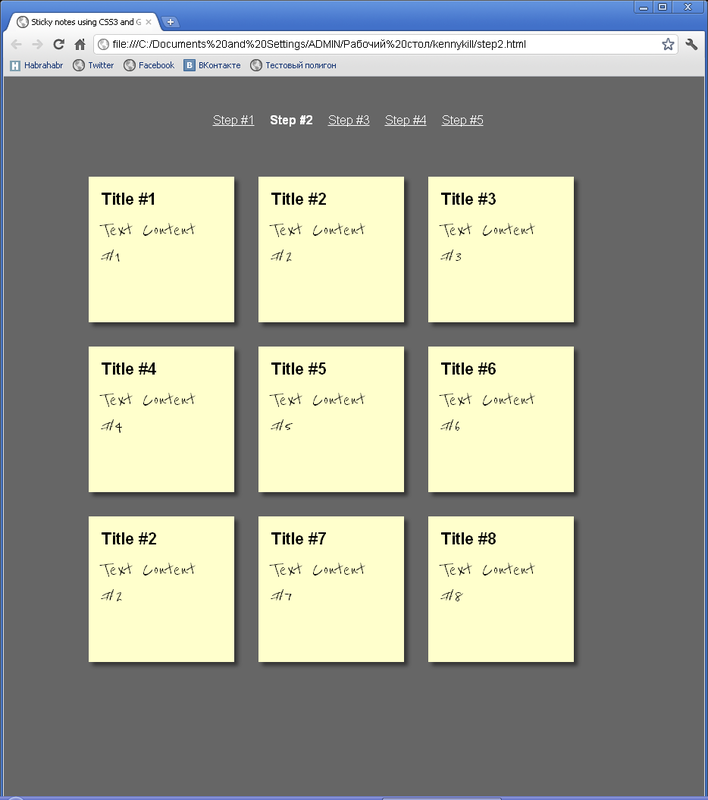
Offset, color, width, height - everything, as thedoctor prescribed usually. Together with the new font and our trinkets shadows on the stickers now began to look even more pleasant. Now they look like this:
Now I suggest you to do something even more exciting and interesting. Change the angle of rotation of our stickers. How? Using the CSS3: transform: rotate property. Like this:
Fine. Not really. So we tilted all the stickers at the same angle. I don’t even want to open an example. Let's make a variety with you and turn the stickers in different angles? Let's:
Now every second link will be tilted 4 degrees to the right, indents of five. Every third will be rejected by 3 degrees to the left. And so on ... Until the fantasy is over.
Agree, it is necessary to make the opportunity to increase our note when you hover over it.Here we will again use CSS3, which is not surprising. No sooner said than done:
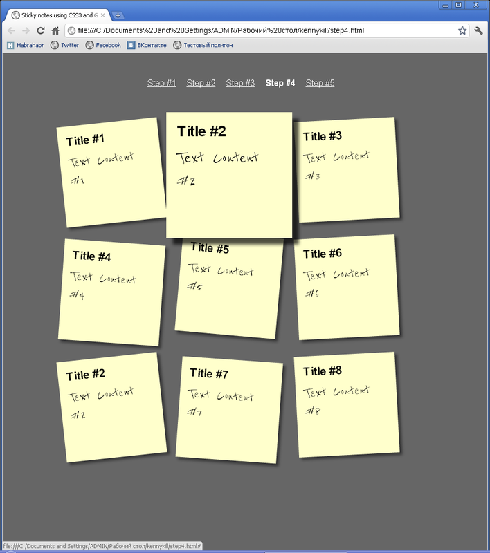
We added such a high z-index so that when you hover our sticker does not limit itselfto seizing land and overlaps near stickers. Actually, when you hover, we will see the following picture:
Still, you need to finish it to be beautiful. Do you understand what we do not praise? That's right, the animation. It is necessary to make the transitions smooth, not stone.It feels like you're in the stone age or you lack CPU. Well, let's go:
Here it is our animation. Unfortunately, the screenshot cannot convey it, just as the phone cannot convey the smell of freshly baked pizzabird . What a pity!
But I would also like to decorate our stickers, but somehow everything is monotonous. Every second sticker will be green, every third will be blue. Well, not bad.
Again, we won't be able to see the animation in the screenshot, but our tricolorzebra mix is no problem. In general, you can see an example here .
Well, that's all for today. Today we learned how to create beautiful animated stickers using CSS3. After all, beautiful, right?
An example of this lesson can be pulled here .
See you soon!
Introduction
At one time it was necessary to make notes in the form of stickers for the website. As you understand, there wasn’t a big choice, and my choice fell on all of us, our favorite CSS3. With his appearance, the realization of the conceived was possible without any bicycle construction.
This solution works in the latest browsers on the Webkit engine (Safari and Chrome), Firefox and Opera. In other browsers (read, IE) there is a chance to get a square yellow sticker without shadow and animation.
Step 1
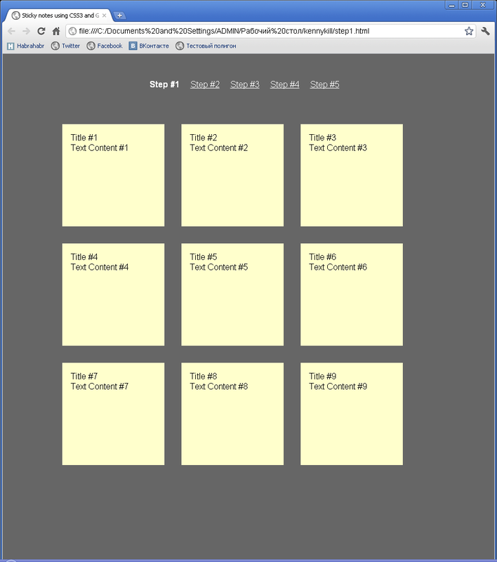
Let's start with the simplest option that will work in all browsers. In order to make a sticker, we will use HTML5 and CSS3, which is logical. And we begin with the usual HTML markup, in which we denote the texts and headings of our notes, which are essentially lists.
')
<ul> <li> <a href = "#"> <h2>Title #1</h2> <p>Content #1</p> </a> </li> <li> <a href = "#"> <h2>Title #1</h2> <p>Content #2</p> </a> </li> </ul> Please note that each note is a link, which is a good enough approach, because This means that if we click on our note, then in the case of a relevant link we can go to the page directly related to the note.
For example, I wrote down “buy a BMW X6” on Sunday (I would like to say hello to Boomburum , and by the link I’ve given the address where to find this car. Hehe!
CSS, to turn this list into yellow stickers is pretty simple:
* { margin: 0; padding : 0; } body { font-family: arial, sans-serif; font-size: 100%; margin: 3em; background: #666; color: #FFF; } h2, p { font-size: 100%; font-weight: normal; } ul, li { list-style: none; } ul { overflow: hidden; padding: 3em; } ul li a { text-decoration: none; color: #000; background: #FFC; display: block; height: 10em; width: 10em; padding: 1em; } ul li { margin: 1em; float: left; } This code is so trivial that it makes no sense to comment on it, because we here make standard manipulations. Such as getting rid of bullets in the list, assigning indents, etc.
By the way, here is the result:
This option will work in any browser. Even ( !!! ) in IE6. On this we will finish his support, because we need paint, not a monochrome rectangle. Right?
Step 2
It's time to preukrasit our stickers. Let's add shadows to them and set the text of the notes like a handwritten font. For this we will use the Google Fonts API . And we will use the font under the name Reenie Beanie . The easiest way to use this API is to work with the Google Font previewer :
Using it, we get a piece of HTML code that we need to insert into our page in order to use the font. This option will be supported in all modern browsers:
<source lang = "html>
<link href = „ fonts.googleapis.com/css?family=Reenie+Beanie : regular“
rel = "stylesheet"
type = "text / css">
Then we need to indent from the headings to the notes so that our notes are readable. To introduce paragraphs with the new
ul li h2 { font-size: 140%; font-weight: bold; padding-bottom: 10px; } ul li p { font-family: "Reenie Beanie", arial, sans-serif; font-size: 180%; } And now let's set a shadow for our stickers. Yes, so that in all (except IE) browsers displayed:
ul li a { text-decoration: none; color: #000; background: #FFC; display: block; height: 10em; width: 10em; padding: 1em; -moz-box-shadow: 5px 5px 7px rgba(33, 33, 33, 1); /* Firefox */ -webkit-box-shadow: 5px 5px 7px rgba(33, 33, 33, 7); /* , */ -box-shadow: 5px 5px 7px rgba(33, 33, 33, 7); /* */ } Offset, color, width, height - everything, as the
Step 3
Now I suggest you to do something even more exciting and interesting. Change the angle of rotation of our stickers. How? Using the CSS3: transform: rotate property. Like this:
ul li a { -webkit-transform: rotate(-6deg); -o-transform: rotate(-6deg); -moz-transform: rotate(-6deg); } Fine. Not really. So we tilted all the stickers at the same angle. I don’t even want to open an example. Let's make a variety with you and turn the stickers in different angles? Let's:
ul li:nth-child(even) a{ -o-transform:rotate(4deg); -webkit-transform:rotate(4deg); -moz-transform:rotate(4deg); position:relative; top:5px; } ul li:nth-child(3n) a{ -o-transform:rotate(-3deg); -webkit-transform:rotate(-3deg); -moz-transform:rotate(-3deg); position:relative; top:-5px; } ul li:nth-child(5n) a{ -o-transform:rotate(5deg); -webkit-transform:rotate(5deg); -moz-transform:rotate(5deg); position:relative; top:-10px; } Now every second link will be tilted 4 degrees to the right, indents of five. Every third will be rejected by 3 degrees to the left. And so on ... Until the fantasy is over.
Step 4
Agree, it is necessary to make the opportunity to increase our note when you hover over it.
ul li a:hover,ul li a:focus{ -moz-box-shadow:10px 10px 7px rgba(0,0,0,.7); -webkit-box-shadow: 10px 10px 7px rgba(0,0,0,.7); box-shadow:10px 10px 7px rgba(0,0,0,.7); -webkit-transform: scale(1.25); -moz-transform: scale(1.25); -o-transform: scale(1.25); position:relative; z-index:5; } We added such a high z-index so that when you hover our sticker does not limit itself
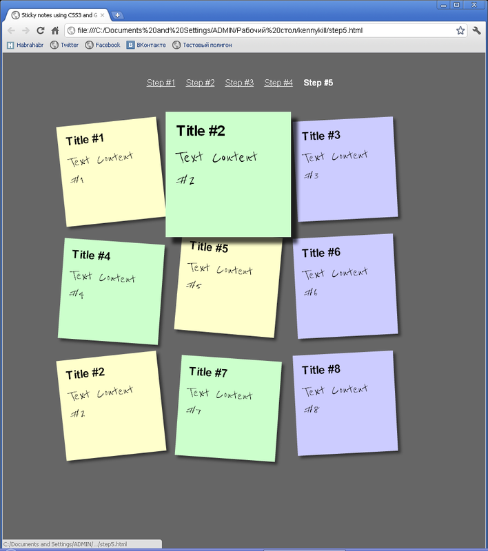
Step 5
Still, you need to finish it to be beautiful. Do you understand what we do not praise? That's right, the animation. It is necessary to make the transitions smooth, not stone.
ul li a{ text-decoration:none; color:#000; background:#ffc; display:block; height:10em; width:10em; padding:1em; -moz-box-shadow:5px 5px 7px rgba(33,33,33,1); -webkit-box-shadow: 5px 5px 7px rgba(33,33,33,.7); box-shadow: 5px 5px 7px rgba(33,33,33,.7); -moz-transition: -moz-transform .15s linear; -o-transition: -o-transform .15s linear; -webkit-transition:-webkit-transform .15s linear; } Here it is our animation. Unfortunately, the screenshot cannot convey it, just as the phone cannot convey the smell of freshly baked pizza
But I would also like to decorate our stickers, but somehow everything is monotonous. Every second sticker will be green, every third will be blue. Well, not bad.
ul li:nth-child(even) a{ -o-transform: rotate(4deg); -webkit-transform: rotate(4deg); -moz-transform: rotate(4deg); position: relative; top: 5px; background: #cfc; } ul li:nth-child(3n) a{ -o-transform: rotate(-3deg); -webkit-transform: rotate(-3deg); -moz-transform: rotate(-3deg); position: relative; top: -5px; background: #ccf; } Again, we won't be able to see the animation in the screenshot, but our tricolor
Conclusion
Well, that's all for today. Today we learned how to create beautiful animated stickers using CSS3. After all, beautiful, right?
An example of this lesson can be pulled here .
See you soon!
Source: https://habr.com/ru/post/136238/
All Articles