Making tooltips with arrows on CSS using symbols
The topic is already rather trite, but I want to share my method. Invented the technology itself, I do not pretend to originality, although so far I have not met a description of such a technique.
So, the challenge is to make a beautiful tooltip with arrows on CSS.
We will not consider the option with pictures; we will use pseudo-elements: before and: after.
Recently, there has already been considered such a technology using CSS transformations:
http://habrahabr.ru/blogs/css/136061/
')
I suggest another way - using symbols.
The original version of the article considered the use of the characters ►, ◄, ▲, ▼, but, as FTDeBUGgeR correctly noted, everything on Android was scattered. The problem turned out to be banal: in the fonts for Android, there are simply no arrows to the left (►) and right (◄).
There was nowhere to retreat, and I decided to use the arrows ↑, ↓, → and ←, which were on Android. But then suddenly a diamonds suit turned up - after all, this symbol is enough for shooters of all directions! In addition, the ↑, ↓, → and ← arrows of a large size are not really sharp, but on Android they generally have rounded ends.
Therefore, we will draw "diamonds" tooltips.
First of all, let's create a tooltip block with a beautiful gradient background, border and shadow:
In our example, we will use 2 CSS classes - 'tooltip' for general properties, as well as for clarity, separate classes of arrows of different directions, for example, 'leftArrow'.
Next, add our arrows. The pseudo-elements will have a content property with the 16th character code to display.
Since we use the border on the block, it is logical and visually pleasing to see the border and the arrow. But the border can be hung only on the block, but not on the text. Therefore, we will have 2 pseudo-elements with arrows -: before and: after, the first arrow will have the color of the border, the second - the background color. Using the offset of the “background” arrow relative to the “bordering” one can get an imitation of the border. The shadow of the arrow will be formed through the text-shadow for the “border” arrow (: before).
If a block without boarders is needed, the task is simplified and it suffices to use one pseudo-element, for example,: before.
We also prohibit the selection of our text arrow using user-select:
The symbol itself is located in the center of a block of 50x50 pixels, and using the clip property, we will cut off part of the symbol, thereby forming exactly the triangular block of the arrow of the desired direction.
The main difficulty lies in determining the absolute coordinates of our pseudo-elements, although with the help of the FireBug you can quickly find the required size of the arrow through the font-size and position the element. It is important to shift the “background” arrow so that it covers the border block.
We also agree that we need to have an arrow in the center of the edge. To do this, we use 50% positioning on top or left, as well as a negative margin at half the height or width of the block, respectively.
By the way, the original version used em, not px as a unit of size, but everyone's favorite Opera sorely refused to understand the clip in em'ah, so I had to use px.
Here we consider the creation of an arrow to the left, at the end of the article there is a link to examples for all 4 options of arrows (left, right, down and up).
As a matter of fact, that's all, we meet the "trumpy diamonds tooltip":
For IE, simply add PIE to see the beauty (rounded corners, shadows and gradient backgrounds).
There is a minus left - the vertical gradient of the tooltip background cannot be shown on the left and right arrows, but this is not always noticeable, but on tooltips with a monotonous background color and not at all a minus.
Demo and full source code example
So, the challenge is to make a beautiful tooltip with arrows on CSS.
We will not consider the option with pictures; we will use pseudo-elements: before and: after.
Recently, there has already been considered such a technology using CSS transformations:
http://habrahabr.ru/blogs/css/136061/
')
I suggest another way - using symbols.
The original version of the article considered the use of the characters ►, ◄, ▲, ▼, but, as FTDeBUGgeR correctly noted, everything on Android was scattered. The problem turned out to be banal: in the fonts for Android, there are simply no arrows to the left (►) and right (◄).
There was nowhere to retreat, and I decided to use the arrows ↑, ↓, → and ←, which were on Android. But then suddenly a diamonds suit turned up - after all, this symbol is enough for shooters of all directions! In addition, the ↑, ↓, → and ← arrows of a large size are not really sharp, but on Android they generally have rounded ends.
Therefore, we will draw "diamonds" tooltips.
First of all, let's create a tooltip block with a beautiful gradient background, border and shadow:
font-size: 12px; color:#FFF; position:relative; width:300px; padding:20px; margin:20px; border: 1px solid #186F8F; -moz-border-radius: 15px; -webkit-border-radius: 15px; border-radius: 15px; background-color:#35acd7; background-image: -moz-linear-gradient( #29A2CE 0%, #3ABAE6 100%); background-image: -webkit-gradient(linear, left top, left bottom, color-stop(0%, #29A2CE), color-stop(100%, #3ABAE6)); background-image: -webkit-linear-gradient( #29A2CE 0%, #3ABAE6 100%); background-image: -o-linear-gradient( #29A2CE 0%, #3ABAE6 100%); background-image: -ms-linear-gradient( #29A2CE 0%, #3ABAE6 100%); background-image: linear-gradient( #29A2CE 0%, #3ABAE6 100%); -moz-box-shadow: 0 1px 0 #7FD2F1 inset, 0 0 7px 4px #666; -webkit-box-shadow: 0 1px 0 #7FD2F1 inset, 0 0 7px 4px #666; box-shadow: 0 1px 0 #7FD2F1 inset, 0 0 7px 4px #666; In our example, we will use 2 CSS classes - 'tooltip' for general properties, as well as for clarity, separate classes of arrows of different directions, for example, 'leftArrow'.
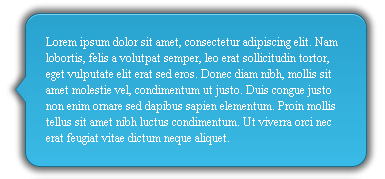
<div class="tooltip leftArrow"> Lorem ipsum dolor sit amet, consectetur adipiscing elit. Nam lobortis, felis a volutpat semper, leo erat sollicitudin tortor, eget vulputate elit erat sed eros. Donec diam nibh, mollis sit amet molestie vel, condimentum ut justo. Duis congue justo non enim ornare sed dapibus sapien elementum. Proin mollis tellus sit amet nibh luctus condimentum. Ut viverra orci nec erat feugiat vitae dictum neque aliquet. </div> Next, add our arrows. The pseudo-elements will have a content property with the 16th character code to display.
Since we use the border on the block, it is logical and visually pleasing to see the border and the arrow. But the border can be hung only on the block, but not on the text. Therefore, we will have 2 pseudo-elements with arrows -: before and: after, the first arrow will have the color of the border, the second - the background color. Using the offset of the “background” arrow relative to the “bordering” one can get an imitation of the border. The shadow of the arrow will be formed through the text-shadow for the “border” arrow (: before).
If a block without boarders is needed, the task is simplified and it suffices to use one pseudo-element, for example,: before.
We also prohibit the selection of our text arrow using user-select:
.tooltip:before, .tooltip:after { content:"\2666"; font-family: monospace; font-size:50px; line-height:52px; text-align:center; position:absolute; overflow:hidden; width:50px; height:50px; -moz-user-select: -moz-none; -khtml-user-select: none; -webkit-user-select: none; user-select: none; } .tooltip:before { color:#186F8F; } .tooltip:after { color:#35acd7; } The symbol itself is located in the center of a block of 50x50 pixels, and using the clip property, we will cut off part of the symbol, thereby forming exactly the triangular block of the arrow of the desired direction.
The main difficulty lies in determining the absolute coordinates of our pseudo-elements, although with the help of the FireBug you can quickly find the required size of the arrow through the font-size and position the element. It is important to shift the “background” arrow so that it covers the border block.
We also agree that we need to have an arrow in the center of the edge. To do this, we use 50% positioning on top or left, as well as a negative margin at half the height or width of the block, respectively.
By the way, the original version used em, not px as a unit of size, but everyone's favorite Opera sorely refused to understand the clip in em'ah, so I had to use px.
Here we consider the creation of an arrow to the left, at the end of the article there is a link to examples for all 4 options of arrows (left, right, down and up).
.leftArrow:before, .leftArrow:after { top:50%; left:-25px; margin-top:-25px; clip:rect(0px, 25px, 50px, 0px); } .leftArrow:before { -moz-text-shadow: -4px 0px 6px #666; -webkit-text-shadow:-4px 0px 6px #666; text-shadow: -4px 0px 6px #666; } .leftArrow:after { left:-24px; } As a matter of fact, that's all, we meet the "trumpy diamonds tooltip":
For IE, simply add PIE to see the beauty (rounded corners, shadows and gradient backgrounds).
There is a minus left - the vertical gradient of the tooltip background cannot be shown on the left and right arrows, but this is not always noticeable, but on tooltips with a monotonous background color and not at all a minus.
Demo and full source code example
Source: https://habr.com/ru/post/136175/
All Articles