We make a tooltips using CSS3
Hello!
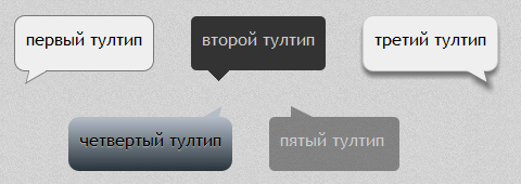
Already several times I have been asked to do the usual tooltips, which are such with arrows. Everything would be fine: he concocted a block with rounds, took triangles from here and voila. However, not all so simple. After all, the flight of imagination of designers is great. Now they have arrows with a slope, now they have frames, then shadows. You can, of course, sip everything in the pictures, but this is
All this turned out to be absolutely solved with the help of CSS, if you include a little imagination.
From words to deeds.
At once I will say that all the examples are on the link at the bottom of the article. And one can not read the post reflecting on “higher matters”, for there is nothing supernatural here.
So, we do the preparation.
We will need one div and 1 or 2 pseudo-elements.
div{ position:relative; display:inline-block; padding:10px; min-height:30px; min-width:100px; font-family:'Trebuchet MS'; margin-right:30px; text-align:left; } div:before, div:after{ content:''; position:absolute; } Tooltip with frame
We round the tooltip itself and make a frame. Then we hang up a pseudo-element with an arrow and with the help of transform we first rotate it and then tilt it. As a result, we get a tilted parallelogram. We give him a frame and through z-index: -1 we hide it “under” the main unit. But now we have a tooltip frame on top of the arrow. To do this, take another pseudo-element and overlay it exactly on top of this frame, setting the background color the same as the tooltip. That's all. Code below.
.t1{ border-radius:10px; background:#efefef; border:1px solid #777; } .t1:before{ bottom:-5px; left:10px; width:20px; height:10px; -webkit-transform:rotate(-30deg) skewX(-45deg); -moz-transform:rotate(-30deg) skewX(-45deg); -o-transform:rotate(-30deg) skewX(-45deg); -ms-transform:rotate(-30deg) skewX(-45deg); background:#efefef; z-index:-1; border:1px solid #777; } .t1:after{ left:13px; bottom:-1px; width:15px; height:1px; background:#efefef; } Simple tooltip with an arrow
Everything is simple here. As I wrote in the introduction: we take a block and hang a triangle to it through a pseudo-element.
')
.t2{ background:#333; border-radius:5px; color:#ccc; } .t2:before{ left:10px; bottom:-10px; width:0px; height:0px; border-left: 15px solid transparent; border-right: 15px solid transparent; border-top: 15px solid #333; } Tooltip with shadow
Here, almost all the same, as in the first version, just add a shadow.
And we make the z-index positive (or not indicated at all), since a shadow is a shadow and cannot be hidden by an auxiliary pseudo-element. Immediately, I note that this design implies a reservation in the tooltip of the space below.
.t3:before{ bottom:-4px; right:10px; width:20px; height:10px; -webkit-transform:rotate(30deg) skewX(45deg); -moz-transform:rotate(30deg) skewX(45deg); -ms-transform:rotate(30deg) skewX(45deg); -o-transform:rotate(30deg) skewX(45deg); background:#efefef; z-index:1; box-shadow:4px 5px 5px 0px #777; } In the example there is a gradient with a gradient, but I will not describe it, because there everything is done by analogy. Added only "beautiful", which is not the subject of my story.
Translucent tooltip
In turn, it is no different from the "ordinary tooltip" with an arrow. Set the background through rgba and forward. For order, I also tilted it.
.t5:before{ left:15px; top:-10px; width:0px; height:0px; border-left: 10px solid transparent; border-right: 10px solid transparent; border-bottom: 10px solid rgba(51,51,51,0.5); -webkit-transform:skewX(45deg); -moz-transform:skewX(45deg); -ms-transform:skewX(45deg); -o-transform:skewX(45deg); } That's all the tricks.
An example is here.
I will say that this post is not striking in its novelty and uniqueness, it is rather from the category "to have it" or "to peep at something." Since many people ask, it is therefore useful.
Thanks for attention.
Source: https://habr.com/ru/post/136061/
All Articles