CSS buttons with pseudo-elements
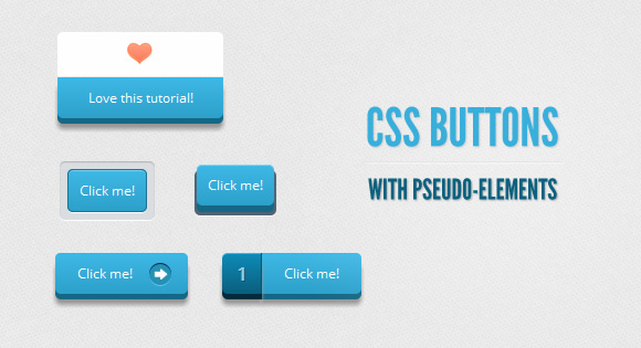
Hello, friends. Over the past month I have experimented with pseudo-elements, especially with their use in creating buttons. Thus, we managed to create cool effects that previously could only be done with sprites.
In this tutorial, I’ll show you how to create a button with a twist using only the anchor tag and the power of CSS.
')
The font used is “Open Sans” by Steve Mattson .
Disclaimer
I will not use CSS prefixes in these examples, but you will find them in the source files.
I did not use the transition property, because only Firefox supports it in pseudo-elements. In addition, I believe that the buttons work well without using it.
Markup
For the operation of all buttons, only the anchor is useful, we will create all other elements using the pseudo-class :: before.
<a href="#" class="a_demo_one"> Click me! </a> First example

I think this is the easiest example to do with regular CSS.
Styles
First of all, we will set the main styles for the button in its normal and active state. Note that the button is positioned relatively. This will help in positioning the element :: before:
.a_demo_one { background-color:#ba2323; padding:10px; position:relative; font-family: 'Open Sans', sans-serif; font-size:12px; text-decoration:none; color:#fff; border: solid 1px #831212; background-image: linear-gradient(bottom, rgb(171,27,27) 0%, rgb(212,51,51) 100%); border-radius: 5px; } .a_demo_one:active { padding-bottom:9px; padding-left:10px; padding-right:10px; padding-top:11px; top:1px; background-image: linear-gradient(bottom, rgb(171,27,27) 100%, rgb(212,51,51) 0%); } Now we will make a gray container around the button using the pseudo-element :: before. Absolute positioning will make our lives easier when positioning the element itself.
.a_demo_one::before { background-color:#ccd0d5; content:""; display:block; position:absolute; width:100%; height:100%; padding:8px; left:-8px; top:-8px; z-index:-1; border-radius: 5px; box-shadow: inset 0px 1px 1px #909193, 0px 1px 0px #fff; } Second example

This example is a bit more complicated due to the 3D effect. Initially, the button is outside the container, then, when clicked, it goes down:
.a_demo_two { background-color:#6fba26; padding:10px; position:relative; font-family: 'Open Sans', sans-serif; font-size:12px; text-decoration:none; color:#fff; background-image: linear-gradient(bottom, rgb(100,170,30) 0%, rgb(129,212,51) 100%); box-shadow: inset 0px 1px 0px #b2f17f, 0px 6px 0px #3d6f0d; border-radius: 5px; } .a_demo_two:active { top:7px; background-image: linear-gradient(bottom, rgb(100,170,30) 100%, rgb(129,212,51) 0%); box-shadow: inset 0px 1px 0px #b2f17f, inset 0px -1px 0px #3d6f0d; color: #156785; text-shadow: 0px 1px 1px rgba(255,255,255,0.3); background: rgb(44,160,202); } Styles
And here it is already more difficult:
Since the position of the pseudo-element depends on the parent element, when moving the parent element by several pixels, the pseudo-element must be moved to the same pixels, but in the other direction.
.a_demo_two::before { background-color:#072239; content:""; display:block; position:absolute; width:100%; height:100%; padding-left:2px; padding-right:2px; padding-bottom:4px; left:-2px; top:5px; z-index:-1; border-radius: 6px; box-shadow: 0px 1px 0px #fff; } .a_demo_two:active::before { top:-2px; } Third example

This is one of my favorite buttons, since there wasn’t one like this before I created it. People seem to like it very much. The button is divided into two parts, and when you click on it, it “breaks”.
Styles
Again, let's start with the easy part. Notice that there is an indent. It is necessary to compensate for the width of the pseudo-element, if you need to center the button. If it is not necessary, then indent can be not used.
.a_demo_three { background-color:#3bb3e0; font-family: 'Open Sans', sans-serif; font-size:12px; text-decoration:none; color:#fff; position:relative; padding:10px 20px; border-left:solid 1px #2ab7ec; margin-left:35px; background-image: linear-gradient(bottom, rgb(44,160,202) 0%, rgb(62,184,229) 100%); border-top-right-radius: 5px; border-bottom-right-radius: 5px; box-shadow: inset 0px 1px 0px #2ab7ec, 0px 5px 0px 0px #156785, 0px 10px 5px #999; } .a_demo_three:active { top:3px; background-image: linear-gradient(bottom, rgb(62,184,229) 0%, rgb(44,160,202) 100%); box-shadow: inset 0px 1px 0px #2ab7ec, 0px 2px 0px 0px #156785, 0px 5px 3px #999; } Let's turn to pseudo-elements:
.a_demo_three::before { content:"·"; width:35px; max-height:29px; height:100%; position:absolute; display:block; padding-top:8px; top:0px; left:-36px; font-size:16px; font-weight:bold; color:#8fd1ea; text-shadow:1px 1px 0px #07526e; border-right:solid 1px #07526e; background-image: linear-gradient(bottom, rgb(10,94,125) 0%, rgb(14,139,184) 100%); border-top-left-radius: 5px; border-bottom-left-radius: 5px; box-shadow:inset 0px 1px 0px #2ab7ec, 0px 5px 0px 0px #032b3a, 0px 10px 5px #999 ; } .a_demo_three:active::before { top:-3px; box-shadow:inset 0px 1px 0px #2ab7ec, 0px 5px 0px 0px #032b3a, 1px 1px 0px 0px #044a64, 2px 2px 0px 0px #044a64, 2px 5px 0px 0px #044a64, 6px 4px 2px #0b698b, 0px 10px 5px #999 ; } Fourth example
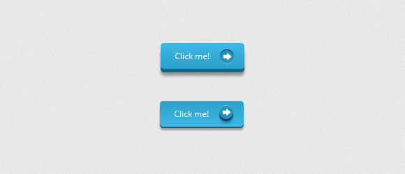
This time we will use the pseudo-element for the arrow using the background image. Instead of images, you can also use these font icons .
Styles
.a_demo_four { background-color:#4b3f39; font-family: 'Open Sans', sans-serif; font-size:12px; text-decoration:none; color:#fff; position:relative; padding:10px 20px; padding-right:50px; background-image: linear-gradient(bottom, rgb(62,51,46) 0%, rgb(101,86,78) 100%); border-radius: 5px; box-shadow: inset 0px 1px 0px #9e8d84, 0px 5px 0px 0px #322620, 0px 10px 5px #999; } .a_demo_four:active { top:3px; background-image: linear-gradient(bottom, rgb(62,51,46) 100%, rgb(101,86,78) 0%); box-shadow: inset 0px 1px 0px #9e8d84, 0px 2px 0px 0px #322620, 0px 5px 3px #999; } .a_demo_four::before { background-color:#322620; background-image:url(../images/right_arrow.png); background-repeat:no-repeat; background-position:center center; content:""; width:20px; height:20px; position:absolute; right:15px; top:50%; margin-top:-9px; border-radius: 50%; box-shadow: inset 0px 1px 0px #19120f, 0px 1px 0px #827066; } .a_demo_four:active::before { top:50%; margin-top:-12px; box-shadow: inset 0px 1px 0px #827066, 0px 3px 0px #19120f, 0px 6px 3px #382e29; } Fifth example
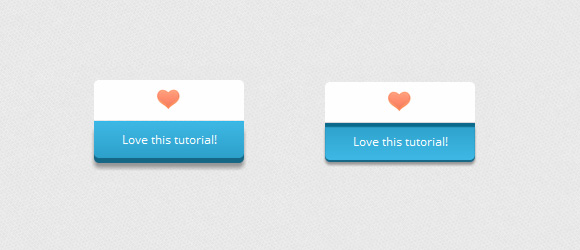
This example is not very cool, but you can modify it at your discretion.
Styles
.a_demo_five { background-color:#9827d3; width:150px; display:inline-block; font-family: 'Open Sans', sans-serif; font-size:12px; text-decoration:none; color:#fff; position:relative; margin-top:40px; padding-bottom:10px; padding-top:10px; background-image: linear-gradient(bottom, rgb(168,48,232) 100%, rgb(141,32,196) 0%); border-bottom-right-radius: 5px; border-bottom-left-radius: 5px; box-shadow: inset 0px 1px 0px #ca73f8, 0px 5px 0px 0px #6a1099, 0px 10px 5px #999; } .a_demo_five:active { top:3px; background-image: linear-gradient(bottom, rgb(168,48,232) 0%, rgb(141,32,196) 100%); box-shadow: inset 0px 4px 1px #7215a3, 0px 2px 0px 0px #6a1099, 0px 5px 3px #999; } .a_demo_five::before { background-color:#fff; background-image:url(../images/heart.gif); background-repeat:no-repeat; background-position:center center; border-left:solid 1px #CCC; border-top:solid 1px #CCC; border-right:solid 1px #CCC; content:""; width:148px; height:40px; position:absolute; top:-30px; left:0px; margin-top:-11px; z-index:-1; border-top-left-radius: 5px; border-top-right-radius: 5px; } .a_demo_five:active::before { top: -33px; box-shadow: 0px 3px 0px #ccc; } Finally
Well that's all. Do not forget that these creation of these buttons is an experiment, so not every browser will display them correctly.
Thanks for reading this tutorial, I hope you find a use for it.
Demonstration | Sources
Source: https://habr.com/ru/post/136048/
All Articles