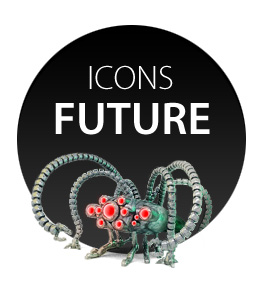
Future icons
Once I came across an entertaining post dedicated to the future of logos. The authors tried to look into the future and imagine what famous brands will look like in a few years.
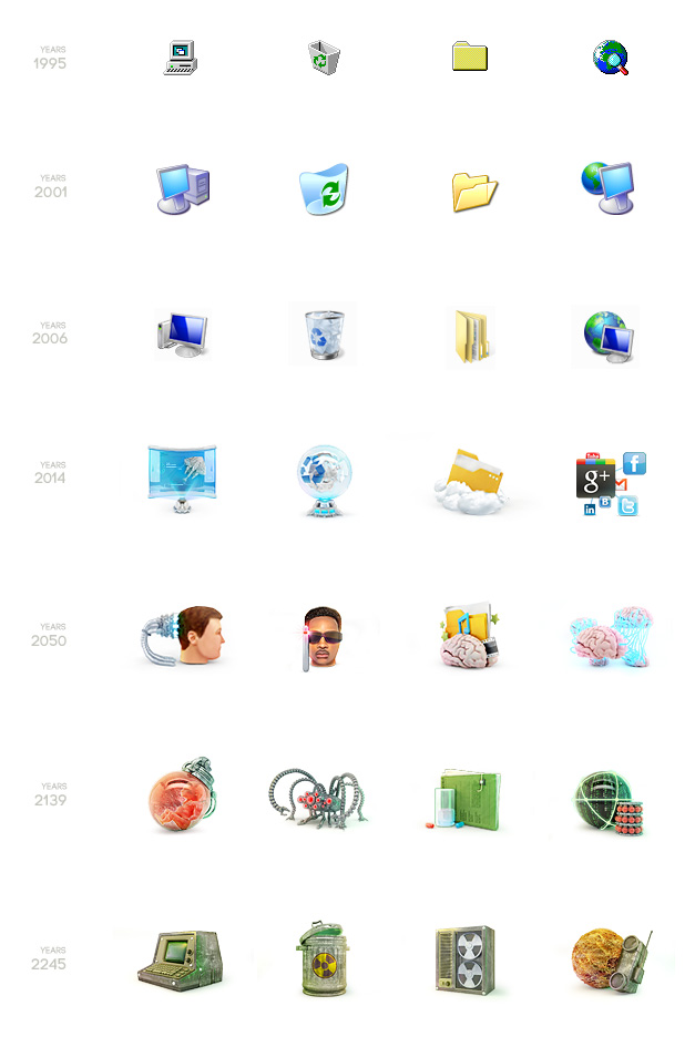
Inspired by the post, I thought it would be interesting to make my own evolution of icons. Variants of the future of our world are invented by a huge number of science fiction writers and it is quite likely that all of them will come true one day or another.
I just had to take a few pictorial scenarios, set a chronology and make a visualization.
Initially, I had Napoleonic plans: to take the most characteristic OS icons and trace their development, say, five hundred years ahead. Along the way, I realized that in the first place, a bunch of icons will simply disappear in the course of time, and some will simply not find analogues in all fantastic versions of reality, secondly, then there will be a lot of icons and taking into account free time it will take about a year to create them. I took four pieces, which seemed the most promising and rushed:
')
Appendage
As a rule, initially I make icons larger than necessary, then shrink and finish. First of all, this results in a better end result, secondly, after finishing work, there is a need to make the icon bigger or turn it into a mini illustration at all.
In this case, the source code, for the love of art)) was made even too large.
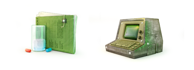
Projection screen. "It was a marsh gas blast."
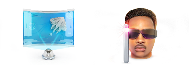
"The Matrix has you ..."
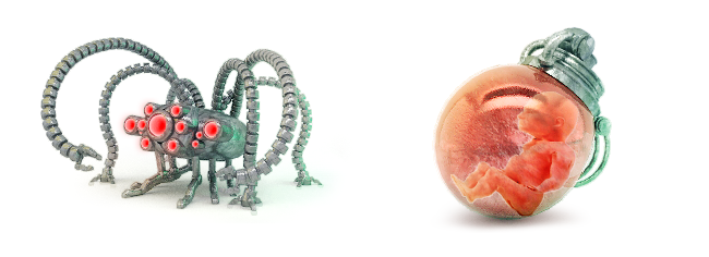
"Follow the White Rabbit". “War. War Never Changes
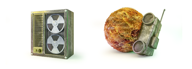
“Welcome to the workplace of the Cola Kernels packaging line operator”
PS I looked at the last posts in the iconography and could not resist - I also painted my own version of the icons of popular services. I think that designers undeservedly pay much attention to squares (rounded or not), and forget that there are other equally beautiful figures, such as irregular hexagons. Increase the number of angles, increase geometry, long live the variety)))
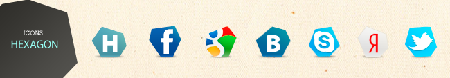
PPS At the request of those who wish to post the hexagonal icons
Archive with .PSD and .PNG
Actually, frankly, it was a banter)) It seemed to me funny that the people were so hooked on these long-suffering icons, so I wanted to show that there are various shapes, gradients and shadows in the world :)
Corrected the cant with dating icons, adding another step with XP
Source: https://habr.com/ru/post/135937/
All Articles