Moving and Transforming in CSS3
Hello, dear habradrug! On the Internet you can find many examples of excellent use of transformations and transitions in CSS3. In this article, we turn to the fundamentals of CSS3 and learn how to create something like this . This tutorial will be useful to those who have just started to get acquainted with CSS3. Let's start the same!
')
Coordinate system
To make it easier to understand how the movement of the object is arranged, we will work in the coordinate system.

However, our coordinate system has one feature: the Y axis is directed in the opposite direction than usual. Why? The fact is that HTML and CSS (along with, for example, ActionScript) use the reverse coordinate system , since the web page starts from the upper left corner and goes down.
Note: We will assume that you are already familiar with the structure of HTML and CSS. I will skip explaining how to set up a CSS file, how to place images, etc. We will focus on animating images. If you are not sure that your skills are at a high level, then we advise you to look at the course of the lessons "HTML and CSS for 30 days" (free of charge and in English) to learn everything you need.
1: Horizontal movement
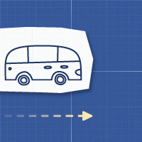
The first movement we demonstrate is horizontal. We will move objects from left to right and from right to left.
Move right
To move the object, we will use transform: translate (x, y) , where X is a positive number and Y = 0.

HTML
Open your favorite code editor and enter the following:
<div id="axis" class="one"> <img class="object van move-right" src="images/van-to-right.png" alt="" /></div> We have identified three classes for the picture:
- object: Setting the main rules of our object.
- van: We will use different objects to demonstrate each type of animation.
- move-right: Using this class, we will move our object.
CSS
First, we will place our object (truck image) in the center.
.object { position: absolute; } .van { top: 45%; left: 44%; } In this example, we move the object 350px to the right. The syntax used is transform: translate (350px, 0); . In addition, the object will move only when you hover the cursor on it: #axis: hover .move-right.
#axis:hover .move-right{ transform: translate(350px,0); -webkit-transform: translate(350px,0); /** Chrome & Safari **/ -o-transform: translate(350px,0); /** Opera **/ -moz-transform: translate(350px,0); /** Firefox **/ } The transform parameter will only move the object from one point to another, but will not create an animation for this move. To fix this, you need to add a move parameter in the class .object.
.object { position: absolute; transition: all 2s ease-in-out; -webkit-transition: all 2s ease-in-out; /** Chrome & Safari **/ -moz-transition: all 2s ease-in-out; /** Firefox **/ -o-transition: all 2s ease-in-out; /** Opera **/ } This moving rule will tell the browser to animate all object parameters for 2 seconds (without delay) using the ease-in-out function .
We can use 6 different movements timing functions:
- linear : moving occurs at a constant speed from start to finish.
- ease : moving starts slowly and then picks up speed.
- ease-in : moving slowly.
- ease-out : movement ends slowly.
- ease-in-out : movement begins and ends slowly.
- cubic-bezier : manual determination of the displacement value.
View DEMO
Moving left
To move the object to the left, you just need to put a negative value to the axis OX , while Y remains unchanged. In our case, we will move the object to - 350px to the left.

HTML
Create a new html document and paste the following code:
<div id="axis" class="two"> <img class="object van move-left" src="images/van-to-left.png"/> </div> This time we use the move-left class to move the object to the left.
CSS
Now we will enter -350px for the OX axis. transform: translate (-350px, 0); - move the object to the left.
#axis:hover .move-left { transform: translate(-350px,0); -webkit-transform: translate(-350px,0); /** Safari & Chrome **/ -o-transform: translate(-350px,0); /** Opera **/ -moz-transform: translate(-350px,0); /** Firefox **/ } Since we have previously defined movement rules, we do not need to do it again.
View DEMO
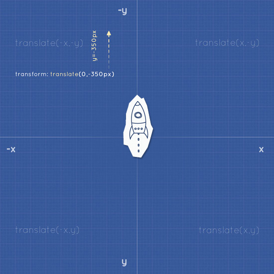
2: Vertical movement
Moving an object vertically will not be difficult, because it is identical to the horizontal. The only difference is that we will use the -y value to move up and the y value to move down.
Move up
HTML
The HTML template is identical to the previous examples. However, we will replace our object with a rocket (for clarity) and assign the class move-up.
<div id="axis"> <img class="object rocket move-up" src="images/rocket.png"/> </div> CSS
As well as the truck, we will place the rocket in the center:
.rocket { top: 43%; left: 44%; } As we noted earlier, the Y coordinate should be negative. In our case, we move the object up 350px.
#axis:hover .move-up { transform: translate(0,-350px); -webkit-transform: translate(0,-350px); -o-transform: translate(0,-350px); -moz-transform: translate(0,-350px); } View DEMO
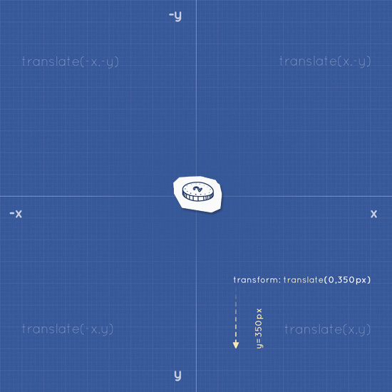
Moving down
As you guessed, to move the object down, the Y coordinate must be positive, and X must be 0. Syntax: translate (0, y);
HTML
<div id="axis" class="four"> <img class="object coin move-down" src="images/coin.png"/> </div> CSS
#axis:hover .move-down { transform: translate(0,350px); -webkit-transform: translate(0,350px); -o-transform: translate(0,350px); -moz-transform: translate(0,350px); } View DEMO
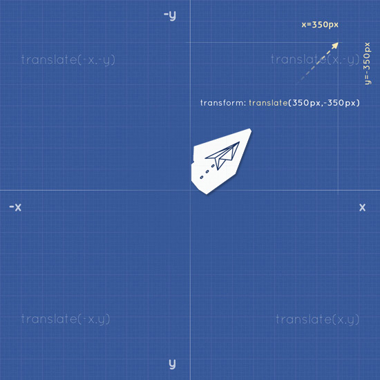
3: Diagonal movement
To move an object diagonally, we combine the parameters x and y . The syntax is as follows: transform: translate (x, y). Depending on the direction, the value of x and y can be either positive or negative.
HTML
<div id="axis" class="five"> <img class="object plane move-ne" src="images/paper-plane.png"/> </div> CSS
#axis:hover .move-ne { transform: translate(350px,-350px); -webkit-transform: translate(350px,-350px); -o-transform: translate(350px,-350px); -moz-transform: translate(350px,-350px); } View DEMO
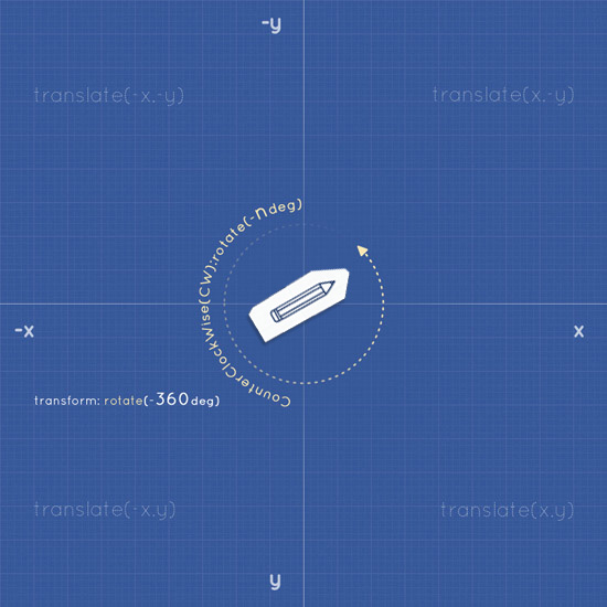
4: Rotation
Rotation in CSS3 is governed by degree coordinates (from 0 ° to 360 °). To rotate an object, apply the following parameters: transform: rotate (ndeg) ; where n is degrees.

Clockwise rotation
To rotate an object clockwise, apply a positive value for rotate (ndeg) .
HTML
<div id="axis" class="six"> <img class="object pencil rotate360cw" src="images/pencil.png"/> </div> CSS
#axis:hover .rotate360cw { transform: rotate(360deg); -webkit-transform: rotate(360deg); -o-transform: rotate(360deg); -moz-transform: rotate(360deg); } Anti-clockwise rotation
To rotate an object counterclockwise, apply a negative value for rotate (ndeg) .
HTML
<div id="axis" class="seven"> <img class="object pencil rotate360ccw" src="images/pencil.png"/> </div> CSS
#axis:hover .rotate360ccw { transform: rotate(-360deg); -webkit-transform: rotate(-360deg); -o-transform: rotate(-360deg); -moz-transform: rotate(-360deg); } View DEMO
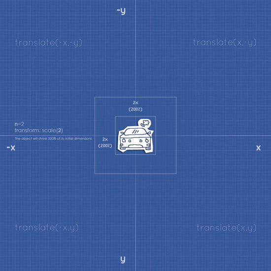
5: Scaling
Scaling is an interesting feature of CSS3. Using the scale (n) parameter or the scale (x, y) parameter, we can either enlarge or reduce the object directly within the HTML framework. The object will change size depending on the value of n / x, y, where the X axis is the width and Y is the height.
Let's look at the following example.
HTML
<div id="axis" class="eight"> <img class="object car larger" src="images/car.png"/> </div> CSS
#axis:hover .larger{ transform: scale(2); -webkit-transform: scale(2); -o-transform: scale(2); -moz-transform: scale(2); } View DEMO
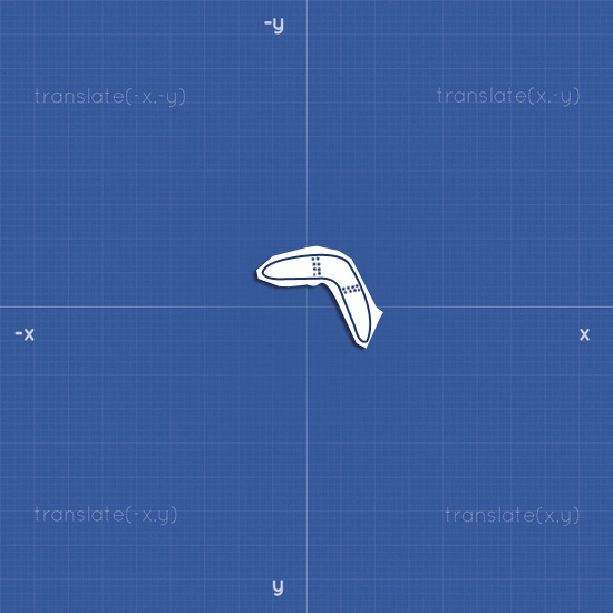
6: Multiple Movements
After we have considered the basic movements and transformations, we can try to combine them.
HTML
<div id="axis" class="ten"> <img class="object boomerang multiple-move" src="images/pencil.png"/> </div> CSS
The plan is this: you need to move the boomerang to the upper right corner and simultaneously rotate it. To do this, simply list the commands separated by a space.
#axis:hover .multiple { transform: translate(350px, -350px) rotate(360deg); -webkit-transform: translate(350px, -350px) rotate(360deg); -o-transform: translate(350px, -350px) rotate(360deg); -moz-transform: translate(350px, -350px) rotate(360deg); } View DEMO
Conclusion
So, in this article we looked at the main examples of transformation. Remember that you need to pay attention to compatibility with different browsers. And do not overdo it with these effects, because they can not only not improve your design, but also spoil it.
Download source
Source: https://habr.com/ru/post/135816/
All Articles