Arrow shaped elements using CSS3

In web design, irregularly shaped elements are always of interest. Swept shapes and diagonal lines can create an interesting visual flow and give a pleasant result. I was inspired by projects that use irregular shapes, and now I want to show a couple of simple examples using them.
')
First example
In the first example, we will create a regular layout with one feature: the blocks will be divided not by a horizontal line, but by a vertical one. To do this, just turn the block with content. Since we do not want the content to turn with the block, we will simply turn it in the opposite direction.
Markup
Let's create a section for all content, and in it we will place blocks with the se-slope class, inside of which there will be texts:
<section class="se-container"> <div class="se-slope"> <article class="se-content"> <h3>Some headline</h3> <p>Some text</p> </article> </div> <div class="se-slope"> <!-- ... --> </div> <!-- ... --> </section> Now we will start styles.
Styles
The web page will have the same background color as the block with the se-slope class. This will hide the irregularities of the edges of the rotated blocks:
body{ background: #e90089; } Apply the overflow: hidden property to the block with the se-container class so that rotated blocks are reflected:
.se-container{ display: block; width: 100%; overflow: hidden; padding-top: 150px; } Make the odd blocks black and rotate them 5 degrees, and even the blocks make pink and rotate them already -5 degrees. Adjust the positions of odd elements by adding a negative indent from above:
.se-slope{ margin: 0 -50px; transform-origin: left center; } .se-slope:nth-child(odd){ background: #000; transform: rotate(5deg); margin-top: -200px; box-shadow: 0px -1px 3px rgba(0,0,0,0.4); } .se-slope:nth-child(even){ background: #e90089; transform: rotate(-5deg); box-shadow: 0px 2px 3px rgba(0,0,0,0.4) inset; } Center the content:
.se-content{ margin: 0 auto; } Let's make headlines. To do this, use the pseudo-elements: before and: after to create arrow-shaped sides:
.se-content h3{ font-size: 60px; position: relative; display: inline-block; padding: 10px 30px 8px 30px; height: 80px; line-height: 80px; margin-bottom: 20px; font-family: 'Bitter', 'Trebuchet MS', Arial; text-shadow: 1px 1px 1px rgba(0,0,0,0.9); } .se-slope:nth-child(odd) .se-content h3{ background: #e90089; color: #000; } .se-slope:nth-child(even) .se-content h3{ background: #000; color: #e90089; } .se-content h3:before{ content: ''; width: 0; height: 0; border-top: 38px solid transparent; border-bottom: 60px solid transparent; border-right: 60px solid black; position: absolute; left: -59px; top: 0px; } .se-content h3:after{ content: ''; width: 0; height: 0; border-top: 38px solid transparent; border-bottom: 60px solid transparent; border-left: 60px solid black; position: absolute; right: -59px; top: 0px; } Set the color for odd elements:
.se-slope:nth-child(odd) .se-content h3:before, .se-slope:nth-child(odd) .se-content h3:after{ border-right-color: #e90089; border-left-color: #e90089; } Let's set styles for paragraphs:
.se-content p{ width: 75%; max-width: 500px; margin: 0 auto; font-style: italic; font-size: 18px; line-height: 24px; padding-top: 10px; } Let's set styles for the letter with which the paragraph begins:
.se-content p:first-letter{ font-size: 40px; font-family: 'Adobe Garamond Pro', Georgia, serif; } Rotate the content so that it is horizontal and adjust the indents:
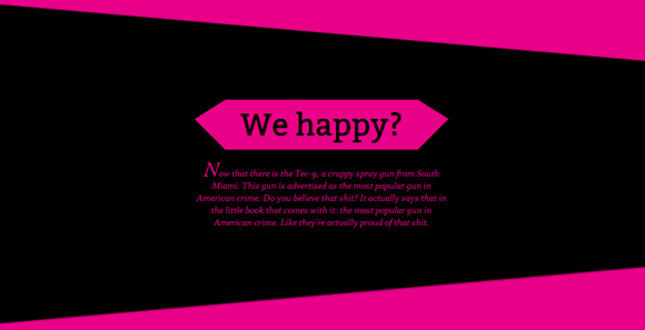
.se-slope:nth-child(odd) .se-content{ transform: rotate(-5deg); color: #e90089; padding: 130px 100px 250px 100px; } .se-slope:nth-child(even) .se-content{ transform: rotate(5deg); color: #000; padding: 150px 100px 250px 100px; } Demonstration of the first example
This was the first example. Consider the second.
Second example
In the second example, we use transparent borders and pseudo-elements to create arrow-shaped forms.
Markup
We use the same markup as in the first example, just add two classes sl-slope-black and sl-slope-pink depending on the color of the blocks:
<section class="se-container"> <div class="se-slope sl-slope-black"> <article class="se-content"> <h3>Some headline</h3> <p>Some text</p> </article> </div> <div class="se-slope sl-slope-pink"> <!-- ... --> </div> <!-- ... --> </section> Let's get down to styles.
Styles
A web page and a block with the se-container class will have the same styles as in the first example:
body{ background: #e90089 } .se-container{ display: block; width: 100%; overflow: hidden; box-shadow: 0px 0px 10px #000; } Blocks with content will be wrapped around on the left and connected to each other:
.se-slope{ width: 50%; height: 300px; position: relative; float: left; overflow: hidden; } Add indents to the content:
.se-slope .se-content{ margin: 50px 100px 0px 100px; } Set the black and pink background for the corresponding blocks:
.se-slope-black{ background: #000; } .se-slope-pink{ background: #e90089; } For black blocks, apply the pseudo-element: after to create arrow-shaped. Odd elements will be located on the left and even elements on the right:
.se-slope-black:nth-child(odd):after, .se-slope-black:nth-child(even):after{ content: ''; position: absolute; bottom: 0px; width: 0px; height: 0px; border-top: 150px solid transparent; border-bottom: 150px solid transparent; } .se-slope-black:nth-child(odd):after{ border-right: 60px solid #e90089; right: 0px; } .se-slope-black:nth-child(even):after{ border-left: 60px solid #e90089; left: 0px; } Add styles to the headers:
.se-content h3{ z-index: 10; font-size: 30px; margin-top: 60px; position: relative; display: inline-block; padding: 15px 20px; line-height: 40px; font-family: 'Bitter', 'Trebuchet MS', Arial; text-shadow: 1px 1px 1px rgba(0,0,0,0.9); } .se-slope.se-slope-black h3{ background: #e90089; } .se-slope.se-slope-pink h3{ background: #000; } Add bevels in header forms:
.se-slope.se-slope-black h3:after, .se-slope.se-slope-black h3:before, .se-slope.se-slope-pink h3:after, .se-slope.se-slope-pink h3:before{ content: ''; width: 0px; height: 0px; top: 0px; position: absolute; } .se-slope.se-slope-black h3:after{ border-top: 70px solid transparent; border-left: 30px solid #e90089; right: -30px; } .se-slope.se-slope-black h3:before{ border-bottom: 70px solid transparent; border-right: 30px solid #e90089; left: -30px; } .se-slope.se-slope-pink h3:after{ border-top: 70px solid transparent; border-right: 30px solid #000; left: -30px; } .se-slope.se-slope-pink h3:before{ border-bottom: 70px solid transparent; border-left: 30px solid #000; right: -30px; } Use text as a decorative element. In the left block we will turn the text 15 degrees, and in the right we will turn them by -15 degrees:
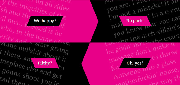
.se-content p{ position: absolute; z-index: 9; opacity: 0.3; font-size: 50px; text-align: left; transform-origin: top center; } .se-slope:nth-child(even) .se-content p{ transform: rotate(-15deg); top: -100px; right: -50px; text-align: left; width: 95%; } .se-slope:nth-child(odd) .se-content p{ transform: rotate(15deg); top: -100px; left: -50px; text-align: right; width: 90%; } .se-slope.sl-slope-pink .se-content p{ color: #000; } Demonstration of the second example
That's all! I hope that you liked the lesson and you will find a use for it!
Source: https://habr.com/ru/post/135508/
All Articles