Making a controlled sunset with CSS3 and javascript
A quick demonstration of CSS3 features with an example. This example affects the border-radius, box-shadow and linear-gradient properties.
head
I ask you to regard the proposed code not as a ready-made solution that you want to use in your project, but only as a demonstration. Although, with proper refinement, it is quite possible for any task.
For those who are too lazy to read the entire text of the article, I immediately attach a link to the working example . The sun can be moved around the screen, as it approaches the horizon, an imitation of sunset is created. After the complete disappearance of the sun beyond the horizon, the stars float in the sky.
The example was tested in the latest versions of modern browsers - IE9, Chrome 16, Opera 11.60 and Firefox 8. Oddly enough, but the quickest example on my machine was the example in the IE9 browser, slightly worse things were in the Firefox browser. In Chrome and Opera, some friezes are noticeable when moving.
')
body
Initially, for a smooth change in the color of the sky and the soil, I wanted to use some analogue color animate, then I realized that it would be too difficult for a simple example, not to mention the fact that it causes quite noticeable brakes when the sun moves. That is why I used several superimposed blocks with variable transparency. In my opinion, it turned out to be quite realistic, but I’m not a designer and I can’t reproduce authentic sunset colors :)
Let's start with the sky. We will need 3 blocks for it, this is a day sky with a bluish gradient, a sunset sky with a red gradient and a night sky with a dark blue gradient. All gradients will be done using css3 linear-gradient properties. To begin, define our blocks in the body of the document.
<div id="sky"></div> <div id="sunsetSky"></div> <div id="nightSky"></div> Now we will declare styles for our sky. I decided to use the height of the sky equal to 60% of the height of the screen and the width of the full screen. To correctly place the layers relative to each other, we will use the z-index property.
#sky { position: absolute; height: 60%; width: 100%; background: #004cf2; background: -moz-linear-gradient(top, #004cf2 0%, #00b7ea 100%); background: -webkit-gradient(linear, left top, left bottom, color-stop(0%,#004cf2), color-stop(100%,#00b7ea)); background: -webkit-linear-gradient(top, #004cf2 0%,#00b7ea 100%); background: -o-linear-gradient(top, #004cf2 0%,#00b7ea 100%); background: -ms-linear-gradient(top, #004cf2 0%,#00b7ea 100%); background: linear-gradient(top, #004cf2 0%,#00b7ea 100%); filter: progid:DXImageTransform.Microsoft.gradient( startColorstr='#004cf2', endColorstr='#00b7ea',GradientType=0 ); z-index: 1; } #sunsetSky { position: absolute; height: 60%; width: 100%; background: #1a4182; background: -moz-linear-gradient(top, #1a4182 0%, #ef6d56 100%); background: -webkit-gradient(linear, left top, left bottom, color-stop(0%,#1a4182), color-stop(100%,#ef6d56)); background: -webkit-linear-gradient(top, #1a4182 0%,#ef6d56 100%); background: -o-linear-gradient(top, #1a4182 0%,#ef6d56 100%); background: -ms-linear-gradient(top, #1a4182 0%,#ef6d56 100%); background: linear-gradient(top, #1a4182 0%,#ef6d56 100%); filter: progid:DXImageTransform.Microsoft.gradient( startColorstr='#1a4182', endColorstr='#ef6d56',GradientType=0 ); opacity: 0; z-index: 2; } #nightSky { position: absolute; height: 60%; width: 100%; background: #060a21; background: -moz-linear-gradient(top, #060a21 0%, #0a1638 80%, #181f59 100%); background: -webkit-gradient(linear, left top, left bottom, color-stop(0%,#060a21), color-stop(80%,#0a1638), color-stop(100%,#181f59)); background: -webkit-linear-gradient(top, #060a21 0%,#0a1638 80%,#181f59 100%); background: -o-linear-gradient(top, #060a21 0%,#0a1638 80%,#181f59 100%); background: -ms-linear-gradient(top, #060a21 0%,#0a1638 80%,#181f59 100%); background: linear-gradient(top, #060a21 0%,#0a1638 80%,#181f59 100%); filter: progid:DXImageTransform.Microsoft.gradient( startColorstr='#060a21', endColorstr='#181f59',GradientType=0 ); opacity: 0; z-index: 3; } You can read more about using a linear gradient as a background, for example, here . To generate a gradient, I used a service from Colorzilla.
Next we have to work on the surface of the earth. Only 2 blocks are enough for day and night surfaces.
<div id="grass"></div> <div id="nightGrass"></div> The surface of the earth will occupy the entire width of the screen and the rest of the sky-free part in height (that is, 40% of the height). Below are the styles
#grass { position: absolute; top: 60%; height: 40%; width: 100%; background: #42ab3f; z-index: 11; } #nightGrass { position: absolute; top: 60%; height: 40%; width: 100%; background: #000000; opacity: 0; z-index: 11; } Now we need to create our sun - the main character of our scene. The sun must be absolutely positioned. In total we will use 2 suns, by analogy with the previous examples, for the day and sunset. But in this case, the sun variant at sunset will be nested to the daytime variant to ensure their synchronous movement.
<div id="sun"> <div id="sunsetSun"></div> </div> #sun { position: absolute; height: 100px; width: 100px; -webkit-border-radius: 50px; -moz-border-radius: 50px; border-radius: 50px; background: #eff866; box-shadow: 0 0 150px #eff866; z-index: 9; cursor: move; } #sunsetSun { height: 100%; width: 100%; border-radius: 50px; -webkit-border-radius: 50px; -moz-border-radius: 50px; background: #F9AD43; box-shadow: 0 0 150px #F9AD43; opacity: 0; } The sun here is a block with a width and height of 100px. To give it a circle shape, we use the css3 border-radius property with a value of 50px (half the length of the side of the block). In principle, this property is easy to use, but to facilitate the work, you can generate the necessary code using this service. It will also facilitate the work if you need to specify different degrees of rounding for individual angles.
For a spectacular halo around the sun, we use the box-shadow property. For its simple generation, you can use this service . Actually there is a bunch of other useful css3 generators.
Now let's start for the stars. Since their creation will be done dynamically, we only need to define styles for them.
.star { position: absolute; z-index: 5; background: #CEFFFA; height: 1px; width: 1px; opacity: 0; } At this stage, work with the design of our page can be considered complete. It is time to breathe interactivity into it with the help of javascript. The main core of our system will be jQuery. You can, of course, do it without it, there will be a little more code. I enclose the full listing of the code below, I think it doesn’t need an explanation, since everything is quite commented.
Besides jQuery, I used the dom-drag library to drag-and-drop
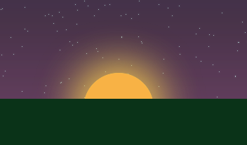
<script type="text/javascript"> $(function(){ // HTML var sun = document.getElementById('sun'); // jQuery var $sun = $(sun); // var $sunsetSun = $('#sunsetSun'); // var $sunsetSky = $('#sunsetSky'); // var $nightSky = $('#nightSky'); // var $grass = $('#grass'); // var $nightGrass = $('#nightGrass'); // Drag.init(sun); // "" 100 makeStars(100); // ( Drag.init() ) $sun.css({ 'top': 20, 'left': 300 }); // sun.onDrag = function(x, y){ // var sunTop = $sun.css('top'); // , var sunPosition = parseInt(sunTop) / (parseInt($sunsetSky.css('height')) / 100); // , var sunAbsolutePosition = parseInt(sunTop) / ($(window).height() / 100); // $sunsetSky.css('opacity', (Math.floor(sunPosition) / 100)); // $sunsetSun.css('opacity', (Math.floor(sunPosition) / 100)); // $nightGrass.css('opacity', (Math.floor(sunPosition) / 100)); // , 60% if (sunAbsolutePosition >= 40){ // , var start = $(window).height() / 100 * 40; // , , var end = $(window).height() / 100 * 65; // start end var pos = (parseInt(sunTop) - parseInt(start)) / ((parseInt(end) - parseInt(start)) / 100); // $nightSky.css('opacity', pos / 100); // $('.star').css('opacity', pos / 100); } // 60% , else { $('.star').css('opacity', 0); } } // start end function range(start, end){ if ((start >= 0) && (end >= 0)){ return Math.round(Math.abs(start) + (Math.random() * (Math.abs(end) - Math.abs(start)))); } else if ((start <= 0) && (end <= 0)){ return 0 - (Math.round(Math.abs(start) + (Math.random() * (Math.abs(end) - Math.abs(start))))); } else{ return Math.round(((start) + Math.random() * (end - start))); } } // count function makeStars(count){ for (var i=0; i<=count; i++){ // , var star = $(document.createElement('div')); // star star.addClass('star'); // DOM body star.appendTo('body'); // star.css({ // - 0 60% 'top': range(0, parseInt($(window).height()) / 100 * 60), // - 0 'left': range(0, $(window).width()) }); } } }); </script> Changing the argument passed to the function makeStars () we can change the number of stars. Their increase leads to greater realism, but greatly affects the speed of animation. In the screenshot above, the value 500 is used.
Actually this can be finished, just wanted to summarize. Many will agree that it is for this problem that my solution, to put it mildly, is not the most optimal. After all, there is a canvas, svg, silverlight. Flash finally. Each of these solutions will work faster in this task. Therefore, this is just a demonstration, no more, made for fun :)
Links
The best, in my opinion, linear gradient generator for CSS3
A bunch of different CSS3 style generators
Javascript library for organizing DnD
Well, an example .
Thank you for your attention. I wish you all a good working week)
Source: https://habr.com/ru/post/135267/
All Articles