Create a Christmas tree-timer with CSS3
Just a week ago, I was excited about the idea of using as much as possible CSS3 for creating my own websites. And since lately insomnia has tormented me, I began to develop these skills. Relaxing and watching the next video, I was soaked with Christmas mood and decided to make a Christmas tree on CSS. The idea was that everything should be as simple as possible, classic and without the use of pictures. At the time when I was making the Christmas tree, I decided to also make a countdown timer for the New Year. I spent not so much time for all this and a lot of pleasure was provided to me.
So let's get started.
')
The HTML code will be extremely simple:
<!DOCTYPE html> <html> <head> <meta http-equiv="Content-Type" content="text/html; charset=utf-8" /> <title> ...</title> <link rel="stylesheet" type="text/css" href="style.css" /> <script src="js/jquery-1.7.min.js" type="text/javascript"></script></script> <script src="js/jquery.countdown.js" type="text/javascript"></script> <script type="text/javascript"> $(function () { var austDay = new Date(2011, 1, 1, 00, 00, 00) ; austDay = new Date(austDay.getFullYear() + 1, 1 - 1, 1); $('#defaultCountdown').countdown({until: austDay}); $('#year').text(austDay.getFullYear()); }); </script> <script src="js/pseudocursor.js" type="text/javascript"></script> </head> <body> <div class="fir-tree"><div class="stem"><div class="text"> <span id="pseudoCursor">:</span></div></div> <div class="conf-stem"></div> <div class="a"></div> <div class="b"></div> <div class="c"></div> <div class="d"></div> <div class="e"></div> <div class="f"></div> <div class="g"></div> <div class="h"></div> <div class="i"></div> <div class="j"></div> <div class="k"></div> <div class="l"></div> <div class="timer"> <div id="defaultCountdown"> </div></div> </body> </html> We write styles
To begin, we will create a background for our Christmas tree:
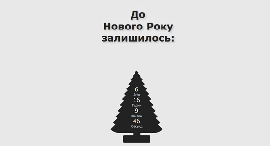
body { background: #E8E8E8; } To create a Christmas tree, I used a light pattern of twelve triangles, legs, and stands — giving them the appropriate styles.
It turned out the following:
.fir-tree { position: absolute; top: 80%; left: 45%; width: 100px; height: 30px; background: #222222; -moz-border-radius: 4px; -webkit-border-radius: 4px; border-radius: 4px; } .fir-tree .conf-stem { position: absolute; top: 0%; left: 10%; width: 100px; height: 30px; background: #222222; -moz-border-radius: 4px; -webkit-border-radius: 4px; border-radius: 4px; } .fir-tree .stem { position: absolute; top: -120%; left: 41%; width: 30px; height: 60px; background: #222222; } .fir-tree .a { position: inherit; top: -430%; left: -65%; width:0; height: 0; border-left: 120px solid transparent; border-right: 120px solid transparent; border-bottom: 120px solid #222222; /* Only FF, Safari, Chrome (I don't use this in IE and Opera because this function doesn't work correctly) */ -moz-border-radius: 50px; -webkit-border-radius: 50px; } .fir-tree .b { position: inherit; top: -485%; left: -55%; width:0; height: 0; border-left: 110px solid transparent; border-right: 110px solid transparent; border-bottom: 110px solid #222222; /* Only FF, Safari, Chrome (I don't use this in IE and Opera because this function doesn't work correctly) */ -moz-border-radius: 50px; -webkit-border-radius: 50px; } .fir-tree .c { position: inherit; top: -535%; left: -45%; width:0; height: 0; border-left: 100px solid transparent; border-right: 100px solid transparent; border-bottom: 100px solid #222222; /* Only FF, Safari, Chrome (I don't use this in IE and Opera because this function doesn't work correctly) */ -moz-border-radius: 50px; -webkit-border-radius: 50px; } .fir-tree .d { position: inherit; top: -585%; left: -35%; width:0; height: 0; border-left: 90px solid transparent; border-right: 90px solid transparent; border-bottom: 90px solid #222222; /* Only FF, Safari, Chrome (I don't use this in IE and Opera because this function doesn't work correctly) */ -moz-border-radius: 50px; -webkit-border-radius: 50px; } .fir-tree .e { position: inherit; top: -635%; left: -25%; width:0; height: 0; border-left: 80px solid transparent; border-right: 80px solid transparent; border-bottom: 80px solid #222222; /* Only FF, Safari, Chrome (I don't use this in IE and Opera because this function doesn't work correctly) */ -moz-border-radius: 50px; -webkit-border-radius: 50px; } .fir-tree .f { position: inherit; top: -685%; left: -15%; width:0; height: 0; border-left: 70px solid transparent; border-right: 70px solid transparent; border-bottom: 70px solid #222222; /* Only FF, Safari, Chrome (I don't use this in IE and Opera because this function doesn't work correctly) */ -moz-border-radius: 50px; -webkit-border-radius: 50px; } .fir-tree .g { position: inherit; top: -725%; left: -5%; width:0; height: 0; border-left: 60px solid transparent; border-right: 60px solid transparent; border-bottom: 60px solid #222222; /* Only FF, Safari, Chrome (I don't use this in IE and Opera because this function doesn't work correctly) */ -moz-border-radius: 50px; -webkit-border-radius: 50px; } .fir-tree .h { position: inherit; top: -765%; left: 5%; width:0; height: 0; border-left: 50px solid transparent; border-right: 50px solid transparent; border-bottom: 50px solid #222222; /* Only FF, Safari, Chrome (I don't use this in IE and Opera because this function doesn't work correctly) */ -moz-border-radius: 50px; -webkit-border-radius: 50px; } .fir-tree .i { position: inherit; top: -805%; left: 15%; width:0; height: 0; border-left: 40px solid transparent; border-right: 40px solid transparent; border-bottom: 40px solid #222222; /* Only FF, Safari, Chrome (I don't use this in IE and Opera because this function doesn't work correctly) */ -moz-border-radius: 50px; -webkit-border-radius: 50px; } .fir-tree .j { position: inherit; top: -835%; left: 25%; width:0; height: 0; border-left: 30px solid transparent; border-right: 30px solid transparent; border-bottom: 30px solid #222222; /* Only FF, Safari, Chrome (I don't use this in IE and Opera because this function doesn't work correctly) */ -moz-border-radius: 50px; -webkit-border-radius: 50px; } .fir-tree .k { position: inherit; top: -855%; left: 35%; width:0; height: 0; border-left: 20px solid transparent; border-right: 20px solid transparent; border-bottom: 20px solid #222222; /* Only FF, Safari, Chrome (I don't use this in IE and Opera because this function doesn't work correctly) */ -moz-border-radius: 50px; -webkit-border-radius: 50px; } .fir-tree .l { position: inherit; top: -872%; left: 45%; width:0; height: 0; border-left: 10px solid transparent; border-right: 10px solid transparent; border-bottom: 10px solid #222222; /* Only FF, Safari, Chrome (I don't use this in IE and Opera because this function doesn't work correctly) */ -moz-border-radius: 50px; -webkit-border-radius: 50px; } We already have the Christmas tree and now we need to make a timer. To create it, I chose a plugin for JS called Countdown .
To do the countdown, I used this sample code:
$(function () { var austDay = new Date(2011, 1, 1, 00, 00, 00) ; austDay = new Date(austDay.getFullYear() + 1, 12 - 1, 32); $('#defaultCountdown').countdown({until: austDay}); $('#year').text(austDay.getFullYear()); }); For the plugin, of course, you can add styles to your taste, here are mine:
.countdown_show1 .countdown_section { width: 200%; } .countdown_show2 .countdown_section { width: 100%; } .countdown_show3 .countdown_section { width: 100%; } .countdown_show4 .countdown_section { width: 100%; } .countdown_show5 .countdown_section { width: 100%; } .countdown_show6 .countdown_section { width: 100%; } .countdown_show7 .countdown_section { width: 60%; } .countdown_section { display: block; float: left; font-size: 80%; text-align: center; } .countdown_amount { font-size: 200%; } .countdown_descr { display: block; width: 100%; } We already have a full Christmas tree, it remains only to make an inscription. You can use some beautiful font for the inscription, but in this example I decided to hold on and follow the simplicity.
.text { position: absolute; top: -800%; left: -430%; font-size: 40px; color: #222222; font-family: Verdana, Arial; text-align: center; font-weight:bold; text-shadow: 4px 4px 7px rgba(0,0,0,0.2), 0px -6px 38px rgba(255,255,255,0.3); } And this is what we got as a result:
Demonstration
Conclusion
So, we have a beautiful timer in the form of a Christmas tree. Everything is pretty simple and beautiful.
Holiday greetings!
Source: https://habr.com/ru/post/135238/
All Articles