Create New Year Card with CSS3
Long-awaited New Year and Christmas holidays are getting closer and it's time to prepare gifts and greetings. And as you know, the best gift is a gift made with your own hands. :) So today we will create a Christmas animated postcard using CSS3. Creating such a postcard will take you only a few minutes, since for it we will use only a few background images and CSS3 animation.
So let's get started.
')
The HTML code will be extremely simple:
<!DOCTYPE html> <html> <head> <link href='http://fonts.googleapis.com/css?family=Lobster&subset=latin,cyrillic' rel='stylesheet' type='text/css'> <link rel="stylesheet" media="screen" href="style.css"> </head> <body> <div id="wrapper"> <div id="container"> <h2> !</h2> </div> </div> </body> </html> To begin with, we will create a background for our postcard, for this you can choose any beautiful picture corresponding to the subject. And set the following styles for the body so that our picture does not reproduce on the screen:
body { background-image: url('christmas.jpg'); background-repeat: no-repeat; background-attachment: fixed; -webkit-background-size: cover; -moz-background-size: cover; -o-background-size: cover; -ms-background-size: cover; background-size: cover; } Here we used background-size: cover to make our background scale with the same proportions.
To create the effect of falling snow, we use the following idea , for this we take three pictures with snowflakes, of different sizes and a transparent background. You can add more if you like it so much, but we will not arrange a “snowstorm” here and limit ourselves to three. Snowflake images are square PNG images, 500, 400 and 300 pixels in size, and, as I said, with a transparent background. Snowflakes can be painted in Photoshop or Gimp using appropriate brushes. I used brushes for the Gimp GIMP Snowflake Brushes by ~ Project-GimpBC . Also, snowflakes can be set to different sizes and different degrees of blur, so that they look more natural.
Now we will apply these images to our block wrapper (div # wrapper). We assign it a height of 100% so that it occupies the entire area of the window, also let's not forget to specify the same height for the html and body tags.
The use of several background images, in syntax, does not differ from the use of only one background, the only difference is that you list all images used as a background, separated by commas. As a result, we get the following:
html, body { height: 100% } div#wrapper { background-image: url('snowflake1.png'), url('snowflake3.png'), url('snowflake2.png'); height:100%; } Create animation
To create the animation, we will use @keyframes. Set the name for the animation, for example, snow. Next we will create two frames. The first is how our page will look at the beginning of the animation, the second is how it will look at the end. At the beginning, I placed all our background images in the upper left corner of the page, setting the background-position to “0px 0px”. Then we move each image to different places on the page.
@keyframes snow { 0% {background-position: 0px 0px, 0px 0px, 0px 0px;} 100% {background-position: 500px 1000px, 400px 400px, 300px 300px;} } Please note that for each browser you need to register the corresponding prefix. As a result, the code will look like this:
@keyframes snow { 0% {background-position: 0px 0px, 0px 0px, 0px 0px;} 100% {background-position: 500px 1000px, 400px 400px, 300px 300px;} } @-moz-keyframes snow { 0% {background-position: 0px 0px, 0px 0px, 0px 0px;} 100% {background-position: 500px 1000px, 400px 400px, 300px 300px;} } @-webkit-keyframes snow { 0% {background-position: 0px 0px, 0px 0px, 0px 0px;} 100% {background-position: 500px 1000px, 400px 400px, 300px 300px;} } @-ms-keyframes snow { 0% {background-position: 0px 0px, 0px 0px, 0px 0px;} 100% {background-position: 500px 1000px, 400px 400px, 300px 300px;} } In the next step, we will set the rules for showing the animation. First we specify the name of the animation we want to use, in this case “snow”, then the duration of the animation (20 seconds), then select the type of animation (linear) and, finally, the animation cycle is infinite.
div#wrapper { background-image: url('snowflake.png'), url('snowflake3.png'), url('snowflake2.png'); height:100%; -webkit-animation: snow 20s linear infinite; -moz-animation: snow 20s linear infinite; -ms-animation: snow 20s linear infinite; animation: snow 20s linear infinite; } For the label you can use some beautiful font, in this example I used the font Lobster, which connected to the page using Google Web Fonts.
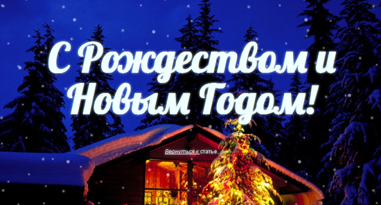
<link href='http://fonts.googleapis.com/css?family=Lobster&subset=latin,cyrillic' rel='stylesheet' type='text/css'> And this is what we got as a result:
Demonstration
Conclusion
So, we got a nice New Year card, but, unfortunately, it will only work in Firefox, Chrome and Safari. IE only starts supporting keyframes from version 10, Opera currently also does not support this animation. But, I hope, this will not spoil the impression of the New Year's greetings (although the addressee should be warned about what to open the postcard :)).
Holiday greetings!

Source: https://habr.com/ru/post/135142/
All Articles