Working with models and delegates on the example of creating a list for FireFox
More than once, comparisons of the complexity of constructing interfaces on Qt skipped over. In this article I will give an example of how you can make a list in the style of the list of FireFox modules.

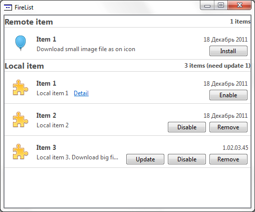
To do this, we use the MVC approach, which is implemented in Qt . At the output, we get something like this:
')
The whole process is divided into 3 parts:
The general principles of working with models in Qt can be found in the documentation, everything is described in great detail.
So let's get started. First we decide on the base model. Since the list may contain sections, we need a simple tree model. In the basic configuration this is not available, so we implement it ourselves.
To do this, we inherit from QAbstractItemModel and implement all abstract methods (this is the required minimum that is needed to build a model).
Also, to change the model, override and method:
I will not paint the model in detail, the full implementation can be viewed in the attached source code.
The most interesting and important part is here, because This class is responsible for how our data will look and interact with the user.
And so, the work of the delegate will consist in displaying an element on the view and in processing clicks on it (we want all sorts of buttons, like Firefox, etc.).
The entry point for this is in the paint method:
Depending on whether the displayed element is a header or not, we call the appropriate methods. If everything is stacked in one, then you get a terrible unreadable footcloth, and the smaller / simpler the methods, the easier it is to navigate them.
It's all very simple. We receive the text preparation, we deduce it with alignment on height and the left edge. Description, containing the number of elements and other information is aligned to the right.
To begin with, we will limit the drawing area and set clipping in order not to climb on the neighbors by chance.
The second step is to shift the point relative to which we will display the contents:
The second line is necessary to take into account the height of the information message, it will be lower. Next, display the icon, title, description and version. When displaying the schedule, we also take into account the fact that the text should not climb under the buttons and other elements. Therefore, we calculate the maximum allowable width and trim it to make it look more pleasant.
Since we want the controls to look the same as on the system, for drawing we will use the style set in the application and the primitives provided.
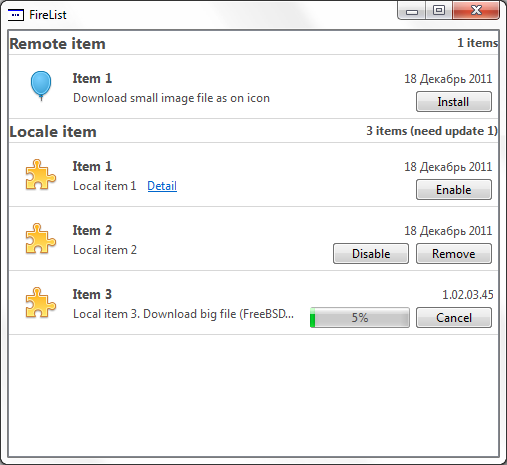
Let's start with the download indicator:
The basis of this fragment was again taken from the sources, namely QProgressBar. For output, fill in the non-required values in the QStyleOptionProgressBarV2 structure (see the documentation for the full description). Set the initial, maximum and current values, as well as the text of the label that will be displayed on top of the indicator. After that, all this is sent to the processing style:
After the indicator, proceed to the buttons.
Each element of the list may be in a different state, depending on which it may provide different valid operations. To begin with we will make the list of those actions which we can perform:
Fill in the QStyleOptionButton structure and for each element from the actions list, we will draw the button:
And at the end, if necessary, we will display an informational message.
This conclusion is made, but the sense of it, if not taught our drawn buttons to press. Therefore, we move on to the next part, handling mouse clicks.
All events about clicking on the elements of our view come to the method:
We will redefine it:
Our buttons should respond to pressing, releasing and pointing the cursor on them.
When checking the button press, we again get the list of available operations, since the order in the output is the same as what was received at this moment, then it is easy to establish a correspondence by running through the array and determining which button hit the square of the button. After emit the corresponding signal with the index of the element on which it was pressed. We do the same for the Detail link.
To view our tree structure, we use QTreeView. So as we do not need indents, set the appropriate parameters in the constructor. Basic operations will occur when the model is installed, where we establish connections between the delegate signals and model slots.
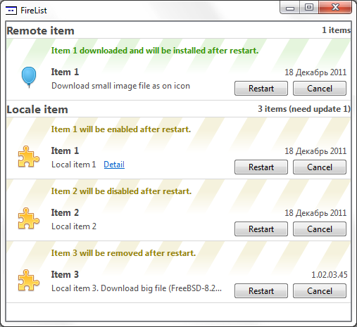
As a result, having built a model, a delegate, and setting up all the links, we’ll get a list of items for Firefox.
In the link below you can download the source code of the demonstration project, which shows the work list and the various state of the elements. Since I use it in my project to display a list of available updates and modules, I also included in the example the ability to download files from the network ( in the example, the FreeBSD 8.2 image is downloaded ).
Constructive criticism and comments are welcome.
Sources: ajieks.ru/download/file_list.zip
DISCLAIMER
The given example does not claim to be a finished component, is presented for informational purposes and requires adaptation to be used. Taken from the working draft, where it fully performs the tasks assigned to it.
To do this, we use the MVC approach, which is implemented in Qt . At the output, we get something like this:
')
The whole process is divided into 3 parts:
- model creation
- delegate creation
- creating a view
Creating a model
The general principles of working with models in Qt can be found in the documentation, everything is described in great detail.
So let's get started. First we decide on the base model. Since the list may contain sections, we need a simple tree model. In the basic configuration this is not available, so we implement it ourselves.
To do this, we inherit from QAbstractItemModel and implement all abstract methods (this is the required minimum that is needed to build a model).
int columnCount ( const QModelIndex & parent = QModelIndex() ) const; QVariant data ( const QModelIndex & index, int role = Qt::DisplayRole ) const; QModelIndex index ( int row, int column, const QModelIndex & parent = QModelIndex() ) const; QModelIndex parent ( const QModelIndex & index ) const; int rowCount ( const QModelIndex & parent = QModelIndex() ) const; Qt::ItemFlags flags ( const QModelIndex & index ) const; Also, to change the model, override and method:
bool setData ( const QModelIndex & index, const QVariant & value, int role = Qt::EditRole ); I will not paint the model in detail, the full implementation can be viewed in the attached source code.
Creating a delegate
The most interesting and important part is here, because This class is responsible for how our data will look and interact with the user.
For this implementation, I was pushed by the way the work with CheckBox was implemented by the QItemDelegate delegate. Therefore, in addition to reading the documentation, it is also useful to look into the source code, there are many useful solutions there.
And so, the work of the delegate will consist in displaying an element on the view and in processing clicks on it (we want all sorts of buttons, like Firefox, etc.).
Drawing
The entry point for this is in the paint method:
void QvObjectDelegate::paint( QPainter * painter, const QStyleOptionViewItem & option, const QModelIndex & index ) const { painter->save(); if(index.parent().isValid()) { if(needRestart(index)) { drawItemBackground(painter, option, index); paintObjectHeader(painter, option, index); } paintObject(painter, option, index); } else { paintHeader(painter, option, index); } painter->restore(); painter->save(); painter->setPen(QColor(0xD7, 0xD7, 0xD7)); painter->drawLine(option.rect.bottomLeft(), option.rect.bottomRight()); painter->restore(); } Depending on whether the displayed element is a header or not, we call the appropriate methods. If everything is stacked in one, then you get a terrible unreadable footcloth, and the smaller / simpler the methods, the easier it is to navigate them.
Section title drawing
void QvObjectDelegate::paintHeader( QPainter * painter, const QStyleOptionViewItem & option, const QModelIndex & index ) const { QPainter &p = *painter; p.save(); p.setClipRect(option.rect); p.setPen(QColor(77, 77, 77)); // QRect tr; QString name = index.data(Qt::DisplayRole).toString(), desc = index.data(QvObjectModel::DetailRole).toString(); QFont f = option.font; f.setPointSize(12); f.setWeight(QFont::Bold); QFontMetrics fm(f); tr = fm.boundingRect(name); p.setFont(f); p.drawText(option.rect, Qt::AlignVCenter | Qt::AlignLeft, name); f = option.font; f.setWeight(QFont::DemiBold); p.setFont(f); p.drawText(option.rect, Qt::AlignVCenter | Qt::AlignRight, desc); p.restore(); } It's all very simple. We receive the text preparation, we deduce it with alignment on height and the left edge. Description, containing the number of elements and other information is aligned to the right.
Body element drawing
void QvObjectDelegate::paintObject(QPainter * painter, const QStyleOptionViewItem & option, const QModelIndex & index ) const { QRect tr; QString name = index.data(Qt::DisplayRole).toString(), description = index.data(QvObjectModel::DescriptionRole).toString(); QPainter &p = *painter; p.setClipRect(option.rect); p.setPen(QColor(210, 210, 210)); p.setBrush(QColor(240, 240, 240)); p.setPen(QColor(77, 77, 77)); p.translate(option.rect.topLeft()); p.translate(0, sizeHint(option, index).height() - ITEM_HEIGHT); p.translate(OFFSET_H, OFFSET_H); QImage img = index.data(Qt::DecorationRole).value<QImage>(); if(!img.isNull()) { p.drawImage(0,0, img); } else { p.drawImage(0,0, defaultIcon_); } p.translate(ICON_SIZE + OFFSET_H, 0); // 10px // QFont f = option.font; f.setPointSize(10); f.setWeight(QFont::Bold); QFontMetrics fm(f); tr = fm.boundingRect(name); p.setFont(f); p.drawText(0, tr.height()-5, name); // p.setFont(option.font); fm = QFontMetrics(option.font); QDate date_ = index.data(QvObjectModel::DateRole).toDate(); int version_ = index.data(QvObjectModel::VersionRole).toInt(); QString versionStr_; if(!date_.isNull()) { versionStr_ = date_.toString("dd MMMM yyyy"); } else if(version_ > 1000000000){ int ver_min = 0; int ver = version_ / 1000000000; ver_min = version_ % 1000000000; int major = ver_min / 10000000; ver_min = ver_min % 10000000; int minor = ver_min / 100000; ver_min = ver_min % 100000; versionStr_ = QCoreApplication::translate("list", "%1.%2.%3.%4", "Version in list") .arg(ver).arg(major, 2, 10, QLatin1Char('0') ) .arg(minor, 2, 10, QLatin1Char('0')).arg(ver_min); } if(!versionStr_.isEmpty()) { tr = fm.boundingRect(versionStr_); tr.moveTo(option.rect.width() - ICON_SIZE - 2*OFFSET_H - tr.width() - OFFSET_BUTTON, 0 ); painter->drawText(tr, Qt::TextSingleLine, versionStr_); } int maxWidth(option.rect.width() - widthButtonGroup(index) - ICON_SIZE - OFFSET_H - DETAIL_OFFSET ); if(!index.data(QvObjectModel::DetailRole).toString().isEmpty()) { maxWidth -= fm.boundingRect(QCoreApplication::translate("list", "Detail")).width(); } description = fm.elidedText(description, Qt::ElideRight, maxWidth); p.translate(0, ICON_SIZE / 2); tr = fm.boundingRect(description); p.drawText(0, tr.height(), description); if(!index.data(QvObjectModel::DetailRole).toString().isEmpty()) { paintDetail(painter, option, index); } if(index.flags().testFlag(Qt::ItemFlag(QvAbstractListItem::Downloading))) { paintObjectProgress(painter, option, index); } paintObjectBtn(painter, option, index); } To begin with, we will limit the drawing area and set clipping in order not to climb on the neighbors by chance.
The second step is to shift the point relative to which we will display the contents:
p.translate(option.rect.topLeft()); p.translate(0, sizeHint(option, index).height() - ITEM_HEIGHT); p.translate(OFFSET_H, OFFSET_H); The second line is necessary to take into account the height of the information message, it will be lower. Next, display the icon, title, description and version. When displaying the schedule, we also take into account the fact that the text should not climb under the buttons and other elements. Therefore, we calculate the maximum allowable width and trim it to make it look more pleasant.
Drawing buttons and loading bars
Since we want the controls to look the same as on the system, for drawing we will use the style set in the application and the primitives provided.
Let's start with the download indicator:
void QvObjectDelegate::paintObjectProgress( QPainter * painter, const QStyleOptionViewItem & option, const QModelIndex & index ) const { QStyleOptionProgressBarV2 opt; initStyleProgressOption(&opt, index); QStyle *style = QApplication::style(); opt.rect.setLeft(option.rect.width() - (CHECK_WIDTH + OFFSET_H) * 2 - ICON_SIZE - OFFSET_BUTTON - buttonRect.width() - OFFSET_BUTTON ); opt.rect.setTop( 4 ); opt.rect.setWidth(CHECK_WIDTH * 2); opt.rect.setHeight(PROGRESS_HEIGHT); painter->setPen(QColor(77, 77, 77)); style->drawControl(QStyle::CE_ProgressBar, &opt, painter); } void QvObjectDelegate::initStyleProgressOption( QStyleOptionProgressBar *option, const QModelIndex & index ) const { int value = index.data(QvObjectModel::ProgressRole).toInt(); if (!option) return; option->rect = QRect(100, 100, 100, 100); option->state |= QStyle::State_Active; option->state |= QStyle::State_Enabled; option->state |= QStyle::State_Horizontal; option->minimum = 0; option->maximum = 100; //maximum?maximum:100; option->progress = value; option->textAlignment = Qt::AlignCenter; option->textVisible = true; option->text = QString("%1%").arg(value); if (QStyleOptionProgressBarV2 *optionV2 = qstyleoption_cast<QStyleOptionProgressBarV2 *>(option)) { optionV2->orientation = Qt::Horizontal ; // ### Qt 5: use State_Horizontal instead optionV2->invertedAppearance = false; optionV2->bottomToTop = true; } } The basis of this fragment was again taken from the sources, namely QProgressBar. For output, fill in the non-required values in the QStyleOptionProgressBarV2 structure (see the documentation for the full description). Set the initial, maximum and current values, as well as the text of the label that will be displayed on top of the indicator. After that, all this is sent to the processing style:
style->drawControl(QStyle::CE_ProgressBar, &opt, painter); After the indicator, proceed to the buttons.
Each element of the list may be in a different state, depending on which it may provide different valid operations. To begin with we will make the list of those actions which we can perform:
QVector<QvObjectDelegate::ButtonAction> QvObjectDelegate::getButtons( const QModelIndex &index ) const { QVector<ButtonAction> tags_; if(needRestart(index) ) { tags_ << baRestart << baCancel; } else if( index.flags() & Qt::ItemFlag(QvAbstractListItem::Downloading) ) { tags_ << baCancel; } else { bool installed = index.data(QvObjectModel::InstalledRole).toBool(), enabled = index.data(QvObjectModel::EnabledRole).toBool(), buildin = index.data(QvObjectModel::BuildInRole).toBool(); if (installed && (index.flags() & Qt::ItemFlag(QvAbstractListItem::hasUpdate))) { tags_ << baUpdate;} if (installed && index.flags() & Qt::ItemFlag(QvAbstractListItem::canBeToggled)) { tags_ << (enabled ? baDisable : baEnable);} if (installed && !buildin) { tags_ << baRemove;} if (!installed) { tags_ << baInstall; } } return tags_; } Fill in the QStyleOptionButton structure and for each element from the actions list, we will draw the button:
void QvObjectDelegate::drawButton( QStyleOptionButton &o, const QPoint &p, QPainter * painter ) const { if(o.rect.contains(p)) o.state |= QStyle::State_Sunken; QStyle * style = QApplication::style(); if(style) style->drawControl(QStyle::CE_PushButton, &o, painter ); o.state &= ~QStyle::State_Sunken; o.rect.translate(buttonRect.width() + OFFSET_BUTTON, 0); } And at the end, if necessary, we will display an informational message.
This conclusion is made, but the sense of it, if not taught our drawn buttons to press. Therefore, we move on to the next part, handling mouse clicks.
Click processing
All events about clicking on the elements of our view come to the method:
bool editorEvent( QEvent *event, QAbstractItemModel *model, const QStyleOptionViewItem &option, const QModelIndex &index ); We will redefine it:
Q_ASSERT(event); Q_ASSERT(model); // make sure that we have the right event type if ((event->type() == QEvent::MouseButtonRelease) || (event->type() == QEvent::MouseMove) || (event->type() == QEvent::MouseButtonPress)) { return validateLabel(index, option, event) || validateButton(index, option, event); } else if (event->type() == QEvent::KeyPress) { if (static_cast<QKeyEvent*>(event)->key() != Qt::Key_Space && static_cast<QKeyEvent*>(event)->key() != Qt::Key_Select) return false; } else { return false; } return false; Our buttons should respond to pressing, releasing and pointing the cursor on them.
When checking the button press, we again get the list of available operations, since the order in the output is the same as what was received at this moment, then it is easy to establish a correspondence by running through the array and determining which button hit the square of the button. After emit the corresponding signal with the index of the element on which it was pressed. We do the same for the Detail link.
Creating a view
To view our tree structure, we use QTreeView. So as we do not need indents, set the appropriate parameters in the constructor. Basic operations will occur when the model is installed, where we establish connections between the delegate signals and model slots.
As a result, having built a model, a delegate, and setting up all the links, we’ll get a list of items for Firefox.
In the link below you can download the source code of the demonstration project, which shows the work list and the various state of the elements. Since I use it in my project to display a list of available updates and modules, I also included in the example the ability to download files from the network ( in the example, the FreeBSD 8.2 image is downloaded ).
Constructive criticism and comments are welcome.
Sources: ajieks.ru/download/file_list.zip
DISCLAIMER
The given example does not claim to be a finished component, is presented for informational purposes and requires adaptation to be used. Taken from the working draft, where it fully performs the tasks assigned to it.
Source: https://habr.com/ru/post/134802/
All Articles