New old youtube design
Most recently, YouTube has stopped supporting the Cosmic Panda interface. Judging by the comments on the network and reviews of friends, the design came to taste to many, and partly this fact pushed me to write this post, because even though the new interface has acquired some gloss, most of them remained at the 2005 level, which I personally find unacceptable for service of this level. But let's leave these arguments, perhaps YouTube is only taking the first steps towards improving the appearance, but I offer you a Friday excursion into the history of design in pictures. This is not a multi-page report, but just a small series of scattered images, arched with restrained sarcasm, with all this, perfectly illustrating the devil-may-care attitude to design and users in general by Google.
First of all, I would like to thank the designers who designed this interface and were able, if not for a long time, but to breathe in even a fraction of the style on YouTube.
A small digression: unfortunately, I started taking screenshots too late and there were not so many materials, there were a lot more stocks in the design.
So, in July of this year, YouTube rolls out a new interface - Cosmic Panda. Looks stylish and promising.
')
But the happiness did not last long, apparently the designer began to conflict with the management which required more gif cats and glitches in the design , after which, perhaps he even started drinking , eventually spat and left.
It all started with a hat. The initial version was bad only in an inaccurate search icon.

The button was adjusted, but for some reason they changed the color of the substrate to white. This was done apparently because the old hat clashed with the main page, on which everything is white since 2000. Tribute to tradition, so to speak.

After some time, the gray color was returned, and along with the O_- icon, the link to the profile suffered, the screenshot shows the state of the cursor.

Well, in the end, corrected all at once. Even the on-screen keyboard call icon was pushed.

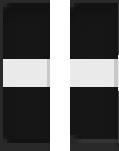
The block with quick access to favorites and playlists is a separate song. Apparently the old designer did not have time to finish the job. The left-right arrows are good.
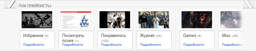
The guys went a long time to a completely obvious version, and did not dare to stretch them to their full length, even the intermediate version was done.
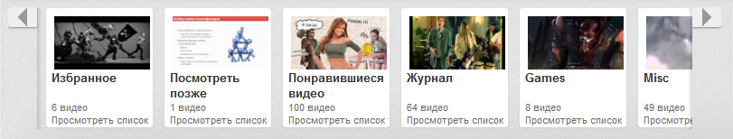
Praise to Odin, it ended up almost well here, as with the cap. Arrows stretched and grew stout. True, the indent of the preview on the right has not been corrected.
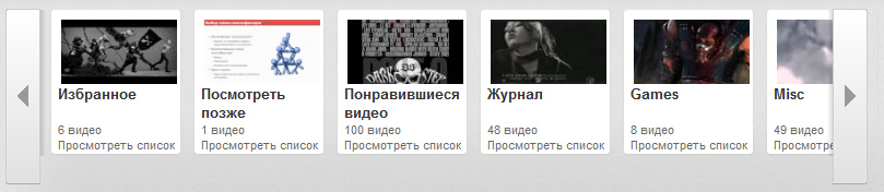
Well, the option to hover the cursor is generally bad.

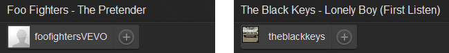
Get down below. When viewing the channel, there are arrows to the next video on the left and right of the player window. Unfortunately, there is no initial option, but there is one. These are the charming arrows with cool tips.

Nakosyachit with the player turned out to be more difficult, so he was not subjected to special changes. Thank you Adobe Flash FOR THIS!
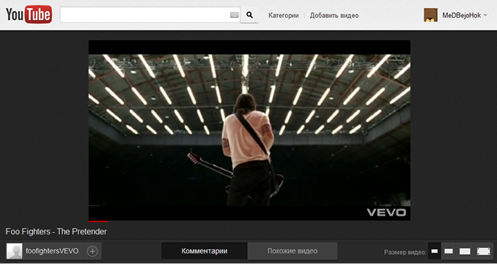
Well, it's not scary, there are enough opportunities below. Next comes the title, it has only three blocks: a block with an avatar, the name of the owner of the video and a subscription button, a switch box “Comments - Related Videos” and a block for resizing the player. Attention, and now the question:
How many of the three units made mistakes? Right! In all.
The original version eventually turned into
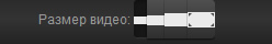
Many admired many, the buttons for switching the size were also subjected to executions and as a result pressed against each other for an indecent distance.

But this is not the only cant in this element. The fact is that when you hover the cursor, the external, lower line, black, changes to internal white. As a result, the button is reduced in size by one pixel. In statics, this is not particularly visible, but the eye clings.
The same disease is observed in the buttons "Comments - Related Videos."
At this moment, and perhaps earlier, the attentive reader will probably say: “Just a minute, and what browser are you looking at? Probably installed the Conqueror and tells us how bad things are. ” I will calm the attentive reader, at the time of creating the screenshots I used the latest version of Opera. Not too convincing? Opera, CIS, yes, yes, but especially for this occasion I saved some screenshots from ... surprise-surprise Google browser - Chrome. Open, look.

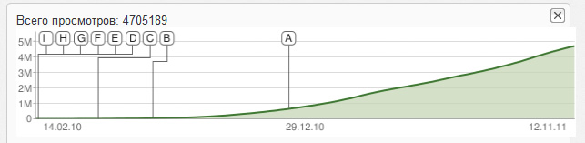
Video statistics. No one looks into it, apparently for this reason, until the last moment, the schedule has gone beyond.
But then the most delicious. Create a playlist.

Well, everything seems to be the norm ... Just a minute. Seriously?! "Cancel ..." means climbed to "Cancel" no? Google, are u insane? Well, “Create a play ...” I don’t know, you’ll probably have to be a student of Jacob Nielsen, at least to get out of such a difficult situation. And we leave on the conscience of designers the cancel button on the left.
Well, the last Easter egg from the old interface: block "These channels may be of interest to you."

Look at this picture, in particular, the close buttons. Under the first block it is, under the last one too. "Well, yes, but under the second there is no" But hell! She is. See the one pixel white line? So here it is. With grief in half, having endured some changes, this very button migrated to the new interface, and it's still difficult to get through it.

And finally, a few "pleasant" moments from the new interface.
Immediately after launch, YouTube took care and clarified several key points so that the transition to a new design was less painful and showed prompts.
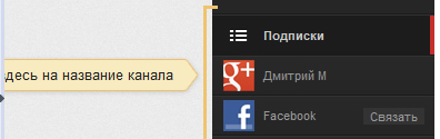
Only here the trouble "here on the name of the channel" does not really help. On the left is the border of the Opera sidebar. The screen resolution is 1366x768.
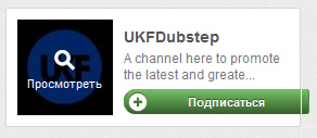
Well, add channels, it is in Africa - add channels. What is there to clarify.

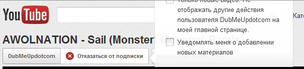
The amount of text breaks the button.
Perhaps that's all. I wish YouTube to be more attentive to the front-end, and have a nice weekend. Thank you for reading.
First of all, I would like to thank the designers who designed this interface and were able, if not for a long time, but to breathe in even a fraction of the style on YouTube.
A small digression: unfortunately, I started taking screenshots too late and there were not so many materials, there were a lot more stocks in the design.
So, in July of this year, YouTube rolls out a new interface - Cosmic Panda. Looks stylish and promising.
')
But the happiness did not last long, apparently the designer began to conflict with the management which required more gif cats and glitches in the design , after which, perhaps he even started drinking , eventually spat and left.
It all started with a hat. The initial version was bad only in an inaccurate search icon.
The button was adjusted, but for some reason they changed the color of the substrate to white. This was done apparently because the old hat clashed with the main page, on which everything is white since 2000. Tribute to tradition, so to speak.
After some time, the gray color was returned, and along with the O_- icon, the link to the profile suffered, the screenshot shows the state of the cursor.
Well, in the end, corrected all at once. Even the on-screen keyboard call icon was pushed.
The block with quick access to favorites and playlists is a separate song. Apparently the old designer did not have time to finish the job. The left-right arrows are good.
The guys went a long time to a completely obvious version, and did not dare to stretch them to their full length, even the intermediate version was done.
Praise to Odin, it ended up almost well here, as with the cap. Arrows stretched and grew stout. True, the indent of the preview on the right has not been corrected.
Well, the option to hover the cursor is generally bad.
Get down below. When viewing the channel, there are arrows to the next video on the left and right of the player window. Unfortunately, there is no initial option, but there is one. These are the charming arrows with cool tips.
Nakosyachit with the player turned out to be more difficult, so he was not subjected to special changes. Thank you Adobe Flash FOR THIS!
Well, it's not scary, there are enough opportunities below. Next comes the title, it has only three blocks: a block with an avatar, the name of the owner of the video and a subscription button, a switch box “Comments - Related Videos” and a block for resizing the player. Attention, and now the question:
How many of the three units made mistakes? Right! In all.
The original version eventually turned into
Many admired many, the buttons for switching the size were also subjected to executions and as a result pressed against each other for an indecent distance.
But this is not the only cant in this element. The fact is that when you hover the cursor, the external, lower line, black, changes to internal white. As a result, the button is reduced in size by one pixel. In statics, this is not particularly visible, but the eye clings.
The same disease is observed in the buttons "Comments - Related Videos."
At this moment, and perhaps earlier, the attentive reader will probably say: “Just a minute, and what browser are you looking at? Probably installed the Conqueror and tells us how bad things are. ” I will calm the attentive reader, at the time of creating the screenshots I used the latest version of Opera. Not too convincing? Opera, CIS, yes, yes, but especially for this occasion I saved some screenshots from ... surprise-surprise Google browser - Chrome. Open, look.
Presumed To and. Click% UserName%.
Those icons in Chrome, Opera at that time did not understand CSS3 gradients.
Video statistics. No one looks into it, apparently for this reason, until the last moment, the schedule has gone beyond.
But then the most delicious. Create a playlist.
Well, everything seems to be the norm ... Just a minute. Seriously?! "Cancel ..." means climbed to "Cancel" no? Google, are u insane? Well, “Create a play ...” I don’t know, you’ll probably have to be a student of Jacob Nielsen, at least to get out of such a difficult situation. And we leave on the conscience of designers the cancel button on the left.
Well, the last Easter egg from the old interface: block "These channels may be of interest to you."
Look at this picture, in particular, the close buttons. Under the first block it is, under the last one too. "Well, yes, but under the second there is no" But hell! She is. See the one pixel white line? So here it is. With grief in half, having endured some changes, this very button migrated to the new interface, and it's still difficult to get through it.
And finally, a few "pleasant" moments from the new interface.
Immediately after launch, YouTube took care and clarified several key points so that the transition to a new design was less painful and showed prompts.
Only here the trouble "here on the name of the channel" does not really help. On the left is the border of the Opera sidebar. The screen resolution is 1366x768.
Well, add channels, it is in Africa - add channels. What is there to clarify.
The amount of text breaks the button.
Butter. YouTube 2011
Perhaps that's all. I wish YouTube to be more attentive to the front-end, and have a nice weekend. Thank you for reading.
Source: https://habr.com/ru/post/134707/
All Articles