CSS3. Work with shadows. Part 2

Continuing to dive into the art of owning shadows in new CSS3 modules. Last time we looked at working with box-shadow , today we will move on to text-shadow .
I recall that both rules, although described in different modules, work in an almost identical way, so if you are already familiar with box-shadow in the first part, in this, second part, you will see a lot of familiarity. And, before passing directly to the examples, let's see right away what the differences are, so as not to dwell on them further.
text-shadow vs box-shadow
If you return to the section on box-shadow syntax in the first part, you will find this description:
box-shadow: <shadow> [ , <shadow> ]*; <shadow> = inset? && [ <length>{2,4} && <color>? ] Where the latter unfolds in its entirety in this design:
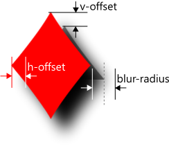
box-shadow: inset? h-offset v-offset blur-radius spread-distance color; The CSS3 Text specification, describing text-shadow, literally says the following:
<shadow> is the same as defined for the box-shadow property
'inset' keyword is not allowed
Translated into Russian, this means that internal shadows (inset) are impossible for text and the syntax for text-shadow is as follows:
text-shadow: <shadow> [ , <shadow> ]*; <shadow> = [ <length>{2,4} && <color>? ] Similarly to box-shadow, multiple shadows can be placed over each other so that the first shadow is at the top. Now let's watch how this all works.
')
text-shadow
Shifts and color
Let's start with shifts and work with color. Shadow shifts correspond to the first two linear parameters indicating the length (1.1–1.4):
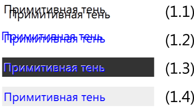
If you specify positive values, the shadow moves to the left and down (1.1):
text-shadow:10px 10px; width:300px; Negative values are shifted to the right and up (1.2):
text-shadow:-5px -5px; width:300px; color:blue; Similar to box-shadow, all browsers, except those based on webkit, if the color of the shadow is not explicitly set, take it from the text color (1.1–1.2). This can be useful, for example, if you want to automatically make the shadow of the text color, but, for example, blur (see examples 2.3 and 2.4). To explicitly set the color of the shadow, it is enough to register the desired value in the rule:
text-shadow:-1px -1px white; color:blue; background:#333; /* 1.3 */ text-shadow:1px 1px rgba(255,255,255, 0.5); color:blue; background:#eee; /* 1.4 */ Please note that when specifying a color, the CSS3 Color features are fully applicable, including specifying the level of color transparency (alpha) via rgba or hsla .
Blur
The third linear parameter describes the shadow blur radius (2.1–2.4):
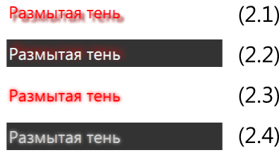
In full agreement with the box-shadow definition, the blur is defined by some positive number - the blur radius. The blur itself can be carried out by the UA using any algorithm with high accuracy and similar Gaussian blur with a half radius relative to the shadow border.
In the first two examples (2.1 and 2.2) a different blur radius is set:
text-shadow:5px 5px 3px darkred; color:red; /* 2.1 */ text-shadow:4px -4px 10px red; color:azure; background:#333; /* 2.2 */ In the second pair of examples (2.3 and 2.4), only the color of the text and the background is different, and the rules for specifying the shadow are described in terms of the blured-shadow class applied to the blocks:
.blured-shadow { text-shadow:0px 0px 4px ; /* */ } color:red; /* 2.3 */ color:lightgray; background:#333; /* 2.4 */ (This example works incorrectly in Chrome due to the nuances described above, but the specification says that the missing color is left to the discretion of the UA.)
Stretching and compression
The fourth linear parameter, if present, is responsible for stretching or compressing the shadow.
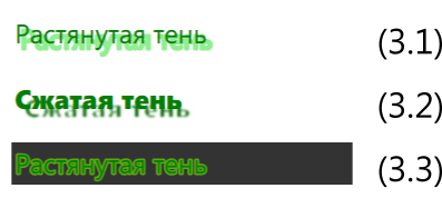
To increase the shadow, the spray distance should be positive (3.1):
text-shadow:5px 5px 0px 3px lightgreen; color:green; For reduction - negative (3.2):
text-shadow:8px 8px 2px -3px darkgreen; color:green; font-weight:900; If the indent of the shadow is zero, it can be used to stroke text (3.3):
text-shadow:0 0 0 3px rgba(128, 255, 0, 0.75); color:green; background:#333; An important detail. As far as I know, at the moment (surprise!) The spray-distance parameter for text-shadow is supported only in Internet Explorer 10, and other browsers do not support it (see, for example, bug 655590 "[css3-text] Support the spread radius in text-shadow "in the Mozilla Bug tracker). The same is true of most textbooks and articles on the Internet that were not updated in a timely manner following changes in the specification. Therefore, in most examples that you find on the web, you will not even see any mention of the possibility of stretching or compressing the shadow of the text;)
And one more important detail. The presence of the fourth parameter is today interpreted by non-supporting browsers as an incorrect shadow assignment - as a result, these rules are simply ignored. Therefore, to ensure at least some level of compatibility, if you use spread-distance, you need to duplicate the rules, for example, like this:

text-shadow: 0px 0px 10px lightgreen; /* 3.4 */ text-shadow: 0px 0px 10px 10px lightgreen; /* 3.5 */ If you still want to model the increase in shadow, within certain limits you can do this through the multiple shadows discussed in the next section (see examples 4.6 and 4.7).
Multiple shadows
Finally, similar to the shadows for the blocks, you can also apply several shadows to the text simultaneously, while achieving different effects (4.1–4.5):

Starting with the simplest duplicate stroke (4.1):
text-shadow: 0 0 0 3px white, 0 0 0 4px gray; color:magenta; And the possibility of shifting shadows in different directions (4.2):
text-shadow: 3px 3px 4px 2px rgba(255,255,255,0.35), 6px -6px 4px 2px rgba(255,255,255,0.25), -3px -3px 4px 6px rgba(255,0,255,0.15); Continuing with neon type effects (4.3):
text-shadow: 0 0 0 3px white, 0 0 2px 6px magenta, 0 0 1px 9px white, 0 0 6px 12px magenta; And a slightly more sophisticated version (4.4)
text-shadow: 0 0 2px #fff, 0 0 4px 2px rgba(255,255,255,0.5), 0 0 6px 6px #f0f, 0 0 4px 7px #fff, 0 0 3px 15px #222, -4px 0 2px 9px #f0f, 4px 0 2px 9px #f0f, 0 -4px 2px 9px #f0f, 0 4px 2px 9px #f0f; Or with limited use of the previous reception of the overlap of the shifted shadows - a slight underlining (4.5):
text-shadow: 0 -3px 3px 15px white, 0 1px 2px 9px; color:magenta; Stretch emulation

As mentioned in the previous section, technically multiple shadows can be used to emulate the increase in shadow. For example, to do something similar to (4.6):
text-shadow: 0px 0px 0px 4px magenta; One could apply simultaneously several shadows shifted in different directions (4.7):
text-shadow: magenta 0px 2px, magenta 2px 0px, magenta -2px 0px, magenta 0px-2px, magenta -1.4px -1.4px, magenta 1.4px 1.4px, magenta 1.4px -1.4px, magenta -1.4px 1.4px; However, if you look closely, there is a noticeable difference between them. It is also important to understand that this technique is limited in applicability: it is not only less accurate, but also adversely affects page rendering performance.
Interesting examples
Now let's look at a few more examples of using shadows to implement various interesting effects.
Let's start with the classic rainbow (5.1):

text-shadow: 0 0 2px 3px yellow, 0 0 2px 6px orange, 0 0 2px 9px red, 0 0 2px 12px lime, 0 0 2px 15px blue, 0 0 2px 18px violet; Double shadow for the arrow (5.2):

text-shadow: 0 0 2px 2px white, 2px 0 2px 5px #222, 3px 0 3px 6px #933, 5px 0 2px 14px #222, 6px 0 5px 16px #533; Traditional Fire Shadow (5.3):

text-shadow: 0 0 2px #eee, 0 0 4px 2px #fff, 0 -2px 4px 2px #ff3, 2px -4px 6px 4px #fd3, -2px -6px 11px 6px #f80, 2px -8px 18px 8px #f20; Traditional letter-press - here the contrast with the background is also important (5.4):

text-shadow: 0px 2px 3px #555; No less traditional 3d-text (5.5):

text-shadow: 0 0 1px #999, 1px 1px 1px #888, 2px 2px 1px #777, 3px 3px 1px #666, 4px 4px 1px #555, 5px 5px 1px #444; Double shadow for vintage effect (5.6)

text-shadow: 2px 2px #fff, 3px 3px #666; An incoming caption with transparent text and compressed shadow also depends on the size and typeface (5.7)

text-shadow: 0 0 2px -3px rgba(196,255,0,0.3), 0 0 6px -5px #9c6; color:transparent; Using a single letter for the pseudo-class :: first-letter (5.8)

.text { text-shadow:0 0 5px; } .text::first-letter { color:azure; text-shadow:0 0 5px, 0 0px 6px 3px blue, 0 -2px 6px 6px cyan, 0 -4px 9px 9px lightblue ; } Interactive
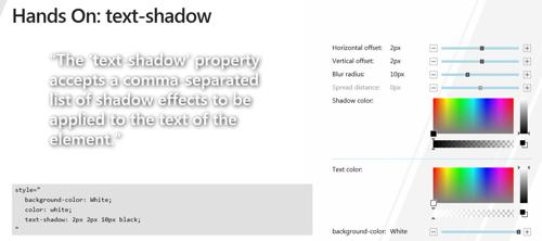
If you just want to play with the shadows online, our colleagues prepared a demo page for the Build conference in September: " Hands-on: text-shadow ".
Internet exlorer
text-shadow is supported in IE10 +.
And I will repeat my advice regarding the use of filters: do not use filters at all , or think over the layout and styles so that they are not used for IE9 +. Standard css-effects in IE, unlike the old filters, starting from version 9, work using hardware acceleration, and filters are often incompatible with new CSS properties and their simultaneous use can lead to unexpected consequences.
See also the developer guide for Internet Explorer 10 .
Source: https://habr.com/ru/post/134431/
All Articles