Beautiful and effective email marketing
 Good day!
There is a well-known problem in runet - a lot of users have a negative attitude to html letters, saying that plain / text is the best option for receiving web correspondence. But personally, I think that we are oversaturated with the design design of the Russian design conveyor. I'm not saying that there are no good designers in Russia, they undoubtedly are! But most of them have long been working for a western uncle, and those that still work on the Russian market are so rare that we are not able to appreciate their work for dignity.
In this topic, I would like to give examples of the design of excellent Western regular mailings. They have a lot to learn.
')
Lumosity.com
A site dedicated to games and trainings that develop your thinking and memory. The corporate identity of the site is perfectly maintained, and there is nothing superfluous here that could please the eye. Excellent grouped information, extremely readable presentation. The physical details of the company give confidence. The link to the unsubscribe is direct - without additional authorizations, which also is good news.

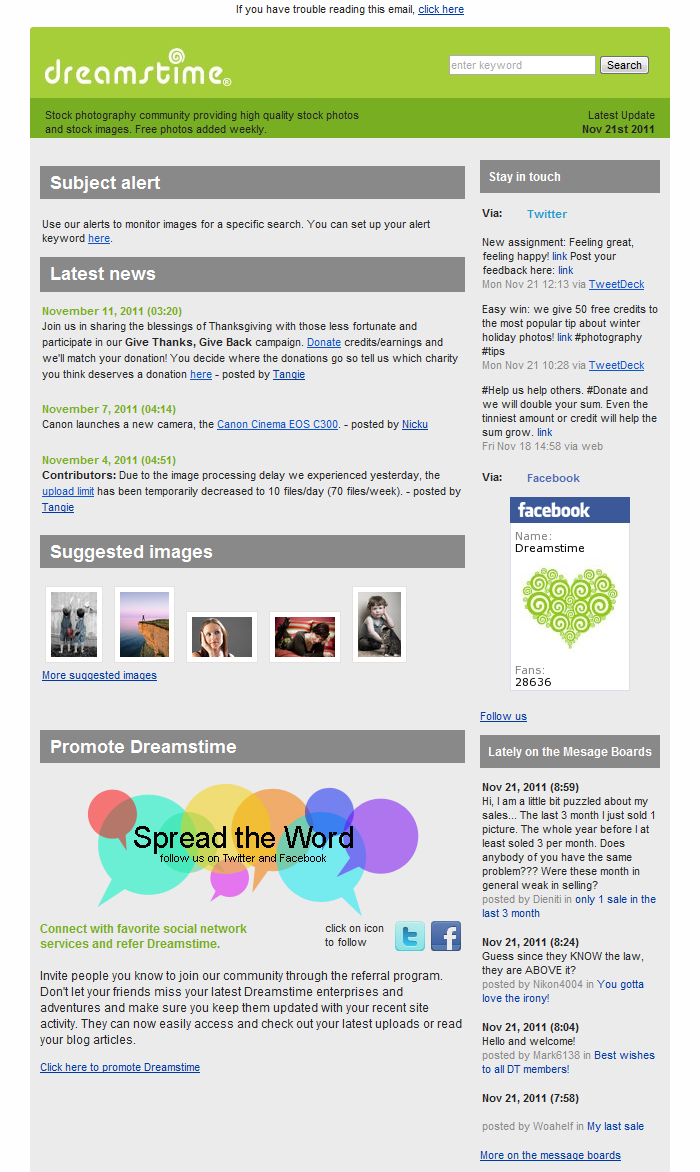
Dreamstime.com
Site stock photos. This newsletter is a prime example of a “western template” of email marketing. The most informative, and at the same time, no less readable. And yes, by the way, this question has already popped up on a habre - the search form in the corner of the letter is implemented as a regular html form, but its performance in email clients is in doubt. It works in web interfaces, but asks the user at the sub-site - are you sure that you want to transfer content to an external page? At least in gmail.
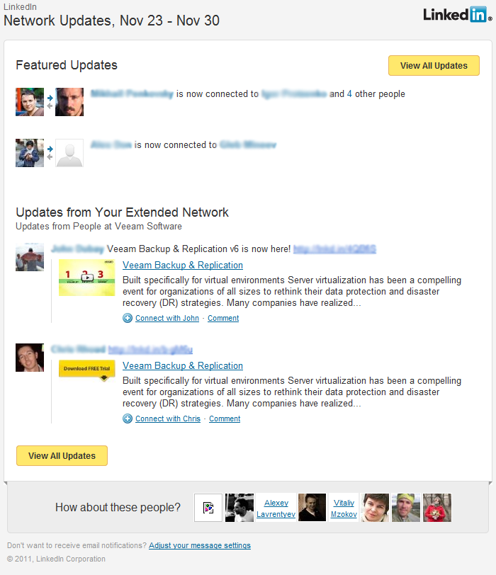
Could not help but give an example of this wonderful social network. But agree that it is much better than the default style? In this regard, I am very pleased with the e-mail notifications of the Habr, in which the corporate identity is also maintained, which in principle is not in the hassle, but nonetheless the general style is present.
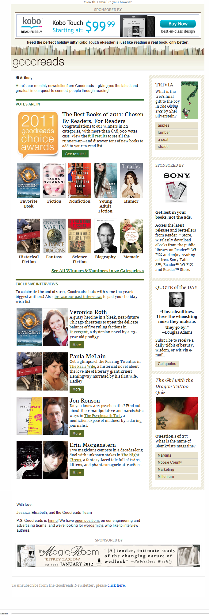
Goodreads.com
I would call this service as a “club of book lovers” in the possibility of sharing books with my friends. Looking at this design, we can safely say “minimalism is cool!”. It is also one of the very few high-quality mailings that allows itself to insert as many as 2 banners, but considering their high targeting, I do not consider this a minus. I also gave only part of the mailing, because in fact it is about three times longer than on the screen, but I conveyed a general view.
But this is not worth doing
And finally, an example of mailing from the category - "how not to do." At first glance, in principle, mailing as mailing. But upon detailed study, “OMG!” And “WTF!” Appear (see image below).
1. View the letter in the browser. Ok, I accept the position that it is more convenient for some unknown user to read letters in the browser, BUT why over the page with the letter in the browser we see a pop-up asking us “how do you call?” While asking to enter a name , last name and password? Okay, this we swallow, we introduce. And what do you think? New pop-up! Also enter ka, some info! At this step, I freaked out.
2. From whom did this letter come to us? No site logo, no signature, nothing. In the sender’s column we see email - blablabla@sample.com, and we can safely think that the sending site is sample.com, but it wasn’t here, the domain isn’t working. And if you follow the link from the letter, then we just get to this site, but the url looks like sample.com/_tut_dlinnyy_hesh.
3. By the button you can judge that we will learn more at kupibonus.ru. HA! No matter how! Under the link we get on that mysterious sample.com/and_tut_dlinnyyy_hesh.
4. That the button, that the separator is never like a button and a separator. Looking at this letter, I see a childish application of white and colored (green) paper.
5. I think it is not necessary to say that in fact the letter is longer than on the screen. This is not bad, but in the context of everything else, I would like to immediately send such a letter to spam.
6. And now focus on the footer! “You received this email at dudeonthehorse@gmail.com because you subscribed to the newsletter.” - who? Where? when? and the last is not me! That is, they themselves signed me and do not soar. The second line of the footer is useless to the user - unnecessary information Only a third is enough for a warning. The color of the unsubscribe link is different from the color of the normal link. What for? It is not clear.

I will take my leave for this. I think that many will extract useful points from this collection. Thanks for attention.
PS Can you give an example of a great Russian newsletter? Wellcome to the stones! They are, but as if none in the head sat down.
Source: https://habr.com/ru/post/134414/
All Articles