Alternative approach to optimize screen space utilization.
In the new Linux interfaces, such as Gnome shell and Unity, developers are trying to optimize the flow of screen space. In principle, they succeed in this (although some users are indignant), but it seems to me that one could go further and achieve better results with less blood. Under the cut, you will find an analysis of interface optimizations on the example of comparing a classic interface (ala Windows \ Gnome 2 \ Xfce \ KDE) with Unity, as well as the concept of how I would work in this direction.
In any modern and not very computer interface, there are controls similar in purpose, without which it is quite difficult to manage:
The approach to implementing these basic elements and placing them on the screen determines the differences between our desktop environments. In the context of this article, I will operate with the above elements only. Otherwise, you can get involved in writing the differences in the position of the buttons, which threatens to stretch over many pages.

')
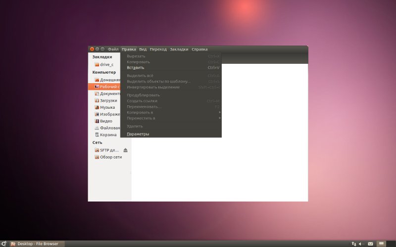
In the classic interface uses one panel configuration. On the bottom of the only panel, there are icons for applications running in the background, open windows, and the main menu of the system. The application menu bars are displayed in the windows of the applications themselves.
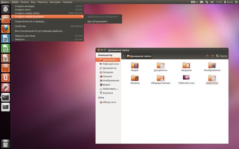
In Unity two panels. At the top is a global menu bar that varies depending on the currently selected window, indicators of running applications. On the left hiding panel there are buttons for switching between open applications, and the Dash call button, which plays the role of the environment's main menu in Unity.
The advantages and disadvantages that arise from such differences are as follows (for example, Unity):
AND EVERYTHING! Further solid flaws.
It should be noted that these disadvantages are not so noticeable when using hot keys, and with them in Unity everything is fine. And the only plus is not small worth.
In general, I often think that Unity designers are dualbooters . Only the second system is clearly not Windows. No, it’s impossible to say that Unity is completely lapped to MacOs, but the global menu bar with all its advantages and disadvantages (+ original Unity flaws) is clearly from there. But putting the menu bar on the top panel is not the only possible solution for saving vertical space.
As you can see, on this screen crookedly corrected in the gimp, there is only one panel, fans can make it hidden and / or move to the other edge of the screen, and here it is PROFIT! (For those whoare in the tank who have disabled images: I combined the title bar of the window with his own menu bar). In this case, the name of the window (if it is needed at all) will be displayed on the bottom panel, or in its usual place, and the menu will replace it only when you hover the cursor over there (similar to the work of the top Unity panel). Windows can be dragged for the remaining free space of the title bar, or for any other place while Alt is held down.
This solution preserves the advantages of a classic desktop, and allows you to save even more space, while the mileage of the mouse does not increase. Why such a surface solution did not occur to thezombie MacOs designers Linux Linux DE, remains a mystery. However, as it seems to me, using the Unity practices to ensure the operation of the global menu, it will not be difficult to realize this if there is a programmer who understands this (s). On this I write all this on Habr and I hope that he will read this article. And you see and mark me in thanks to the new plug-in to Compiz.
UPD: As I was told in google + , the idea is not new, and the similar one has already slipped on webupd8 .
Common elements:
In any modern and not very computer interface, there are controls similar in purpose, without which it is quite difficult to manage:
- Buttons for switching between open applications;
- Icons running in the background of the application (for example, tray);
- The main menu of the system, from which you can access all installed applications;
- Window titles, menu bars of individual applications, window control buttons.
The approach to implementing these basic elements and placing them on the screen determines the differences between our desktop environments. In the context of this article, I will operate with the above elements only. Otherwise, you can get involved in writing the differences in the position of the buttons, which threatens to stretch over many pages.
Classic interface VS Unity
')
In the classic interface uses one panel configuration. On the bottom of the only panel, there are icons for applications running in the background, open windows, and the main menu of the system. The application menu bars are displayed in the windows of the applications themselves.
In Unity two panels. At the top is a global menu bar that varies depending on the currently selected window, indicators of running applications. On the left hiding panel there are buttons for switching between open applications, and the Dash call button, which plays the role of the environment's main menu in Unity.
The advantages and disadvantages that arise from such differences are as follows (for example, Unity):
- By combining the application menu bars, to the global menu bar on the top panel, approximately the vertical line space is saved;
AND EVERYTHING! Further solid flaws.
- Since there is not enough space on one panel for everything now, I had to move the icons for switching between running applications to the hidden panel on the left; now switching between windows with a mouse is difficult;
- The global menu does not work very much. If you open Gimp in multi-window mode, and select, for example, a window for selecting colors that does not have any menu bar, you will have to select its main window before you can use the Gimp menu bar;
- The buttons for switching between windows have a smaller width; you have to carefully aim at them with the mouse.
- The button of the main menu of the environment by analogy with the previous item is also not so accessible. In the classic mode, it was possible just to send the cursor to the lower left corner just by a sharp movement of the hand without aiming at all.
- If the window is not open to full screen, then when you work with its menu bar, mouse mileage increases, you have to shake it from the top of the screen back to the application window.
It should be noted that these disadvantages are not so noticeable when using hot keys, and with them in Unity everything is fine. And the only plus is not small worth.
In general, I often think that Unity designers are dualbooters . Only the second system is clearly not Windows. No, it’s impossible to say that Unity is completely lapped to MacOs, but the global menu bar with all its advantages and disadvantages (+ original Unity flaws) is clearly from there. But putting the menu bar on the top panel is not the only possible solution for saving vertical space.
As you can see, on this screen crookedly corrected in the gimp, there is only one panel, fans can make it hidden and / or move to the other edge of the screen, and here it is PROFIT! (For those who
This solution preserves the advantages of a classic desktop, and allows you to save even more space, while the mileage of the mouse does not increase. Why such a surface solution did not occur to the
UPD: As I was told in google + , the idea is not new, and the similar one has already slipped on webupd8 .
Source: https://habr.com/ru/post/134015/
All Articles