Mobile Interfaces Study
I present to you the translation of the article entitled " A Study of Trends in Mobile Design " by Alexander Dawson . Translated in the company UXDepot specifically for users of Habrahabr with the approval of the publication Smashing Magazine .
The web design industry is developing in many directions at once, but one of its areas influenced how we build websites more than any other. The surge in the number of mobile devices that allow access to the Internet has created a subculture of users who need websites to adapt to their devices. Despite the fact that web design for mobile devices is still in its infancy (and there are very few primary research on trends in this area), we should observe how this critical element of the web industry is evolving, and also know the patterns that appeared as a result of the development of this area.

The purpose of this article is to tell you about the methods that are used on the most popular sites in order to provide users of mobile devices with convenient and (hopefully) useful interaction . Among the analyzed sites are many well-known companies, such as Facebook and Amazon. We have prepared for you a real excursion into the world of mobile web design, with statistics and truly interesting discoveries.
')
What is this document after all?
In order to identify best practices and general trends in the constantly evolving field of mobile design, a study was conducted aimed at studying how problems related to information architecture and the implementation of design on mobile versions of popular websites were solved. Since this work could cover any number of parameters, it is important to note that it is impossible to find all the answers in it, although it is very likely that you will learn some useful things!

Fig. 1: The mobile version has become an important component of the success of any site. Smashing Magazine also has its own mobile version.
In our study, we studied not only what websites reviewed provide interaction with a mobile device, but also whether they provide some features not available in the browser version of the desktop computer, for example, a mobile application with useful functions. Also, some patterns in the markup, design solutions, programming levels and useful features inherent only in mobile sites were studied (for availability, appropriateness and approaches used).
Note: in spite of the thoroughness of all the research, with so many parameters studied, inaccuracies and inconsistencies could creep into the work.
Principles of research
Before presenting the results of our research to you, let me briefly describe the parameters being evaluated and the methodology used to explain how the study went and how we obtained these results. With this information, you may see the limitations of this research, and if you are adventurous enough, you could publish your own research to see if the results of our research are applicable in other situations. It would be interesting to read something like that!

Fig. 2: This is how our research process looked.
About the research methodology. First, we selected a group of sites (compiled independently and not by us). Then we chose which parameters we will evaluate. Many of the selected parameters have never been evaluated on such a scale (or so carefully). In order for a parameter to be included in our research, it had to meet certain criteria. First, the results of the research on this parameter should have been interesting (and could have influenced how the community sees the situation in the field of mobile design), and secondly, they should be statistically important (we don’t want to write obvious things).
Note: After the study, we discarded some parameters from the results due to the lack of any useful conclusions. So, for example, it happened with the support of landscape and portrait orientation when displaying the page - this turned out to be unimportant, since all sites had support.
Selection of sites for research
Selecting a group of sites for analysis is certainly a critical part of the process. In order to exclude opportunities for bias or consider a niche, we decided to use the first 100 sites on the Google AdPlanner List . Although the list had 1000 sites, we decided that the first hundred would be enough for
to get a good sample and quite diverse outcomes.
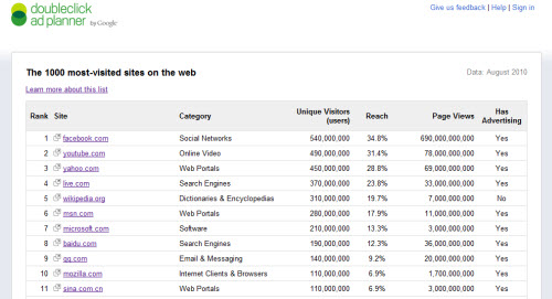
Fig. The 3: 1000 most popular sites on the Google AdPlanner list are an objective source used in the study.
Options
This study would not make sense if we had not talked about the parameters being evaluated. We decided to focus on two types of criteria: characterizing how the user leads to the mobile version of the site, and how the mobile version works. The way the user goes to the mobile version of the site has attracted our attention because of the large number of existing approaches. It was also important to see whether the studied web pages take into account the download speed on the mobile device, the speed of data transfer to the device, the screen size, the presence of a touchscreen, and so on.

Fig. 4: Many parameters were evaluated to provide you with informative and helpful conclusions.
Error correction
Of course, in any research there are errors and prejudice. In order to avoid as many problems of this kind as possible, we not only used an independently compiled list of sites, but also we looked at each mobile site we looked at first on the desktop, then not on several mobile devices, and then we ran it on the emulators, to be sure. This made it possible to significantly reduce the number of errors, and the re-testing of each site on another day ensured that the results were not due to the fact that something broke.

Fig. 5: Emulators were used to increase the number of different devices used in the study.
Well, finally - the results
Now that the basic principles of the study have been explained, the time has come to talk about the most interesting - the results of our research. Get ready for a lot of graphs and charts, and for the fact that some of the results may be really amazing. We divided the results into separate categories and provided an opportunity for different interpretations of the results, but we hope that the obtained information will be very obvious. Well, let's get started?
Access method
In this part of the study, it was important to establish whether the presence of a mobile version of the site is obvious to the user. When a user visits a website, he needs to know whether his device is supported, or whether a regular version of the site will load. We determined whether the redirect occurs from the main version or the device is automatically detected, whether the mobile version is on a separate subdomain, and whether it is possible to switch to the mobile version of the site in a regular desktop browser.
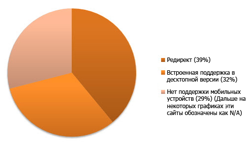
Fig. 6: The ratio between the number of sites with automatic redirection to the mobile version of the site and the number of sites where there is only the desktop version with optional support for mobile devices.
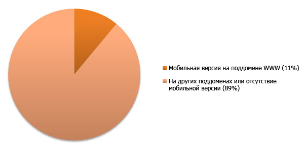
Fig. 7: The number of sites that placed the mobile version on the WWW subdomain.
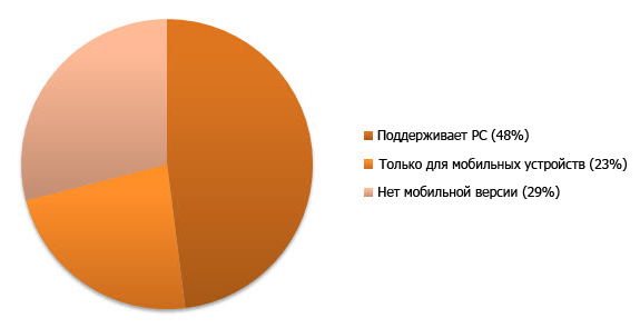
Fig. 8: The number of mobile sites that allow you to open yourself in a regular desktop browser.

Fig. 9: If the .mobi version of the Amazon site works in the PC browser, then m.amazon.com redirects the PC users to the main site.
The number of sites that automatically determine the mobile device and redirect users to the mobile version turned out to be less than we expected (after all, many believe that the mobile version must first be shown in order to speed up the download speed). However, at the same time, we noticed one interesting tendency - all sites except one (answers.com) were forced to redirect the user to the regular version during a request for a mobile version from a PC without any possibility of opening a mobile one.
Mobile domains of the first level
In the next part of our research, we tried to determine how often in the mobile web they follow the conventions of using top-level domains. For the purity of the experiment, only subdomains (for example, m.) And the top level domain .mobi (as well as mobile versions located on separate sites) were taken into account. Thus, mobile versions of sites located on a site in the WWW domain within the subdirectory (for example, / mobile /) were not taken into account. This data can show the degree of popularity of the .mobi domain and the trends in the use of subdomains on mobile sites.

Fig.10: The use of mobile domains with the degree of their popularity.
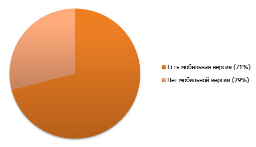
Fig. 11: The number of sites that do not have a version of the site optimized for mobile devices.
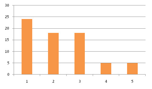
Fig. 12: Average number of subdomains for one site.

Fig. 13: Supports WAP and WML protocols.
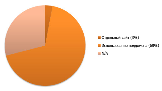
Fig. 14: Percentage of sites redirecting users to a single first-level mobile domain.

Fig. 15: PayPal uses domains m., Mobile for its mobile sites . and .mobi.
Despite the fact that there are some mobile versions on a large number of sites and some websites redirect the user to a mobile site, the use of the .mobi domain turned out to be much less than we expected. We also noticed an unusual trend. Unlike other countries, on Asian mobile sites they prefer to use the subdomain “3g” (instead of the popular in other countries “m” or “mobile”). It is also worth noting that only Apple devices were lucky to get their own subdomains, such as “touch” or “i”.
Mobile applications
In this part of the study, we tried to figure out how many sites from the list in question has mobile apps for iOS, Android or Blackberry. The results are summarized and not divided into specific platforms.
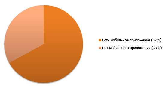
Fig. 16: The number of sites that have applications for mobile devices (on any platform).
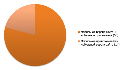
Fig. 17: Percentage of sites that have a mobile application, but do not have a mobile version of the site.

Fig. 18: The Internet Movie Database site has a mobile version of the site and an iPhone application that improves interaction with a mobile device even further.
It is not surprising that many sites from the TOP-100 have applications for mobile devices, because these services are quite popular and common. Surprisingly, many sites, without having a mobile version (in any form), still offer to download an application for a mobile device. This trend may indicate that the transition to services adapted for mobile devices, mainly occurs in the form of the emergence of new mobile applications.
Average load time
Here we measured the average download time of all sites in order to understand how mobile services take into account the limited bandwidth of wireless networks and the impatience that characterizes the average network user. We downloaded sites only via Wi-Fi (not using 3G or EDGE, to equalize the results when using device emulators). We also disabled the use of the cache: thus, the result takes into account the time required to load any external resources.
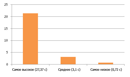
Fig. 19: The highest, medium, and smallest site load times under cold loading conditions without a cache.
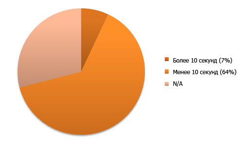
Fig. 20: Percentage of sites that need to download for more than 10 seconds when using Wi-Fi.
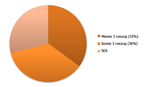
Fig. 21: Percentage of sites that require three seconds or less to download via Wi-Fi.
Fig. 22: The mobile version of YouTube has one of the smallest loading times.
Although using a cache would significantly increase the download speed, according to the results, the vast majority of mobile sites need only five seconds to load. Basically, sites that require more than 5 seconds to load, often have delays due to the slow response of the server, and not due to the transmission of information over the network. Since users do not want to wait long for the appearance of the required information on the screen, the site loading speed has become a critical parameter.
Home page weight
It became obvious to us that in addition to the page loading speed, we also need to measure the weight of the downloaded files along with any external resources. Since many mobile tariffs have a serious speed limit and the per-megabyte payment for mobile traffic is still high, you should pay attention to whether the site is optimized for downloading in a mobile browser, whether the amount of uncached data is not as big as on an average web site. website for desktop computers.
Fig. 23: The largest, average, and lowest weight among the measured sites in kilobytes without using a cache.
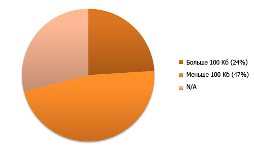
Fig. 24: Percentage of sites with total downloaded noncached data exceeding 100 kilobytes.
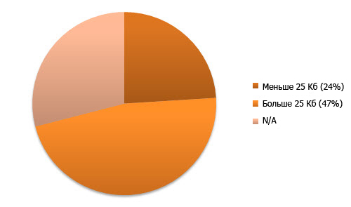
Fig. 25: Percentage of sites with a total download of non-cached data less than 25 kilobytes.

Fig. 26 The site Softonic distinguished itself by the largest weight of the home page.
The results of this test are very interesting. While a large number of sites (mainly focused on WAP) weigh less than 25 kilobytes, which seems acceptable, a significant number of sites supposedly sharpened for mobile devices weigh over 100 kilobytes, and sometimes the weight of the home page almost reaches 0.5 MB ! And we were surprised that the percentage of sites weighing 25 Kb and less exactly coincided with the percentage of sites weighing 100 Kb and more.
Doctype
When creating a website, one of the first questions is which language or which version of language is better suited to display the content of your website. Religious wars about HTML and XHTML do not subside, and since there are many varieties adapted for mobile devices (mobile profiles XHTML and WML), we decided that statistics on the use of different DTDs would be very useful to readers. So, in this part of the study, we looked at which Doctype is used on the main pages of mobile services.
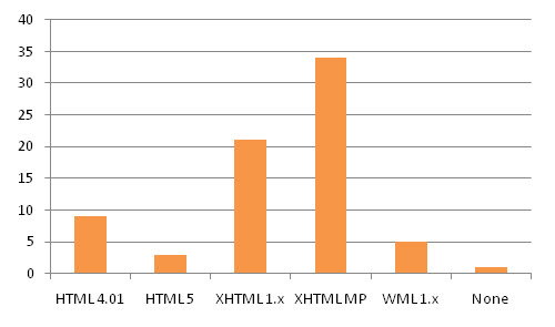
Fig. 27: Distribution of markup languages on mobile sites, including versions and language profiles.
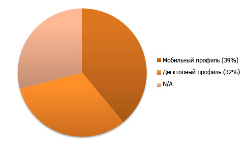
Fig. 28: Sites using mobile profiles and sites using regular profiles.
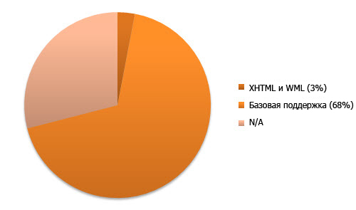
Fig. 29: Percentage of sites supporting both WML and XHTML simultaneously.
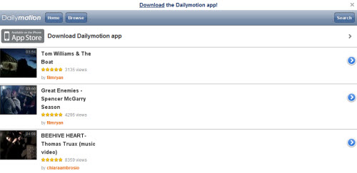
Fig. 30: The Dailymotion mobile version of the site , adapted for the iPhone, is one of the few websites that use HTML5.
Research results clearly show that XHTML is still much more popular than HTML (or HTML5). This may be due to the fact that HTML has no mobile profile (after all, a mobile profile is used in most cases), although it is worth noting that many smartphones support HTML and XHTML. The percentage of use of mobile and desktop profiles turned out to be almost equal. And yet, the iPhone version of Facebook optimized was the only site where Doctype was not specified at all!
Code check
Remembering the semantic web and the importance of adhering to standards in our business, we conducted this test, following the example of a study by Jeffrey Zeldman, in which he conducted a large number of sites through a simple validation test on the principle “passed - failed”. Zeldman took sites for research from Alexa Top 100, we are from the Google AdPlanner list. Although adherence to standards is not alpha and omega in website development, this test was included in our research to look at how close we are to the semantic web.
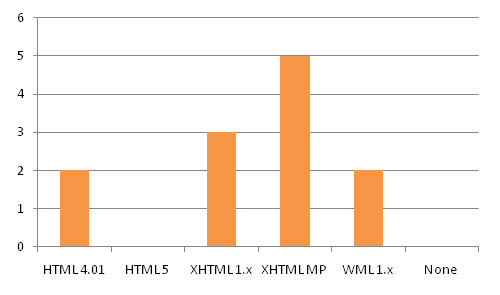
Fig. 31: The number of sites that have been validated and distributed by markup languages.
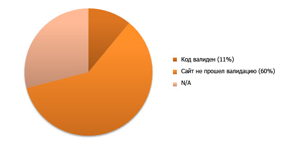
Fig. 32: Percentage of sites whose main page was validated by the specified DTD.
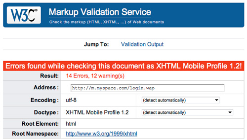
Fig. 33: MySpace is no different from the majority and has not been validated.
The study was based only on the main pages of mobile versions of websites, so the results are not as complete as they could be. However, they clearly show the attention paid to mobile versions of sites. Unfortunately, the results coincide with the results of Zeldman's research: the absolute majority of sites do not meet the standards of the selected DTDs.
All this underlines the fact that for developers, design turns out to be overriding optimization and code quality.
Code separation
Separating structure, style, and behaviors can reduce file size (by avoiding duplicate code and using caching). We also thought it important to see if CSS3 or jQuery are used on mobile sites to give objects more dynamic behavior.

Fig. 34: Percentage of sites using inline-inline styles instead of being placed in separate files.
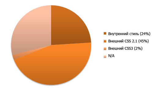
Fig. 35: Percentage of sites using external CSS 2.1 or CSS3.
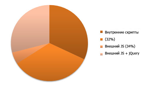
Fig. 36: Percentage of sites using external JS or jQuery.
Fig. 37: The jQuery library is used in the mobile version of Wikipedia .
Although we all assumed that in order to speed up the loading of mobile pages, some of them would remove the styles and behaviors of elements, on a small number of sites all the code was still embedded in the pages. Also, only a small number of sites use the jQuery framework, and the same small number of sites use CSS3 media queries to dynamically resize content. As you would expect, the number of sites using HTML5 is as small as the number using CSS3.
Fonts
Typography is an integral part of the web and how information is visualized. In this part of the study, we looked at which typefaces and font families that are safe to use on the web are used on mobile sites. We also noted the number of sites that relied on the default font and did not indicate the sequence of fonts, as well as sites that indicated several fonts in the sequence. , .
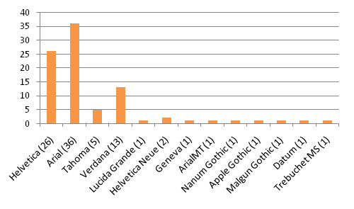
Fig. 38: , .

Fig. 39: , ( ).
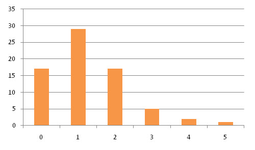
Fig. 40: .

Fig. 41: m.naver.com , .
. , , ( , ). , (, - ). , , - .
, . , , , .
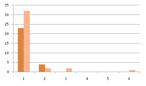
Fig. 42: , .
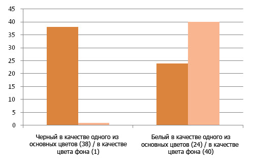
Fig. 43: , .

Fig. 44: , .

Fig. 45: 56.com .
, , , ( ). , . — .
. , . , — .
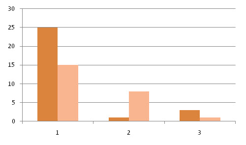
Fig. 46: , .
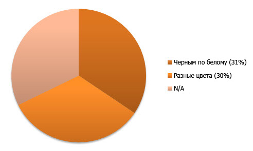
Fig. 47: , .

Fig. 48: eBay , , .
, , , , . , , , . , .
, . - ( ). , , , , , , , — , , ( ). , .
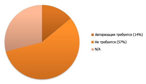
Fig. 49: , .

Fig. 50: Facebok .
. , . 100 !
. , , , . ( ).
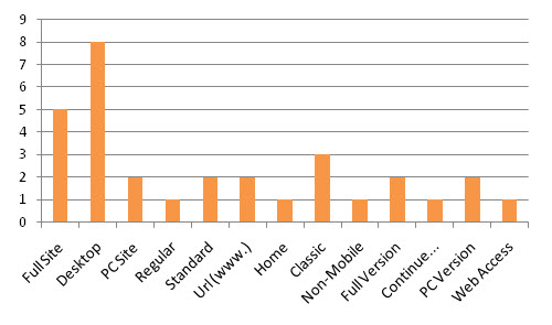
Fig. 51: .
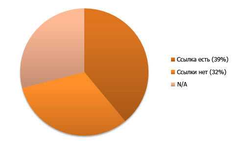
Fig. 52: , .

Fig. 53: Daum.net «PC Version».
- “ ” “ ”. , , , ( ). , , .
Navigation
, -. . ( ): , , , ( , ).

Fig. 54: , -.
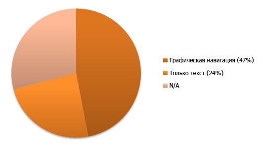
Fig. 55: -.
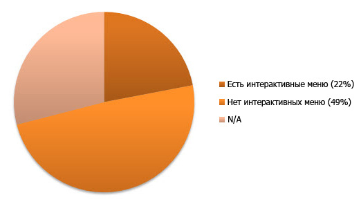
Fig. 56: , ( ).

Fig. 57: HP .
, , , , , , . , .
— . , . ( ) , . .
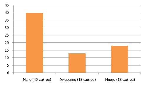
Fig. 58: , (1-25), (26-50), (51+) .
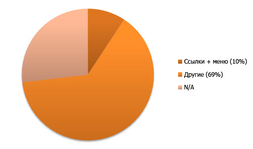
Fig. 59: , - .
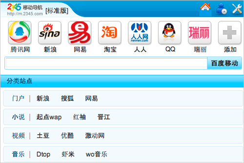
Fig. 60: 2345.com . ?
-. , . , , .
— , . , .

Fig. 61: , (1-5), (6-10) (11+) .
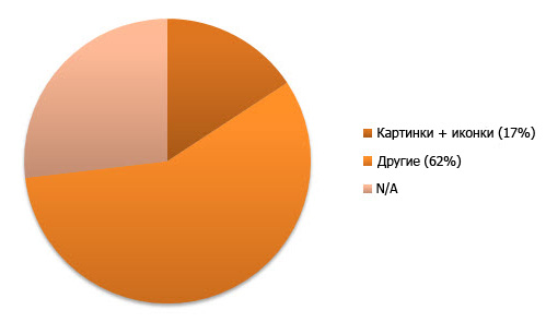
Fig. 62: , - .
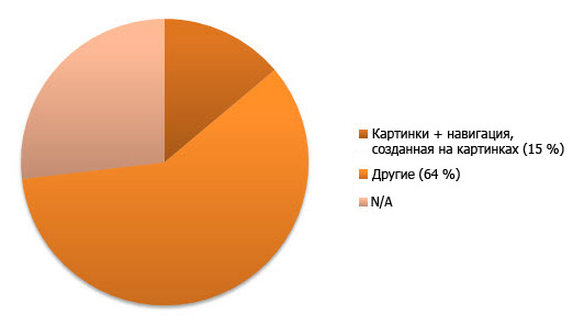
Fig. 63: , - , .

Fig. 64: Mail.ru .
, ( ). ( ). , , ( Flickr), .
( , ) . - , (accesibility). . .

Fig. 65: .
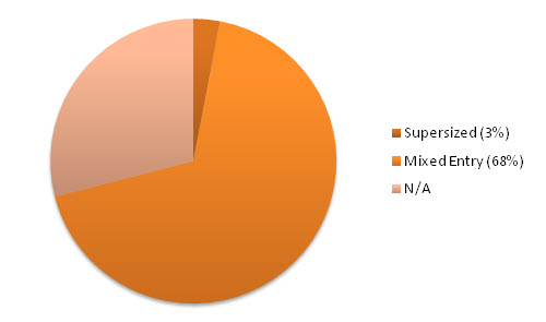
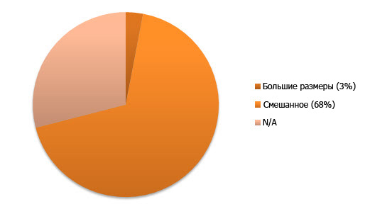
Fig. 66: .
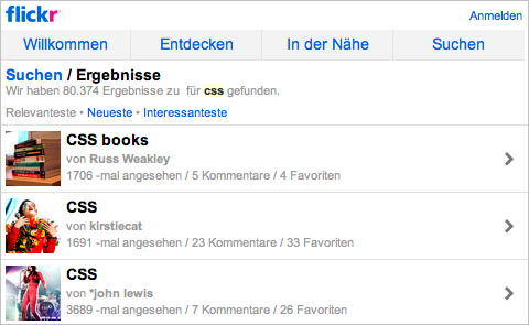
Fig. 67: Flickr , .
, ( ) — , , . , (, ).
, . , ( , ), . - , , .
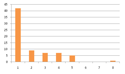
Fig. 68: ( ) .
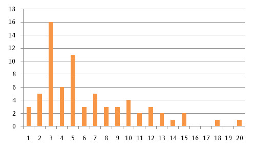
Fig. 69: ( ).

Fig. 70: , ( / ).

Fig. 71: Zol .
- ( , , ). , . , .
. , (, overflow, ), , jQuery, JavaScript CSS3 ( , .
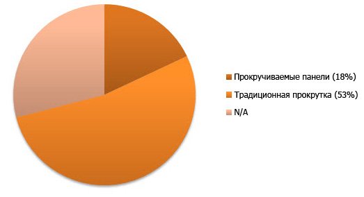
Fig. 72: , .
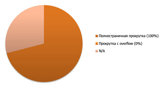
Fig. 73: , overflow .

Fig. 74: Yahoo divided its content into several clickable panels.
The results show that scrolling panels are almost not used (which indirectly indicates the absence of “cool” scripts on most sites). It is possible that such a result was obtained due to the type of websites included in the Top 100 (panel scrolling would be used more often on portfolio sites and other demonstration sites). Along with the general simplification of the design (no scrollable overflow was used on any of the sites), a rubber layout was used to simplify scrolling.
Moving on
Although the sample used contained a wide range of different types of sites, it should be noted that the results could be different in different niches. For example, if this study were conducted on portfolio sites, the results would be different, because on such sites, users have other needs, which requires the creation of another interaction. But still the trends found on the sites in question,
apply to many other sites
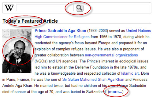
Fig. 75: Different trends can be found on different websites, but all of them all have comparable similarities.
In order to make sure that the results of this study were characteristic not only of the most popular websites, we reviewed another 10 sites (these results were not included in the document, as they were simply thought of as checking the main results). Among them were a variety of sites, but most used similar approaches, or slightly changed them due to specific use scenarios. So we believe that the trends found exist throughout the web.
Note: It should also be noted that a number of sites from the Top 100 were subdomains or localizations of other sites from the list. But such sites were too few to distort the results.
General trends
General trends in mobile design included the use of scripts that redirect mobile device users to the mobile version of the site instead of giving this choice to the users themselves (this is interesting, since this is a double-edged sword in terms of usability). Another established trend is the use of subdomains that help users understand that they are on the mobile version of the site. The last common trend is the unpleasant fact that the code of quite a few sites is being validated!

Fig.76: On some sites, the mobile version is actually automatically generated using tools like Mobify .
Models in other types of sites
If the study were conducted on other types of sites, the graphics might look a little different. Examples include a greater percentage of CSS3 usage on portfolio sites, a smaller number of mobile applications on corporate sites of small companies, and a larger percentage of sites with mandatory authorization, if the study focused on social networks. And on content-oriented sites (like Smashing Magazine), the weight of the pages is an obvious side effect.

Fig. 77: Designer Simon Collison on his site uses CSS3 media queries in order to customize the design for different screen sizes.
Possible research improvements
Our study could be improved. Despite the fact that we tested sites on a large number of devices, including iPhone 4, Blackberry, Nokia phone, Windows Mobile device, a couple of Android phones, we could examine compatibility with a large number of devices (not taking emulators into account) . It would also be possible to increase the accuracy of the results, having experienced more sites (it would be cool to expand the number of sites to 1000).

Fig. 78: It would be possible to conduct additional research sites in certain niches. For example, it could be news sites like The Guardian .
The future of mobile design
The results of this study are interesting, but we hope they will inspire you not only to follow the identified trends, but also to look for new ones. If the Internet is still a teenager, then the mobile web is a baby. This means that trends will change even more rapidly, along with research that will be conducted to find out how well the needs of users are met. The mobile web is the industry of the future, and we need to pay a lot of attention to it.
The way we make websites changes due to the emergence of new devices with new browsers and different screen sizes, because of frameworks such as jQuery, because of the development of standards like HTML5 and CSS3, and that web services are gradually moving into the clouds. Although the design for mobile devices, there are elementary trends (like the lack of a horizontal scroll), the next few years will come out hot due to the fact that more and more designers will be interested in this rapidly growing audience.
.
PS from translators : I hope you enjoyed the article. We will be happy if you point us to errors in the translation so that we can correct them promptly. Write me in PM, please :)
Source: https://habr.com/ru/post/133684/
All Articles