CSS3. Work with shadows. Part 1
It happened (and please consider it a good coincidence), exactly today a topic about the practical use of CSS3 shadows for creating interesting effects was published on Habré, and we in turn prepared a topic about the basics for this creativity.
We will try to understand how the shadows work in the new CSS3 modules. From a practical point of view, we consider two rules: box-shadow and text-shadow , defined respectively in the modules CSS3 Backgrounds and Borders and CSS3 Text .
Both rules work in a similar way (up to the appropriate reference in the specification), so it makes sense to consider them together. At the same time there are some differences, which also can not be said.
The first part is dedicated to working with box-shadow, in the second we will go through the shadows for the text.
')
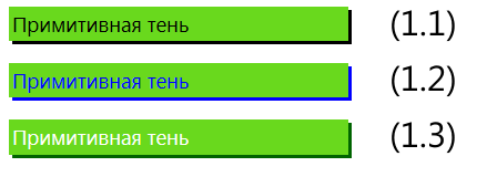
In the simplest version, to specify the shadow, it is enough to specify two parameters that specify the horizontal and vertical shifts of the shadow (1.1), respectively:
Positive shift values shift the shadow to the right and down, negative ones move it to the left and up.
By default, if the shadow color is not set, in most browsers (everything except webkit-based) it is taken from the text color (color) in the current context (1.2), however, it seems that this moment is not negotiated by the specification:
To set the shadow color, it is enough to specify it with the additional parameter (1.3):
Obviously, the color can be specified in any of the available ways: from direct indication of the name and hexadecimal code, to rgb or rgba and hsla with transparency (we will look at such examples a little later).
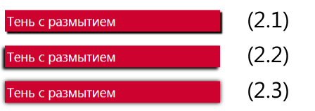
The third “linear” parameter that can be set when describing a shadow is the blur radius (blur), a positive value indicating how strongly the shadow should be blurred in space (2.1–2.3):
By default, the blur radius is 0, in which case the shadow is clear.
In combination with different shifts of the shadow, you can get different effects, for example, at (2.3) both shifts of the shadow are equal to zero, but due to the blur the shadow appears from different sides:
The specification blur algorithm itself is not described, except for indicating that it should be an effect similar to Gaussian blur with a half radius to both sides of the shadow border (2.4):

Another interesting parameter is the stretching or spreading of the shadow (spray), which allows you to increase or decrease its size (by default, the size of the shadow corresponds to the size of the original object). It should be noted that this parameter did not immediately appear in the specification, so in many examples on the Internet it is simply not considered.
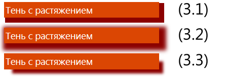
To increase the shadow, you need to specify a positive spray parameter (3.1, 3.2):
To reduce - negative (3.3):
Stretching or compressing a shadow can be regarded as a scaling operation, but the specification describes it somewhat more cunningly (through the analogy of blurring and removing transparent or opaque pixels), which, however, does not change the essence of the matter:

In the example above (3.4), the shadow is shifted 6px down and to the left and increased by 8px on each side:
If rounded corners are used in your block, be prepared for the fact that in the expanded shadow the radius of rounding will also be proportionally scaled (3.5):


Finally, another tricky parameter is the ability to apply a shadow inside the block. To do this, use the special keyword inset (4.1-4.4):
Note that the inner shadow is drawn only inside the block to which the corresponding rule is applied, and using the spray parameter for the inner shadow (4.2) as opposed to the outer one leads to a decrease in the inner perimer of the shadow.
Well, now another nuance: in fact, any number of shadows can be applied to the blocks at the same time, for this it is enough to list them separated by a comma when describing box-shadow.

For example, to get a rainbow shadow (5.1), it is enough to consistently specify 7 shadows with increasing stretching:
Notice that the shadows are actually arranged in a stack in the reverse order and drawn, starting with the last one, with each of them being applied to the original object as if there is only it.

Since shadows are independent, you can easily combine shadows aligned in different directions (5.2):

Similarly, internal and external shadows (5.3) can be set immediately:

Or “advanced underscore” (5.4):

Or, if you show a little more imagination and additional special effects, make a slick-box, described, for example, in Matt Hamm (5.5):
(For simplicity, I removed the code with vendor prefixes, but you will need to add -ms-transform, -webkit-transform, etc.)
In summary, the syntax for describing shadows is as follows:
The last in its full form unfolds in the following scheme:
Blur radius and stretch are optional. inset switches the display mode of the shadow from external to internal.
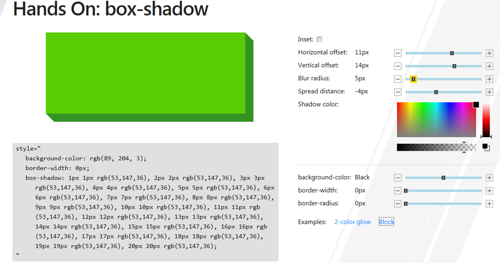
If you just want to play with the shadows online, our colleagues have prepared a demo page for the Build conference held in September: " Hands-on: box-shadow ".
Urgent for many question: box-shadow is supported in IE9 and higher .
And one more important detail: standard css-rules, starting with the 9th version of Internet Explorer, work using hardware acceleration - in contrast to non-standard old filters like filter: DXImageTransform.Microsoft.Shadow. That is, using standards is not only more correct, but also more effective.
My advice: try to use standard features based on the ideas of progressive enhacenment.
We will try to understand how the shadows work in the new CSS3 modules. From a practical point of view, we consider two rules: box-shadow and text-shadow , defined respectively in the modules CSS3 Backgrounds and Borders and CSS3 Text .
Both rules work in a similar way (up to the appropriate reference in the specification), so it makes sense to consider them together. At the same time there are some differences, which also can not be said.
The first part is dedicated to working with box-shadow, in the second we will go through the shadows for the text.
box-shadow
Shifts and color

')
In the simplest version, to specify the shadow, it is enough to specify two parameters that specify the horizontal and vertical shifts of the shadow (1.1), respectively:
box-shadow: 3px 3px; Positive shift values shift the shadow to the right and down, negative ones move it to the left and up.
By default, if the shadow color is not set, in most browsers (everything except webkit-based) it is taken from the text color (color) in the current context (1.2), however, it seems that this moment is not negotiated by the specification:
box-shadow: 3px 3px; color:blue; To set the shadow color, it is enough to specify it with the additional parameter (1.3):
box-shadow: 3px 3px darkgreen; Obviously, the color can be specified in any of the available ways: from direct indication of the name and hexadecimal code, to rgb or rgba and hsla with transparency (we will look at such examples a little later).
Blur

The third “linear” parameter that can be set when describing a shadow is the blur radius (blur), a positive value indicating how strongly the shadow should be blurred in space (2.1–2.3):
box-shadow:3px 3px 3px darkgrey; By default, the blur radius is 0, in which case the shadow is clear.
In combination with different shifts of the shadow, you can get different effects, for example, at (2.3) both shifts of the shadow are equal to zero, but due to the blur the shadow appears from different sides:
box-shadow:0 0 9px black; The specification blur algorithm itself is not described, except for indicating that it should be an effect similar to Gaussian blur with a half radius to both sides of the shadow border (2.4):

Stretching

Another interesting parameter is the stretching or spreading of the shadow (spray), which allows you to increase or decrease its size (by default, the size of the shadow corresponds to the size of the original object). It should be noted that this parameter did not immediately appear in the specification, so in many examples on the Internet it is simply not considered.
To increase the shadow, you need to specify a positive spray parameter (3.1, 3.2):
box-shadow:6px 6px 0px 4px darkred; To reduce - negative (3.3):
box-shadow:12px 12px 8px -4px darkred; Stretching or compressing a shadow can be regarded as a scaling operation, but the specification describes it somewhat more cunningly (through the analogy of blurring and removing transparent or opaque pixels), which, however, does not change the essence of the matter:

In the example above (3.4), the shadow is shifted 6px down and to the left and increased by 8px on each side:
box-shadow:6px 6px 0 8px grey; If rounded corners are used in your block, be prepared for the fact that in the expanded shadow the radius of rounding will also be proportionally scaled (3.5):

Inner shadow

Finally, another tricky parameter is the ability to apply a shadow inside the block. To do this, use the special keyword inset (4.1-4.4):
box-shadow:inset 4px 4px rgba(66,66,66,0.5); /* (4.1) */ box-shadow:inset 4px 4px 0 8px rgba(198,198,198,1); /* (4.2) */ box-shadow:inset -2px -2px 8px 0px black; /* (4.3) */ box-shadow:inset 0 0 4px 0px black; /* (4.4) */ Note that the inner shadow is drawn only inside the block to which the corresponding rule is applied, and using the spray parameter for the inner shadow (4.2) as opposed to the outer one leads to a decrease in the inner perimer of the shadow.
Multiple shadows
Well, now another nuance: in fact, any number of shadows can be applied to the blocks at the same time, for this it is enough to list them separated by a comma when describing box-shadow.

For example, to get a rainbow shadow (5.1), it is enough to consistently specify 7 shadows with increasing stretching:
box-shadow: 0 0 2px 1px red, 0 0 2px 2px orange, 0 0 2px 3px yellow, 0 0 2px 4px green, 0 0 2px 5px lightblue, 0 0 2px 6px blue, 0 0 2px 7px violet; Notice that the shadows are actually arranged in a stack in the reverse order and drawn, starting with the last one, with each of them being applied to the original object as if there is only it.

Since shadows are independent, you can easily combine shadows aligned in different directions (5.2):
box-shadow: -6px -6px 8px -4px rgba(255,0,0,0.75), 6px -6px 8px -4px rgba(0,255,0,0.75), 6px 6px 8px -4px rgba(255,255,0,0.75), -6px 6px 8px -4px rgba(0,0,255,0.75); 
Similarly, internal and external shadows (5.3) can be set immediately:
box-shadow: inset 0 0 8px lightgray, 1px 1px 3px darkgray; 
Or “advanced underscore” (5.4):
box-shadow: 0 1px red, 0 3px 3px -2px black 
Or, if you show a little more imagination and additional special effects, make a slick-box, described, for example, in Matt Hamm (5.5):
.slick-box { position: relative; height: 50px; border: 1px solid #efefef; background: #fff; box-shadow: 0 1px 4px rgba(0, 0, 0, 0.27), 0 0 40px rgba(0, 0, 0, 0.06) inset; } .slick-box:before, .slick-box:after { content: ''; z-index: -1; position: absolute; left: 10px; bottom: 10px; width: 70%; max-width: 300px; /* avoid rotation causing ugly appearance at large container widths */ height: 55%; box-shadow: 0 8px 16px rgba(0, 0, 0, 0.3); transform: skew(-15deg) rotate(-6deg); } .slick-box:after { left: auto; right: 10px; transform: skew(15deg) rotate(6deg); } (For simplicity, I removed the code with vendor prefixes, but you will need to add -ms-transform, -webkit-transform, etc.)
General syntax
In summary, the syntax for describing shadows is as follows:
box-shadow: <shadow> [ , <shadow> ]*; <shadow> = inset? && [ <length>{2,4} && <color>? ] The last in its full form unfolds in the following scheme:
box-shadow: inset? h-offset v-offset blur-radius spread-distance color; Blur radius and stretch are optional. inset switches the display mode of the shadow from external to internal.
Interactive

If you just want to play with the shadows online, our colleagues have prepared a demo page for the Build conference held in September: " Hands-on: box-shadow ".
Internet exlorer
Urgent for many question: box-shadow is supported in IE9 and higher .
And one more important detail: standard css-rules, starting with the 9th version of Internet Explorer, work using hardware acceleration - in contrast to non-standard old filters like filter: DXImageTransform.Microsoft.Shadow. That is, using standards is not only more correct, but also more effective.
My advice: try to use standard features based on the ideas of progressive enhacenment.
Source: https://habr.com/ru/post/133276/
All Articles