Mobile usability
 Mobile versions of the site have a number of features that should not be neglected in order for the site to have a high degree of usability. However, as in any business, it is enough to take into account a few basic rules in order to make a mobile site simple, clear and enjoyable for the user.
 1. Reduce the amount of content.
On a small screen of a mobile device, only a small amount of content is simultaneously placed. Therefore, in the main content area include only the main information and functions. Discard the background information that is usually placed on the right side of regular websites.
2. The "one column" rule.
Web pages stretched across the width are almost impossible to read on a mobile device. The reason, as always, is the same - the small size of the devices. Even on smartphones with a fairly large screen, wide web pages do not fit completely, the content has to be brought closer, which is extremely inconvenient even for users of the most modern models.
Instead, use the page format in a single column. Then the scrolling will be vertical, which is quite convenient on almost all models of devices.
')

3. Use the navigation form that suits the specifics of your site.
- The main page consisting of the navigation bar and the search form is suitable for situations in which the user, after entering the main page, will immediately use the search or go to the next page. He still will not read the contents of the main one.
- If you need the information on the main page to be read, place the navigation below. The user will still have access to it, but the navigation bar will not interpose between him and the information he is reading. As an option - “at the top” you can place one button that will forward the user to the navigation bar in the “footer” of the site.
- If it is difficult to predict user actions, place the menu in the drop-down list. Navigation can be placed simultaneously from above and below.
 4. How many versions do you need?
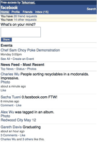
The screens and computing power of mobile gadgets vary greatly. While smartphones can load almost any web page without problems, phones of previous generations will not always cope with this. Therefore, if you only need to reach the audience owning smartphones, one version will be enough for you. But if you want to reach a wider audience, it is worth making versions for devices easier. For example, facebook.com has as many as 3 mobile versions: m.facebook.com is the main mobile version, touch.facebook.com is the version for touchscreen mobile phones, 0.facebook.com is the version optimized for countries with very low download speeds.
5. Touchscreen and button navigation.
The design should take into account that the application is convenient for touchscreen and devices with button navigation. For example, a user of a touchscreen model will click on links with a finger. Small, closely spaced links will be inconvenient for him, since it is likely to click the wrong place.
6. Take advantage of the built-in functions.
A lot of manual operations can be reduced using the built-in functionality of a mobile phone:
- Making calls is convenient for automatic telephone calling from the contacts page, or the main page.
- Add the ability to see your address on the map in one click.
- The function "Find the nearest object" will help your friends to find if it is a social network, or the nearest boutique, if it is a store site.
Source: https://habr.com/ru/post/133254/
All Articles