Thiographic for Dyslexics
Some readers noticed a typo in the title. The part noticed both. Part did not notice at all. If you are from the third group, then most likely you are dyslexic.
Another important trend is increasingly paying attention to usability issues for people with disabilities . At the same time, the problems of dyslexics are barely talked about, and this misunderstanding should be corrected. Not without reason, according to various statisticians, in developed countries one can speak of 5–15% of dyslexics in a population (although such statistics do not exist in Russia).
Dyslexics is hard to read:
According to Dyslexic.com , Arial, Trebuchet MS, Myriad Pro and Geneva can be attributed to relatively “good” common fonts.
')
However, some font designers develop fonts specifically for dyslexics.
Font Read Regular Dutch production distributed on request, apparently.

Dyslexie , also Dutch, is also available upon request.

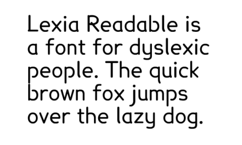
Lexia Readable font from the K-Type slogan foundry, can be bought for British pounds. The font is used by McMillan.
Fonts Gill Dyslexic and Mono Dyslexic , clearly inspired by the Dutch Dyslexie.
Exljbris Font Foundry's free Delicious font dyslexics is praised in the online discussion .
The Sylexiad font family is based on a five-year study of dyslexics and a defended doctoral dissertation (PDF, Eng.).
The aforementioned Dyslexic.com also recommends Tiresias free fonts and the Sassoon project (more intended, however, for learning to read).
In addition to fonts, the design of the text itself plays a role. We list the recommendations of the British Dyslexia Association (both for paper and for the web).
Perhaps finish the article without closing it. Friends, are there dyslexics among us? How do you live? Which Cyrillic fonts are easier to read?
Dyslexia is a type of specific learning disorder that has a neurological nature. It is characterized by the inability to quickly and correctly recognize words, perform decoding, and master spelling skills. These difficulties are associated with the inferiority of the phonological components of the language. They exist, despite the preservation of other cognitive abilities and high-grade learning conditions.Of course, the Internet is rapidly moving towards a growing percentage of media in the perceived flow of information. Nevertheless, the text was, is and remains a means of transmitting a huge part of the knowledge gained from the Web.
Another important trend is increasingly paying attention to usability issues for people with disabilities . At the same time, the problems of dyslexics are barely talked about, and this misunderstanding should be corrected. Not without reason, according to various statisticians, in developed countries one can speak of 5–15% of dyslexics in a population (although such statistics do not exist in Russia).
Fonts for dyslexics
Dyslexics is hard to read:
- similar letters in the usual style;
- letters reflected on vertical and horizontal axes;
- inverted letters;
- words with mixed letters.
According to Dyslexic.com , Arial, Trebuchet MS, Myriad Pro and Geneva can be attributed to relatively “good” common fonts.
')
However, some font designers develop fonts specifically for dyslexics.
Font Read Regular Dutch production distributed on request, apparently.
Dyslexie , also Dutch, is also available upon request.
Lexia Readable font from the K-Type slogan foundry, can be bought for British pounds. The font is used by McMillan.
Fonts Gill Dyslexic and Mono Dyslexic , clearly inspired by the Dutch Dyslexie.
Exljbris Font Foundry's free Delicious font dyslexics is praised in the online discussion .
The Sylexiad font family is based on a five-year study of dyslexics and a defended doctoral dissertation (PDF, Eng.).
The aforementioned Dyslexic.com also recommends Tiresias free fonts and the Sassoon project (more intended, however, for learning to read).
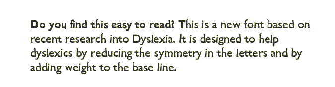
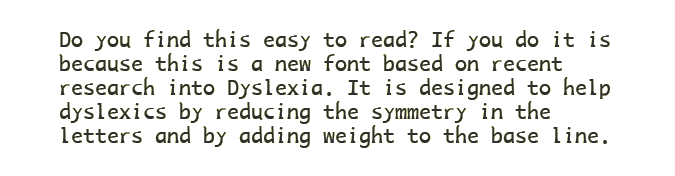
Recommendations on the design of texts for dyslexics
In addition to fonts, the design of the text itself plays a role. We list the recommendations of the British Dyslexia Association (both for paper and for the web).
Carriers
- With double-sided printing, the paper should be thick enough so that the text on the other side of the paper does not appear through.
- It is better to use matte, not glossy paper. It is advisable to avoid digital printing, which makes the paper more glossy.
- For typing - on paper and on screens - it is better not to use too bright white background. Cream or pastel colors are preferred.
Font
- The font size should be large enough - no less than 12-14 points.
- Use a dark font on a light (see above) background.
- Avoid green and red / pink flowers, as they can be difficult to perceive people with color blindness.
Headings and Highlights
- To select text fragments, it is preferable to use boldface rather than underlining or italics.
- DO NOT CAPTURE: this text is harder to read than typed lowercase.
- Headings should be typed in lowercase letters of a large size in bold.
- Frames can be used for more noticeable highlighting.
Layout
- Use the switch on the left, with the flag set on the right.
- Avoid narrow columns (as in newspapers).
- Strings should not be longer than 60-70 characters (for English!)
- Do not use dense, concise paragraphs - more air!
- The preferred line spacing is 1.5 em.
- When typing, try not to start new sentences at the end of the line.
- Use lists (numbered and unnumbered) instead of plain text more often.
Style
- Use short, simple sentences.
- Give clear instructions. Avoid long explanations.
- Use a valid, not passive voice.
- Avoid double negatives.
- Be concise.
And how are we?
Perhaps finish the article without closing it. Friends, are there dyslexics among us? How do you live? Which Cyrillic fonts are easier to read?
Curious links (can be replenished)
- UXMovement: 6 surprisingly bad practices that hurt dyslexics
- Flickr: Narrowing down web font choices for Dyslexic readers
- A Dyslexic Thoughts On Webpages
- Case Study Of A Dyslexic Person's Visual Perceptual Problems: A Fizz Effect (PDF)
- Typefaces (Fonts) for People with Reading Difficulties - an article challenging everything written above
- Do dyslexics need a specially designed font? - another critical article with an interesting discussion in the comments
Source: https://habr.com/ru/post/132903/
All Articles