Improving new gmail

After the Gmail guys rolled out their appearance update, it was time to slightly improve a couple of small things. We offer several custom styles and scripts to squeeze even more out of the Gmail design.
They will work in Chrome, Firefox with Greasemonkey or Safari with Ninjakit . Chrome and Firefox users can set styles as custom scripts from style pages or with Stylish for Chrome / Stylish for Firefox , which offer one-click installation. Those who use the Opera browser can install them as CSS or JavaScript from the styles page.
Hide "Send Feedback"
Of course, the most annoying thing in the new interface is the small “Send Feedback” message that is constantly hanging in the lower right corner. Even if you hit X, it will appear again, annoying you again and again making you feel helpless. Thanks to this little script you can get rid of it forever.

Making the chat more readable with new colors

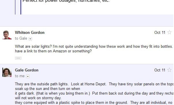
With the new view, it became a little harder to visually separate the two messages in the correspondence. They are both with a white background and very thin frames. To make it easier to navigate, you can set a custom style, Alternating Message Colors , which will tint every second letter with a light blue background. You can choose the color as well as which messages to highlight: even or odd lightly filed with CSS.
It would be better to highlight messages by the author, and not just even, but, alas, gmail did not do anything for this in html. Note per.
')
Increase the contrast between read and unread messages.

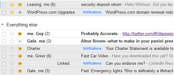
Google also clarified most of the colors, which made it difficult to separate the read from the unread letters. If you want to darken the background of unread messages in order to more easily separate them, set the custom style Read / Unread Contrast Increase . You can choose several options for improving contrast before installation.
Differentiate the buttons of the toolbar colors

For me, one of the biggest problems in the new Gmail toolbar is that they removed the labels from them and made the same color, which is why I now need a couple of seconds to find the right button.
The Easy Access Colored Buttons custom style tints the buttons, and now you can almost instantly tell where the delete button is and where the tags are. Of course, you can change the colors to those that you prefer - I commented out a few lines with / * because I thought that some buttons look better without colors.
Where and what commented out in CSS I did not find. But if you want you can comment out yourself. Note per.
Making the toolbar more compact

If you are using the “Compact” version of the Gmail interface and still think that it eats away a lot of space, install the custom Gmail Compact script to make more efficient use of space, which is especially effective for netbooks and small screens. It makes the buttons of the toolbar smaller and seals them to the left sidebar.
Another very useful feature is pressing the h or H buttons, which remove the black menu or menu + block logo with the search, respectively, from the top of the interface. Note per.
Making new scrollbars more visible

And finally, if you are using Chrome, you may have noticed new transparent scrolbars. On some themes they are pretty hard to find, so if you want to make them more noticeable, set the style to the Visible Scroll Bar to make them blue. And if you don't use Chrome, you can make them in Chrome style using the Scrollbar Like Chrome user style (but you can't make it darker with the first style, as it only works in Chrome).
We hope the above will make your Gmail a little better. Of course, don’t forget about all the other user scripts we’ve talked about before, including the awesome Firefox Better Gmail extension. Many of them still work, despite the change of interface.
Source: https://habr.com/ru/post/132692/
All Articles