Usability principles: understandable, convenient, comfortable. Briefly about the main thing
 In today's world, understanding the basics of usability is a must. Most visitors to the site do not perform the actions that resource owners expect from them. People do not order goods, do not register, do not subscribe to updates, etc. What is the reason for this user behavior?
The reason is simple - the resource is inconvenient for the user. For example, in order to “order” a product, you have to go through several pages, and the registration button is completely undetectable. This makes the resource uncompetitive.
How to reduce the number of refusals to use the site? If the project needs a thorough approach, you can contact the studio, to the experts. Usability laboratories offer not only various testing options and interface design. And if the budget is limited, you can try to learn the basics of usability yourself.
For independent development of the interface, you need to consider a few simple rules:
- Rule 7-mi.
It is known that the abilities of the human brain are not infinite. A person is able to keep in short-term memory no more than 5-9 entities. Therefore, you should not place in the navigation more than 7 points.
From this point of view, the site tutu.ru certainly deserves good reviews, since the main functionality was placed in the header of the site, limited to 4 menu items and a drop-down list.
While the Russian Railways website is a great example of how not to do it. From the amount of scattered information dazzles in the eyes, I just want to close it and never enter again. - Rule 2 seconds.
The less the user waits for the response of the program, site or application, the greater the likelihood that he will not refuse to use this product. 2 seconds is the optimal time interval of the program response, it is for him to strive. So it is worth thinking a hundred times before putting a heavy flash intro on the site, as they did on mtv.ru. - Rule of 3 clicks.
No one likes to surf the page, in search of the necessary information and functionality. The visitor should be able to get from the main page to any other page of the site, making no more than 3 clicks. This contributes to a more successful site indexing by search engines. - Fitts Rule
The model of human movements published by Paul Fitts in 1954 determines the time needed to move quickly to the target zone as a function of the distance to the target and the size of the target.
Metaphorically, the rule can be explained as follows: it is easier to point at a lighter than a match. But pointing to a cliff or a huge airship is equally simple. If an interface object, such as a link, is already large enough, it makes no sense to make it even larger. - Inverted Pyramid
This principle is followed by the usability guru himself, Jacob Nielsen. The article should begin with a final conclusion, followed by key points, and conclude with the least important information for readers. This is optimal for the web, where the user wants to get information as quickly as possible.
But even a well-designed interface is worth testing. Focus groups are the most affordable way to test on your own.
Testing consists of four stages:
- Selection of focus groups. Testers must match your target audience. You should not ask your grandmother to test the application to look for driver updates.
- Making a test plan - a list of tasks for which your product is developed. This list will be followed by testers. If you are doing an online store, the list should include such tasks as searching for a product, getting information about a product, the path from getting information about a product to its order, and removing goods from the cart.
- Execution by testers of the task list and fixing errors. Anything can be considered an error: a too complex captcha, no message from the server stating that “goods are added to the basket”, the inability to change the number of goods in the basket or cancel the action, etc.
- After identifying and correcting errors, the testing cycle must be repeated. The cycle should be repeated until the results meet the necessary requirements.
The quality of the interface should be assessed at each stage of the project. Do not delay testing usability until the very last moment. Serious errors simply cannot be corrected due to the fact that the project is at the final stage. And then - either redoing anew, or getting low usability.
As a rule, 5 testers are enough to identify the main bugs.
')
Example by topic
Finally, we analyze typical errors using the example of the site of the famous artist Vlad Topalov . Suppose we want to agree on a presentation with his management and want to find their contacts on the site. And here begins the quest!
The first thing we see on the site is a black screensaver with a “enter” link and a suggestion to update the flash player.
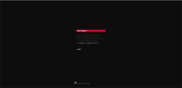
The "enter" button sounds like a call to get to the main page of the site. But instead of the main page we fall on the "clean sheet".
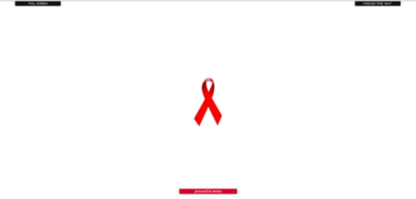
Here the eye catches the image of the red ribbon, and we, of course, think that this is a link, and maybe even on the menu. But no - this is just a symbol of the fight against AIDS, which is intended to denote the social position of the singer and no more. And then the hand reaches into the upper left corner. And there is not a menu at all, but a full-screen button. A few seconds in confusion, and the search is over, the desired menu below, in the center of the screen. Click ... and see the PLAYER! We were deceived again.

While the player is broadcasting a clip, we continue to look for the menu. Now it is at the top, in the center. In the drop-down list, we finally see the desired word "Contacts". But here it is not so simple. These contacts cannot be copied. We'll have to rewrite manually!
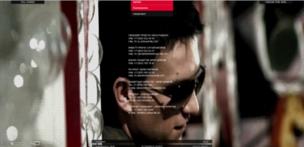
Now about the numbers. The response time may vary depending on the connection speed, but in any case it will be more than 2 seconds. And the path to the contact management page took 7 clicks. And it could take only one.
Vlad Topalov, of course, can afford such “creative” solutions. But it is obvious that such decisions are simply destructive for business.
Source: https://habr.com/ru/post/132564/
All Articles