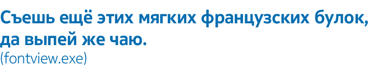
Nokia Pure: pure typography
Today we want to talk to you on a slightly unusual topic for us - about typography.
We try to take care not only about the appearance of our devices, but also about how our software interfaces look. As part of the ongoing work on this, a brand new font appeared not so long ago - Nokia Pure, which replaces many acquaintances of Nokia Sans.
Font design deals with Bruno Maag and several other type designers from his studio Dalton Maag. You are probably already familiar with the work of this studio. The Dalton Maag Publisher last year released the Ubuntu font, which appeared in OS 10.10 of the same name.
Under the cut you can find both the process of creating a font (along with the problems that have arisen, but solved) and understand the personal attitude of the eminent designer to the modern design of fonts. Oh, what a controversial person!
Bruno Maag is angry at modern typography. He hates Helvetica, comparing this font family with cheap ice cream: “If you imagine ice cream, then Helvetica is a cheap, nasty, ice cream made from water with the use of substitutes and vegetable fats. The composition is bad and leaves a slightly funny aftertaste. ” According to Maag, something old-fashioned is felt in Helvetik: the font was based on the old font family Akzidenz Grotesk (1896), and everyone who calls Helvetica modern cannot be called modernist.
')

Bruno Maag began his career as a student of the typesetter bukvonobornoy machine in Switzerland, when the newspaper editorial were noisy, the design was obtained thanks to a pencil on paper, and the smell of hot calender was around. Now he has his own studio in Brixton (south London), which is a quiet white typographical temple, where designers work in front of the screens of their monitors with a concentration of Zen Buddhists.

Working on fonts day by day makes you a pedant, intolerant of imperfection:
“If fonts began to take on an integral part of your life ... well, we all suffer from a slight mental disorder. Every line should be perfect, ”Bruno says.
Nokia Pure Text is a user interface font family that contains normal, italic, and bold fonts inherent in all Dalton Maag fonts.
Perhaps this is the person whom you would invite to make you a font. “To do quality work, you need a real creator,” says Maag. “You have to be a designer, knowing how the color is made and where the flows should be. People appreciate the beauty of simple shapes. You can do not just something beautiful, but also extremely functional. ”
For the past ten months, the Dalton Maag team has been developing a new font for Nokia that best meets the demands of all digital media. As a result, Nokia Pure appeared: a font that reflects the Finnish tradition of simplicity and purity, but at the same time supporting such different alphabets like Cyrillic and Devanagari. This font was also completely unscrambled , so that only pleasant impressions would remain from viewing it on mobile devices.
How many details from the old font were used in the new?
“We actually didn't use the previous Nokia font at all,” says Maag. - We started making the font from scratch. The old font was good, but it seems to me that it has outlived its own. It would be hard to work with him because of his rigor and expressiveness. It had too many individual traits. We wanted to make the font softer and more functional. ”
Font creation begins with the design of the four defining characters: HO and NO. Maaga grieves young designers who immediately rush into the thick, full of enthusiasm and determination to create a font from scratch, starting from another set of characters. In the end, they discover that this step was erroneous, and they have to start all the work anew. “If you start to make a font with characters E or F, you will not achieve anything. These four defining symbols define 70% of the whole process. They give you an idea of proportions. And only when you make them and will be pleased with the result, you can begin to make other characters, up to a group of eight digits. For a long time you will switch back and forth between them, and only then can you finish all the other characters. ”

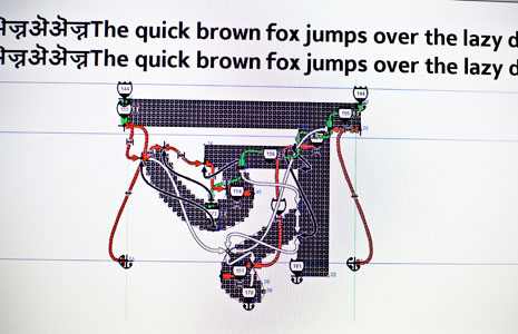
Each font originates from sketches on paper, which are then transferred to the application FontLab Studio . After this, a long and complex technical process begins, during which it is necessary to make sure that the font can be used on all computer systems. Hinting is the last and longest stage of this process, at which the pixels are aligned on the grid for each character in the font. But it allows you to achieve excellent display of the font, even on small screens.
The first version of Nokia Pure will support Latin, Greek, Cyrillic, Arabic, Thai alphabets, as well as Hebrew and Devanagari.
Amelie Bonet from Dalton Maag has a lot of dusty and battered books in Hindi and Bengali. She received most of them on research trips to India. In this, she is like a font archeologist, not a designer. Making hundreds of ligatures is a daunting task, especially for non-speakers in the language presented. “The nodules and axes of ovals differ everywhere. If we do something wrong, it will look very unusual for the indigenous people. ”She carefully examines a number of characters:“ Devanagari is blocky, and the Bengali alphabet is sharp and round. Unlike the Latin alphabet, there are not so many literature on these fonts, so we are trying to systematize what we have. ”
Veteran designer Ron Carpenter works with the Arabic alphabet and Urdu. Like Amelie Bonet, he often speaks to native speakers to make sure the font looks right and is easy to read. The Kufi-style Arabic typeface can most often be seen on signs and billboards; this is not the classic italics found in news papers. “In Arabic, there is a need to follow the traditions, but the consultant who helped us with the design, developed this idea even further,” said Carpenter. In the Latin alphabet, the width of the characters does not make sense, but for the Arabic language it does not work, so a lot of adjustment work was carried out.
A large sheet with the Arabic alphabet is filled with hundreds of references to the Quran. A pair of brackets with annotations indicate a quotation or reference to the Quran, and a few characters standing side by side. Meaning a greeting: "May Allah bless him."
The Nokia Pure font was designed to take into account the specifics of writing the Quran in Arabic and the Torah in Hebrew, which means that in many countries of the world, mobile devices have begun to play a significant role in the field of religion.
Now that the first part of the project is close to completion, Bruno Maag begins to think about the next set of languages. He started working on Armenian. “Not many people speak it,” he said.
The result of all these efforts was the Nokia Pure font - a humanistic sans serif font, but with different contour thicknesses. Maag points out the small details that make this font unique:
“In the symbol K, the lines smoothly converge to the main stroke. And look at M: the connecting strokes do not fully converge on the line of the main stroke. Tiny elements are decisive for this font, ”Maag points out. He compares the line of two characters, which only he can notice. “A strange influx on the E and C curve. It does not look like a smooth curve - due to the influx that attracts to the lower left edge. Such tiny details make this font really different. ”
He finishes with satisfaction: “Nokia Pure is not trying to scream, to be what it is not. And that makes it so beautiful. He looks good, he is simple, it is easy to read - he does his job. ”
We try to take care not only about the appearance of our devices, but also about how our software interfaces look. As part of the ongoing work on this, a brand new font appeared not so long ago - Nokia Pure, which replaces many acquaintances of Nokia Sans.
Font design deals with Bruno Maag and several other type designers from his studio Dalton Maag. You are probably already familiar with the work of this studio. The Dalton Maag Publisher last year released the Ubuntu font, which appeared in OS 10.10 of the same name.
Under the cut you can find both the process of creating a font (along with the problems that have arisen, but solved) and understand the personal attitude of the eminent designer to the modern design of fonts. Oh, what a controversial person!
Bruno Maag is angry at modern typography. He hates Helvetica, comparing this font family with cheap ice cream: “If you imagine ice cream, then Helvetica is a cheap, nasty, ice cream made from water with the use of substitutes and vegetable fats. The composition is bad and leaves a slightly funny aftertaste. ” According to Maag, something old-fashioned is felt in Helvetik: the font was based on the old font family Akzidenz Grotesk (1896), and everyone who calls Helvetica modern cannot be called modernist.
')
Bruno Maag began his career as a student of the typesetter bukvonobornoy machine in Switzerland, when the newspaper editorial were noisy, the design was obtained thanks to a pencil on paper, and the smell of hot calender was around. Now he has his own studio in Brixton (south London), which is a quiet white typographical temple, where designers work in front of the screens of their monitors with a concentration of Zen Buddhists.
Working on fonts day by day makes you a pedant, intolerant of imperfection:
“If fonts began to take on an integral part of your life ... well, we all suffer from a slight mental disorder. Every line should be perfect, ”Bruno says.
About Nokia Pure
Nokia Pure Text is a user interface font family that contains normal, italic, and bold fonts inherent in all Dalton Maag fonts.
Perhaps this is the person whom you would invite to make you a font. “To do quality work, you need a real creator,” says Maag. “You have to be a designer, knowing how the color is made and where the flows should be. People appreciate the beauty of simple shapes. You can do not just something beautiful, but also extremely functional. ”
Last ten months
For the past ten months, the Dalton Maag team has been developing a new font for Nokia that best meets the demands of all digital media. As a result, Nokia Pure appeared: a font that reflects the Finnish tradition of simplicity and purity, but at the same time supporting such different alphabets like Cyrillic and Devanagari. This font was also completely unscrambled , so that only pleasant impressions would remain from viewing it on mobile devices.
How many details from the old font were used in the new?
“We actually didn't use the previous Nokia font at all,” says Maag. - We started making the font from scratch. The old font was good, but it seems to me that it has outlived its own. It would be hard to work with him because of his rigor and expressiveness. It had too many individual traits. We wanted to make the font softer and more functional. ”
Font creation begins with the design of the four defining characters: HO and NO. Maaga grieves young designers who immediately rush into the thick, full of enthusiasm and determination to create a font from scratch, starting from another set of characters. In the end, they discover that this step was erroneous, and they have to start all the work anew. “If you start to make a font with characters E or F, you will not achieve anything. These four defining symbols define 70% of the whole process. They give you an idea of proportions. And only when you make them and will be pleased with the result, you can begin to make other characters, up to a group of eight digits. For a long time you will switch back and forth between them, and only then can you finish all the other characters. ”
Each font originates from sketches on paper, which are then transferred to the application FontLab Studio . After this, a long and complex technical process begins, during which it is necessary to make sure that the font can be used on all computer systems. Hinting is the last and longest stage of this process, at which the pixels are aligned on the grid for each character in the font. But it allows you to achieve excellent display of the font, even on small screens.
Heading East
The first version of Nokia Pure will support Latin, Greek, Cyrillic, Arabic, Thai alphabets, as well as Hebrew and Devanagari.
Amelie Bonet from Dalton Maag has a lot of dusty and battered books in Hindi and Bengali. She received most of them on research trips to India. In this, she is like a font archeologist, not a designer. Making hundreds of ligatures is a daunting task, especially for non-speakers in the language presented. “The nodules and axes of ovals differ everywhere. If we do something wrong, it will look very unusual for the indigenous people. ”She carefully examines a number of characters:“ Devanagari is blocky, and the Bengali alphabet is sharp and round. Unlike the Latin alphabet, there are not so many literature on these fonts, so we are trying to systematize what we have. ”
Arabic issues
Veteran designer Ron Carpenter works with the Arabic alphabet and Urdu. Like Amelie Bonet, he often speaks to native speakers to make sure the font looks right and is easy to read. The Kufi-style Arabic typeface can most often be seen on signs and billboards; this is not the classic italics found in news papers. “In Arabic, there is a need to follow the traditions, but the consultant who helped us with the design, developed this idea even further,” said Carpenter. In the Latin alphabet, the width of the characters does not make sense, but for the Arabic language it does not work, so a lot of adjustment work was carried out.
A large sheet with the Arabic alphabet is filled with hundreds of references to the Quran. A pair of brackets with annotations indicate a quotation or reference to the Quran, and a few characters standing side by side. Meaning a greeting: "May Allah bless him."
The Nokia Pure font was designed to take into account the specifics of writing the Quran in Arabic and the Torah in Hebrew, which means that in many countries of the world, mobile devices have begun to play a significant role in the field of religion.
Now that the first part of the project is close to completion, Bruno Maag begins to think about the next set of languages. He started working on Armenian. “Not many people speak it,” he said.
The result of all these efforts was the Nokia Pure font - a humanistic sans serif font, but with different contour thicknesses. Maag points out the small details that make this font unique:
“In the symbol K, the lines smoothly converge to the main stroke. And look at M: the connecting strokes do not fully converge on the line of the main stroke. Tiny elements are decisive for this font, ”Maag points out. He compares the line of two characters, which only he can notice. “A strange influx on the E and C curve. It does not look like a smooth curve - due to the influx that attracts to the lower left edge. Such tiny details make this font really different. ”
He finishes with satisfaction: “Nokia Pure is not trying to scream, to be what it is not. And that makes it so beautiful. He looks good, he is simple, it is easy to read - he does his job. ”
Source: https://habr.com/ru/post/132357/
All Articles