CSS3 and HTML5 tooltips
Due to the fact that I did not find a description of this simple and at the same time convenient way to create simple “tooltips” on Habrahabr, I decided to write about it.
This method will not use JS, we are content with only CSS3 and HTML5.
In fact, css attr () for the content pseudo-element property appeared in CSS2 and in this way, in general, there is nothing new.
')

This method will fit where you need small "tooltips" - tooltips.
First show the code:
We take a certain element (in our case, a span), add an attribute to it with text that will be shown, and take the pseudo-element :: after. In the content of this pseudo-element, we use the most remarkable property of attr () , assign the text to our pop-up help and then show it by hover.
I think the other properties are clear from the comments in the code.
Separately, I want to note how the animation behaves in Chrome and Opera (Probably in IE, because of its absence, I have no way to check it).
She is not. This is due to the fact that WebKit and Opera do not apply transitions and animation to the :: before and :: after pseudo-elements.
A bug was registered in the WebKit bug tracker about this.
Sometimes in the tooltip there should be not just text, but also some formatting or an image that you cannot put into the previous method.
Further I will consider only an example of what can be done in this way.
And again the code:
It's simple. These examples can be seen on this page.
PS Some will ask: Where is HTML5? The article mentions data- * attributes that are part of the HTML5 specification.
This method will not use JS, we are content with only CSS3 and HTML5.
Disclaimer
In fact, css attr () for the content pseudo-element property appeared in CSS2 and in this way, in general, there is nothing new.
')
Easy way
This method will fit where you need small "tooltips" - tooltips.
First show the code:
<span class="tooltip" data-tooltip="I'm small tooltip. Don't kill me!">Hover me!</span> .tooltip { border-bottom: 1px dotted #0077AA; cursor: help; } .tooltip::after { background: rgba(0, 0, 0, 0.8); border-radius: 8px 8px 8px 0px; box-shadow: 1px 1px 10px rgba(0, 0, 0, 0.5); color: #FFF; content: attr(data-tooltip); /* , */ margin-top: -24px; opacity: 0; /* ... */ padding: 3px 7px; position: absolute; visibility: hidden; /* ... . */ transition: all 0.4s ease-in-out; /* */ } .tooltip:hover::after { opacity: 1; /* */ visibility: visible; } We take a certain element (in our case, a span), add an attribute to it with text that will be shown, and take the pseudo-element :: after. In the content of this pseudo-element, we use the most remarkable property of attr () , assign the text to our pop-up help and then show it by hover.
I think the other properties are clear from the comments in the code.
Separately, I want to note how the animation behaves in Chrome and Opera (Probably in IE, because of its absence, I have no way to check it).
She is not. This is due to the fact that WebKit and Opera do not apply transitions and animation to the :: before and :: after pseudo-elements.
A bug was registered in the WebKit bug tracker about this.
Method for more complex tooltips
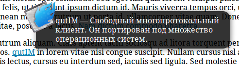
Sometimes in the tooltip there should be not just text, but also some formatting or an image that you cannot put into the previous method.
Further I will consider only an example of what can be done in this way.
And again the code:
<a class="htooltip" href="http://habrahabr.ru/">qutIM <span>qutIM — . . <img src="logo.png" /> </span> </a> .htooltip span { /* */ background-color: rgba(0,0,0, 0.8); border-radius: 15px 15px 15px 0px; box-shadow: 1px 1px 10px rgba(0, 0, 0, 0.5); color: #fff; margin-left: 2px; margin-top: -75px; opacity: 0; /* */ padding: 10px 10px 10px 40px; position: absolute; text-decoration: none; visibility: hidden; /* */ width: 350px; z-index: 10; } .htooltip:hover span { /* hover */ opacity: 1; visibility: visible; } .htooltip span img { /* */ border: 0 none; float: left; margin: -71px 0 0 -234px; opacity: 0; position: absolute; visibility: hidden; z-index: -1; } .htooltip:hover span img { /* */ opacity: 1; visibility: visible; } It's simple. These examples can be seen on this page.
PS Some will ask: Where is HTML5? The article mentions data- * attributes that are part of the HTML5 specification.
Source: https://habr.com/ru/post/132283/
All Articles