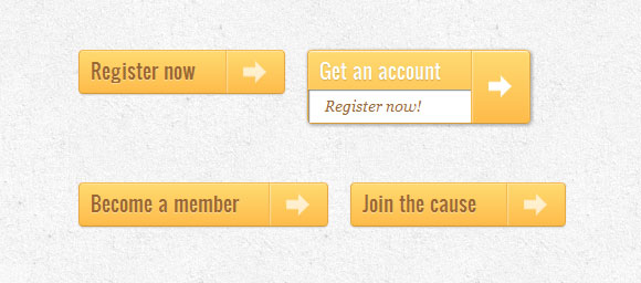
Create animated buttons with CSS3
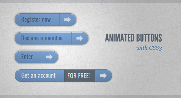
In this article I want to share with you some experiments on creating animated buttons using CSS3. The idea is to create animated links with different styles, hover effects, etc.
These examples use icons from webiconset.com , as well as the font from Just Be Nice .
')
We will look at each example and analyze how their HTML structure and styles look for different button states.
Please note that animations / transitions will only work in browsers that support these CSS3 properties.
In order not to litter the code in the lesson, I will not use prefixes for different browsers. You can see them in the archive with examples.
Example 1
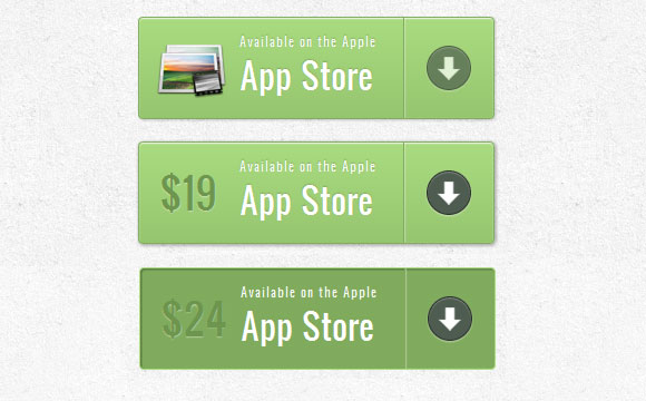
In this example, we will create a large button with several elements on it. It will have an icon, a main text, an arrow on the right side and a price that will appear only when we hover the cursor.
HTML markup
The structure is quite simple: image icon and other elements in span tags:
<a href="#" class="a-btn"> <span class="a-btn-slide-text">$29</span> <img src="images/icons/1.png" alt="Photos" /> <span class="a-btn-text"><small>Available on the Apple</small> App Store</span> <span class="a-btn-icon-right"><span></span></span> </a> CSS
In the styles, we will make sure that the transitions are set correctly for the element that we want to animate when hovering. The price will be invisible, we set its transparency to 0. Using the set box-shadow will allow us to create realistic effects:
.a-btn{ background: linear-gradient(top, #a9db80 0%,#96c56f 100%); padding-left: 90px; padding-right: 105px; height: 90px; display: inline-block; position: relative; border: 1px solid #80ab5d; box-shadow: 0px 1px 1px rgba(255,255,255,0.8) inset, 1px 1px 3px rgba(0,0,0,0.2); border-radius: 4px; float: left; clear: both; margin: 10px 0px; overflow: hidden; transition: box-shadow 0.3s ease-in-out; } .a-btn img{ position: absolute; left: 15px; top: 13px; border: none; transition: all 0.3s ease-in-out; } .a-btn .a-btn-slide-text{ position: absolute; font-size: 36px; top: 18px; left: 18px; color: #6d954e; opacity: 0; text-shadow: 0px 1px 1px rgba(255,255,255,0.4); transition: opacity 0.2s ease-in-out; } .a-btn-text{ padding-top: 13px; display: block; font-size: 30px; text-shadow: 0px -1px 1px #80ab5d; } .a-btn-text small{ display: block; font-size: 11px; letter-spacing: 1px; } .a-btn-icon-right{ position: absolute; right: 0px; top: 0px; height: 100%; width: 80px; border-left: 1px solid #80ab5d; box-shadow: 1px 0px 1px rgba(255,255,255,0.4) inset; } .a-btn-icon-right span{ width: 38px; height: 38px; opacity: 0.7; border-radius: 20px; position: absolute; left: 50%; top: 50%; margin: -20px 0px 0px -20px; border: 1px solid rgba(0,0,0,0.5); background: #4e5c50 url(../images/arrow_down.png) no-repeat center center; box-shadow: 0px 1px 1px rgba(255,255,255,0.3) inset, 0px 1px 2px rgba(255,255,255,0.5); transition: all 0.3s ease-in-out; } When you hover the mouse over the button, we will change the shadow, and also show the price and hide the image:
.a-btn:hover{ box-shadow: 0px 1px 1px rgba(255,255,255,0.8) inset, 1px 1px 5px rgba(0,0,0,0.4); } .a-btn:hover img{ transform: scale(10); opacity: 0; } .a-btn:hover .a-btn-slide-text, .a-btn:hover .a-btn-icon-right span{ opacity: 1; } In the active state, make the button pressed by adding a shadow. The arrow icon on the right will be increased:
.a-btn:active { position:relative; top:1px; background:#80ab5d; box-shadow:1px 1px 2px rgba(0,0,0,0.4) inset; border-color: #a9db80; } .a-btn:active .a-btn-icon-right span{ transform: scale(1.4); } Example 2
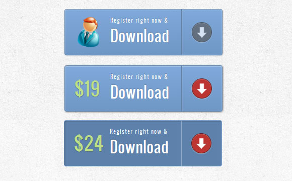
The second example will be very similar to the first, only we will add some new effects.
HTML markup
The markup on this example will be the same as in the first example.
CSS
The styles are almost the same as in the first example, we just adapt the colors. But we will make a different hover effect. The price will increase to its original size and the icon will disappear. For the arrow, change the background color to red:
.a-btn:hover{ box-shadow: 0px 1px 1px rgba(255,255,255,0.8) inset, 1px 1px 5px rgba(0,0,0,0.4); } .a-btn:hover img{ opacity: 0; } .a-btn:hover .a-btn-slide-text{ opacity: 1; transform: scale(1); } .a-btn:hover .a-btn-icon-right span{ opacity: 1; background-color: #bc3532; } The active state will be the same as in the previous example. We will only change colors. When we press the button, we will also turn the arrow:
.a-btn:active { position: relative; top: 1px; background: #5d81ab; box-shadow: 1px 1px 2px rgba(0,0,0,0.4) inset; border-color: #80a9da; } .a-btn:active .a-btn-icon-right span{ transform: rotate(360deg); } Example 3
In this example, we will try to do something completely different. The button will expand downwards when hovering and reveal another message. The arrow icon will rotate slightly.
HTML markup
The markup in example 3 will be slightly different than in the previous examples. The text that will slide down will be in a span tag with the class “a-btn-slide-text”:
<a href="#" class="a-btn"> <span class="a-btn-text">Register now</span> <span class="a-btn-slide-text">Get a promotion</span> <span class="a-btn-icon-right"><span></span></span> </a> CSS
In the normal state, the button will have a certain height, we will animate it when you hover in order to display additional messages. The additional message “a-btn-slide-text” will be positioned absolutely and we will increase its height from 0 to 30 pixels when hovering.
.a-btn{ background: linear-gradient(top, #feda71 0%,#febb4a 100%); border: 1px solid #f5b74e; border-color: #f5b74e #e5a73e #d6982f; box-shadow: 0 1px 1px #d3d3d3, inset 0 1px 0 #fee395; padding: 0px 80px 0px 10px; height: 38px; display: inline-block; position: relative; border-radius: 4px; float: left; margin: 10px; overflow: hidden; transition: all 0.3s linear; } .a-btn-text{ padding-top: 5px; display: block; font-size: 18px; white-space: nowrap; color: #996633; text-shadow: 0 1px 0 #fedd9b; transition: all 0.3s linear; } .a-btn-slide-text{ position:absolute; top: 35px; left: 0px; width: auto; right: 52px; height: 0px; background: #fff; color: #996633; font-size: 13px; white-space: nowrap; font-family: Georgia, serif; font-style: italic; text-indent: 15px; overflow: hidden; line-height: 30px; box-shadow: -1px 0px 1px rgba(255,255,255,0.4), 1px 1px 1px rgba(0,0,0,0.5) inset; transition: height 0.3s linear; } .a-btn-icon-right{ position: absolute; right: 0px; top: 0px; height: 100%; width: 52px; border-left: 1px solid #f5b74e; box-shadow: 1px 0px 1px rgba(255,255,255,0.4) inset; } .a-btn-icon-right span{ width: 38px; height: 38px; opacity: 0.7; position: absolute; left: 50%; top: 50%; margin: -20px 0px 0px -20px; background: transparent url(../images/arrow_right.png) no-repeat 50% 55%; transition: all 0.3s linear; } When you hover, we will change the height of the button and additional text. We will also rotate the arrow icon 45 degrees:
.a-btn:hover{ height: 65px; box-shadow: 0px 1px 1px rgba(255,255,255,0.8) inset, 1px 1px 5px rgba(0,0,0,0.4); } .a-btn:hover .a-btn-text{ text-shadow: 0px 1px 1px rgba(0,0,0,0.2); color: #fff; } .a-btn:hover .a-btn-slide-text{ height: 30px; } .a-btn:hover .a-btn-icon-right span{ opacity: 1; transform: rotate(-45deg); } In the active state, the button will move slightly and change color, so that the button will appear pressed:
.a-btn:active { position:relative; top:1px; background: linear-gradient(top, #fec354 0%,#fecd61 100%); /* W3C */ border-color: #d29a3a #cc9436 #c89133; text-shadow: 0 1px 0 #fee1a0; box-shadow: 0 1px 1px #d4d4d4, inset 0 1px 0 #fed17e; } Example 4

In example 4, we will put forward an additional message, as in the previous example, but we will do it now on the right side. It will look like the button opens a message inside itself.
HTML markup
The markup in this example is the same as in the previous one.
CSS
Button styles will be similar to the previous example. We will only change the color and position of the additional text:
.a-btn{ background: linear-gradient(top, #80a9da 0%,#6f97c5 100%); padding-left: 20px; padding-right: 80px; height: 38px; display: inline-block; position: relative; border: 1px solid #5d81ab; box-shadow: 0px 1px 1px rgba(255,255,255,0.8) inset, 1px 1px 3px rgba(0,0,0,0.2), 0px 0px 0px 4px rgba(188,188,188,0.5); border-radius: 20px; float: left; clear: both; margin: 10px 0px; overflow: hidden; transition: all 0.3s linear; } .a-btn-text{ padding-top: 5px; display: block; font-size: 18px; white-space: nowrap; text-shadow: 0px 1px 1px rgba(255,255,255,0.3); color: #446388; transition: all 0.2s linear; } .a-btn-slide-text{ position:absolute; height: 100%; top: 0px; right: 52px; width: 0px; background: #63707e; text-shadow: 0px -1px 1px #363f49; color: #fff; font-size: 18px; white-space: nowrap; text-transform: uppercase; text-align: left; text-indent: 10px; overflow: hidden; line-height: 38px; box-shadow: -1px 0px 1px rgba(255,255,255,0.4), 1px 1px 2px rgba(0,0,0,0.2) inset; transition: width 0.3s linear; } .a-btn-icon-right{ position: absolute; right: 0px; top: 0px; height: 100%; width: 52px; border-left: 1px solid #5d81ab; box-shadow: 1px 0px 1px rgba(255,255,255,0.4) inset; } .a-btn-icon-right span{ width: 38px; height: 38px; opacity: 0.7; position: absolute; left: 50%; top: 50%; margin: -20px 0px 0px -20px; background: transparent url(../images/arrow_right.png) no-repeat 50% 55%; transition: all 0.3s linear; } When hovering, we will increase the padding buttons on the right, as well as the width of the span tag with the class “a-btn-slide-text”:
.a-btn:hover{ padding-right: 180px; box-shadow: 0px 1px 1px rgba(255,255,255,0.8) inset, 1px 1px 3px rgba(0,0,0,0.2); } .a-btn:hover .a-btn-text{ text-shadow: 0px 1px 1px #5d81ab; color: #fff; } .a-btn:hover .a-btn-slide-text{ width: 100px; } .a-btn:hover .a-btn-icon-right span{ opacity: 1; } In the active state, create the effect of pressing with the shadow:
.a-btn:active { position: relative; top: 1px; background: #5d81ab; box-shadow: 1px 1px 2px rgba(0,0,0,0.4) inset; border-color: #80a9da; } Example 5

In this example, we will use a character font for the icons. The idea is to create the following effect: when you hover the mouse, the icon disappears and a moving arrow appears.
HTML markup
The structure will consist of 4 span tags inside the link. Span with the class "a-btn-slide-icon" will animate the arrow, it will move from top to bottom.
<a href="#" class="a-btn"> <span class="a-btn-symbol">Z</span> <span class="a-btn-text">Download Now</span> <span class="a-btn-slide-text">Windows Vista / Windows 7</span> <span class="a-btn-slide-icon"></span> </a> CSS
Since we will use the font to display the icon on the left side, we will need to connect this font.
We will hide the arrow by setting its top value to -30px.
@font-face { font-family: 'WebSymbolsRegular'; src: url('websymbols/websymbols-regular-webfont.eot'); src: url('websymbols/websymbols-regular-webfont.eot?#iefix') format('embedded-opentype'), url('websymbols/websymbols-regular-webfont.woff') format('woff'), url('websymbols/websymbols-regular-webfont.ttf') format('truetype'), url('websymbols/websymbols-regular-webfont.svg#WebSymbolsRegular') format('svg'); font-weight: normal; font-style: normal; } .a-btn{ border-radius: 50px; padding: 10px 30px 10px 70px; position: relative; float:left; display: block; overflow: hidden; margin: 10px; background: linear-gradient(top, rgba(255,255,255,1) 0%,rgba(246,246,246,1) 74%,rgba(237,237,237,1) 100%); box-shadow: 0px 0px 7px rgba(0,0,0,0.2), 0px 0px 0px 1px rgba(188,188,188,0.1); transition: box-shadow 0.3s ease-in-out; } .a-btn-symbol{ font-family: 'WebSymbolsRegular', cursive; color: #555; font-size: 20px; text-shadow: 1px 1px 2px rgba(255,255,255,0.5); position:absolute; left: 20px; line-height: 32px; transition: opacity 0.3s ease-in-out; } .a-btn-text{ font-size: 20px; color: #d7565b; line-height: 16px; font-weight: bold; font-family: "Myriad Pro", "Trebuchet MS", sans-serif; text-shadow: 1px 1px 2px rgba(255,255,255,0.5); display: block; } .a-btn-slide-text{ font-family: Arial, sans-serif; font-size: 10px; letter-spacing: 1px; text-transform: uppercase; color: #555; text-shadow: 0px 1px 1px rgba(255,255,255,0.9); } .a-btn-slide-icon{ position:absolute; top:-30px; width: 22px; height: 22px; background: transparent url(../images/arrow_down_black.png) no-repeat top left; left:20px; opacity: 0.4; } When hovering, we will hide the icon on the left and endlessly play the animation for the arrow:
.a-btn:hover{ background: #fff; box-shadow: 0px 0px 9px rgba(0,0,0,0.4), 0px 0px 0px 1px rgba(188,188,188,0.1); } .a-btn:hover .a-btn-symbol{ opacity: 0; } .a-btn:hover .a-btn-slide-icon{ -webkit-animation: slideDown 0.9s linear infinite; } When you click on the button, we will make it red and create a clicking effect by adding a shadow:
.a-btn:active{ background: #d7565b; box-shadow: 0px 2px 2px rgba(0,0,0,0.6) inset, 0px 0px 0px 1px rgba(188,188,188,0.1); } .a-btn:active .a-btn-text{ color: #fff; text-shadow: 0px 1px 1px rgba(0,0,0,0.3); } .a-btn:active .a-btn-slide-text{ color: rgba(0,0,0,0.4); text-shadow: none; } And finally, a simple animation to move the arrow from top to bottom:
@keyframes slideDown { 0% { top: -30px; } 100% { top: 80px;} } Example 6
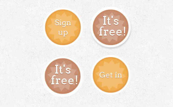
In this example, we will create a round button with an asterisk in it. We will make the star rotate when the cursor is hovering (with a slight impulse) and make additional text appear.
HTML markup
We will have three span tags in our link button. The latter will be hidden text, which is shown when you hover.
<a href="#" class="a-btn"> <span></span> <span>Sign up</span> <span>It's free!</span> </a> CSS
We will play a little with nth-child in this example. Since we have 3 span tags, we will refer to them like this: .a-btn span: nth-child (1), .a-btn span: nth-child (2) and .a-btn span: nth- child (3).
We will make the buttons round and add unusual shadows to them. In order to center the main text vertically, we set the display equal to the table-cell. Stars and hidden text will be positioned absolutely.
.a-btn{ width: 120px; height: 120px; border-radius: 50%; display: block; margin: 20px; float: left; background: #f0ad4e; position: relative; box-shadow: 0px 0px 5px 0px rgba(246, 212, 163, 0.5) inset, 0px -1px 5px 4px rgba(170, 77, 27, 0.2) inset, 0px 0px 0px 7px #fff, 0px 0px 1px 8px rgba(188, 188, 188, 0.4), 0px 0px 0px 9px #fff; transition: all 0.3s linear; } .a-btn span{ display: table-cell; width: 80px; height: 80px; padding: 20px; text-align: center; vertical-align: middle; font-size: 26px; color: #fff; text-shadow: 0px 1px 1px #A03F16; font-family: "Arvo", "Myriad Pro", "Trebuchet MS", sans-serif; transition: all 0.3s linear; } .a-btn span:nth-child(1), .a-btn span:nth-child(3){ position: absolute; top: 0px; left: 0px; font-size: 40px; line-height: 36px; opacity: 0; } .a-btn span:nth-child(1){ background: transparent url(../images/star.png) no-repeat center center; opacity: 0.2; } When you hover, we will change the shadow of the button so that it seems raised. The hidden text will appear, and we will apply the animation to the initial text. We will also apply the rotation animation to the star:
.a-btn:hover{ background: rgba(170, 77, 27, 0.6); box-shadow: 0px 0px 5px 0px rgba(246, 212, 163, 0.5) inset, 0px -1px 5px 4px rgba(170, 77, 27, 0.2) inset, 0px 0px 0px 7px #fff, 1px 4px 5px 8px rgba(188, 188, 188, 0.6), 0px 0px 0px 9px #fff; } .a-btn:hover span:nth-child(3){ opacity: 1; } .a-btn:hover span:nth-child(2){ transform: scale(0); opacity: 0; } .a-btn:hover span:nth-child(1){ animation: rotate 1s linear; } Now we will make the button supposedly pressed when you click on it:
.a-btn:active{ box-shadow: 0px 0px 5px 0px rgba(246, 212, 163, 0.5) inset, 0px -1px 5px 4px rgba(170, 77, 27, 0.2) inset, 0px 0px 0px 7px #fff, 0px -1px 0px 8px rgba(188, 188, 188, 0.3), 0px 0px 0px 10px #fff; } .a-btn:active span:nth-child(2){ color: rgba(170, 77, 27, 0.8); text-shadow: 0px 1px 1px rgba(255, 255, 255, 0.6); } The rotation / ripple animation looks like this:
@-webkit-keyframes rotate{ 0% { transform: scale(1) rotate(0);} 50% { transform: scale(0.5) rotate(180deg);} 100% { transform: scale(1) rotate(360deg);} } Example 7

In the last example, we will create a pseudo 3D button using some cool shadows.
HTML markup
The structure will be the same as in the fifth example.
CSS
The style will also be very similar to example 5, we just change some colors and shadows:
.a-btn{ border-radius: 10px; padding: 10px 30px 10px 70px; position: relative; float:left; display: block; overflow: hidden; margin: 10px; background: linear-gradient(top, #b7f2f4 0%,#7ce7ea 100%); border: 1px solid #90c6c8; border-color: #90c6c8 #78bdc0 #65b6ba; box-shadow: 0px -5px 0px 0px #458a8c, 0 1px 1px #d5d5d5, 0 1px 0 rgba(255,255,255,0.8) inset; transition: all 0.2s linear; } .a-btn-symbol{ font-family: 'WebSymbolsRegular', cursive; color: #437b7d; text-shadow: 0 1px 0 #bef3f5; font-size: 20px; position:absolute; left: 20px; width: 20px; text-align: center; line-height: 32px; transition: all 0.3s ease-in-out; } .a-btn-text{ font-size: 20px; color: #437b7d; text-shadow: 0 1px 0 #bef3f5; line-height: 16px; font-weight: bold; font-family: "Myriad Pro", "Trebuchet MS", sans-serif; display: block; } .a-btn-slide-text{ font-family: Arial, sans-serif; font-size: 10px; letter-spacing: 1px; text-transform: uppercase; color: #555; text-shadow: 0px 1px 1px rgba(255,255,255,0.9); } When you hover, we will increase the button and rotate the small icon:
.a-btn:hover{ transform: scale(1.05); } .a-btn:hover .a-btn-symbol{ opacity: 0.5; transform: rotate(360deg); } When you click on the button, we will make the button smaller and by clicking on it, we will change the shadow:
.a-btn:active{ transform: scale(0.95); box-shadow: 0px 0px 0px 1px #458a8c, 0 1px 1px #d5d5d5, inset 0 1px 0 rgba(255,255,255,0.8), 0px 1px 1px 2px #fff; } That's all! I hope you enjoyed creating some crazy buttons with CSS3 and got inspired for your experiments!
PS Previous articles on CSS3 animations can be found here and here .
Download sample files
Source: https://habr.com/ru/post/132186/
All Articles