Create original hover effects with CSS3

The power of CSS3 is immense and in this tutorial you can see how to use it creatively. We are going to create some effects when hovering the mouse using CSS3 transitions. When you hover over a thumbnail, a description of thumbnails will be displayed, using different styles in each example.
Please note that these examples will only work correctly in modern browsers that support CSS3 properties.
HTML markup
The markup structure is very simple and intuitive. Create a container that will contain an image and any other information, such as a title, description, and so on.
')
Inside the block with the view class, we will insert an element with the mask class, which will be responsible for our CSS3 effects, inside of it we will place the name, description and link to the full image. (For some examples, we will need to add mask as a separate element and wrap the description in a div with the class content.)
<div class="view"> <img src="image.gif" /> <div class="mask"> <h2>Title</h2> <p>Your Text</p> <a href="#" class="info">Read More</a> </div> </div> CSS
After creating the markup, we will create our styles.
We will set general rules for our styles, and then we will add special classes with the desired effects. In the article we will omit CSS prefixes for different browsers, but you can see them in the source code.
.view { width: 300px; height: 200px; margin: 10px; float: left; border: 10px solid #fff; overflow: hidden; position: relative; text-align: center; box-shadow: 1px 1px 2px #e6e6e6; cursor: default; background: #fff url(../images/bgimg.jpg) no-repeat center center } .view .mask, .view .content { width: 300px; height: 200px; position: absolute; overflow: hidden; top: 0; left: 0 } .view img { display: block; position: relative } .view h2 { text-transform: uppercase; color: #fff; text-align: center; position: relative; font-size: 17px; padding: 10px; background: rgba(0, 0, 0, 0.8); margin: 20px 0 0 0 } .view p { font-family: Georgia, serif; font-style: italic; font-size: 12px; position: relative; color: #fff; padding: 10px 20px 20px; text-align: center } .view a.info { display: inline-block; text-decoration: none; padding: 7px 14px; background: #000; color: #fff; text-transform: uppercase; box-shadow: 0 0 1px #000 } .view a.info:hover { box-shadow: 0 0 5px #000 } And now we look at ten effects.
Example 1

Add a special view-first class to the element with the view class for this effect. We will add a special class for each instance of the view element (view-first, view-second, view-third, etc.).
<div class="view view-first"> </div> In the first example, we will use only some basic transitions to create a good effect when you hover the cursor:
.view-first img { transition: all 0.2s linear; } .view-first .mask { opacity: 0; background-color: rgba(219,127,8, 0.7); transition: all 0.4s ease-in-out; } .view-first h2 { transform: translateY(-100px); opacity: 0; transition: all 0.2s ease-in-out; } .view-first p { transform: translateY(100px); opacity: 0; transition: all 0.2s linear; } .view-first a.info{ opacity: 0; transition: all 0.2s ease-in-out; } And now the most interesting in our effect. When we move the cursor over an image, you can use the delay property to simulate a simple animation. The transition-delay we use when hovering can be changed to differ from the normal class. In this example, we did not use any delay in the normal class, but we added a delay to the hover, which will slightly delay the transition effect.
.view-first:hover img { transform: scale(1.1); } .view-first:hover .mask { opacity: 1; } .view-first:hover h2, .view-first:hover p, .view-first:hover a.info { opacity: 1; transform: translateY(0px); } .view-first:hover p { transition-delay: 0.1s; } .view-first:hover a.info { transition-delay: 0.2s; } Example 2

In the second example, we will add a special view-second class, but we will leave the element with the class mask empty and wrap the description in a div with the class content.
<div class="view view-second"> <img src="images/5.jpg" /> <div class="mask"></div> <div class="content"> <h2>Hover Style #2</h2> <p>Some description</p> <a href="#" class="info">Read More</a> </div> </div> Here the mask class will have different attributes, in particular, we are going to apply the transform (translate and rotate) property. The description of the elements will be moved so that we can move them together when hovering:
.view-second img { transition: all 0.2s ease-in; } .view-second .mask { background-color: rgba(115,146,184, 0.7); width: 300px; padding: 60px; height: 300px; opacity: 0; transform: translate(265px, 145px) rotate(45deg); transition: all 0.2s ease-in-out; } .view-second h2 { border-bottom: 1px solid rgba(0, 0, 0, 0.3); background: transparent; margin: 20px 40px 0px 40px; transform: translate(200px, -200px); transition: all 0.2s ease-in-out; } .view-second p { transform: translate(-200px, 200px); transition: all 0.2s ease-in-out; } .view-second a.info { transform: translate(0px, 100px); transition: all 0.2s 0.1s ease-in-out; } For our hover effect, we use a translate transform to move our elements into place. The mask will also rotate. Description elements will move with a slight delay:
.view-second:hover .mask { opacity:1; transform: translate(-80px, -125px) rotate(45deg); } .view-second:hover h2 { transform: translate(0px,0px); transition-delay: 0.3s; } .view-second:hover p { transform: translate(0px,0px); transition-delay: 0.4s; } .view-second:hover a.info { transform: translate(0px,0px); transition-delay: 0.5s; } Example 3

In the third example, we will use the translate and rotate transform:
.view-third img { transition: all 0.2s ease-in; } .view-third .mask { background-color: rgba(0,0,0,0.6); opacity: 0; transform: translate(460px, -100px) rotate(180deg); transition: all 0.2s 0.4s ease-in-out; } .view-third h2{ transform: translateY(-100px); transition: all 0.2s ease-in-out; } .view-third p { transform: translateX(300px) rotate(90deg); transition: all 0.2s ease-in-out; } .view-third a.info { transform: translateY(-200px); transition: all 0.2s ease-in-out; } These are simple instructions that will apply when hovering. Now we will turn the description of the elements, setting the transition-delay, respectively:
.view-third:hover .mask { opacity:1; transition-delay: 0s; transform: translate(0px, 0px); } .view-third:hover h2 { transform: translateY(0px); transition-delay: 0.5s; } .view-third:hover p { transform: translateX(0px) rotate(0deg); transition-delay: 0.4s; } .view-third:hover a.info { transform: translateY(0px); transition-delay: 0.3s; } Example 4

In the fourth example, we will perform a simple image reduction and an increase in our content with rotation, all thanks to a scale transformation. We set the transition-delay to 0.2 for image styles, but when hovering we change it to 0s. This allows you to start the animation immediately when you hover the mouse, but to hold it when the cursor leaves.
.view-fourth img { transition: all 0.4s ease-in-out 0.2s; opacity: 1; } .view-fourth .mask { background-color: rgba(0,0,0,0.8); opacity: 0; transform: scale(0) rotate(-180deg); transition: all 0.4s ease-in; border-radius: 0px; } .view-fourth h2{ opacity: 0; border-bottom: 1px solid rgba(0, 0, 0, 0.3); background: transparent; margin: 20px 40px 0px 40px; transition: all 0.5s ease-in-out; } .view-fourth p { opacity: 0; transition: all 0.5s ease-in-out; } .view-fourth a.info { opacity: 0; transition: all 0.5s ease-in-out; } These are instructions to get this effect - you can do everything with CSS3 :).
.view-fourth:hover .mask { opacity: 1; transform: scale(1) rotate(0deg); transition-delay: 0.2s; } .view-fourth:hover img { transform: scale(0); opacity: 0; transition-delay: 0s; } .view-fourth:hover h2, .view-fourth:hover p, .view-fourth:hover a.info{ opacity: 1; transition-delay: 0.5s; } Example 5

In this fifth example, we will use the translate property along with transition-timing-function ease-in-out to shift the content from the left side.
.view-fifth img { transition: all 0.3s ease-in-out; } .view-fifth .mask { background-color: rgba(146,96,91,0.3); transform: translateX(-300px); opacity: 1; transition: all 0.4s ease-in-out; } .view-fifth h2{ background: rgba(255, 255, 255, 0.5); color: #000; box-shadow: 0px 1px 3px rgba(159, 141, 140, 0.5); } .view-fifth p{ opacity: 0; color: #333; transition: all 0.2s linear; } The hover effect will shift the image to the right and the description will appear on the left side, as if it had moved the image:
.view-fifth:hover .mask { transform: translateX(0px); } .view-fifth:hover img { transform: translateX(300px); transition-delay: 0.1s; } .view-fifth:hover p{ opacity: 1; transition-delay: 0.4s; } Example 6

In this example we will make the description appearing in front, reduce the image to its original size (scale c 10 to 1). The “read more” button will appear below (translate).
.view-sixth img { transition: all 0.4s ease-in-out 0.5s; } .view-sixth .mask{ background-color: rgba(146,96,91,0.5); opacity:0; transition: all 0.3s ease-in 0.4s; } .view-sixth h2{ opacity:0; border-bottom: 1px solid rgba(0, 0, 0, 0.3); background: transparent; margin: 20px 40px 0px 40px; transform: scale(10); transition: all 0.3s ease-in-out 0.1s; } .view-sixth p { opacity:0; transform: scale(10); transition: all 0.3s ease-in-out 0.2s; } .view-sixth a.info { opacity:0; transform: translateY(100px); transition: all 0.3s ease-in-out 0.1s; } The reverse transition will be delayed so that it looks smooth:
.view-sixth:hover .mask { opacity:1; transition-delay: 0s; } .view-sixth:hover img { transition-delay: 0s; } .view-sixth:hover h2 { opacity: 1; transform: scale(1); transition-delay: 0.1s; } .view-sixth:hover p { opacity:1; transform: scale(1); transition-delay: 0.2s; } .view-sixth:hover a.info { opacity:1; transform: translateY(0px); transition-delay: 0.3s; } Example 7
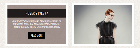
In the seventh example, the idea is to rotate the image in the center and move it into the distance. Then the description will appear, hiding behind a rotating image.
.view-seventh img{ transition: all 0.5s ease-out; opacity: 1; } .view-seventh .mask { background-color: rgba(77,44,35,0.5); transform: rotate(0deg) scale(1); opacity: 0; transition: all 0.3s ease-out; transform: translateY(-200px) rotate(180deg); } .view-seventh h2{ transform: translateY(-200px); transition: all 0.2s ease-in-out; } .view-seventh p { transform: translateY(-200px); transition: all 0.2s ease-in-out; } .view-seventh a.info { transform: translateY(-200px); transition: all 0.2s ease-in-out; } When you hover, we add a delay for the elements with a description. This will allow us to see the rotating image before the description will hide the image. In the reverse transition, everything will disappear immediately, and we will see an image rotating in the opposite direction:
.view-seventh:hover img{ transform: rotate(720deg) scale(0); opacity: 0; } .view-seventh:hover .mask { opacity: 1; transform: translateY(0px) rotate(0deg); transition-delay: 0.4s; } .view-seventh:hover h2 { transform: translateY(0px); transition-delay: 0.7s; } .view-seventh:hover p { transform: translateY(0px); transition-delay: 0.6s; } .view-seventh:hover a.info { transform: translateY(0px); transition-delay: 0.5s; } Example 8

In the eighth example, we will use the animation and recreate the rebound effect. The description will go down below and bounce off the bottom border.
.view-eighth .mask { background-color: rgba(255, 255, 255, 0.7); top: -200px; opacity: 0; transition: all 0.3s ease-out 0.5s; } .view-eighth h2{ transform: translateY(-200px); transition: all 0.2s ease-in-out 0.1s; } .view-eighth p { color: #333; transform: translateY(-200px); transition: all 0.2s ease-in-out 0.2s; } .view-eighth a.info { transform: translateY(-200px); transition: all 0.2s ease-in-out 0.3s; } We will add an animation for the mask element and define some delay settings for the description elements:
.view-eighth:hover .mask { opacity: 1; top: 0px; transition-delay: 0s; animation: bounceY 0.9s linear; } .view-eighth:hover h2 { transform: translateY(0px); transition-delay: 0.4s; } .view-eighth:hover p { transform: translateY(0px); transition-delay: 0.2s; } .view-eighth:hover a.info { transform: translateY(0px); transition-delay: 0s; } To recreate the true rebound effect, we will use translateY, as you can see there are several frames that create this effect:
@keyframes bounceY { 0% { transform: translateY(-205px);} 40% { transform: translateY(-100px);} 65% { transform: translateY(-52px);} 82% { transform: translateY(-25px);} 92% { transform: translateY(-12px);} 55%, 75%, 87%, 97%, 100% { transform: translateY(0px);} } Example 9
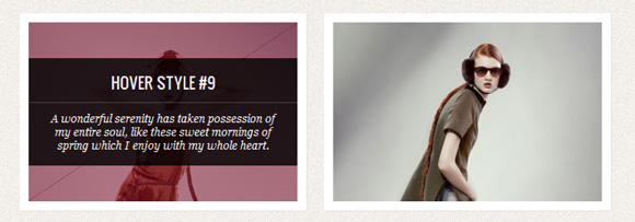
In this example, we will use two elements of the mask to move them from the lower right and upper left corners:
<div class="view view-ninth"> <img src="images/11.jpg" /> <div class="mask mask-1"></div> <div class="mask mask-2"></div> <div class="content"> <h2>Hover Style #9</h2> <p>Some Text</p> <a href="#" class="info">Read More</a> </div> </div> The mask elements will have different translation and transfrom-origin values. We will also indicate that one is aligned on the upper border, and the other on the bottom:
.view-ninth .mask-1,.view-ninth .mask-2{ background-color: rgba(0,0,0,0.5); height: 361px; width: 361px; background: rgba(119,0,36,0.5); opacity: 1; transition: all 0.3s ease-in-out 0.6s; } .view-ninth .mask-1 { left: auto; right: 0px; transform: rotate(56.5deg) translateX(-180px); transform-origin: 100% 0%; } .view-ninth .mask-2 { top: auto; bottom: 0px; transform: rotate(56.5deg) translateX(180px); transform-origin: 0% 100%; } .view-ninth .content{ background: rgba(0,0,0,0.9); height: 0px; opacity: 0.5; width: 361px; overflow: hidden; transform: rotate(-33.5deg) translate(-112px,166px); transform-origin: 0% 100%; transition: all 0.4s ease-in-out 0.3s; } .view-ninth h2{ background: transparent; margin-top: 5px; border-bottom: 1px solid rgba(255,255,255,0.2); } .view-ninth a.info{ display: none; } When hovering, we will make the content appear as if from under the two mask elements:
.view-ninth:hover .content{ height: 120px; width: 300px; opacity: 0.9; top: 40px; transform: rotate(0deg) translate(0px,0px); } .view-ninth:hover .mask-1, .view-ninth:hover .mask-2{ transition-delay: 0s; } .view-ninth:hover .mask-1{ transform: rotate(56.5deg) translateX(1px); } .view-ninth:hover .mask-2 { transform: rotate(56.5deg) translateX(-1px); } We set up the transition-delay for mask elements in such a way that when we hover the cursor, the transition is instantaneous, but when the mouse leaves, the delay will be longer.
Example 10

In the last example, we will enlarge the image and then hide it, bringing the description to the foreground. We can do this using a scale transform and adjusting the level of transparency:
.view-tenth img { transform: scaleY(1); transition: all 0.7s ease-in-out; } .view-tenth .mask { background-color: rgba(255, 231, 179, 0.3); transition: all 0.5s linear; opacity: 0; } .view-tenth h2{ border-bottom: 1px solid rgba(0, 0, 0, 0.3); background: transparent; margin: 20px 40px 0px 40px; transform: scale(0); color: #333; transition: all 0.5s linear; opacity: 0; } .view-tenth p { color: #333; opacity: 0; transform: scale(0); transition: all 0.5s linear; } .view-tenth a.info { opacity: 0; transform: scale(0); transition: all 0.5s linear; } When hovering, we simply scale the image, and why hide it, reducing its transparency to 0:
.view-tenth:hover img { transform: scale(10); opacity: 0; } .view-tenth:hover .mask { opacity: 1; } .view-tenth:hover h2, .view-tenth:hover p, .view-tenth:hover a.info{ transform: scale(1); opacity: 1; } Conclusion
CSS3 has really great potential for creating beautiful effects. Soon, hopefully, we will be able to avoid using JavaScript to create simple effects and rely on 100% on CSS, in all browsers.
I hope you enjoyed these experiments, but first of all I hope that they can inspire you to create your own effects.
Download sample files
PS This article is a logical continuation of the article from Mary Lou.
Source: https://habr.com/ru/post/131848/
All Articles