Zen-mode work with the tree comments
 An article for web designers and usabilityists, whose goal is to make a convenient forum usability with a tree-like structure and complex discussions, to guess and find the structure of their high-complexity forums, to run the forum in an accessible CSS technique. An example of such a forum is given.
For the convenience of working with complex discussions, the topic suggests several CSS-based processing techniques.
1) image of branching nodes;
2) the mode of hiding all the meta-information, except for the name (and the pale avatar with the text of messages);
3) the mode of hiding everything except pale avatars and text (Zen mode);
4) the mode of displaying the root branch of the discussion with meta information (estimates, links);
5) showing one branch with complete metainformation (date, author, answer button).
Switching between them happens only with the help of mouse movement. Depending on the selected position of the mouse, we see the display option we need.
')
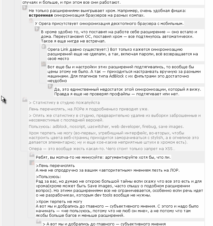
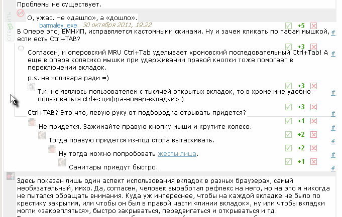
As you know, complex branched comment trees that do not fit on a page require some auxiliary lines for visual tracking of their level and links. When there are no lines, it is inconvenient to look for neighboring respondents deep below. If there are many lines, it is also inconvenient; then a glance may confuse neighboring lines. For example, the invention of this forum (hover points) does not perform the function of tracking one response level.
A method is proposed (and not one) of displaying only the necessary lines only by CSS (v.1-2) using a simple rule: if there are more than 1 branches, a vertical line is drawn connecting the beginning of the comments. As you can see on the working example, there are often not very many vertical lines symbolizing branching nodes, so it becomes convenient to navigate the forum (there is also frequent branching, where the proposed technique will not be enough). For more convenience, the line does not terminate, but ends with a corner at the end of the last node message.
As an example, take the live discussion trees on the forum. They often have difficult trees. We will collect a number of the most interesting and complex examples.
It is most convenient to view the work of displaying complex commentary trees on live comments that are present on Habré - via user style called Zen-Comment for any of the main browsers. Compatibility tested with Firefox (3.6-7), Chrome (13, 15), Opera (11.50), Safari (5.1), IE (8-9) (the eighth in limited mode). For Firefox and Chrome, you need Stylish plugins; for Opera, Safari, IE style is set to settings. For all but FF, you need to copy the contents of the first, large block @ -moz-document domain ("habrahabr.ru") {...} and ignore the small similar block at the end. (Thus, Firefox has several special rules written for it. The rest of the compatibility rules for different browsers are made in the form of several hacks. The system is shaky, but it works and allows you to view the forum in a better way and not even think about which browser to view. )
There is no doubt that someone will not like something. As you know, habits have great power. But, as specialists, we must guess better usability than the traditional one, which succumbs to hundreds of messages. Therefore, the question of the article initially does not consist in “I liked it - I did not like it”, but in the problems of building a well-designed engine, in the ideas of the behavior and location of the visual elements of the forum.
This is what we will see approximately. I will give only 4 examples that correspond to the main modes, because it is better to install once (it will take along with Stylish 10 minutes) than to tell by slides. Or to make a film, as I already did before, presenting a distant ancestor of the current system: ( 8 minutes of screencasts a year ago ).
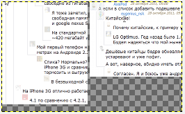
The original "Zen comments" , which removed all unnecessary, except for the names of the authors. The style is observed in this mode, if the mouse is not pointed at a single block of comments. For example, located on the right edge of them.
 |
|---|
Zen mode. Appears when you hover the mouse on a narrow strip of a few pixels on the left. Removed all unnecessary information from the field of view, avatars are muffled and approximately allow to guess repetitive authors.
 |
|---|
Single branch mode. Hovering over the root (20 pixels wide on the left) shows a discussion branch with detailed information, but without dates and names, to view and evaluate.
 |
|---|
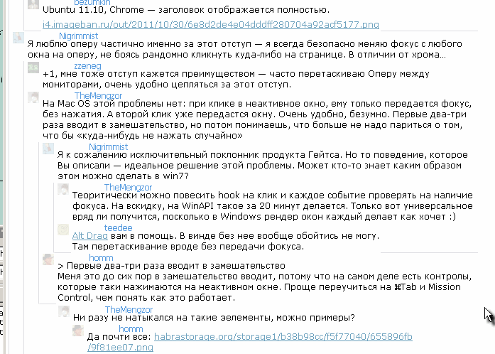
View thread - when you hover on a message, the dates, authors and answer buttons of all predecessor messages are highlighted.
 |
|---|
Now suppose the reader has established a style . After that, you can safely consider almost all the longest discussion, measured in hundreds of posts. If the browser is modern (FF3.6 works, but slowly), and the Internet is fast, then browsing 0.5-3 megabytes of topics is not difficult. Air has been removed from messages (vertical spaces are reduced), and vertical lines help to navigate. Further, only practice and a desire to use are required, after which we will be able to further discuss the usability of the presented mechanism.
We turn to practice and see examples of complex and confusing discussions:
* Why is geek worth switching to Linux (870 comments, new CSS is enough to sort out the nodes, somewhere at the limit of possibilities)
* Update Android versions: sad statistics (250 comments, many branches)
* Node.js - a cancerous tumor (340 com., Good branching and discussion)
* It's not true about computer scientists: what are they writing about us? (200 comms, 400 K texts)
* Hacking a Vogue magazine or a video player for 119 rubles (900 comm., Few branches) - a good illustration of the help of added CSS from user styles - as long as there are no more than 3 nodes on a branch and no more than several screens last, everything is perfectly tracked by vertical stripes .
* Even more modern C ++ (160 comments, there is a well-branched and deeply nested branch)
* The source codes of 3300 global Internet projects were received (900 comments, the most highly appreciated topic, text - 1.5 MBytes)
* The attack on the free Internet in Ukraine: the Law of Ukraine "On the protection of public morality" (4 branches, 200 com., Decent branching)
* Signs of a bad programmer (250 comments, few branches, 5-6 branches)
Examples of seemingly numerous discussions, but with a small number of branches:
* How I built the first analog client for twitter (150 comments, there are branches, but simple ones)
* Broadcast from Let's Talk iPhone (a lot of photos, all traffic - 6 MB; branching is relatively small; 430 com.)
Finally, the trees are too complicated even for the crutches made on CSS:
* What do you lack for a full transition from windows to linux? (1400 com., 2.5 MB of one text), but with them it is better than without them.
* A criminal case will be opened against an anonymous user Habrahabr (900 comments, also difficult to read, even in improved CSS)
* Why do you use Linux? (700 com., At the beginning - it’s quite difficult to follow the nodes, because flipping through to the next light - 12-15 screens.)
The development of styles is not at all finished - it has reached a certain working point, when they can be the subject of discussion and useful. There are a number of plans for improvements. If there are constructive proposals for development or there is an ambitious usability project, where the development of the frontend is needed, it will be possible to think about development.
Source: https://habr.com/ru/post/131642/
All Articles