Ice Cream Sandwich Day
The other day on xda-developers, the Android 4.0 build appeared - Ice Cream Sandwich. After reviewing the comments, I realized that the build was fairly stable with some exceptions, but there was one thing - on my Nexus One it isn’t there yet, but at the same time the news ran through that it’s not worth waiting for the first Google phone. I thought about what to do for about an hour, then got into the car and drove behind the Nexus S, but the story is not about that, but about how I actively used ICS all day today.
Attention under the cut a lot of beautiful pictures (really a lot)
So let's go! You can download the build from this link - http://forum.xda-developers.com/showthread.php?t=1313337
I start the device and go through the procedure for linking the phone to a Google account (there is little changed except for the interface, perhaps)
')
It's all the same as before. We move in one direction - unlocking - in another camera (there used to be a quiet mode)
First screen
Second screen
What immediately catches the eye. First, there are four shortcuts to applications below. They can be customized (they act like regular 1x4 cells on the desktop, only they are visible on all tables)
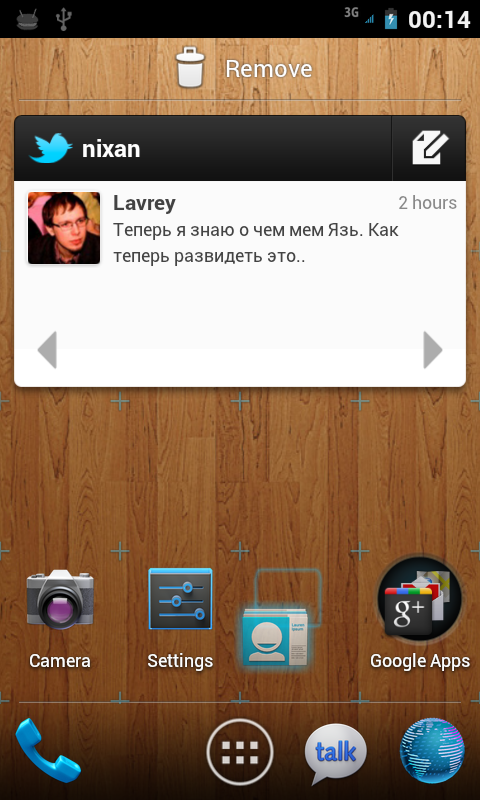
I drag the icon.
Holders of tablets with Honeycomb noticed, perhaps, the changes from the tablet version that had already migrated here: hints on how much one or another element would take up space on the desktop and scalable widgets (on the second screen, GMail widget).
Improved work with folders on the desktop. Now it is enough to drag one icon to another and they will end up in one folder, which can then be renamed (Google Apps on the first desktop). Made a la iOS.
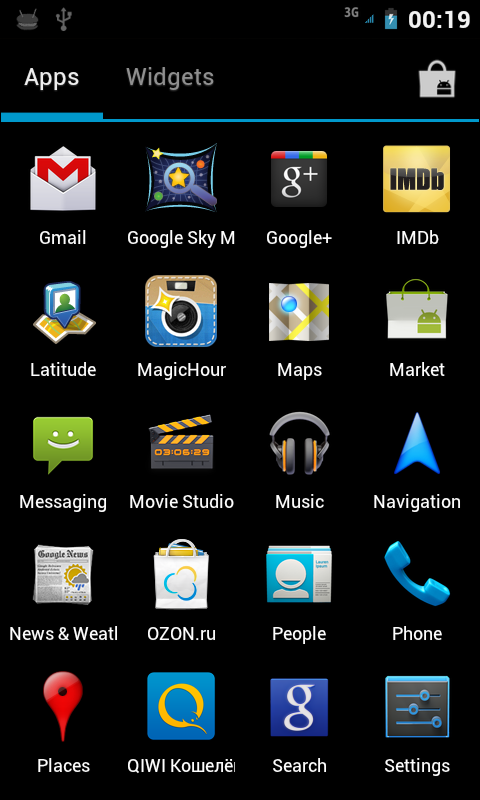
Compared with the default launcher, Gigngerbread has changed dramatically:
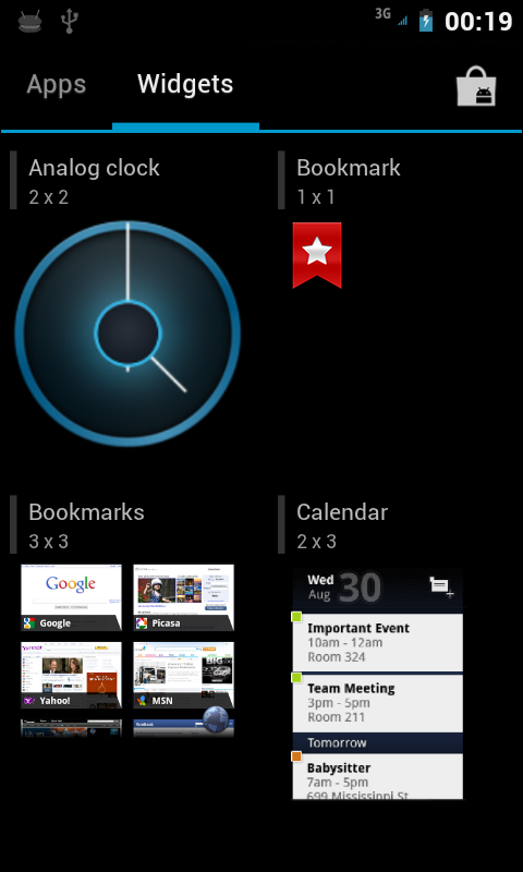
Scrolling between applications is now done by swiping left or right. The Market icon is at the top (on non-Google enabled phones, there is certainly no such icon). But it was all at Honeycomb. In our case, the widgets were managed in a separate tab. You can choose the necessary all the same gestures. You can add elements to the desktop as before - long tap - the desired desktop opens on a slightly reduced scale (in order to make it easier to drag the selected icon or widget to the neighboring desktop) - select a place and release.
A couple of screenshots:
Icons have become larger - in general it looks more careful than it was.
These two things smashed into two different applications - in my opinion it turned out perfectly. Judge for yourself.
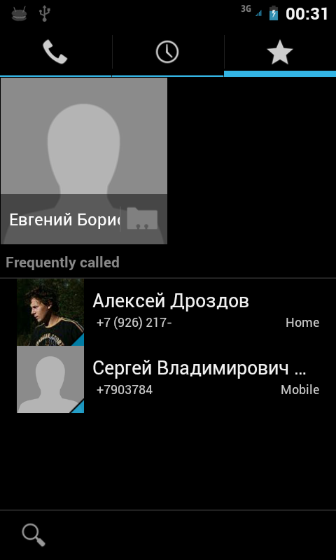
The phone is now divided into three tabs - dialers, recent calls and favorites.
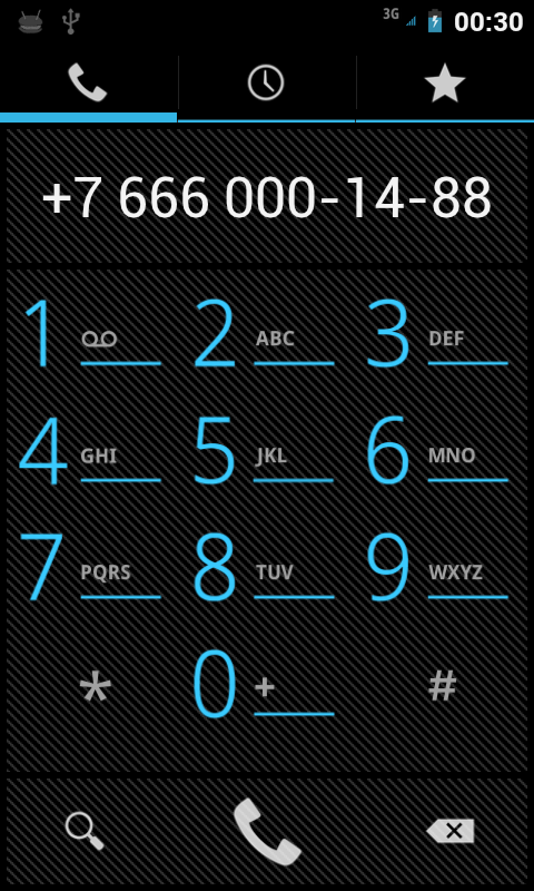
The system has finally learned how to format phone numbers! Hurray comrades)
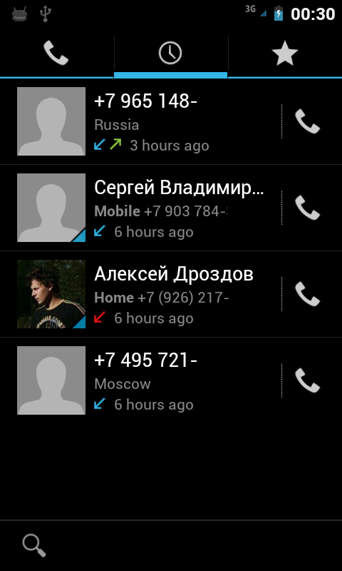
Attention to the line under the phone number: the first and last numbers were not in the notebook, so the google phone showed me where the call came from)
Selected - nothing special, unfortunately the photos are far from the entire notebook, it would look much better with them.
By and large, what was higher is the old version of a dialer without one tab - a notebook. As I said earlier, it is now in a separate application.
The address book now looks like this:

This is how each contact looks like in detail.
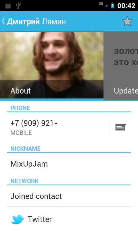
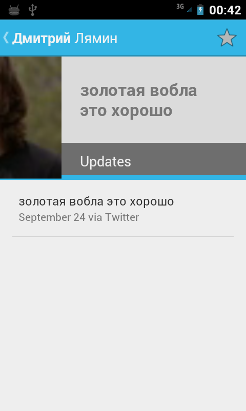
And this is how the social network accounts linked to it are - in this case, twitter.
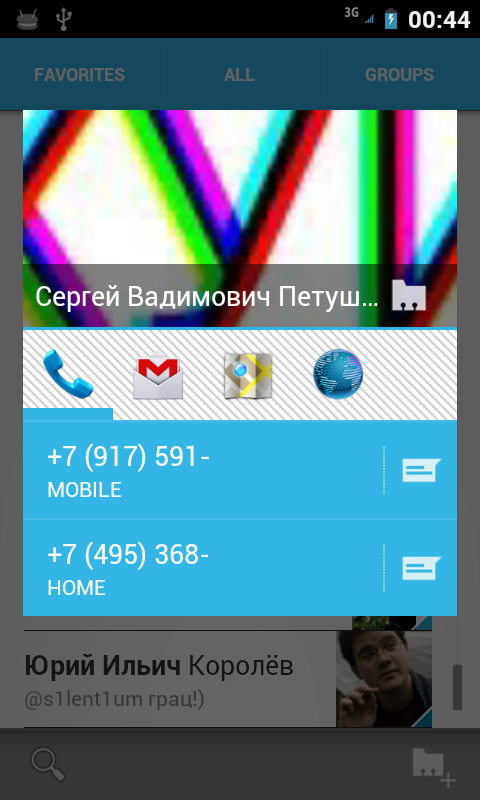
And here is a quick contact - on the tabs you can go with the usual swipe.
Transformed very weakly.
The changes are mostly cosmetic.


It seemed to me that the render was faster.
For those who are going to put a warning about the broken Russian locale.
For those who are not going to or can not do this, ask questions in the comments - I will try to quickly answer or show something.
PS
Face Unlock and panoramas do not work.
Attention under the cut a lot of beautiful pictures (really a lot)
So let's go! You can download the build from this link - http://forum.xda-developers.com/showthread.php?t=1313337
I start the device and go through the procedure for linking the phone to a Google account (there is little changed except for the interface, perhaps)
')
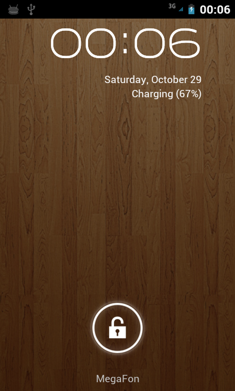
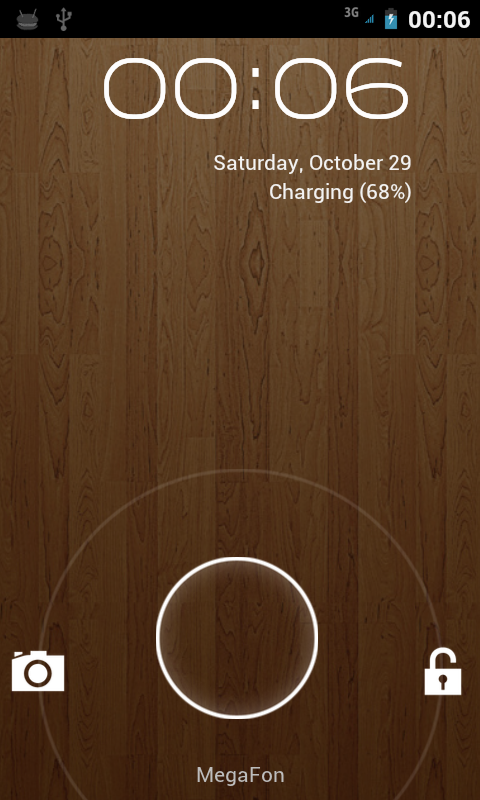
Unlock screen
It's all the same as before. We move in one direction - unlocking - in another camera (there used to be a quiet mode)
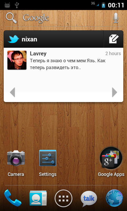
Desktop
First screen
Second screen
What immediately catches the eye. First, there are four shortcuts to applications below. They can be customized (they act like regular 1x4 cells on the desktop, only they are visible on all tables)
I drag the icon.
Holders of tablets with Honeycomb noticed, perhaps, the changes from the tablet version that had already migrated here: hints on how much one or another element would take up space on the desktop and scalable widgets (on the second screen, GMail widget).
Improved work with folders on the desktop. Now it is enough to drag one icon to another and they will end up in one folder, which can then be renamed (Google Apps on the first desktop). Made a la iOS.
Launcher
Compared with the default launcher, Gigngerbread has changed dramatically:
Scrolling between applications is now done by swiping left or right. The Market icon is at the top (on non-Google enabled phones, there is certainly no such icon). But it was all at Honeycomb. In our case, the widgets were managed in a separate tab. You can choose the necessary all the same gestures. You can add elements to the desktop as before - long tap - the desired desktop opens on a slightly reduced scale (in order to make it easier to drag the selected icon or widget to the neighboring desktop) - select a place and release.
A couple of screenshots:
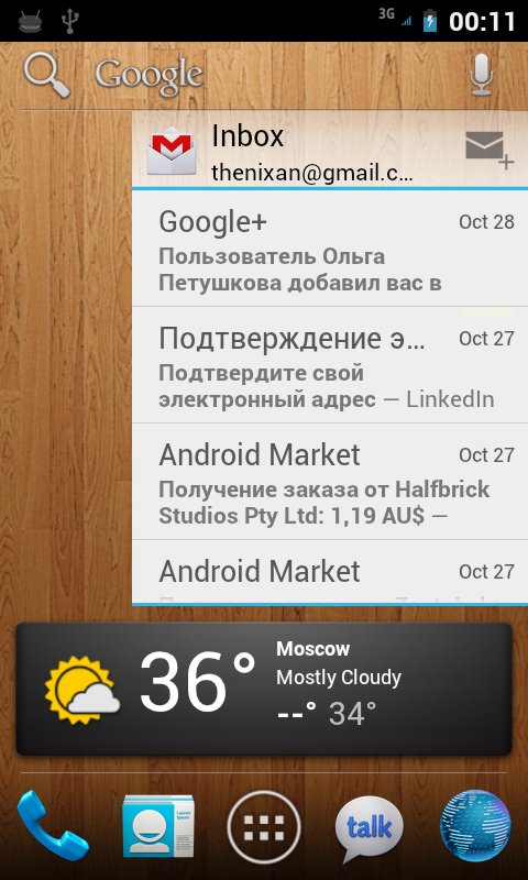
Notifications
Icons have become larger - in general it looks more careful than it was.
Contacts and phone
These two things smashed into two different applications - in my opinion it turned out perfectly. Judge for yourself.
The phone is now divided into three tabs - dialers, recent calls and favorites.
The system has finally learned how to format phone numbers! Hurray comrades)
Attention to the line under the phone number: the first and last numbers were not in the notebook, so the google phone showed me where the call came from)
Selected - nothing special, unfortunately the photos are far from the entire notebook, it would look much better with them.
By and large, what was higher is the old version of a dialer without one tab - a notebook. As I said earlier, it is now in a separate application.
The address book now looks like this:
This is how each contact looks like in detail.
And this is how the social network accounts linked to it are - in this case, twitter.
And here is a quick contact - on the tabs you can go with the usual swipe.
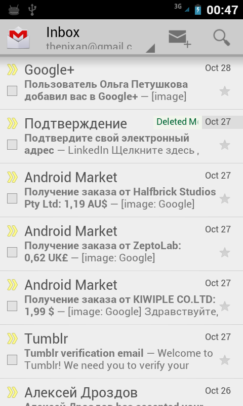
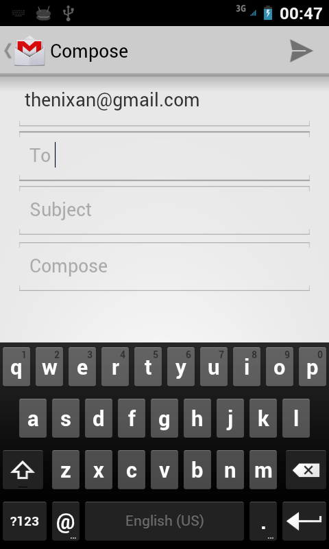
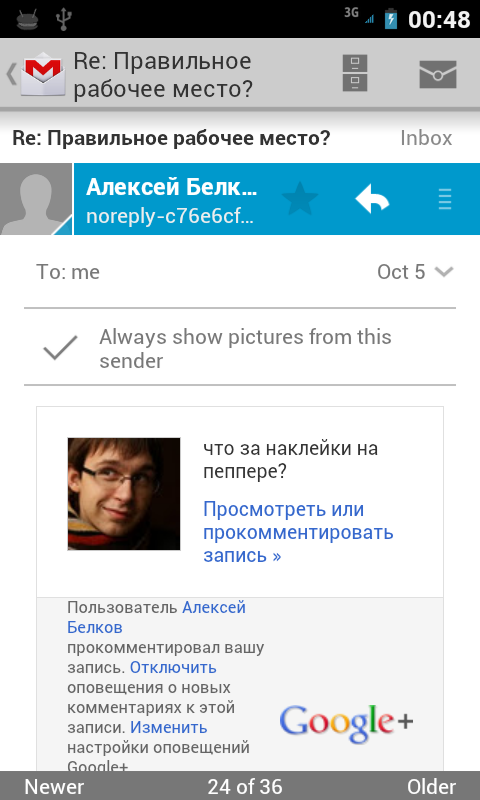
GMail
Transformed very weakly.
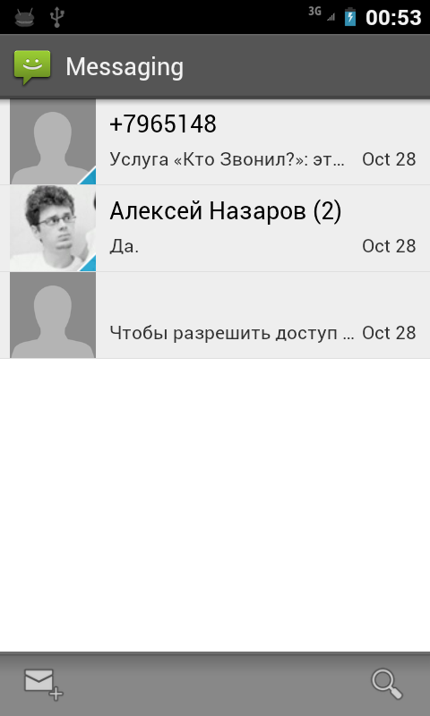
SMS and MMS
The changes are mostly cosmetic.
Browser
It seemed to me that the render was faster.
For those who are going to put a warning about the broken Russian locale.
For those who are not going to or can not do this, ask questions in the comments - I will try to quickly answer or show something.
PS
Face Unlock and panoramas do not work.
Source: https://habr.com/ru/post/131459/
All Articles