SITH - CSS3 technology for smooth image change
Good day, Habr!
I would like to tell you how I achieved a smooth change of the colors of the icons when you hover over them. A similar problem is often found on Facebook. If the icon is a blue silhouette on a white background, then when you hover the cursor, both colors change places, and this happens instantly and looks a bit sharp. My aesthetic feelings were hurt, and I developed my solution.
Not having encountered anything of the kind on the Internet, I took the responsibility to call this method SITH (Soft Image Transition on: Hover) - a smooth transition of the image when hovering.
')

Under Habrakat you will find a full description of the technology, the entire code, several screenshots and a link to the demo version.
Nobody, in general, prohibits the use of different values of transparency.

But this approach will not allow us to smoothly change the colors in the two images below.

My method is based on the fact that one image is above the other, and they smoothly change their transparency to opposite values. If at the moment the transition is not made, added using the transition property from CSS3, then one of the images is always visible to the user.
HTML code:
CSS:
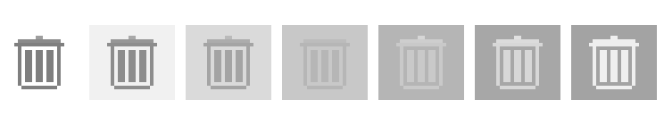
The following picture shows the process itself.
A working example can be tried here.
I would like to tell you how I achieved a smooth change of the colors of the icons when you hover over them. A similar problem is often found on Facebook. If the icon is a blue silhouette on a white background, then when you hover the cursor, both colors change places, and this happens instantly and looks a bit sharp. My aesthetic feelings were hurt, and I developed my solution.
Not having encountered anything of the kind on the Internet, I took the responsibility to call this method SITH (Soft Image Transition on: Hover) - a smooth transition of the image when hovering.
')
Under Habrakat you will find a full description of the technology, the entire code, several screenshots and a link to the demo version.
Nobody, in general, prohibits the use of different values of transparency.
But this approach will not allow us to smoothly change the colors in the two images below.
My method is based on the fact that one image is above the other, and they smoothly change their transparency to opposite values. If at the moment the transition is not made, added using the transition property from CSS3, then one of the images is always visible to the user.
HTML code:
<div class="trash"><b></b></div> CSS:
.trash, .trash b {
display: block;
width: 24px;
height: 21px;
background: url(/demo/img/trash-sprite.png) no-repeat 0px -21px;
cursor: pointer;
-webkit-transition: .5s opacity;
-moz-transition: .5s opacity;
-ms-transition: .5s opacity;
-o-transition: .5s opacity;
transition: .5s opacity;
}
.trash {
position: relative;
background-position: 0px 0px;
}
.trash b {
position: absolute;
top: 0;
left: 0;
opacity: 0;
}
.trash:hover b {
opacity: 1;
}
The following picture shows the process itself.
A working example can be tried here.
Source: https://habr.com/ru/post/131299/
All Articles