Sailing HTML5. How new technologies are changing the modern web
The article follows my report at the User Experience `11 concert.

Today, about HTML5, their number of those who are somehow connected with web development, have not heard just lazy. You won’t lose much, assuming that at every fashion conference, where there is something about the web, almost certainly, something sounds about HTML5. Virtually every large web-related company, be it Google, Apple, Microsoft, Amazon, Adobe, Oracle, Facebook, Yandex, Mail.ru ... says something about HTML5, signs for love for centuries and commitment to promoting and developing HTML5. Yeah! (Opera and Mozilla are also definitely on this list.)
This universal desire can only please. Of course, as long as market participants do not begin to pull the blanket over themselves, they all sit down at the table and agree.
')
Huge prospects, a new wave of web development, a new generation of web applications! Cool.
I will not tell you what HTML5 is . In the context of the article, it is important to clearly understand one thing: there are two understandings of HTML5.
The first is the HTML5 standard , a document that lies on the W3C website, which describes all the new tags, attributes, new APIs, and a number of related documents that have some additional details, such as the Canvas API.
The second is “big,” marketing, trending HTML5, an umbrella for a whole generation of new technologies, including both the HTML5 specification itself, and many CSS3 modules, various APIs for JavaScript, and the new standard for JavaScript itself - ECMAScript5.
As a rule, it is clear from the context what is being discussed and there is no big confusion. Marketing HTML5 is a well-established concept, supported by all market participants. But it’s important every time to be aware of what exactly this is about, as often some people (we won’t show a finger) allow HTML5 to talk about many interesting things, to the web standards and the W3C’s relations that don’t have supporting the general spirit of web development. It is also important to understand what is behind each technology, where it is an early prototype, and where there is already an established and agreed specification.
My story will be devoted more to the “big” HTML5, but I will try to refer to the specific standards that will be discussed.

To better understand where the modern web is heading, the first thing you need to pay attention to is the characteristic transformations that have occurred in the IT industry in general and the web industry in particular. The world that we are seeing today is markedly different from what it was some 5-10 years ago (let me remind you that HTML 4.01 was approved more than 11 years ago).
Among these changes it is necessary to note the following:
All this is evidently embodied in certain web standards, so today we have a really new and ever-growing generation of technologies (just recently Adobe at its conference Adobe MAX presented a proposal for a new standard and a variant of its implementation - filters and shaders for CSS):
It is also important to understand that there is a close interweaving between all these innovations in devices, software, services, standards and various development practices - and what we are seeing now in the field of web development and web standards will certainly be reflected in various Software that implements and supports these standards (from development tools to browsers and OS), and at the hardware level (perhaps even Google’s dream will come true and hardware support for webm will appear in key devices).
Now let's talk about how the modern web actually changes and what technologies and practices are behind it.

I tried to highlight a few key trends that describe the essence of these transformations. It so happened that all of them can pick up the characteristic word with the letter “A” (English), and the order of their use in the process of developing and understanding web sites or web applications, in general, coincides with the alphabetical one. :)
The more AAAAA you have, the better. The smaller, the more dull. Aaaaaaah! - OK. Aaauuuuuuuu - bad.
It will be good if you are considering your next project or analyzing the current one, you look at it through the prism of these "A".
The first A is Accessible. The site must be accessible. Of course, this includes accessibility issues for people with disabilities (Accessebility), but not only. The site should be accessible to all Internet users and this also includes search engines and any programs whose task is to extract the meaning of your documents.
This is the place and time to remember about semantic markup and the right balance between markup, styles and logic in JavaScript. Today, the reality is that not just everything that relates to the content presentation part is taken out of the markup, but also some of the things from JS are put in a declarative description on CSS.
From the point of view of semantics, many new tags have appeared in HTML5 for both structural markup and markup for content itself:

Part of the existing tags in HTML5 acquires a new meaning. So, if earlier the choice between i and em (similar to b and strong ) was more often in favor of shorter writing, today these are tags with different semantic meaning, even if by default they have the same presentation in italic or bold.
See also HTML5 article . Semantics or markup with meaning .
In general, the more semantic markup, and the less garbage in it, the easier (automatically) to understand where what information is located.
Another part of the innovations is directly related to the issues of accessibility: here, first of all, we are talking about aria- and role-attributes, which allow to mark the purpose and role of content. This information can later be used, for example, by screen readers (screen reader). It must be said that ensuring accessibility is not the most trivial task, and in HTML5 almost the first time so much attention was paid to this issue.
Another side of accessibility is the issue of convenience of interaction with content and, in particular, the speed of input. HTML5 introduces new features for web forms that allow you to specify additional attributes that specify the type of input values, ranges, and other parameters. So, if you can enter only a phone in the field, the user's browser, for example, on a mobile or tablet device can tune the keyboard for digital input.
Finally, a topic that I also cannot but mention in this block is HMTL Microdata . Microdata is a development of microformats ideas and offers data annotation rules in accordance with one or another scheme:
See examples of schemes on the website http://schema.org/ - templates collected here are supported by Bing, Google and Yahoo!
From the point of view of balance in the code between the layout, styles and logic, as I said, there are two interesting trends here. The first, obvious, is the repression of all style elements from HTML5, the general undesirability of using inline-styles, including in terms of performance.

I think it is unnecessary to remind of tabular and block layout, but today we are getting closer to semantic layout.
The second trend is the empowerment of CSS and the emergence of the possibility of a declarative description of various effects, animations and transformations through the appropriate rules instead of JavaScript code.

Manifestations of both trends we will see again and again;)
The second A is Adaptive. The site must be adaptive to the surrounding conditions, adapt to the external environment. It must be said here that adaptability is not something much additional in relation to the accessibility of the site, it is rather expansion and development, because adaptability should grow out of accessibility ideas.
Adapting to different screen resolutions, different form factors, different font sizes, different display devices and other parameters means being available in all these scenarios.
In principle, adaptation is based not only on specific standards, but also on various techniques and approaches that can be used in the process of website design and development, as well as their various combinations. In this context, I want to mention two important terms that you should definitely look towards: Responsive Design (see the article Responsive Web Design by Ethan Marcotte) and Progressive Enhancement (see the article Progressive Enhancement ) .
The first is how to adapt to different screen resolutions and form factors. The second is how to move from simpler scenarios to more advanced ones (for example, from old browsers to modern ones) while working on your site.
Somewhere it is a matter of applying certain standards or certain techniques, for example, in order to give different images to the client in different conditions (small on small devices and large on large). Somewhere it is a question of the development of the functional as relevant opportunities appear.
You can imagine a large scheme of different scenarios, where horizontally there will be all sorts of screen resolutions (and associated form factors), and vertically there will be a movement from less advanced browsers to more modern ones. Responsive Design and Progressive Enhancement are ways of navigating (and thinking) to move up and down, left and right.
Let's look at a few specific technologies and web standards.
The first task that you all face is the adaptation of the site for different screen resolutions. The problem here is that there are many of them, they are different and new ones constantly appear. I think everyone involved in web development (or design) not the first year, remember all this talk about whether it’s time or not to switch from a minimum size of 800x600px to a larger 1024x768px, studying statistics and trends in the size of the screen for the average user.
Generally speaking, today this question, and the very posing of such a question is no longer relevant. Do you know why? Because instead of gradually coming to larger and larger screen sizes, in fact we have come to an ever increasing variety of screen sizes, and both ways to small mobile devices like 480x800px and more in modern monitors - 1920x1080px and more.
And in this whole range, a modern browser can work on the end device - be it IE engine (from Windows Phone to Windows desktop) or one of webkit-based engines (from iPhone and iPad to MacOS X and Windows desktop), and there may be various engines, including a huge zoo of java-browsers in various mobile devices.
In certain ranges, a rubber layout can be used, but it is not omnipotent and limited in its application. And in such a variety, additional tools are needed for adaptation. Generally...
If you limit yourself to modern engines for a few minutes, you will find that they all support a special technology called Media Queries (this is one of the CSS3 modules).
CSS3 Media Queries expands on traditional Media Types, available in HTML 4.01 and CSS 2.1, and allows for more targeted definition of CSS rules depending on various playback context settings, such as screen sizes, device orientation, color depth, monochrome or color printing, and more. P.

The idea behind Media Queries is that you can determine how to post content, what content to show, and what not, depending on the value of all these parameters. If the screen is small, then you need to rearrange all the elements so that they fit reasonably into a small screen, if large, somewhere you can more optimally take the available space, and somewhere more and show more. You can independently see how this all works in the examples collected at http://mediaqueri.es
Using Media Queries, by the way, is strongly tied to the fact that you really separate content markup from its presentation. Therefore, accessibility (and semantic) is at the forefront. The advantage is that you make one website for different devices. Devices that don't know Media Queries will ignore your rules.
Usually, in simple scenarios, only CSS 2.1 and the Media Queries module are sufficient, but in cases of complex layout, additional tools are needed to make something worthwhile and effective.
You will surely like many other CSS3 modules that blend in well with the ideas of Media Queries.
Look towards CSS3 Exclusions and Shapes (formerly Positioned Floats), which allows you to customize the positioning of individual elements relative to the flowing content, and the behavior of the content in turn can be determined by other parameters, including screen sizes and placement modes:
In the example above, CSS3 Exclusions is used in combination with multi-column layout and layout using a grid.
The latter must be said separately. Placing blocks on the grid is a huge headache for all layout designers. Once it was a tabular layout, then it became unfashionable and almost everyone recognized this approach as wrong. They began to use block layout with multi-storey css-rules, if it was necessary to do something more complicated than layout in two or three columns.
Among the new CSS3 modules there is a module dedicated to this particular task, CSS3 Grid Layout . Grid allows you to build elements on a virtual grid. This is quite a powerful tool - imagine that you can simply use different grids for your blocks at different screen extensions! Soon you can;)
Another interesting module is CSS3 Flexible Box , which allows your blocks to fill the space allocated for them according to your wishes, be it free space filling or space allocation between blocks in a given proportion. Today, many such tasks are solved with the help of various tricks in the layout and style rules, tomorrow it will be enough to indicate what exactly is required (see also the article CSS3 Flexible Box Layout Explained by Richard Shepherd).
In general, using technologies that are available today or in the near future, you can quite easily make decisions that will adapt to different conditions. Being technologically one solution, your site in different conditions may be rearranged in different ways, showing the most optimal face in each case.
Now let's go back to the Progressive Enhancement.
Briefly, the idea of Progressive Enhancement can be formulated (or reversed) as a gradual improvement: you make basic functionality that works in all browsers, and further improve it, moving from old versions to new ones, without disrupting performance, but adding additional advantages for users of modern solutions.
Ultimately, this means that all users of your site will receive a guaranteed minimum of functionality, but at the same time, for those who prefer more recent solutions, and the site will be, for example, more beautiful.
Yes, if you still live with the thought that the site should look the same everywhere, it's time to roll it up and throw it into the nearest ballot box. Looking the same everywhere is an impermissible waste of energy and in modern conditions of a wide variety of devices looks more like an evolutionary miscalculation (translating into money: users will prefer those who can adapt) rather than riding engineering.
How it works? Very simple.
Thinking of using something from the CSS3 Borders & Backgrounds arsenal? Make square corners for those who do not support round, and round for those who support them. There is nothing to fence around the construction of wrappers and crawl here with your scotch. Make a solid background for old browsers and gradient for modern ones. If you can do with a single background image in IE6-8, leave the use of multiple backgrounds for IE9 +.
Make the basic functionality and add new features to it on top, but without many crutches. Users will be happy when going to a new modern browser, they really feel the difference on your site.
To think about Progressive Enhancement can be in the spirit of the analogy with television. We have come a long way from black and white to color and further high-precision video. And (while we are talking about analog technology), old TVs can still show modern programs, but in black and white. Viewers know that the picture will be better in modern TV. However, the transmitted signal does not depend on the TV.

The third A is Agile. The world is complex and sometimes it is not enough to be simply accessible and adaptive for some different, but common parameters. The site must be flexible and must be flexible technological decisions.
In fact, I must admit, it was quite difficult for me to refrain from using the word “flexible” earlier in this article, but it was worth it — and here's why.
If site adaptation is based on its availability, then flexibility, in turn, is based on adaptation and also expands accessibility. While this may seem like a play on words, there is a certain difference between adaptability and flexibility.
Adaptation is usually limited and involves a change in appearance or behavior in response to a range of environmental changes. For example, our eye adapts to a different level of illumination or distance to the subject in question. The behavior of many living creatures adapts to changes in temperature. So the site adapts to specific screen sizes or browser capabilities.
Flexibility manifests itself at critical points, when gradual adaptation is impossible, more meaningless, or the range of changes made is such that the distance between two extreme points becomes too large, and the path between them breaks into separate scenarios. As a rule, flexibility is characterized by going beyond and changing the technological platform.
Flexibility is not something new and many of you are familiar with it from practice, I will talk about a few of these scenarios a bit later. Now let's go back to the present and recent past. Modern mobile browsers do quite well with ordinary websites, allowing you to interact with them using scaling. Adaptation, discussed earlier, allows you to improve this scenario, adjusting the appearance, but it is still the same site. The solution that is used today in practice more often is completely different - this is a separate mobile version of the site.
You can look at it differently, but one of the points of view is the technological flexibility of the decisions made. If the platforms and the specific functionality required on each of them are very different, the adaptive scenarios experience too much stress and it's time to break them. And this is nothing bad.
In fact, flexibility is what happens with adaptation in the limit. Technological flexibility is the adaptation of thinking, the goal of which is the effective solution of the problem. This, in particular, can lead both to the search for compromises in the technologies used and to the emergence of scenarios that are not fully cross-platform.
For example, the famous game Angry Birds, made on HTML5, uses Adobe Flash to play music and audio effects. This may seem strange, however, it is a normal, flexible technological solution that allows the use of those technologies that are available and work quite effectively in a wide range of browsers. In this case, the developers encountered a number of problems in playing audio through the HTML5 audio element (by the way, it was not Internet Explorer, but another popular browser;) and used a flash to solve the problem. This is an example of a flexible combination of technology without involving religious feelings.
Another typical example is Amazon's Kindle Cloud Reader. This is a browser-based application that allows you to read books directly through the browser, and it works even in offline mode. This wonderful moment we will look at later. What we are interested in now is technological flexibility.
I don’t know all the business details of Amazon’s motivation, but ultimately, the Kindle Cloud Reader clearly shows the company's desire to directly interact with end-users through a browser, bypassing application stores. If you look at the primary target audience - these are users of iPad and tablets on Android.
The next moment, thinking about a technological solution, you will find that you need technology for local storage, which allows you to save files on the user's device for further reading. Here begins a bust of technology, which rather quickly stops at the fact that both platforms integrate a browser - and although the browsers are different, both are based on the Webkit engine.
Webkit supports WebSQL Database technology, which allows you to do exactly what you need: store data in your local storage. At this point, if you are familiar with the new web standards, you should have something to click. In fact, on the W3C website in red letters in a frame and additionally white on a black background with yellow circles (see above) says that the development of technology has stopped. In reality, today W3C and browser developers are looking towards an alternative technology - IndexedDB (and Local Storage for relatively simple scenarios).
All this did not prevent the developers from Amazon from using the technology available at the time of development, despite the uncertainty of its future status and limited support in other browsers.
It is flexibility in technology and, in some ways, even courage in making a decision to first of all make a product for key audiences and not try to get out of their way to make a decision that will work for all-all-all potential users. Flexibility recognizes tradeoffs.
Finally, another example of flexibility. In IE9, it became possible to pin a website to the taskbar with additional functionality - in addition to the application icon or website, this context menu (static and dynamic), application management via buttons in the preview window and notification for users.
Although this technology is only available in IE, it allows you to extend the functionality of the site, make it more accessible and adapt to additional features. This is a flexible user UX extension in conjunction with the site.
Flexibility is not a question of technological cleanliness (this question remains always topical, although sometimes it is necessary to make compromises), it is a question of using existing possibilities and efficiency of solving the tasks at hand.
Often (and the farther, the more) we find ourselves in a situation where new technologies appear that we strongly want to use, but, looking back at the existing ecosystem of browsers, we have to pull ourselves and stop. Flexibility looks in the direction of Graceful Degradation ideas, allowing you to use modern solutions where possible, and seeking to provide alternative scenarios where it is impossible.
These are the so-called fallback scripts, when, for example, in old browsers, a specific unsupported (usually, not because browsers are bad, but because they are old) mechanism is implemented through other available technologies:
In some cases, the emerging difference between the current level and what is in old browsers is filled with the help of the so-called Polyfills (see the article What is a Polyfill? By Remy Sharp).
And sometimes you just need to have the courage to cut off part of the browser ecosystem, however, not forgetting respect for their users. This is really important.
And, of course, don't forget about using the Feature Detection approach and the Modernizr library.

The fourth A is Async. The site must understand the asynchrony of our world and its web part in particular. , — - , , , , .
, , . , , , .
, :
, , , .
, , ? : . : , . Application Cache HTML5 , .
, ? , , , timeout? , , ? ( ) . : - . AJAX , Web Sockets , .
, - , , , , File API? UI, . Web Workers Web Messaging, JavaScript .
, , . .

, A — Attractive. . , , , . , .
, , , - ( , ). .
— . - ( ) — , . , .
HTML5 — Canvas SVG, HTML5 Audio Video, CSS, , , .
, , , HTML5 Canvas. , , . !
Never Mind the Bullets . , CSS3 , . .
, Bing, , Bing - HTML5 Video ( , USA).
, .

. 5A — , . . , , , -.
, , -, , , , .
5A. , !
:
, IE .
What is HTML5?
Today, about HTML5, their number of those who are somehow connected with web development, have not heard just lazy. You won’t lose much, assuming that at every fashion conference, where there is something about the web, almost certainly, something sounds about HTML5. Virtually every large web-related company, be it Google, Apple, Microsoft, Amazon, Adobe, Oracle, Facebook, Yandex, Mail.ru ... says something about HTML5, signs for love for centuries and commitment to promoting and developing HTML5. Yeah! (Opera and Mozilla are also definitely on this list.)
This universal desire can only please. Of course, as long as market participants do not begin to pull the blanket over themselves, they all sit down at the table and agree.
')
Huge prospects, a new wave of web development, a new generation of web applications! Cool.
I will not tell you what HTML5 is . In the context of the article, it is important to clearly understand one thing: there are two understandings of HTML5.
The first is the HTML5 standard , a document that lies on the W3C website, which describes all the new tags, attributes, new APIs, and a number of related documents that have some additional details, such as the Canvas API.
The second is “big,” marketing, trending HTML5, an umbrella for a whole generation of new technologies, including both the HTML5 specification itself, and many CSS3 modules, various APIs for JavaScript, and the new standard for JavaScript itself - ECMAScript5.
As a rule, it is clear from the context what is being discussed and there is no big confusion. Marketing HTML5 is a well-established concept, supported by all market participants. But it’s important every time to be aware of what exactly this is about, as often some people (we won’t show a finger) allow HTML5 to talk about many interesting things, to the web standards and the W3C’s relations that don’t have supporting the general spirit of web development. It is also important to understand what is behind each technology, where it is an early prototype, and where there is already an established and agreed specification.
My story will be devoted more to the “big” HTML5, but I will try to refer to the specific standards that will be discussed.
Revolutions for "HTML5" and in "HTML5"
To better understand where the modern web is heading, the first thing you need to pay attention to is the characteristic transformations that have occurred in the IT industry in general and the web industry in particular. The world that we are seeing today is markedly different from what it was some 5-10 years ago (let me remind you that HTML 4.01 was approved more than 11 years ago).
Among these changes it is necessary to note the following:
- New iron . Graphic chipsets, multi-core processors and various sensors that penetrate completely different devices, up to mobile phones, as well as a great desire for energy efficiency (why not to recall ARM and Intel Atom). Plus a huge variety of form factors: from mobile devices, tablets, tablets, netbooks and laptops to desktops and televisions. And everywhere you want to have access to the Internet!
- New trends in services . Cloud, sociality, mobility and constant availability regardless of access device.
- Changes in browsers . Increased competition - today there are as many as five browsers on the market, with a share sufficient to prevent them from being ignored. Plus, of course, a mobile zoo :) And an important point: today (or tomorrow) the modern browser knows about graphic acceleration, and about multi-core architecture, and about sensors and various media input devices, and about energy efficiency, and about cloud and about social services and about mobility. Specific details may vary from browser to browser, but the overall trend is obvious.
All this is evidently embodied in certain web standards, so today we have a really new and ever-growing generation of technologies (just recently Adobe at its conference Adobe MAX presented a proposal for a new standard and a variant of its implementation - filters and shaders for CSS):
- HTML : Semantics, Graphics, Multimedia, WebForms, Security, DnD, History, Offline ...
- CSS : Fonts, Colors, Borders & Backgrounds, Layouts, Media Queries, Transformations, Transitions & Animations ...
- APIs : Geolocation, DB & LocalStorage, Sockets, Files, Media, Workers ...
- JS : ECMAScript5
It is also important to understand that there is a close interweaving between all these innovations in devices, software, services, standards and various development practices - and what we are seeing now in the field of web development and web standards will certainly be reflected in various Software that implements and supports these standards (from development tools to browsers and OS), and at the hardware level (perhaps even Google’s dream will come true and hardware support for webm will appear in key devices).
Now let's talk about how the modern web actually changes and what technologies and practices are behind it.
5A
I tried to highlight a few key trends that describe the essence of these transformations. It so happened that all of them can pick up the characteristic word with the letter “A” (English), and the order of their use in the process of developing and understanding web sites or web applications, in general, coincides with the alphabetical one. :)
The more AAAAA you have, the better. The smaller, the more dull. Aaaaaaah! - OK. Aaauuuuuuuu - bad.
It will be good if you are considering your next project or analyzing the current one, you look at it through the prism of these "A".
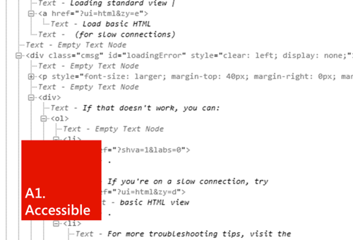
A1. Accessible
The first A is Accessible. The site must be accessible. Of course, this includes accessibility issues for people with disabilities (Accessebility), but not only. The site should be accessible to all Internet users and this also includes search engines and any programs whose task is to extract the meaning of your documents.
This is the place and time to remember about semantic markup and the right balance between markup, styles and logic in JavaScript. Today, the reality is that not just everything that relates to the content presentation part is taken out of the markup, but also some of the things from JS are put in a declarative description on CSS.
From the point of view of semantics, many new tags have appeared in HTML5 for both structural markup and markup for content itself:
Part of the existing tags in HTML5 acquires a new meaning. So, if earlier the choice between i and em (similar to b and strong ) was more often in favor of shorter writing, today these are tags with different semantic meaning, even if by default they have the same presentation in italic or bold.
See also HTML5 article . Semantics or markup with meaning .
In general, the more semantic markup, and the less garbage in it, the easier (automatically) to understand where what information is located.
Another part of the innovations is directly related to the issues of accessibility: here, first of all, we are talking about aria- and role-attributes, which allow to mark the purpose and role of content. This information can later be used, for example, by screen readers (screen reader). It must be said that ensuring accessibility is not the most trivial task, and in HTML5 almost the first time so much attention was paid to this issue.
Another side of accessibility is the issue of convenience of interaction with content and, in particular, the speed of input. HTML5 introduces new features for web forms that allow you to specify additional attributes that specify the type of input values, ranges, and other parameters. So, if you can enter only a phone in the field, the user's browser, for example, on a mobile or tablet device can tune the keyboard for digital input.
Finally, a topic that I also cannot but mention in this block is HMTL Microdata . Microdata is a development of microformats ideas and offers data annotation rules in accordance with one or another scheme:
<div itemscope itemtype="http://schema.org/Person"> <span itemprop="name">Konstantin Kichinsky</span> <img src="http://a1.twimg.com/profile_images/1464844323/avatarh5f_reasonably_small.png" itemprop="image" /> <span itemprop="jobTitle">ADE</span> <a href="http://constantin.kichinsky.ru" itemprop="url">constantin.kichinsky.ru</a> </div> See examples of schemes on the website http://schema.org/ - templates collected here are supported by Bing, Google and Yahoo!
From the point of view of balance in the code between the layout, styles and logic, as I said, there are two interesting trends here. The first, obvious, is the repression of all style elements from HTML5, the general undesirability of using inline-styles, including in terms of performance.
I think it is unnecessary to remind of tabular and block layout, but today we are getting closer to semantic layout.
The second trend is the empowerment of CSS and the emergence of the possibility of a declarative description of various effects, animations and transformations through the appropriate rules instead of JavaScript code.
Manifestations of both trends we will see again and again;)
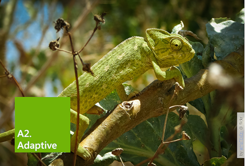
A2. Adaptive
The second A is Adaptive. The site must be adaptive to the surrounding conditions, adapt to the external environment. It must be said here that adaptability is not something much additional in relation to the accessibility of the site, it is rather expansion and development, because adaptability should grow out of accessibility ideas.
Adapting to different screen resolutions, different form factors, different font sizes, different display devices and other parameters means being available in all these scenarios.
In principle, adaptation is based not only on specific standards, but also on various techniques and approaches that can be used in the process of website design and development, as well as their various combinations. In this context, I want to mention two important terms that you should definitely look towards: Responsive Design (see the article Responsive Web Design by Ethan Marcotte) and Progressive Enhancement (see the article Progressive Enhancement ) .
The first is how to adapt to different screen resolutions and form factors. The second is how to move from simpler scenarios to more advanced ones (for example, from old browsers to modern ones) while working on your site.
Somewhere it is a matter of applying certain standards or certain techniques, for example, in order to give different images to the client in different conditions (small on small devices and large on large). Somewhere it is a question of the development of the functional as relevant opportunities appear.
You can imagine a large scheme of different scenarios, where horizontally there will be all sorts of screen resolutions (and associated form factors), and vertically there will be a movement from less advanced browsers to more modern ones. Responsive Design and Progressive Enhancement are ways of navigating (and thinking) to move up and down, left and right.
Let's look at a few specific technologies and web standards.
CSS3 Media Queries
The first task that you all face is the adaptation of the site for different screen resolutions. The problem here is that there are many of them, they are different and new ones constantly appear. I think everyone involved in web development (or design) not the first year, remember all this talk about whether it’s time or not to switch from a minimum size of 800x600px to a larger 1024x768px, studying statistics and trends in the size of the screen for the average user.
Generally speaking, today this question, and the very posing of such a question is no longer relevant. Do you know why? Because instead of gradually coming to larger and larger screen sizes, in fact we have come to an ever increasing variety of screen sizes, and both ways to small mobile devices like 480x800px and more in modern monitors - 1920x1080px and more.
And in this whole range, a modern browser can work on the end device - be it IE engine (from Windows Phone to Windows desktop) or one of webkit-based engines (from iPhone and iPad to MacOS X and Windows desktop), and there may be various engines, including a huge zoo of java-browsers in various mobile devices.
In certain ranges, a rubber layout can be used, but it is not omnipotent and limited in its application. And in such a variety, additional tools are needed for adaptation. Generally...
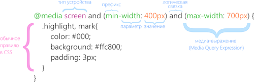
If you limit yourself to modern engines for a few minutes, you will find that they all support a special technology called Media Queries (this is one of the CSS3 modules).
CSS3 Media Queries expands on traditional Media Types, available in HTML 4.01 and CSS 2.1, and allows for more targeted definition of CSS rules depending on various playback context settings, such as screen sizes, device orientation, color depth, monochrome or color printing, and more. P.
The idea behind Media Queries is that you can determine how to post content, what content to show, and what not, depending on the value of all these parameters. If the screen is small, then you need to rearrange all the elements so that they fit reasonably into a small screen, if large, somewhere you can more optimally take the available space, and somewhere more and show more. You can independently see how this all works in the examples collected at http://mediaqueri.es
Using Media Queries, by the way, is strongly tied to the fact that you really separate content markup from its presentation. Therefore, accessibility (and semantic) is at the forefront. The advantage is that you make one website for different devices. Devices that don't know Media Queries will ignore your rules.
Usually, in simple scenarios, only CSS 2.1 and the Media Queries module are sufficient, but in cases of complex layout, additional tools are needed to make something worthwhile and effective.
You will surely like many other CSS3 modules that blend in well with the ideas of Media Queries.
Look towards CSS3 Exclusions and Shapes (formerly Positioned Floats), which allows you to customize the positioning of individual elements relative to the flowing content, and the behavior of the content in turn can be determined by other parameters, including screen sizes and placement modes:
In the example above, CSS3 Exclusions is used in combination with multi-column layout and layout using a grid.
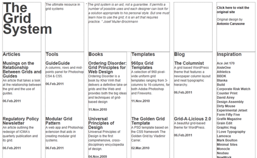
The latter must be said separately. Placing blocks on the grid is a huge headache for all layout designers. Once it was a tabular layout, then it became unfashionable and almost everyone recognized this approach as wrong. They began to use block layout with multi-storey css-rules, if it was necessary to do something more complicated than layout in two or three columns.
Among the new CSS3 modules there is a module dedicated to this particular task, CSS3 Grid Layout . Grid allows you to build elements on a virtual grid. This is quite a powerful tool - imagine that you can simply use different grids for your blocks at different screen extensions! Soon you can;)
Another interesting module is CSS3 Flexible Box , which allows your blocks to fill the space allocated for them according to your wishes, be it free space filling or space allocation between blocks in a given proportion. Today, many such tasks are solved with the help of various tricks in the layout and style rules, tomorrow it will be enough to indicate what exactly is required (see also the article CSS3 Flexible Box Layout Explained by Richard Shepherd).
In general, using technologies that are available today or in the near future, you can quite easily make decisions that will adapt to different conditions. Being technologically one solution, your site in different conditions may be rearranged in different ways, showing the most optimal face in each case.
Now let's go back to the Progressive Enhancement.
Progressive enhancement
Briefly, the idea of Progressive Enhancement can be formulated (or reversed) as a gradual improvement: you make basic functionality that works in all browsers, and further improve it, moving from old versions to new ones, without disrupting performance, but adding additional advantages for users of modern solutions.
Ultimately, this means that all users of your site will receive a guaranteed minimum of functionality, but at the same time, for those who prefer more recent solutions, and the site will be, for example, more beautiful.
Yes, if you still live with the thought that the site should look the same everywhere, it's time to roll it up and throw it into the nearest ballot box. Looking the same everywhere is an impermissible waste of energy and in modern conditions of a wide variety of devices looks more like an evolutionary miscalculation (translating into money: users will prefer those who can adapt) rather than riding engineering.
How it works? Very simple.
Thinking of using something from the CSS3 Borders & Backgrounds arsenal? Make square corners for those who do not support round, and round for those who support them. There is nothing to fence around the construction of wrappers and crawl here with your scotch. Make a solid background for old browsers and gradient for modern ones. If you can do with a single background image in IE6-8, leave the use of multiple backgrounds for IE9 +.
Make the basic functionality and add new features to it on top, but without many crutches. Users will be happy when going to a new modern browser, they really feel the difference on your site.
To think about Progressive Enhancement can be in the spirit of the analogy with television. We have come a long way from black and white to color and further high-precision video. And (while we are talking about analog technology), old TVs can still show modern programs, but in black and white. Viewers know that the picture will be better in modern TV. However, the transmitted signal does not depend on the TV.
A3. Agile
The third A is Agile. The world is complex and sometimes it is not enough to be simply accessible and adaptive for some different, but common parameters. The site must be flexible and must be flexible technological decisions.
In fact, I must admit, it was quite difficult for me to refrain from using the word “flexible” earlier in this article, but it was worth it — and here's why.
If site adaptation is based on its availability, then flexibility, in turn, is based on adaptation and also expands accessibility. While this may seem like a play on words, there is a certain difference between adaptability and flexibility.
Adaptation is usually limited and involves a change in appearance or behavior in response to a range of environmental changes. For example, our eye adapts to a different level of illumination or distance to the subject in question. The behavior of many living creatures adapts to changes in temperature. So the site adapts to specific screen sizes or browser capabilities.
Flexibility manifests itself at critical points, when gradual adaptation is impossible, more meaningless, or the range of changes made is such that the distance between two extreme points becomes too large, and the path between them breaks into separate scenarios. As a rule, flexibility is characterized by going beyond and changing the technological platform.
Flexibility is not something new and many of you are familiar with it from practice, I will talk about a few of these scenarios a bit later. Now let's go back to the present and recent past. Modern mobile browsers do quite well with ordinary websites, allowing you to interact with them using scaling. Adaptation, discussed earlier, allows you to improve this scenario, adjusting the appearance, but it is still the same site. The solution that is used today in practice more often is completely different - this is a separate mobile version of the site.
You can look at it differently, but one of the points of view is the technological flexibility of the decisions made. If the platforms and the specific functionality required on each of them are very different, the adaptive scenarios experience too much stress and it's time to break them. And this is nothing bad.
In fact, flexibility is what happens with adaptation in the limit. Technological flexibility is the adaptation of thinking, the goal of which is the effective solution of the problem. This, in particular, can lead both to the search for compromises in the technologies used and to the emergence of scenarios that are not fully cross-platform.
For example, the famous game Angry Birds, made on HTML5, uses Adobe Flash to play music and audio effects. This may seem strange, however, it is a normal, flexible technological solution that allows the use of those technologies that are available and work quite effectively in a wide range of browsers. In this case, the developers encountered a number of problems in playing audio through the HTML5 audio element (by the way, it was not Internet Explorer, but another popular browser;) and used a flash to solve the problem. This is an example of a flexible combination of technology without involving religious feelings.
Another typical example is Amazon's Kindle Cloud Reader. This is a browser-based application that allows you to read books directly through the browser, and it works even in offline mode. This wonderful moment we will look at later. What we are interested in now is technological flexibility.
I don’t know all the business details of Amazon’s motivation, but ultimately, the Kindle Cloud Reader clearly shows the company's desire to directly interact with end-users through a browser, bypassing application stores. If you look at the primary target audience - these are users of iPad and tablets on Android.
The next moment, thinking about a technological solution, you will find that you need technology for local storage, which allows you to save files on the user's device for further reading. Here begins a bust of technology, which rather quickly stops at the fact that both platforms integrate a browser - and although the browsers are different, both are based on the Webkit engine.
Webkit supports WebSQL Database technology, which allows you to do exactly what you need: store data in your local storage. At this point, if you are familiar with the new web standards, you should have something to click. In fact, on the W3C website in red letters in a frame and additionally white on a black background with yellow circles (see above) says that the development of technology has stopped. In reality, today W3C and browser developers are looking towards an alternative technology - IndexedDB (and Local Storage for relatively simple scenarios).
All this did not prevent the developers from Amazon from using the technology available at the time of development, despite the uncertainty of its future status and limited support in other browsers.
It is flexibility in technology and, in some ways, even courage in making a decision to first of all make a product for key audiences and not try to get out of their way to make a decision that will work for all-all-all potential users. Flexibility recognizes tradeoffs.
Finally, another example of flexibility. In IE9, it became possible to pin a website to the taskbar with additional functionality - in addition to the application icon or website, this context menu (static and dynamic), application management via buttons in the preview window and notification for users.
Although this technology is only available in IE, it allows you to extend the functionality of the site, make it more accessible and adapt to additional features. This is a flexible user UX extension in conjunction with the site.
Flexibility is not a question of technological cleanliness (this question remains always topical, although sometimes it is necessary to make compromises), it is a question of using existing possibilities and efficiency of solving the tasks at hand.
Often (and the farther, the more) we find ourselves in a situation where new technologies appear that we strongly want to use, but, looking back at the existing ecosystem of browsers, we have to pull ourselves and stop. Flexibility looks in the direction of Graceful Degradation ideas, allowing you to use modern solutions where possible, and seeking to provide alternative scenarios where it is impossible.
These are the so-called fallback scripts, when, for example, in old browsers, a specific unsupported (usually, not because browsers are bad, but because they are old) mechanism is implemented through other available technologies:
- HTML5 Video ⇒ Flash | SL ⇒ File
- Web Sockets ⇒ Flash | SL ⇒ Comet
- Canvas ⇒ Flash | SL
- SVG ⇒ VML | Flash | SL
- ...
In some cases, the emerging difference between the current level and what is in old browsers is filled with the help of the so-called Polyfills (see the article What is a Polyfill? By Remy Sharp).
And sometimes you just need to have the courage to cut off part of the browser ecosystem, however, not forgetting respect for their users. This is really important.
And, of course, don't forget about using the Feature Detection approach and the Modernizr library.
A4. Async
The fourth A is Async. The site must understand the asynchrony of our world and its web part in particular. , — - , , , , .
, , . , , , .
, :
, , , .
, , ? : . : , . Application Cache HTML5 , .
, ? , , , timeout? , , ? ( ) . : - . AJAX , Web Sockets , .
, - , , , , File API? UI, . Web Workers Web Messaging, JavaScript .
, , . .
A5. Attractive
, A — Attractive. . , , , . , .
, , , - ( , ). .
— . - ( ) — , . , .
HTML5 — Canvas SVG, HTML5 Audio Video, CSS, , , .
, , , HTML5 Canvas. , , . !
Never Mind the Bullets . , CSS3 , . .
, Bing, , Bing - HTML5 Video ( , USA).
, .
5A. Conclusion
. 5A — , . . , , , -.
, , -, , , , .
5A. , !
ps IE
:
- HTML5 Semantic Tags — IE9+ (+HTML5 Shim <IE9)
- HTML5 Canvas, Audio + Video, SVG — IE9+
- HTML5 Offline|Application Cache, Web Forms — IE10+
- ARIA, role attributes — IE8+, IE9+
- CSS3 Media Queries, Transforms 2D, Fonts (Font-face + WOFF), Borders & Backgrounds (Border Radius, Multiple Backgrounds) — IE9+
- CSS3 Exclusions and Shapes, Grid Layout, Flexible Box, Transforms 3D, Transitions, Animations, Borders & Backgrounds (Gradients) — IE10+
- Web Storage — IE8+
- IndexedDB, Web Sockets, Web Workers, Web Messaging — IE10+
- IE Pinned Sites — IE9+
, IE .
Source: https://habr.com/ru/post/130741/
All Articles