Improved Google Calendar interface
Many people like the Google Calendar scheduler. So do I.
But in the interface, alas, there are a number of points that, out of the blue, make it difficult to use and spoil the impression daily. It turned out that some of my colleagues are upset by the same thing. Well, since by profession I am an interface designer, then at one point I sat down and drew what I would like to see in my favorite service.
Below are some of these pictures.
')
The main dissatisfaction is due to the fact that to configure almost all operations on an event, it is necessary to go to a special page. The absurdity is that before this transition we see a pop-up window and can change some settings one click faster. Only now these settings are often useless, and you have to climb for useful ones.
Next, I understand what settings and where to place.
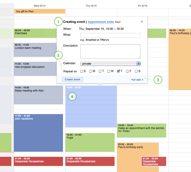
The numbers in the pictures indicate the places where I would like to focus attention. Not all of them will be explained in the text, however, in some places words are not needed.
The first case is to add a new event.
Now for this a small pop-up window appears in which we can only drive a name. To finish creating the event, click Edit event and go to a special page. And yes, everything that you put in there, for example, a description, while viewing the calendar, is still not visible.

And besides, popup is not informatively titled. The caption Event says nothing about what is happening now. Creating event is much more informative.
Well, firstly, we know that description is written to many important events. Why not bring it to the pop-up window so that the description can be added immediately, without going to a separate page? (2)
Yes, looking ahead, I’ll say that you don’t need to hide it either. If there is an opportunity to show additional information without harming the user, then it is necessary to show it. Such classics of information presentation and interface design, such as Edward Tufti and Jeff Raskin, wrote about this principle many times (see last picture, item 4).
The same can be said about the function of changing the calendar (2)
You can add repeatability by day of the week (2). On a separate page, you can leave the fine-tuning of repeatability, for example, “every third Saturday of January” (this case is more rare and with more settings) (3).
Well, make the event created significantly more transparent than the ones already created (4).
It turns out like this:
Event editing
To simplify the editing of the event, you need to use the same idea - to give the user to change the basic parameters without switching to an additional page. And remove all the same gaps. Just.
Here is how the event is edited now:

disadvantages
(1) - for some reason on the pop-up arrow, which allows you to change the color of the project
As far as I can tell, they rarely use it, but it is located on the sooo trump point
(2) - it is not clear why, when editing an event, so much space is given to information about the date and time without being able to change them
(3) - the same with the Calendar and Created by fields. They are displayed, but in order to change - you need to go to a separate page.
(4) - the copy to my calendar function should be reversed out of sight
(5) - often the description of the event is crammed into the heading so that it can be immediately seen without the need to go somewhere, and then return
I want exactly the same as when adding - the ability to quickly edit the main fields. Description, belonging to the project.
For example:
(1) - remove the arrow
(2) - we make the fields editable, we simply reduce the date-time (it is easier to edit it not here, but as drag-drop)
(3) - add autosave of changes and go to the big editing screen
(4) - Description field is now visible when viewing events for a week

In both cases, we excluded only one extra step and made a bit of cosmetic changes. This eliminated 85% of daily user dissatisfaction.
On this post pictures finish, because There is a lot of similar material. Separate analysis deserves the viewing mode Agenda. Tasks are generally an inexhaustible source of inspiration. But enough for today.
Recently, the Good Corporation has taken up improving interfaces on all services, so there is hope that such obvious and annoying errors will someday be corrected.
But in the interface, alas, there are a number of points that, out of the blue, make it difficult to use and spoil the impression daily. It turned out that some of my colleagues are upset by the same thing. Well, since by profession I am an interface designer, then at one point I sat down and drew what I would like to see in my favorite service.
Below are some of these pictures.
')
The main dissatisfaction is due to the fact that to configure almost all operations on an event, it is necessary to go to a special page. The absurdity is that before this transition we see a pop-up window and can change some settings one click faster. Only now these settings are often useless, and you have to climb for useful ones.
Next, I understand what settings and where to place.
The numbers in the pictures indicate the places where I would like to focus attention. Not all of them will be explained in the text, however, in some places words are not needed.
Adding a new event
The first case is to add a new event.
Now for this a small pop-up window appears in which we can only drive a name. To finish creating the event, click Edit event and go to a special page. And yes, everything that you put in there, for example, a description, while viewing the calendar, is still not visible.
And besides, popup is not informatively titled. The caption Event says nothing about what is happening now. Creating event is much more informative.
Here asks
Well, firstly, we know that description is written to many important events. Why not bring it to the pop-up window so that the description can be added immediately, without going to a separate page? (2)
Yes, looking ahead, I’ll say that you don’t need to hide it either. If there is an opportunity to show additional information without harming the user, then it is necessary to show it. Such classics of information presentation and interface design, such as Edward Tufti and Jeff Raskin, wrote about this principle many times (see last picture, item 4).
The same can be said about the function of changing the calendar (2)
You can add repeatability by day of the week (2). On a separate page, you can leave the fine-tuning of repeatability, for example, “every third Saturday of January” (this case is more rare and with more settings) (3).
Well, make the event created significantly more transparent than the ones already created (4).
It turns out like this:
Event editing
To simplify the editing of the event, you need to use the same idea - to give the user to change the basic parameters without switching to an additional page. And remove all the same gaps. Just.
Here is how the event is edited now:
disadvantages
(1) - for some reason on the pop-up arrow, which allows you to change the color of the project
As far as I can tell, they rarely use it, but it is located on the sooo trump point
(2) - it is not clear why, when editing an event, so much space is given to information about the date and time without being able to change them
(3) - the same with the Calendar and Created by fields. They are displayed, but in order to change - you need to go to a separate page.
(4) - the copy to my calendar function should be reversed out of sight
(5) - often the description of the event is crammed into the heading so that it can be immediately seen without the need to go somewhere, and then return
I want exactly the same as when adding - the ability to quickly edit the main fields. Description, belonging to the project.
For example:
(1) - remove the arrow
(2) - we make the fields editable, we simply reduce the date-time (it is easier to edit it not here, but as drag-drop)
(3) - add autosave of changes and go to the big editing screen
(4) - Description field is now visible when viewing events for a week
Conclusion
In both cases, we excluded only one extra step and made a bit of cosmetic changes. This eliminated 85% of daily user dissatisfaction.
On this post pictures finish, because There is a lot of similar material. Separate analysis deserves the viewing mode Agenda. Tasks are generally an inexhaustible source of inspiration. But enough for today.
Recently, the Good Corporation has taken up improving interfaces on all services, so there is hope that such obvious and annoying errors will someday be corrected.
Source: https://habr.com/ru/post/130543/
All Articles