Windows 8 interface slightly fixed
After a public discussion, the developers decided to change the interface of Windows 8, according to an official blog. A significant role was played by the advice and opinions of users who expressed dissatisfaction with different parts of the UI, especially the refusal of the “Start” button.
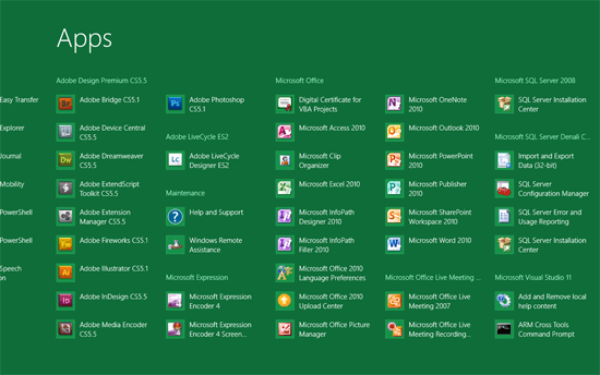
Lead developer Stephen Sinofsky explained in detail exactly what adjustments will be made. Firstly, in App Screen, applications are now distributed into groups, and not just in alphabetical order, but the information density is increased, so that more applications are placed on the screen.
')
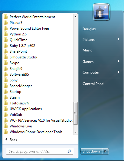
The button and the Start menu will not be returned, this is a fundamental decision. Steven Sinofsky says that the user runs an average of 57 different programs on his PC for several months, and the old menu does not fit more than twenty.
If you enable full screen with a flat hierarchy, you can display more applications and make a more convenient interface. The advantages of the start screen over the old “Start” menu are especially evident when the screen size increases. For comparison, here are how many programs fit on the first page of the menu and on the first page of the start screen at different resolutions, according to Sinofsky.
Corporate customers will be able to customize the start screen to their own taste, including removing the Games , Help & Support items and securing more “required” applications, in accordance with the requests of their users. It will also be possible to prevent users from making changes on this screen.
Apparently, this is not the end of the epic with the new design of Windows 8. Perhaps, for the first time, Microsoft representatives are so openly discussing the development of UI with users and listening to feedback.
Lead developer Stephen Sinofsky explained in detail exactly what adjustments will be made. Firstly, in App Screen, applications are now distributed into groups, and not just in alphabetical order, but the information density is increased, so that more applications are placed on the screen.
')
The button and the Start menu will not be returned, this is a fundamental decision. Steven Sinofsky says that the user runs an average of 57 different programs on his PC for several months, and the old menu does not fit more than twenty.
If you enable full screen with a flat hierarchy, you can display more applications and make a more convenient interface. The advantages of the start screen over the old “Start” menu are especially evident when the screen size increases. For comparison, here are how many programs fit on the first page of the menu and on the first page of the start screen at different resolutions, according to Sinofsky.
| Form factor | Size (inches) | Resolution | # of items in Apps Screen | # of menu items |
| A laptop | 12.1 | 1280x800 | 36 | 20 |
| 13 | 1366x768 | 40 | 20 | |
| 13.3 | 1440x900 | 42 | 20 | |
| Desktop | 21.5 | 1920x1080 | 80 | 20 |
| 23 | 1920x1080 | 80 | 20 | |
| 27 | 2560x1440 | 150 | 20 |
Apparently, this is not the end of the epic with the new design of Windows 8. Perhaps, for the first time, Microsoft representatives are so openly discussing the development of UI with users and listening to feedback.
Source: https://habr.com/ru/post/130282/
All Articles