An example of a two-fold acceleration of font loading for titles from Google Web Fonts, carried out by sampling the optimal version of it
![[-]](https://habrastorage.org/getpro/habr/post_images/0d3/8af/410/0d38af41015fe17dda1f33d1983c1b56.gif "go to Cyclopaedia") If the user of a computer equipped with modern Microsoft Corporation software walks onto the Cyclopaedia wiki-encyclopedia site, then his glance will be primarily attracted by the font of the first and second level headings (Cyclopaedia, Culture, Society, Science and technique ”,“ Nature and man ”,“ Life ”): such a font is not often found on the World Wide Web now (you can easily see it yourself when you compare the screenshot fragment I’ve attached to your right with your own experience).
If the user of a computer equipped with modern Microsoft Corporation software walks onto the Cyclopaedia wiki-encyclopedia site, then his glance will be primarily attracted by the font of the first and second level headings (Cyclopaedia, Culture, Society, Science and technique ”,“ Nature and man ”,“ Life ”): such a font is not often found on the World Wide Web now (you can easily see it yourself when you compare the screenshot fragment I’ve attached to your right with your own experience).But this font, gentlemen, may we all be an example of how we should not make our headlines. Can you guess why this is so? Yes, because this font is Candara (and it is not difficult to see firsthand: it’s enough to resort to the Context Font extension or peer into the current
But you can ensure a uniform display of the title in all systems and browsers; to do this, simply upload the same font to all readers. You can distribute the font from your own site (by adding thoughtful
')
What should I say about the use of Google Web Fonts in the design of headers?
 It is worth noting, to begin with, that the Google Web Fonts collection, as well as generally loading a font through
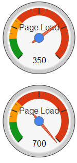
 To verify this, try choosing all four PT Serif fonts on the Google Web Fonts website (“Normal 400”, “Normal 400 Italic”, “Bold 700”, “Blod 700 Italic”), and the arrow indicator “Page Load” will go in the red area of the scale, showing the
Honestly, gentlemen, I don’t have a perfect idea of what these numbers mean: the Google developers didn’t care to write them in any way, and one cannot even be quite sure whether they are proportional to some download time or still the amount of information downloaded. more likely).
Why, that's a lot. If the first time you visit the site from the Internet, the fonts will be downloaded for several hundred kilobytes (which is necessary for four different styles), then perhaps users of unlimited high-speed Internet (LTE, WiMAX, GPON, ETTH, FTTB, ADSL) may not notice anything - and all other readers of the site, of course, indignant. And they will be right in their indignation. It is especially a pity for those users of the mobile Internet, in whom the payment for traffic goes in megabytes, and for those users of the corporate Internet, for whom the volume of traffic is strictly limited.
That is why the merciful author of the site (that is, one whose heart is open to pity) does not at all befitting to use four font styles at once - and thus, when specifying unusual (downloaded from the Internet) fonts, it is appropriate for the author to be limited to merely headlines: because in headings As a rule, there is only one (for example, only direct or only italics of letters). At the same time there is a wider choice: many fonts from birth have a single style (and not four or even not two), which in itself makes them suitable only for headings.
Moreover: if all your headings consist only of letters of the Russian alphabet (and this is exactly the case
Go to Google Web Fonts and select This is what is important. Observing the behavior of the Google system, it is easy to come to the conclusion that Latin letters are included in the font file quite unconditionally - and this means that if you still find an opportunity to turn them off, then the volume of the downloaded font can be halved.
The way to achieve this without fail is easily found in the Google Web Fonts documentation - in the section “ Optimizing your font requests (Beta) ”. It turns out that the URL of the downloaded
Thus, before providing the headers on the site with the coveted rule “ font-family: Cuprum,
@import url('http://fonts.googleapis.com/css?family=Cuprum&text=%D0%90%D0%91%D0%92%D0%93%D0%94%D0%95%D0%81%D0%96%D0%97%D0%98%D0%9A%D0%9B%D0%9C%D0%9D%D0%9E%D0%9F%D0%A0%D0%A1%D0%A2%D0%A3%D0%A4%D0%A5%D0%A6%D0%A7%D0%A8%D0%A9%D0%AA%D0%AB%D0%AC%D0%AD%D0%AE%D0%AF%D0%B0%D0%B1%D0%B2%D0%B3%D0%B4%D0%B5%D1%91%D0%B6%D0%B7%D0%B8%D0%BA%D0%BB%D0%BC%D0%BD%D0%BE%D0%BF%D1%80%D1%81%D1%82%D1%83%D1%84%D1%85%D1%86%D1%87%D1%88%D1%89%D1%8A%D1%8B%D1%8C%D1%8D%D1%8E%D1%8F0123456789%20%A0'); The volume of the WOFF file being downloaded while being reduced is reduced
- space ("% 20"), non-breaking space ("% A0");
- numbers ("0123456789");
- lowercase letters: "abvgdeezhziklmnoprstufkhtschshchyyyuya";
- capital letters: "ABVGDEEZHZIKLMNOPRSTUFHTSCHSHSCHYGYYEYUYA."
Of course, it is also possible to further reduce the size of the file with the font - it is achieved if in the “text” parameter you limit yourself to capital letters that are actually used in the headings, rather than listing all of them. However, this is by no means advisable, since it severely limits further editing of headings on the page where the font is used. Typical saving on letters is ≈4 kilobytes - which means it is not worth it.A good example of the above @import and the subsequent use
I believe that all of you have already guessed that this method can easily be transferred to the design of the headings in any other font from those found in the Google Web Fonts collection. It is enough to change the value of the “family” parameter and find your own value for the “text” parameter (for example, including dashes, commas, ellipses and other punctuation, if the headers on your site contain them).
Source: https://habr.com/ru/post/130172/
All Articles