Rebuild the browser window
Two months ago, Henrik Enerot, designer from the Swedish web studio Antrop, wrote a wonderful post - Redesigning the browser window - on how a modern browser should look like.
We really liked this text - it is such ideas that significantly improve the Internet for the average user. In RuNet, very few people responded to this post, and since we want to find like-minded people who like Henrik's ideas too, we decided to translate it completely for Habr users.
')
As you know, Apple recently released the lion from the cell, Mac OS X Lion. The reaction to the new OS was ambiguous. The authors of Gizmodo.com, for example, called X Lion "Apple Vista". And the owner of Winsupersite.com Paul Turrot though gave a positive review, but with obvious reluctance. In the AppStore, X Lion gets mostly high marks; about 8% of users put three stars or less.

Most of the bad reviews are complaints about stability, performance, and compatibility with the applications used. Some, however, had difficulties with the new sign system. Here is one of the users who writes: “Why should I learn to scroll in the wrong direction, in which I have been scrolling for 20 years now?”
I installed Lion last week, and so far I like it. At the same time, I also see a number of problems, the main of which is a mixture of the old and new paradigms of interaction with the user.
This is not a review of Mac OS X Lion. Actually, I'm going to analyze one specific question that arose during my work with this OS, and propose a solution.
In this version of the operating system, Apple decided to cross iOS-specific direct control ( see Direct manipulation in Wikipedia - approx. Per. ) With the more traditional desktop behavior of programs. So, among other things, the idea of full-screen application work on the desktop was born.
Full-screen applications work quite well, with rare exceptions. Mail, iCal and iPhoto are especially good for using the entire visible area of the screen - the content they display is perfectly scaled.
But browsing the sites in Safari on the Apple Cinema Display is the case when the full screen mode is not as good as we would like. Take a look:

Safari full-screen mode works great on laptops, but on larger screens it doesn't look so great. On the big screen, the interface becomes almost unusable. The most important thing is that it is impossible to work with tabs on this screen. The spot with a height of 20 pixels under the address bar in the picture above is a tab bar. Trying to click on it is about how to play darts with the mouse cursor.
This Safari problem is very similar to those that are solved using responsive web design ( responsive web design - see article on Smashing Magazine - approx. Lane. ). The idea of responsive web design is that programmers and designers are looking for ways to create websites that dynamically adapt to virtually any screen size, from smartphones to high-resolution monitors. Instead of creating sites for one specific permission or for a small range of permissions.
The modern user expects that the applications he uses will be displayed correctly on the full screen. At the same time, the full screen can have any resolution. So, it’s time to study the principles of responsive design more thoroughly and start applying them to creating desktop applications exactly as we started to do this with websites.
When creating applications, we are faced with the problem of screen sizes and resolutions. Especially when it comes to browsers. Their interface reminds us of those days when, in order to purchase a monitor with the dimensions and resolution of the Rubik's Cube, it was necessary to renounce its first-born. Then we simply could not afford to make the tab bar and address bar at least a little more. Gradually, the browser interface became absolutely minimalist, while screen sizes have long since grown.
The inconvenience of browsing Safari pages on the Apple Cinema Display suggests that in our efforts to make the browser interface increasingly minimalistic, we seem to have reached a turning point.
Screen size, of course, is still important for browsing sites on the Internet. Many sites are “longer” than the height of our screen. And the fewer user interface elements will be placed vertically, the better. But most of the screens today are widescreen, so why don't we use the left and right sides of the screen to increase efficiency?
Why, instead, do we put everything on a strip in the upper area of the screen?

Modern browsers use the left part of the screen for a limited set of their capabilities: browsing history, bookmarks, Reading List in Safari in OS Lion. This place can be used better, for example, by placing browser tabs there. Bookmarks and other similar nonsense are used incomparably less often than tabs. The idea, I understand, is not new, but for some reason it still does not take root.
Having decided to investigate how the left-sided browser interface could look and work, I drew a few mockups in the Antetype program. Sorry in advance, there will be a lot of details.
Mocap uses iOS / OS X-style graphics (since I myself am a Mac user). But don't let that bother you. The whole concept is perfect for Linux, Windows and BeOS.
Here's what I got. Pictures are clickable.

A bit closer.

There are several advantages of the left-sided arrangement of the tabs, in addition to the appearance of free space vertically. The first plus - tabs have become much larger. At the same time on one browser screen they fit quite a lot - especially when it comes to full-screen modes, as in Lion.
Secondly, the larger size of tabs allows you to enrich them with graphics and additional descriptions. This simplifies the task of selecting a tab among the rest. They cease to be indistinguishable gray spots on the background of other indistinguishable gray spots.
If colors are too distracting, then it would make sense to allow the user to reduce the contrast of the tab bar when it is inactive. It is also probably worth adding the option to make the panel more compact or remove it completely.
No more
As you can see, I took the liberty to remove the address bar. An action that suggested itself, didn't it? Google is also experimenting with this.
How often do you change the URL of the site after you entered? As a rule, navigating through an already loaded page is clicking on links, and sometimes entering a password. Therefore, it is unlikely that changing the URL is paramount. Of course, this option should be available on request, for example, when you press ⌘ + L (CTRL + L on Windows and Linux).

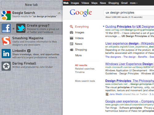
New tabs, you guessed it, are created using hotkeys or by clicking on “New Tab”. In the line you can enter the address or search query.
Nowadays, there is no point in separating the address and search lines. Do I know the exact address of the site or I just have a general idea of what I want to find - both are just two different starting points leading to the same goal. So let's combine them, as some browsers have already done.
In this example, we are looking for “ux design principles” - what all advanced dudes are doing today.

And the result.

Alerts . You probably noticed the numbers next to the names of the tabs on Facebook, Twitter and LinkedIn. These are notification counters. Let's face it: from web applications today can not go anywhere.
There are some sites that are updated dynamically at the time of their use, or even when the corresponding tab is inactive. Let them notify us of the changes in the same way. In the case of Twitter, you can display the number of user references, and in the case of Gmail, the number of unread emails.
Descriptions . The subtitle or description of the tab basically simply repeats the description that the owner has chosen for the site. However, for some cases, the browser may choose a more efficient subtitle. For example, a search phrase could become a subtitle for the Google tab, it will simplify the search for a tab among his alike.

Titles In most cases, the site name is the most important information displayed on the tab header. But not always. When you read an article, its title is more important than the name of the site. It is worth reflecting on the tab.
As far as I know, the HTML standard does not separate the concept of “page title” from “website name”. Therefore, there are headlines like "The Medium Is The Message - Smashing Magazine." Where two information objects are combined in one line.
I'm not saying that by formatting the page title in this way, Smashing Magazine is doing something wrong. Actually, this is even good, because most browsers only show the first part of a phrase in a tab (due to the size of the tab).

And if the heading of a taba looked like “Smashing Magazine - The Medium Is The Message”, without seeing it in its entirety, you would not have distinguished this article from other articles of this site that were open to you.

Therefore, it makes more sense to separate these two names and let the browser decide how best to display them. If the name of the site, which is the same for all its pages, can be separated from the name of the page or article (and this information changes from page to page), then the browser can decide for itself: when to display the article title, and when - the site name.
Here's what a tab might look like if the title of the article takes precedence over the name of the site:

Let us briefly digress and look at the human nervous system, more specifically, the context-dependent model of the brain. Her study helps to understand how people systematize information.
The essence of the contextual model: all your emotions, memories and experiences are stored contextually. If you have noticed that happy memories come to mind more easily when you are happy, then you already know the contextual nature of the brain in action.
Context is a mode, an environment, of which the nervous system considers itself a part. When in a certain "mode", some specific information is more accessible than the other, which the brain considers less relevant (ie, more distant from the current context).
The more information is removed from the current context, the more difficult it is to access it, right up to the moment when the memories are almost indistinguishable (as is the case with psychologically traumatized people).
To design user interaction, it is important to understand how people systematize their impressions and experiences in terms of contexts. What is relevant for users in a particular context, and how the switch from one context to another occurs. Then you can exclude everything that does not apply to the current context and focus only on what is important for the user right now. At the same time, as needed, helping him quickly switch between contexts. And such a strategy is more justified than creating a huge interface that includes everything at once. Using it, the user is forced to manage the switching between contexts independently, without the help of an interface.
In terms of contexts, modern browsers, to put it mildly, are far from ideal. For example, I can first go on social networks in which I am registered, and then start looking for websites with information about web design. For me, these are two completely different contexts, but the browser has no idea about this.
At the end of the day, I have at least half a dozen contexts open in my browser, which, of course, creates a mess in the tabs. Then I close the browser and start everything from scratch, because it is easier than to understand all these tabs.
Mozilla is also experimenting with tab groups as with the way contexts are presented. However, their solution does not seem to me particularly intuitive. I don't seem to be alone in this. When you search for “Mozilla tab groups,” Google’s search first shows the help section on the Mozilla website and the “Where are the tab groups?” Page. Although, as it seems to me, in general, they understood the idea correctly, they just need to refine it a little.
The design of the left-side tab bar can be improved by adding context management to it. Grouping tabs is a good way to do this. But everything should be intuitive. To create a group, drag one tab to another. Something like this:
You can give the group a name, and the browser will automatically offer its most likely option (more on that later). You can name a group, for example, “Social Networking” (social networks). Note that after grouping, the Facebook and Twitter counters were added up.

When the content of the group is expanded, all the redundant information should be removed or made less noticeable.

Let's add LinkedIn to this group.

After that, we will group Smashing Magazine and Daring Fireball in the same way and name the new group “Design”.

Now there is where to keep all the interesting things that can be found on the topic “UX design principles”. And under no circumstances will the information from this group interfere with the tabs from Social Networking.
It should be possible to close the group. Closed groups make room for building a new context (studying a different topic) and do not interfere too much. The Social Networking group counter continues to be updated in the background.

If you have time to group the pages (and even give them names), it seems you are quite interested in their content. And you probably want to continue using these contexts for more than one browser session. And do you want to create these contexts every time after restarting the browser? Not.
Probably there must be some way to preserve contexts. For example:


In the absence of a more appropriate term, I will name the top panel “Group Palette”. The meaning of the groups palette is as follows: you may want to save groups, but you do not want them to always be displayed in the tab bar. Therefore, it is necessary that there is a place where tab groups will be stored permanently and from where they can be restored.
When you drag a group onto the groups palette, it will be stored there until you delete it. All changes made with the group will automatically affect the version saved in the groups palette. A small time machine (history of saving) will allow you to roll back to any previous version of the group without much effort or find any tab that was once part of the group.
We continue to keep the group.

Both groups saved.

Perhaps when creating a group it should be automatically saved. If I bothered to create a group and came up with a name for it, then I most likely would like to keep it. However, I am not 100% sure. It is difficult to speculate on the reasonableness of the default settings without testing them on users.
Groups must follow the user everywhere. Remember, they are context sensitive to the user, not the browser. Synchronization of groups with the cloud will have a number of advantages (apart from the obvious: easy accessibility from any place).
On the backend, the browser developer may refer to the names of the groups as tags for sites included in this group. When there are a lot of saved groups, you can select the most assigned names and use this information for various purposes:
This concept is not yet fully formed. I have a long list of additions and questions to the interface that have arisen as these sketches are drawn. Most of them can not be answered without a minimum study of user behavior. And, for sure, I have not yet considered a bunch of different pitfalls and extreme cases.
It is difficult to predict how, for example, people will use groups. Whether they want to, say, share groups or create groups together with other users. Not sure. Different browsers have already tried to implement social functions, most of which are not particularly taken root (I think).
I think that the basic principles of this concept are easily applicable to the iPad and other devices. The left-side tabs panel can appear if you hold two or three fingers across the screen from left to right, and the group palette, if drawn from top to bottom.
The foundation of the user interface also requires development. I do not know how best to present the group. I tried different options, for example:

If you have your own opinion or criticism on this occasion, and you want to convey them to me, then on Twitter I’m @henrik_eneroth or write to henrik.eneroth@antrop.se. And you can just leave a comment to the post .
98% of the prototypes were made in Antetype, images were formatted in Pixelmator or Photoshop, and various other things in Omnigraffle.
Many thanks to Robert Landberg for his feedback and suggestions in the process of developing all this.
And further. These ideas are created to be spread throughout the world. Take them and do with them everything you want, with or without commercial gain. I promise that I will not sue you, because I am against acts of stupid and unnecessary violence, which hack up innovations in the bud.
We really liked this text - it is such ideas that significantly improve the Internet for the average user. In RuNet, very few people responded to this post, and since we want to find like-minded people who like Henrik's ideas too, we decided to translate it completely for Habr users.
')
Rebuild the browser window
As you know, Apple recently released the lion from the cell, Mac OS X Lion. The reaction to the new OS was ambiguous. The authors of Gizmodo.com, for example, called X Lion "Apple Vista". And the owner of Winsupersite.com Paul Turrot though gave a positive review, but with obvious reluctance. In the AppStore, X Lion gets mostly high marks; about 8% of users put three stars or less.
Most of the bad reviews are complaints about stability, performance, and compatibility with the applications used. Some, however, had difficulties with the new sign system. Here is one of the users who writes: “Why should I learn to scroll in the wrong direction, in which I have been scrolling for 20 years now?”
I installed Lion last week, and so far I like it. At the same time, I also see a number of problems, the main of which is a mixture of the old and new paradigms of interaction with the user.
This is not a review of Mac OS X Lion. Actually, I'm going to analyze one specific question that arose during my work with this OS, and propose a solution.
Full-screen high?
In this version of the operating system, Apple decided to cross iOS-specific direct control ( see Direct manipulation in Wikipedia - approx. Per. ) With the more traditional desktop behavior of programs. So, among other things, the idea of full-screen application work on the desktop was born.
Full-screen applications work quite well, with rare exceptions. Mail, iCal and iPhoto are especially good for using the entire visible area of the screen - the content they display is perfectly scaled.
But browsing the sites in Safari on the Apple Cinema Display is the case when the full screen mode is not as good as we would like. Take a look:
Safari full-screen mode works great on laptops, but on larger screens it doesn't look so great. On the big screen, the interface becomes almost unusable. The most important thing is that it is impossible to work with tabs on this screen. The spot with a height of 20 pixels under the address bar in the picture above is a tab bar. Trying to click on it is about how to play darts with the mouse cursor.
This Safari problem is very similar to those that are solved using responsive web design ( responsive web design - see article on Smashing Magazine - approx. Lane. ). The idea of responsive web design is that programmers and designers are looking for ways to create websites that dynamically adapt to virtually any screen size, from smartphones to high-resolution monitors. Instead of creating sites for one specific permission or for a small range of permissions.
The modern user expects that the applications he uses will be displayed correctly on the full screen. At the same time, the full screen can have any resolution. So, it’s time to study the principles of responsive design more thoroughly and start applying them to creating desktop applications exactly as we started to do this with websites.
Alteration of the browser window under full screen mode
When creating applications, we are faced with the problem of screen sizes and resolutions. Especially when it comes to browsers. Their interface reminds us of those days when, in order to purchase a monitor with the dimensions and resolution of the Rubik's Cube, it was necessary to renounce its first-born. Then we simply could not afford to make the tab bar and address bar at least a little more. Gradually, the browser interface became absolutely minimalist, while screen sizes have long since grown.
The inconvenience of browsing Safari pages on the Apple Cinema Display suggests that in our efforts to make the browser interface increasingly minimalistic, we seem to have reached a turning point.
Screen size, of course, is still important for browsing sites on the Internet. Many sites are “longer” than the height of our screen. And the fewer user interface elements will be placed vertically, the better. But most of the screens today are widescreen, so why don't we use the left and right sides of the screen to increase efficiency?
Why, instead, do we put everything on a strip in the upper area of the screen?
Modern browsers use the left part of the screen for a limited set of their capabilities: browsing history, bookmarks, Reading List in Safari in OS Lion. This place can be used better, for example, by placing browser tabs there. Bookmarks and other similar nonsense are used incomparably less often than tabs. The idea, I understand, is not new, but for some reason it still does not take root.
Having decided to investigate how the left-sided browser interface could look and work, I drew a few mockups in the Antetype program. Sorry in advance, there will be a lot of details.
Mocap uses iOS / OS X-style graphics (since I myself am a Mac user). But don't let that bother you. The whole concept is perfect for Linux, Windows and BeOS.
Mokapi
Here's what I got. Pictures are clickable.
A bit closer.
There are several advantages of the left-sided arrangement of the tabs, in addition to the appearance of free space vertically. The first plus - tabs have become much larger. At the same time on one browser screen they fit quite a lot - especially when it comes to full-screen modes, as in Lion.
Secondly, the larger size of tabs allows you to enrich them with graphics and additional descriptions. This simplifies the task of selecting a tab among the rest. They cease to be indistinguishable gray spots on the background of other indistinguishable gray spots.
If colors are too distracting, then it would make sense to allow the user to reduce the contrast of the tab bar when it is inactive. It is also probably worth adding the option to make the panel more compact or remove it completely.
No more rock and roll address bar
As you can see, I took the liberty to remove the address bar. An action that suggested itself, didn't it? Google is also experimenting with this.
How often do you change the URL of the site after you entered? As a rule, navigating through an already loaded page is clicking on links, and sometimes entering a password. Therefore, it is unlikely that changing the URL is paramount. Of course, this option should be available on request, for example, when you press ⌘ + L (CTRL + L on Windows and Linux).
New tabs
New tabs, you guessed it, are created using hotkeys or by clicking on “New Tab”. In the line you can enter the address or search query.
Nowadays, there is no point in separating the address and search lines. Do I know the exact address of the site or I just have a general idea of what I want to find - both are just two different starting points leading to the same goal. So let's combine them, as some browsers have already done.
In this example, we are looking for “ux design principles” - what all advanced dudes are doing today.
And the result.
Other details: alerts, descriptions and titles
Alerts . You probably noticed the numbers next to the names of the tabs on Facebook, Twitter and LinkedIn. These are notification counters. Let's face it: from web applications today can not go anywhere.
There are some sites that are updated dynamically at the time of their use, or even when the corresponding tab is inactive. Let them notify us of the changes in the same way. In the case of Twitter, you can display the number of user references, and in the case of Gmail, the number of unread emails.
Descriptions . The subtitle or description of the tab basically simply repeats the description that the owner has chosen for the site. However, for some cases, the browser may choose a more efficient subtitle. For example, a search phrase could become a subtitle for the Google tab, it will simplify the search for a tab among his alike.
Titles In most cases, the site name is the most important information displayed on the tab header. But not always. When you read an article, its title is more important than the name of the site. It is worth reflecting on the tab.
As far as I know, the HTML standard does not separate the concept of “page title” from “website name”. Therefore, there are headlines like "The Medium Is The Message - Smashing Magazine." Where two information objects are combined in one line.
I'm not saying that by formatting the page title in this way, Smashing Magazine is doing something wrong. Actually, this is even good, because most browsers only show the first part of a phrase in a tab (due to the size of the tab).
And if the heading of a taba looked like “Smashing Magazine - The Medium Is The Message”, without seeing it in its entirety, you would not have distinguished this article from other articles of this site that were open to you.
Therefore, it makes more sense to separate these two names and let the browser decide how best to display them. If the name of the site, which is the same for all its pages, can be separated from the name of the page or article (and this information changes from page to page), then the browser can decide for itself: when to display the article title, and when - the site name.
Here's what a tab might look like if the title of the article takes precedence over the name of the site:
Tab context groups
Let us briefly digress and look at the human nervous system, more specifically, the context-dependent model of the brain. Her study helps to understand how people systematize information.
The essence of the contextual model: all your emotions, memories and experiences are stored contextually. If you have noticed that happy memories come to mind more easily when you are happy, then you already know the contextual nature of the brain in action.
Context is a mode, an environment, of which the nervous system considers itself a part. When in a certain "mode", some specific information is more accessible than the other, which the brain considers less relevant (ie, more distant from the current context).
The more information is removed from the current context, the more difficult it is to access it, right up to the moment when the memories are almost indistinguishable (as is the case with psychologically traumatized people).
To design user interaction, it is important to understand how people systematize their impressions and experiences in terms of contexts. What is relevant for users in a particular context, and how the switch from one context to another occurs. Then you can exclude everything that does not apply to the current context and focus only on what is important for the user right now. At the same time, as needed, helping him quickly switch between contexts. And such a strategy is more justified than creating a huge interface that includes everything at once. Using it, the user is forced to manage the switching between contexts independently, without the help of an interface.
In terms of contexts, modern browsers, to put it mildly, are far from ideal. For example, I can first go on social networks in which I am registered, and then start looking for websites with information about web design. For me, these are two completely different contexts, but the browser has no idea about this.
At the end of the day, I have at least half a dozen contexts open in my browser, which, of course, creates a mess in the tabs. Then I close the browser and start everything from scratch, because it is easier than to understand all these tabs.
Mozilla is also experimenting with tab groups as with the way contexts are presented. However, their solution does not seem to me particularly intuitive. I don't seem to be alone in this. When you search for “Mozilla tab groups,” Google’s search first shows the help section on the Mozilla website and the “Where are the tab groups?” Page. Although, as it seems to me, in general, they understood the idea correctly, they just need to refine it a little.
Tab groups, left-sided style
The design of the left-side tab bar can be improved by adding context management to it. Grouping tabs is a good way to do this. But everything should be intuitive. To create a group, drag one tab to another. Something like this:
You can give the group a name, and the browser will automatically offer its most likely option (more on that later). You can name a group, for example, “Social Networking” (social networks). Note that after grouping, the Facebook and Twitter counters were added up.
When the content of the group is expanded, all the redundant information should be removed or made less noticeable.
Let's add LinkedIn to this group.
After that, we will group Smashing Magazine and Daring Fireball in the same way and name the new group “Design”.
Now there is where to keep all the interesting things that can be found on the topic “UX design principles”. And under no circumstances will the information from this group interfere with the tabs from Social Networking.
It should be possible to close the group. Closed groups make room for building a new context (studying a different topic) and do not interfere too much. The Social Networking group counter continues to be updated in the background.
Saving groups
If you have time to group the pages (and even give them names), it seems you are quite interested in their content. And you probably want to continue using these contexts for more than one browser session. And do you want to create these contexts every time after restarting the browser? Not.
Probably there must be some way to preserve contexts. For example:
In the absence of a more appropriate term, I will name the top panel “Group Palette”. The meaning of the groups palette is as follows: you may want to save groups, but you do not want them to always be displayed in the tab bar. Therefore, it is necessary that there is a place where tab groups will be stored permanently and from where they can be restored.
When you drag a group onto the groups palette, it will be stored there until you delete it. All changes made with the group will automatically affect the version saved in the groups palette. A small time machine (history of saving) will allow you to roll back to any previous version of the group without much effort or find any tab that was once part of the group.
We continue to keep the group.
Both groups saved.
Save by default?
Perhaps when creating a group it should be automatically saved. If I bothered to create a group and came up with a name for it, then I most likely would like to keep it. However, I am not 100% sure. It is difficult to speculate on the reasonableness of the default settings without testing them on users.
In the cloud
Groups must follow the user everywhere. Remember, they are context sensitive to the user, not the browser. Synchronization of groups with the cloud will have a number of advantages (apart from the obvious: easy accessibility from any place).
Group name selection
On the backend, the browser developer may refer to the names of the groups as tags for sites included in this group. When there are a lot of saved groups, you can select the most assigned names and use this information for various purposes:
- The browser will suggest a name for the group based on its content. As more users are created around the world, the browser will offer more and more appropriate names;
- Improved search results;
- The ability to offer the user additional pages and other resources based on what is already included in the group. On request, of course - please do not tug the user.
And finally (not really)
This concept is not yet fully formed. I have a long list of additions and questions to the interface that have arisen as these sketches are drawn. Most of them can not be answered without a minimum study of user behavior. And, for sure, I have not yet considered a bunch of different pitfalls and extreme cases.
It is difficult to predict how, for example, people will use groups. Whether they want to, say, share groups or create groups together with other users. Not sure. Different browsers have already tried to implement social functions, most of which are not particularly taken root (I think).
I think that the basic principles of this concept are easily applicable to the iPad and other devices. The left-side tabs panel can appear if you hold two or three fingers across the screen from left to right, and the group palette, if drawn from top to bottom.
The foundation of the user interface also requires development. I do not know how best to present the group. I tried different options, for example:
We will be in touch
If you have your own opinion or criticism on this occasion, and you want to convey them to me, then on Twitter I’m @henrik_eneroth or write to henrik.eneroth@antrop.se. And you can just leave a comment to the post .
98% of the prototypes were made in Antetype, images were formatted in Pixelmator or Photoshop, and various other things in Omnigraffle.
Many thanks to Robert Landberg for his feedback and suggestions in the process of developing all this.
And further. These ideas are created to be spread throughout the world. Take them and do with them everything you want, with or without commercial gain. I promise that I will not sue you, because I am against acts of stupid and unnecessary violence, which hack up innovations in the bud.
Source: https://habr.com/ru/post/129745/
All Articles