Animated graphics with gnuplot + bash + Avidemux
An almost integral part of any presentation at a natural science conference is graphics. It is often interesting to see not only the graph of some dependence at some point in time, but also to see how this dependence changes over time. Very clearly, this can be shown by making many, many graphs and collecting video from them. About one of the options how to do it, and will be my post.
Beautiful graphics can be done in many programs: proprietary Grapher and Origin, free gnuplot, QtiPlot, Veusz and others. Most popular graphing programs have an interactive graphical interface that allows you to quickly make a publication-quality graph without straining your brain. However, now we have another task - we need to stamp a lot of pictures with the same type of graphs. Editing each chart manually is a thankless task, so we will use not a glamorous Origin, but a plain gnuplot. Its strength is in the ability to build a graph according to a predetermined scenario (i.e., gnuplot has its own scripting language). Next, I will show how to quickly create graphics in any required quantity using simple scripts.
For Windows users. Go to the project site . There, click "Download" and select the appropriate option for download. Then set as usual.
For linuksoidov. Install the package with your favorite package manager. For Ubuntu Lucid users, I recommend this PPA - it has a new version with additional buns.
Let's make an animation of how the pair correlation function of the fluid changes during the transition to the glassy state. The source data is a file with values of the pair correlation function at different points in time. It looks like this:
The first line is the moment of time and the number of points N. Then there are N lines in the format
Then 2 line breaks and again the same. Line breaks between blocks are important - gnuplot treats blocks separated by several line breaks as different. Thus, it is possible to build a graph corresponding to only one block.
')
Now we start gnuplot - we come into the command interface of the program. Typing
What does this mean? plot - command to plot; "Rdf.txt" - the path to the file from which we want to read data; using 2: 3 means "use column 2 as X values, column 3 as Y values"; with lines - please print only the lines connecting data points to the chart.
The result of this command will be something like this:
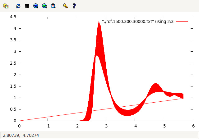
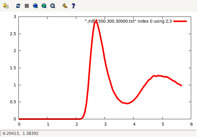
As you can see, all the graphs in the file are drawn. To draw a graph only for parts of points, use the index keyword. For example, we build a graph using only the first 100 lines with data:
Here linewidth 5 indicates that the line will be thicker than usual. Result:
We assume that this kind of graphics suits us. Now you need to run through all the records in the input file, build graphs for all of them and export them to pictures. I did this with a couple of bash scripts. In fact, you can do with the built-in gnuplot tools (which is better, since it does not bind to Unixes). Making scripts animator.gp and animate.gp . In animator.gp customize the schedule and terminal:
In animate.gp we do, in fact, the generation of images.
I wanted the graph to gradually change color, so I set a certain palette from green to purple. Options unset colorbox and set key off - disable the display of the palette and the legend on the chart.
The main commands in these scripts are:
The first one includes the export of graphics in png with the size of 750x750 and the Droid font, when the plot command is given, the second one sets the file name. In the second command, we used the fact that gnuplot can concatenate integers (but not float!) With strings.
The if command in the second script executes subsequent commands when the condition is met (note that all commands in the if-a body must be on the same line and separated by a semicolon). The reread command reads the entire script from the very beginning, i.e. it turns out a kind of cycle.
The scripts are executed either by simply adding permissions to execute the file animator.gp and then launching it (in Unix) or using the command
at the gnuplot command line (any OS).
Having run the scripts, I got a number of pictures in the figures folder: 1.png, 2.png, etc. Of these, you can already collect animation. I did this using the free video editor Avidemux .
Assembling animation is easy. Open the editor, click "Open", select the first image in the sequence (in my case it was "1.png") - ready, the animation is loaded. You can click Play and check that everything is fine. Then we save the animation in the format we need. Here is my result:
A more difficult task is to do the same, but the background should not be white, but be a picture, and it should also be animated. I had such a need when I needed to visualize capillary fluctuations in a two-phase system according to the results of molecular dynamics (MD). In principle, it is possible to impose, for example, the boundaries of cyclones on the map, the visualization of some velocity field on the video of the nozzle, and you never know. So, we proceed.
You will need gnuplot version not lower than 4.4 (Ubuntu users have it in the repository for versions later than 10.04. For 10.04 we download from the specified PPA). The fact is that in this version gnuplot can upload png-files with alpha-channel to the chart. I had about a thousand files with images of MD cells in png format and as many files containing the coordinates of the phase boundary. animator.gp remains about the same:
In animate.gp we add the loading of a picture from a png-file:
Png is loaded with a command like
The with rgbalpha option requires that the chart be with four “axes” (R, G, B, alpha channels, oddly enough). I did not have an alpha channel in the background pictures, and I simply set its value as (160). The value of transparency was chosen by scientific method, so that the overlay graph was visible, and the background was not too faded.
It starts all the same as last time, generated images and are collected in the video all the same Avidemux. Here is the result:
Of course, you can add to the charts beautiful signatures of axes, legends, etc. To do this, you need to add several commands to the scripts. Interested people recommend the following sources:
Note: Origin, QtiPlot and, possibly, other graphic editors also have their own scripting languages. But the author, because of his ardent adherence to gnuplot, did not bother to learn them and wrote about what he knew.
UPD: made iteration by means of gnuplot, but not through bash. Thanks zeliboba for the tip.
Beautiful graphics can be done in many programs: proprietary Grapher and Origin, free gnuplot, QtiPlot, Veusz and others. Most popular graphing programs have an interactive graphical interface that allows you to quickly make a publication-quality graph without straining your brain. However, now we have another task - we need to stamp a lot of pictures with the same type of graphs. Editing each chart manually is a thankless task, so we will use not a glamorous Origin, but a plain gnuplot. Its strength is in the ability to build a graph according to a predetermined scenario (i.e., gnuplot has its own scripting language). Next, I will show how to quickly create graphics in any required quantity using simple scripts.
Install gnuplot
For Windows users. Go to the project site . There, click "Download" and select the appropriate option for download. Then set as usual.
For linuksoidov. Install the package with your favorite package manager. For Ubuntu Lucid users, I recommend this PPA - it has a new version with additional buns.
Example 1. The changing schedule
Let's make an animation of how the pair correlation function of the fluid changes during the transition to the glassy state. The source data is a file with values of the pair correlation function at different points in time. It looks like this:
0 100 1 0.0284366 0 2 0.0853097 0 ... 99 5.60201 1.0403 100 5.65888 1.01337 1000 100 1 0.0284366 0 2 0.0853097 0 ... The first line is the moment of time and the number of points N. Then there are N lines in the format
_X _Y Then 2 line breaks and again the same. Line breaks between blocks are important - gnuplot treats blocks separated by several line breaks as different. Thus, it is possible to build a graph corresponding to only one block.
')
Now we start gnuplot - we come into the command interface of the program. Typing
plot "rdf.txt" using 2:3 with lines What does this mean? plot - command to plot; "Rdf.txt" - the path to the file from which we want to read data; using 2: 3 means "use column 2 as X values, column 3 as Y values"; with lines - please print only the lines connecting data points to the chart.
The result of this command will be something like this:
As you can see, all the graphs in the file are drawn. To draw a graph only for parts of points, use the index keyword. For example, we build a graph using only the first 100 lines with data:
plot "rdf.txt" index 0 using 2:3 linewidth 5 with lines Here linewidth 5 indicates that the line will be thicker than usual. Result:
We assume that this kind of graphics suits us. Now you need to run through all the records in the input file, build graphs for all of them and export them to pictures. I did this with a couple of bash scripts. In fact, you can do with the built-in gnuplot tools (which is better, since it does not bind to Unixes). Making scripts animator.gp and animate.gp . In animator.gp customize the schedule and terminal:
#!/usr/bin/gnuplot set xrange [2:5.66] # X set yrange [0:4.5] # Y set palette model RGB defined (0 "green", 0.5 "blue", 1 "dark-violet") unset colorbox set terminal png font "Droid, 14" size 750,750 set key off set size square iterations=100 # iterator=0 offset=0.0 load "animate.gp" In animate.gp we do, in fact, the generation of images.
iterator=iterator+1 offset=iterator/(iterations+1.0) #1.0 , float if (offset <= 1.0)\ set output "figures/".iterator.".png";\ plot "./rdf.txt" index iterator using 2:3 smooth csplines linewidth 5 linecolor palette frac offset;\ reread I wanted the graph to gradually change color, so I set a certain palette from green to purple. Options unset colorbox and set key off - disable the display of the palette and the legend on the chart.
The main commands in these scripts are:
set terminal png font "Droid, 14" size 750,750 set output "figures/".iterator.".png" The first one includes the export of graphics in png with the size of 750x750 and the Droid font, when the plot command is given, the second one sets the file name. In the second command, we used the fact that gnuplot can concatenate integers (but not float!) With strings.
The if command in the second script executes subsequent commands when the condition is met (note that all commands in the if-a body must be on the same line and separated by a semicolon). The reread command reads the entire script from the very beginning, i.e. it turns out a kind of cycle.
The scripts are executed either by simply adding permissions to execute the file animator.gp and then launching it (in Unix) or using the command
load "animator.gp" at the gnuplot command line (any OS).
Having run the scripts, I got a number of pictures in the figures folder: 1.png, 2.png, etc. Of these, you can already collect animation. I did this using the free video editor Avidemux .
Assembling animation is easy. Open the editor, click "Open", select the first image in the sequence (in my case it was "1.png") - ready, the animation is loaded. You can click Play and check that everything is fine. Then we save the animation in the format we need. Here is my result:
Example 2. Overlay graphics on pictures
A more difficult task is to do the same, but the background should not be white, but be a picture, and it should also be animated. I had such a need when I needed to visualize capillary fluctuations in a two-phase system according to the results of molecular dynamics (MD). In principle, it is possible to impose, for example, the boundaries of cyclones on the map, the visualization of some velocity field on the video of the nozzle, and you never know. So, we proceed.
You will need gnuplot version not lower than 4.4 (Ubuntu users have it in the repository for versions later than 10.04. For 10.04 we download from the specified PPA). The fact is that in this version gnuplot can upload png-files with alpha-channel to the chart. I had about a thousand files with images of MD cells in png format and as many files containing the coordinates of the phase boundary. animator.gp remains about the same:
#!/usr/bin/gnuplot set xrange [0:242.4] set yrange [0:242.4] set xtics 0 242.4 # , # set ytics 0 242.4 set terminal png font "Droid, 14" size 750,750 set key off set size square iterations=100 # iterator=0 load "animate.gp" In animate.gp we add the loading of a picture from a png-file:
iterator=iterator+1 if (iterator <= iterations)\ plot "pic_".iterator.".png" binary filetype=png dx=0.327567568 dy=0.327567568 format='%uchar' using 1:2:3:(160) with rgbalpha;\ # replot "../surf_z/surface.".iterator.".cfg" using 2:3 smooth csplines linewidth 5;\ #replot #smooth csplines - , set output iterator.".png";\ replot;\ reread Png is loaded with a command like
plot "pic.png" binary filetype=png dx=0.327567568 dy=0.327567568 format='%uchar' using 1:2:3:(160) with rgbalpha The with rgbalpha option requires that the chart be with four “axes” (R, G, B, alpha channels, oddly enough). I did not have an alpha channel in the background pictures, and I simply set its value as (160). The value of transparency was chosen by scientific method, so that the overlay graph was visible, and the background was not too faded.
It starts all the same as last time, generated images and are collected in the video all the same Avidemux. Here is the result:
Of course, you can add to the charts beautiful signatures of axes, legends, etc. To do this, you need to add several commands to the scripts. Interested people recommend the following sources:
- Gnuplot official guide (eng.)
- The book "Gnuplot in Action" - it describes all the tricks available in gnuplot.
- Blog "Debianshka notes" - about gnuplot and not only.
Note: Origin, QtiPlot and, possibly, other graphic editors also have their own scripting languages. But the author, because of his ardent adherence to gnuplot, did not bother to learn them and wrote about what he knew.
UPD: made iteration by means of gnuplot, but not through bash. Thanks zeliboba for the tip.
Source: https://habr.com/ru/post/129407/
All Articles