Image design on CSS3
When using the box-shadow or border-radius properties directly on the image, browsers may incorrectly display the CSS styles that we set, due to which the appearance of the block will be significantly different from the plan. However, if you use the image as a background, then this problem can be easily avoided. From the article you will learn how using jQuery to make perfectly rounded corners of images, as well as what other design methods are possible using properties such as box-shadow, border-radius and transition.
Watch the demo
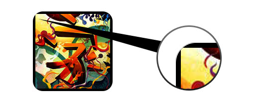
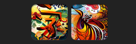
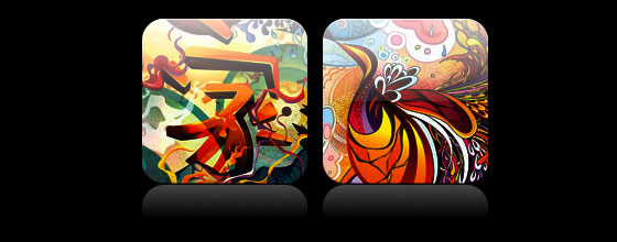
From the example below, it becomes clear what difficulties we may encounter when using css-properties on the image. In addition, each browser displays the finished item in its own way. Firefox does not want to make the corners rounded, but adds a shadow to the element, and Chrome or Safari refuse to do both.
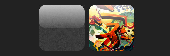
For all properties to work correctly and in all browsers, you must use the image as a background.
To add dynamics, you need to use a small jQuery script that will wrap the original image in a span tag with an image-wrap style. Also, the use of the script will make our original image a background image and set its width and height.
After applying, we get the following result:
Now that the image is used as a background, any style can be added to the element. Below are examples of rounding off the corners of images, creating a circle effect, adding shadows and other design techniques.
')
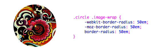
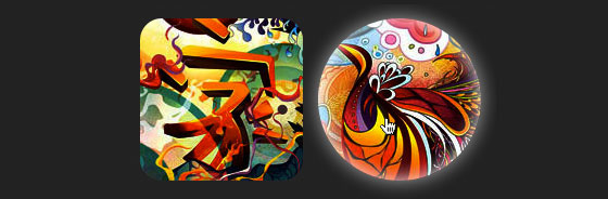
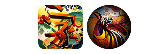
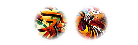
Circle effect
Simple effect with creating a circle.
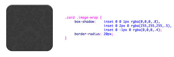
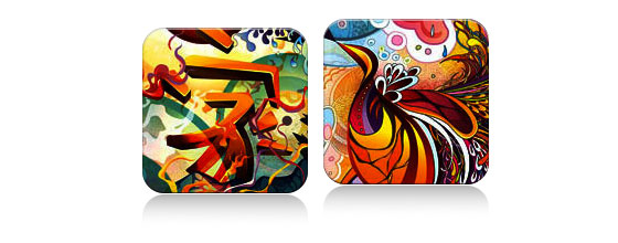
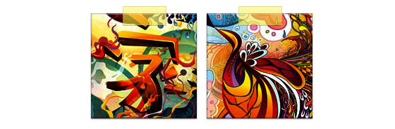
Rounded corners
An example with rounded corners and adding a shadow.
Embossed style
Add a small ledge (relief) at the bottom of the image.
Embossed smoothing
Same effect, but with 1px blurring of the lower border.

Embedded style
Using the box-shadow property, you can make the effect embedded in the plane of the image.
Morphing and highlighting
In this example, the transition property is added. When you hover the mouse, the image is highlighted and its shape changes to a circle. The backlight effect is created by the box-shadow property.
Gloss effect
An example of a gradient overlay on top of an image. Achieved by using a pseudo-element: after.
Reflection effect
Another example using a gradient, but this time to create a reflection effect.
Gloss and reflection
Combining the two effects described above.
Ribbon effect
Use the pseudo-element: after to create a ribbon effect at the top of the image.
Morphing and toning
When you hover the mouse over the image, we add a radial gradient using the pseudo-element: after.
Circle effect with blurred edges
The radial gradient can also be used as a mask to create a smooth edges effect.
Watch the demo
These examples work in all browsers (Chrome, Firefox and Safari), with support for the border-radius, box-shadow and pseudo-elements properties: before and: after. In other browsers, we just see the pictures, without any effects.
Watch the demo
Problem
From the example below, it becomes clear what difficulties we may encounter when using css-properties on the image. In addition, each browser displays the finished item in its own way. Firefox does not want to make the corners rounded, but adds a shadow to the element, and Chrome or Safari refuse to do both.
Decision
For all properties to work correctly and in all browsers, you must use the image as a background.
<div style="background:url(image.jpg) no-repeat center center; width:150px; height:150px;"></div> Adding dynamics
To add dynamics, you need to use a small jQuery script that will wrap the original image in a span tag with an image-wrap style. Also, the use of the script will make our original image a background image and set its width and height.
<script type="text/javascript" src="http://ajax.googleapis.com/ajax/libs/jquery/1.5/jquery.min.js"></script> <script type="text/javascript"> $(document).ready(function(){ $("img").load(function() { $(this).wrap(function(){ return '<span class="image-wrap ' + $(this).attr('class') + '" style="position:relative; display:inline-block; background:url(' + $(this).attr('src') + ') no-repeat center center; width: ' + $(this).width() + 'px; height: ' + $(this).height() + 'px;" />'; }); $(this).css("opacity","0"); }); }); </script> After applying, we get the following result:
<span class="image-wrap" style="position:relative; display:inline-block; background:url(image.jpg) no-repeat center center; width:150px; height:150px;"> <img src="image.jpg" style="opacity:0;"> </span> Examples (view demo )
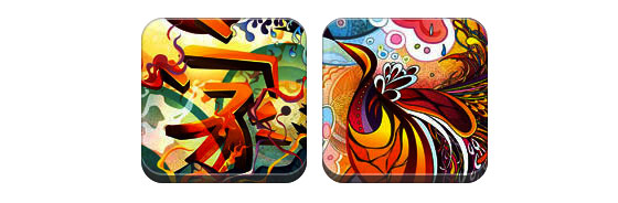
Now that the image is used as a background, any style can be added to the element. Below are examples of rounding off the corners of images, creating a circle effect, adding shadows and other design techniques.
')
Circle effect
Simple effect with creating a circle.
.circle .image-wrap { -webkit-border-radius: 50em; -moz-border-radius: 50em; border-radius: 50em; } Rounded corners
An example with rounded corners and adding a shadow.
.card .image-wrap { -webkit-box-shadow: inset 0 0 1px rgba(0,0,0,.8), inset 0 2px 0 rgba(255,255,255,.5), inset 0 -1px 0 rgba(0,0,0,.4); -moz-box-shadow: inset 0 0 1px rgba(0,0,0,.8), inset 0 2px 0 rgba(255,255,255,.5), inset 0 -1px 0 rgba(0,0,0,.4); box-shadow: inset 0 0 1px rgba(0,0,0,.8), inset 0 2px 0 rgba(255,255,255,.5), inset 0 -1px 0 rgba(0,0,0,.4); -webkit-border-radius: 20px; -moz-border-radius: 20px; border-radius: 20px; } Embossed style
Add a small ledge (relief) at the bottom of the image.
.embossed .image-wrap { -webkit-box-shadow: inset 0 0 2px rgba(0,0,0,.8), inset 0 2px 0 rgba(255,255,255,.5), inset 0 -7px 0 rgba(0,0,0,.6), inset 0 -9px 0 rgba(255,255,255,.3); -moz-box-shadow: inset 0 0 2px rgba(0,0,0,.8), inset 0 2px 0 rgba(255,255,255,.5), inset 0 -7px 0 rgba(0,0,0,.6), inset 0 -9px 0 rgba(255,255,255,.3); box-shadow: inset 0 0 2px rgba(0,0,0,.8), inset 0 2px 0 rgba(255,255,255,.5), inset 0 -7px 0 rgba(0,0,0,.6), inset 0 -9px 0 rgba(255,255,255,.3); -webkit-border-radius: 20px; -moz-border-radius: 20px; border-radius: 20px; } Embossed smoothing
Same effect, but with 1px blurring of the lower border.
.soft-embossed .image-wrap { -webkit-box-shadow: inset 0 0 4px rgba(0,0,0,1), inset 0 2px 1px rgba(255,255,255,.5), inset 0 -9px 2px rgba(0,0,0,.6), inset 0 -12px 2px rgba(255,255,255,.3); -moz-box-shadow: inset 0 0 4px rgba(0,0,0,1), inset 0 2px 1px rgba(255,255,255,.5), inset 0 -9px 2px rgba(0,0,0,.6), inset 0 -12px 2px rgba(255,255,255,.3); box-shadow: inset 0 0 4px rgba(0,0,0,1), inset 0 2px 1px rgba(255,255,255,.5), inset 0 -9px 2px rgba(0,0,0,.6), inset 0 -12px 2px rgba(255,255,255,.3); -webkit-border-radius: 20px; -moz-border-radius: 20px; border-radius: 20px; } Embedded style
Using the box-shadow property, you can make the effect embedded in the plane of the image.
.cut-out .image-wrap { -webkit-box-shadow: 0 1px 0 rgba(255,255,255,.2), inset 0 4px 5px rgba(0,0,0,.6), inset 0 1px 0 rgba(0,0,0,.6); -moz-box-shadow: 0 1px 0 rgba(255,255,255,.2), inset 0 4px 5px rgba(0,0,0,.6), inset 0 1px 0 rgba(0,0,0,.6); box-shadow: 0 1px 0 rgba(255,255,255,.2), inset 0 4px 5px rgba(0,0,0,.6), inset 0 1px 0 rgba(0,0,0,.6); -webkit-border-radius: 20px; -moz-border-radius: 20px; border-radius: 20px; } Morphing and highlighting
In this example, the transition property is added. When you hover the mouse, the image is highlighted and its shape changes to a circle. The backlight effect is created by the box-shadow property.
.morphing-glowing .image-wrap { -webkit-transition: 1s; -moz-transition: 1s; transition: 1s; -webkit-border-radius: 20px; -moz-border-radius: 20px; border-radius: 20px; } .morphing-glowing .image-wrap:hover { -webkit-box-shadow: 0 0 20px rgba(255,255,255,.6), inset 0 0 20px rgba(255,255,255,1); -moz-box-shadow: 0 0 20px rgba(255,255,255,.6), inset 0 0 20px rgba(255,255,255,1); box-shadow: 0 0 20px rgba(255,255,255,.6), inset 0 0 20px rgba(255,255,255,1); -webkit-border-radius: 60em; -moz-border-radius: 60em; border-radius: 60em; } Gloss effect
An example of a gradient overlay on top of an image. Achieved by using a pseudo-element: after.
.glossy .image-wrap { -webkit-box-shadow: inset 0 -1px 0 rgba(0,0,0,.5); -moz-box-shadow: inset 0 -1px 0 rgba(0,0,0,.5); box-shadow: inset 0 -1px 0 rgba(0,0,0,.5); -webkit-border-radius: 20px; -moz-border-radius: 20px; border-radius: 20px; } .glossy .image-wrap:after { position: absolute; content: ' '; width: 100%; height: 50%; top: 0; left: 0; -webkit-border-radius: 20px; -moz-border-radius: 20px; border-radius: 20px; background: linear-gradient(top, rgba(255,255,255,0.7) 0%,rgba(255,255,255,.1) 100%); background: -moz-linear-gradient(top, rgba(255,255,255,0.7) 0%, rgba(255,255,255,.1) 100%); background: -webkit-gradient(linear, left top, left bottom, color-stop(0%,rgba(255,255,255,0.7)), color-stop(100%,rgba(255,255,255,.1))); } Reflection effect
Another example using a gradient, but this time to create a reflection effect.
.reflection .image-wrap:after { position: absolute; content: ' '; width: 100%; height: 30px; bottom: -31px; left: 0; -webkit-border-top-left-radius: 20px; -webkit-border-top-right-radius: 20px; -moz-border-radius-topleft: 20px; -moz-border-radius-topright: 20px; border-top-left-radius: 20px; border-top-right-radius: 20px; background: -moz-linear-gradient(top, rgba(0,0,0,.3) 0%, rgba(255,255,255,0) 100%); background: linear-gradient(top, rgba(0,0,0,.3) 0%,rgba(255,255,255,0) 100%); background: -webkit-gradient(linear, left top, left bottom, color-stop(0%,rgba(0,0,0,.3)), color-stop(100%,rgba(255,255,255,0))); } .reflection .image-wrap:hover { position: relative; top: -8px; } Gloss and reflection
Combining the two effects described above.
.glossy-reflection .image-wrap { -webkit-box-shadow: inset 0 -1px 0 rgba(0,0,0,.5), inset 0 1px 0 rgba(255,255,255,.6); -moz-box-shadow: inset 0 -1px 0 rgba(0,0,0,.5), inset 0 1px 0 rgba(255,255,255,.6); box-shadow: inset 0 -1px 0 rgba(0,0,0,.5), inset 0 1px 0 rgba(255,255,255,.6); -webkit-transition: 1s; -moz-transition: 1s; transition: 1s; -webkit-border-radius: 20px; -moz-border-radius: 20px; border-radius: 20px; } .glossy-reflection .image-wrap:before { position: absolute; content: ' '; width: 100%; height: 50%; top: 0; left: 0; -webkit-border-radius: 20px; -moz-border-radius: 20px; border-radius: 20px; background: linear-gradient(top, rgba(255,255,255,0.7) 0%,rgba(255,255,255,.1) 100%); background: -moz-linear-gradient(top, rgba(255,255,255,0.7) 0%, rgba(255,255,255,.1) 100%); background: -webkit-gradient(linear, left top, left bottom, color-stop(0%,rgba(255,255,255,0.7)), color-stop(100%,rgba(255,255,255,.1))); } .glossy-reflection .image-wrap:after { position: absolute; content: ' '; width: 100%; height: 30px; bottom: -31px; left: 0; -webkit-border-top-left-radius: 20px; -webkit-border-top-right-radius: 20px; -moz-border-radius-topleft: 20px; -moz-border-radius-topright: 20px; border-top-left-radius: 20px; border-top-right-radius: 20px; background: linear-gradient(top, rgba(230,230,230,.3) 0%, rgba(230,230,230,0) 100%); background: -moz-linear-gradient(top, rgba(230,230,230,.3) 0%, rgba(230,230,230,0) 100%); background: -webkit-gradient(linear, left top, left bottom, color-stop(0%,rgba(230,230,230,.3)), color-stop(100%,rgba(230,230,230,0))); } Ribbon effect
Use the pseudo-element: after to create a ribbon effect at the top of the image.
.tape .image-wrap { -webkit-box-shadow: inset 0 0 2px rgba(0,0,0,.7), inset 0 2px 0 rgba(255,255,255,.3), inset 0 -1px 0 rgba(0,0,0,.5), 0 1px 3px rgba(0,0,0,.4); -moz-box-shadow: inset 0 0 2px rgba(0,0,0,.7), inset 0 2px 0 rgba(255,255,255,.3), inset 0 -1px 0 rgba(0,0,0,.5), 0 1px 3px rgba(0,0,0,.4); box-shadow: inset 0 0 2px rgba(0,0,0,.7), inset 0 2px 0 rgba(255,255,255,.3), inset 0 -1px 0 rgba(0,0,0,.5), 0 1px 3px rgba(0,0,0,.4); } .tape .image-wrap:after { position: absolute; content: ' '; width: 60px; height: 25px; top: -10px; left: 50%; margin-left: -30px; border: solid 1px rgba(137,130,48,.2); -webkit-box-shadow: inset 0 1px 0 rgba(255,255,255,.3), 0 1px 0 rgba(0,0,0,.2); background: linear-gradient(top, rgba(254,243,127,.6) 0%,rgba(240,224,54,.6) 100%); background: -moz-linear-gradient(top, rgba(254,243,127,.6) 0%, rgba(240,224,54,.6) 100%); background: -webkit-gradient(linear, left top, left bottom, color-stop(0%,rgba(254,243,127,.6)), color-stop(100%,rgba(240,224,54,.6))); } Morphing and toning
When you hover the mouse over the image, we add a radial gradient using the pseudo-element: after.
.morphing-tinting .image-wrap { position: relative; -webkit-transition: 1s; -moz-transition: 1s; transition: 1s; -webkit-border-radius: 20px; -moz-border-radius: 20px; border-radius: 20px; } .morphing-tinting .image-wrap:hover { -webkit-border-radius: 30em; -moz-border-radius: 30em; border-radius: 30em; } .morphing-tinting .image-wrap:after { position: absolute; content: ' '; width: 100%; height: 100%; top: 0; left: 0; -webkit-transition: 1s; -moz-transition: 1s; transition: 1s; -webkit-border-radius: 30em; -moz-border-radius: 30em; border-radius: 30em; } .morphing-tinting .image-wrap:hover:after { background: -webkit-gradient(radial, 50% 50%, 40, 50% 50%, 80, from(rgba(0,0,0,0)), to(rgba(0,0,0,1))); background: -moz-radial-gradient(50% 50%, circle, rgba(0,0,0,0) 40px, rgba(0,0,0,1) 80px); } Circle effect with blurred edges
The radial gradient can also be used as a mask to create a smooth edges effect.
.feather .image-wrap { position: relative; -webkit-border-radius: 30em; -moz-border-radius: 30em; border-radius: 30em; } .feather .image-wrap:after { position: absolute; content: ' '; width: 100%; height: 100%; top: 0; left: 0; background: -webkit-gradient(radial, 50% 50%, 50, 50% 50%, 70, from(rgba(255,255,255,0)), to(rgba(255,255,255,1))); background: -moz-radial-gradient(50% 50%, circle, rgba(255,255,255,0) 50px, rgba(255,255,255,1) 70px); } Watch the demo
Cross-browser compatibility
These examples work in all browsers (Chrome, Firefox and Safari), with support for the border-radius, box-shadow and pseudo-elements properties: before and: after. In other browsers, we just see the pictures, without any effects.
Source: https://habr.com/ru/post/129313/
All Articles