The site of the payment system Monety.Ru is now in a new design
Since last week, all our users can try to work in the new site design in the "combat mode". We created a new version in the studio of Lebedev and a little bit below I will tell you a little about the experience of working with them.
We have not yet decided to completely replace the old design version with a new one and made a switch between versions. The link can be found at the top of the screen. In the old version it is on the right, and in the new one it is on the left.
')
On the studio website you can see the design of ready-made templates and work process.
We were very lucky with the managers who led our project in the studio. These wonderful people are called Daria Sviridov and Maksim Stupenko, who approached work with a soul and delved into all the subtleties of the payment system.
The scheme of work was as follows: a prototype of individual pages was created, where we coordinated the main blocks. Then we were offered a design option, where we either agreed with the general concept or rejected it and waited for the next version of the work. With the approved concept was already large-scale tuning, which occupied most of the time.
And now what was and what became:
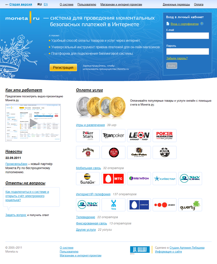
Old design of the main page (new is shown at the beginning of the topic)

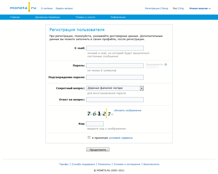
Register a new account in the old design
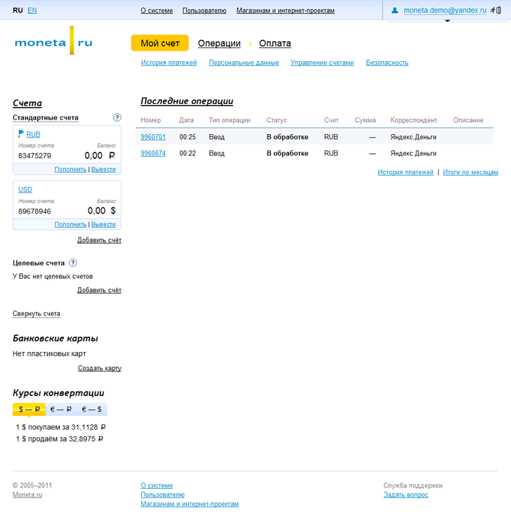
The same is in the new
You may notice that we refused the password confirmation field, but added functionality with a “eye”, when clicked, the password is either displayed in the clear or hides behind the mask.

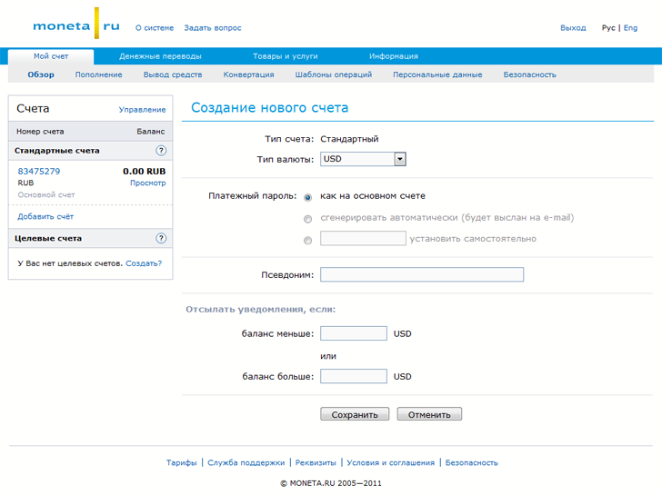
Adding a new account to your account
In the Coin, a user can have several accounts in different currencies. It is extremely necessary for the same poker players who make deposits in the rooms and want to transfer money between them. In this case, they do not lose interest on the commission for currency conversion. And deposits and withdrawals from the rooms in Monet are carried out without commission.
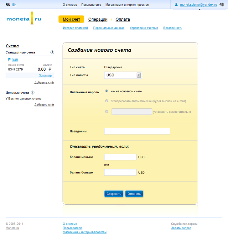
The same in new design
Overview Pages
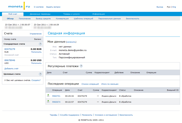
The overview page is one of the main internal pages. Here, with one glance, you can cover a list of all accounts, and there may be quite a lot of them, so they can be rolled up into “bundles”. Naturally we display a list of recent transactions and a list of regular payments, if any.
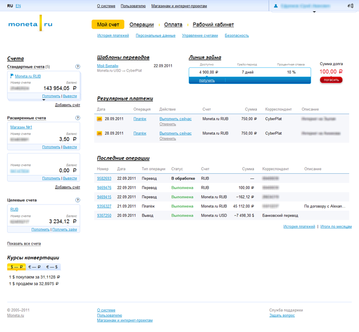
And this is the overview page of the personalized account, there are more possibilities and more functionality in the functional and the design is slightly different. Here, by the way, you can just see the standard accounts rolled up in a “wad”.
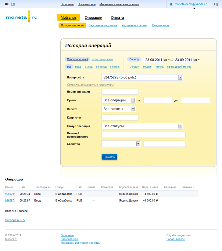
Operations history
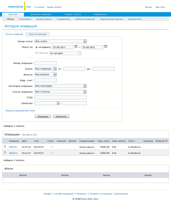
There are a lot of different filters in the history of operations that are actively used by our partners. By default, the form of filters is presented in a simplified version, but here I showed all the fields.
What do you think should be the main thing in the design and usability of payment system sites? Which sites do you like, and which ones should be redone in the shortest possible time? )
And finally, a new video from Trailer Studio
We have not yet decided to completely replace the old design version with a new one and made a switch between versions. The link can be found at the top of the screen. In the old version it is on the right, and in the new one it is on the left.
')
On the studio website you can see the design of ready-made templates and work process.
We were very lucky with the managers who led our project in the studio. These wonderful people are called Daria Sviridov and Maksim Stupenko, who approached work with a soul and delved into all the subtleties of the payment system.
The scheme of work was as follows: a prototype of individual pages was created, where we coordinated the main blocks. Then we were offered a design option, where we either agreed with the general concept or rejected it and waited for the next version of the work. With the approved concept was already large-scale tuning, which occupied most of the time.
And now what was and what became:
Old design of the main page (new is shown at the beginning of the topic)
Register a new account in the old design
The same is in the new
You may notice that we refused the password confirmation field, but added functionality with a “eye”, when clicked, the password is either displayed in the clear or hides behind the mask.
Adding a new account to your account
In the Coin, a user can have several accounts in different currencies. It is extremely necessary for the same poker players who make deposits in the rooms and want to transfer money between them. In this case, they do not lose interest on the commission for currency conversion. And deposits and withdrawals from the rooms in Monet are carried out without commission.
The same in new design
Overview Pages
The overview page is one of the main internal pages. Here, with one glance, you can cover a list of all accounts, and there may be quite a lot of them, so they can be rolled up into “bundles”. Naturally we display a list of recent transactions and a list of regular payments, if any.
And this is the overview page of the personalized account, there are more possibilities and more functionality in the functional and the design is slightly different. Here, by the way, you can just see the standard accounts rolled up in a “wad”.
Operations history
There are a lot of different filters in the history of operations that are actively used by our partners. By default, the form of filters is presented in a simplified version, but here I showed all the fields.
What do you think should be the main thing in the design and usability of payment system sites? Which sites do you like, and which ones should be redone in the shortest possible time? )
And finally, a new video from Trailer Studio
Source: https://habr.com/ru/post/128977/
All Articles