Create Your Look and Feel - Part I
Good afternoon, habrazhitel!

Quite a lot has already been said about Swing and graphics , as well as some of the various outstanding features provided by third-party libraries.
Today, I will present to your court the “last frontier” of immersion in all those opportunities that Swing offers us - creating your Look and Feel class, as well as everything that will be required along the way.
I’ll sayright away - if you want to start writing your own example, and not just “peep” a couple of interesting moments - be ready to kill, spend a lot of time on this business, if you are going to release something more or less alive and usable in any applications in as a “wrapper”, and also are going to continue to support the LaF you created.
')
But even if you are not going to make your LaF - I advise you to get acquainted with the content. I am sure you will find a lot of new and interesting. And even, perhaps, you will understand what was the root of this or that interface problem, which probably tormented you for many months and years.
Tip: If you are not familiar with graphics and Swing in Java more or less closely, I advise you first to re-read several articles on the topic (for example, the official tutorial , an article on Swing from Skipy or my previous introductory articles ).
So, without losing time, let's start with the basics - the LookAndFeel class itself. We follow our MyLookAndFeel class from BasicLookAndFeel, not the “empty” LookAndFeel, since it already implements many things, such as: constants for various UI classes, standard component hotkeys, color schemes and much more, without which most UI classes it can not even be correctly initialized (especially since most of these variables do not need to be overridden).
So, use a ready-made BasicLookAndFeel and override a few required methods that describe our future LaF:
Now it remains to apply one “magic” line before creating any application and it will use our LaF:
Here is what we get with a simple example:
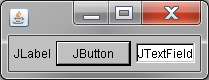
This LaF already has one noticeable plus - it is fully cross-platform, i.e. in the current implementation it will looklike the same on Windows, on Mac OS, and on Linux systems.
It remains to work on cosmetics - this is what we will do! ..
So, we need several things to modify each component, let's start with the most obvious - creating a UI class for the selected component.
For simplicity, we take the button - the most familiar component to anyone.
By analogy with BasicLookAndFeel, for each J-component there is a BasicUI-implementation, which greatly simplifies and minimizes the operations necessary for styling components. For the button, it is not difficult to guess, this is BasicButtonUI - it is him that we will inherit and redefine.
In all UI classes, in addition to specialized methods (they are different for each class, depending on the component for which this UI) there are several standard methods inherited from the ComponentUI - for a start, consider them:
Tip: There are several more methods in ComponentUI, but we will not need them today and are very unlikely to be used by you ever, so I will save time and allow myself to skip their descriptions.
In order not to get confused, I will give a list of the mentioned classes / methods again:
Jcomponent
I will add some more descriptions of the construction of the LookAndFeel class in order not to return to it anymore.
In addition to the possibility described above for specifying UI classes for standard components in UIDefaults when implementing LookAndFeel, there are also many other things that run the LookAndFeel class. Most of them you hardly need to implement / redefine, since they already exist in the BasicLookAndFeel class, but for order it is worth knowing what is going on there.
So, consider the methods presented in the LookAndFeel class:
As I wrote above, we will inherit our UI class from the BasicButtonUI. To begin with, we throw a simple interface for the button and make sure that everything works exactly as we think:initClassDefaults method (UIDefaults table) and override the required value:
Hmm, something went wrong ... Did we really get somewhere in the UI class?
Let's try to directly set the UI button:

No, the UI is fine. What is wrong?
It was at this moment that I fought, probably the whole day. As a result, of course, everything turned out to be banal simply - we missed another method, which must be described first of all in our MyButtonUI class -createUI (JComponent c) . How did I miss it you ask? It's very simple - sometimes it is too harmful and short-sighted to rely on IDE - you can miss important points out of sight (I do not blame IDE in any way, because it is my inattention).
The given method is present in ComponentUI, but is it ... public static !? The question is why in the abstract ComponentUI a static method that cannot be overridden (which is why I did not see it right away)?
The fact is that this method is called when creating a UI in the UIDefaults class via Reflection, so in our case, since we did not create this method, the first one we got to hand was used in the call — its implementation in BasicButtonUI. And if you look at the source code, it looks like this:
Hurray, it works!
Tip: If the same your UI class can be used for all components of a certain type, then it is worth doing it. In our case with MyButtonUI, this is also possible, so we change the above method a little:
Now we know how to create and install in LookAndFeel our own UI class for a button, but what about the other components? All the same, all the same - you just need to supplement theinitClassDefaults (UIDefaults table) method with the UI classes we need. In the final form, it should look like this:
Now you can at least approximately imagine how much work (and time) will require a complete redefinition and implementation of all UIs for standard Swing components.
But not everything is so bad - if you initially decided on the concept / appearance of your LookAndFeel, things will go much faster. As I was convinced from my own experience, the implementation of most UIs comes down to using several standard methods that can be abstracted, put into separate utility classes and used everywhere (for example, drawing border, background, creating standard shapes, etc.). It requires only a little "magic" in some complex components to bring to mind their appearance.
So, we will continue our acquaintance with various UI classes, or rather, we will consider the methods and possibilities offered by the BasicUI-classes, as well as some subtleties and complex issues associated with each individual UI and requiring the same “magic”.
Perhaps for the order let's go straight through the list given in the code above ...
One of the simplest components. In most LookAndFeel's, LabelUI is either not redefined at all and uses BasicLabelUI, or it is only slightly modified. For example, in WindowsLabelUI, the mnemonic-underline drawing works differently - it is visible only when Alt is clamped.
All that is needed - rendering ordinary or HTML text, as well as mnemonic underscores - is in BasicLabelUI.
The main trick, by the way, is in the correct drawing of the text - methods from SwingUtilities / SwingUtilities2 are actively used for it. First, the location of the text is determined, and then the standard method is used to draw it:
If you are interested in learning more, you can thoroughly study the BasicLabelUI class. If you are already quite well-versed in the schedule, no problems should arise.
We will not linger and go on.
No less simple than the JLabel component. In fact, JToolTip (speaking abstractly) is the text on the background and with a certain border.
However, there is one small nuance - this component, when displayed, is located either on the JLayeredPane of the window in which the tooltip was shown, or on a separate JWindow if the tooltip goes beyond the window. This nuance should be taken into account when drawing and avoiding any specific forms of tooltip and sticking to “more or less” rectangular.
Also, if you setsetOpaque (false) to the JToolTip yourself and it will be within the current window, it will be really transparent. In the case of a tooltip display in a separate JWindow, this trick will not work anymore.
So far, there are several tricks to get out of this situation - to make the window transparent with recently appeared features (AWTUtilities in versions 1.6 and 10 + 10 or Window methods in 1.7+) or to take a "screenshot" of the area over which the tooltip is displayed and place it as a background .
The first option has a minus in the fact that this feature does not work correctly everywhere. The second minus is in static and speed, i.e., if there was any animation under the tooltip window, its absence will be noticeable. However, in the context of the tooltip it hardly plays a big role.
In the example MyButtonUI above, I did not use the methods defined in BasicButtonUI, but simply redefined the paint (Graphics g, JComponent c) method .
Do the same or inherit methods:
paintButtonPressed (Graphics g, AbstractButton b)
paintText (Graphics g, AbstractButton b, Rectangle textRect, String text)
paintIcon (Graphics g, JComponent c, Rectangle iconRect)
paintFocus (Graphics g, AbstractButton b, Rectangle viewRect, Rectangle textRect, Rectangle iconRect)
the matter is purely yours and depends, rather, on the complexity of the button being drawn.
If desired, you can completely separate the drawing into parts by their own methods. For example, to make a separate method for drawing the background and text with an icon, but no more.
In any case - the result will be the same, if you never make a mistake of course.
For JToggleButton there is no ToggleButtonUI class - only BasicToggleButtonUI inherited from BasicButtonUI and in fact there is almost no difference between them. Just in the JToggleButton, the button model can assume the state selected = true, but not in the JButton, although the model itself is the same in both cases.
Accordingly, the visual difference is that the JToggleButton can remain in the pressed state without holding the component with the mouse. Neither drawing nor logic, in fact, does not change at all.
Therefore, it seems to me logical to implement the UI of both JButton and JToggleButton with the same class, or simply pass on for visual clarity (MyToggleButtonUI extends MyButtonUI), and of course do not forget to add the static createUI method (JComponent c) to MyToggleButtonUI.
Similar to JToggleButton - this component does not have a RadioButtonUI class. BasicRadioButtonUI is inherited from BasicToggleButtonUI and differs only in the drawn icon and the lack of a standard background.
This UI completely duplicates the BasicRadioButtonUI, with the exception of the icon.
This component is a “stand” for JMenu components and doesn’t draw anything except the background.
However, when overriding BasicMenuBarUI, it is also worth overriding the component border, which is inherited.
Another feature is that on the Mac OS the design and the UI itself, as well as all the other UI menus and menu items will not make sense if integration with the system menu bar is used.
i.e. when using:
Honestly, this component is the ugliest of all in terms of sales and hemorrhoids. Therefore, I will describe all problem areas in more detail.
In BasicMenuItemUI there are several originally separated methods:
What is most interesting - half of these things are not needed in a regular JMenuItem. But, looking ahead, I will say that this class implements a visual representation of all four different menu items - JMenu, JMenuItem, JCheckBoxMenuItem, JRadioButtonMenuItem.
And this is only the beginning of all porridge, then - better.
All calculations of the sizes and locations of individual items are made to the MenuItemLayoutHelper class, which is generally in a different package (sun.swing) and cannot be changed in any way. Also, this class is not included in some of the old JDK and OpenJDK builds.
As a result, if you are somehow not satisfied with the location of the elements or their sizes, you have to resort to deceptions and tricks and bypass the standard MenuItemLayoutHelper data in every possible way (for example, I had to align all the menu items with a space in the 16x16 icon, if none of the elements have it).
After a couple of days of people killed for a useless war with him, I abandoned the idea and, using a portion of the MenuItemLayoutHelper code, wrote my own class for calculations. Also, as an option, you can completely stop using MenuItemLayoutHelper and implement all the calculations again.
This UI 1 in 1 repeats the implementation of BasicMenuItemUI, but you have to choose the lesser of evils - either inherit your implementation of BasicMenuItemUI and copy the JMenu logic from BasicMenuUI, or inherit BasicMenuUI and copy the visual implementation from your successor to BasicMenuItemUI.
I chose the second option, as it is still easier to understand my code, and it will be much more difficult to maintain any changes in logic than to duplicate the visual design.
BasicCheckBoxMenuItemUI - JCheckBoxMenuItem
You can expand both of these UI classes without a hint of conscience from your implementation of BasicMenuItemUI and only override the method of drawing the checkbox / radio button selection.
And you can completely implement this drawing directly in your successor to the BasicMenuItemUI, and simply expand the two data of the UI class from it by adding only the staticcreateUI (JComponent c) method.
This class represents only slightly modified BasicSeparatorUI and is used exclusively in JPopupMenu to separate menu items. The JSeparator component itself is a simple drawn line / line / stroke and is used to visually separate the logical parts of the interface.
When overriding this UI class, it is enough just to change the standardpaint (Graphics g, JComponent c) method, drawing the desired view of the separator in it.
Actually, the last component of the menu series is JPopupMenu. All the logic necessary for the operation of this component is implemented in BasicPopupMenuUI, so we only need to change the appearance to your taste.
Actually here are two points - the menu border, which will define the indent from the edge of the pop-up menu to the internal elements and the drawing of the menu background.
Border should be installed in theinstallUI method (JComponent c) , and drawn, as usual, in the paint (Graphics g, JComponent c) method .
Also, if you want exotics, you can implement the drawing of the selection of the pop-up menu items on its background, and not inside each individual menu item. This can be useful if you need some indent from the edge to the elements, but you want to draw the selection to the full width of the menu up to the edge (you can see this selection, for example, in the system popup menu on Mac OS).
To do this, the truth will have to additionally remember the current popup menu in the UI class and, when drawing the background, find out the state of the elements, as well as correctly listen to the selection change for redrawing the background.
After some time, I will publish Part II, in which I will describe in detail all the remaining BasicUI classes, and also provide several ready-made examples of the implementation of UI components.
If you have already read and mastered all the above material, you can try to start implementing your LaF or just try to override a few standard UI classes.
You can also dig into the source codes of the WebLookAndFeel library I am working on at the moment and on the basis of which I was able to practice thoroughly enough in writing the UI.There you can find a full-fledged implementation of all standard UIs, most of which I have described or will describe in this and the next article, as well as some other interface “buns”.
In more detail about it, and also the remained UI classes read in continuation approximately in a week. And thank you for your attention!
If you have any questions on Java LookAndFeel / UI - feel free to unsubscribe and unsubscribe in the comments! I will try to answer them as far as possible.
PS Special thanks to the project dumpz.org for a pleasant readable code highlighting.
Quite a lot has already been said about Swing and graphics , as well as some of the various outstanding features provided by third-party libraries.
Today, I will present to your court the “last frontier” of immersion in all those opportunities that Swing offers us - creating your Look and Feel class, as well as everything that will be required along the way.
I’ll say
')
But even if you are not going to make your LaF - I advise you to get acquainted with the content. I am sure you will find a lot of new and interesting. And even, perhaps, you will understand what was the root of this or that interface problem, which probably tormented you for many months and years.
Tip: If you are not familiar with graphics and Swing in Java more or less closely, I advise you first to re-read several articles on the topic (for example, the official tutorial , an article on Swing from Skipy or my previous introductory articles ).
MyLookAndFeel.java
So, without losing time, let's start with the basics - the LookAndFeel class itself. We follow our MyLookAndFeel class from BasicLookAndFeel, not the “empty” LookAndFeel, since it already implements many things, such as: constants for various UI classes, standard component hotkeys, color schemes and much more, without which most UI classes it can not even be correctly initialized (especially since most of these variables do not need to be overridden).
So, use a ready-made BasicLookAndFeel and override a few required methods that describe our future LaF:
public class MyLookAndFeel extends BasicLookAndFeel
{
public String getDescription ()
{
// Description LaF
return "Cross-platform Java Look and Feel" ;
}
public String getName ()
{
// LaF Name
return "MyLookAndFeel" ;
}
public String getID ()
{
// Unique identifier of LaF
return getName ();
}
public boolean isNativeLookAndFeel ()
{
// Is the given LaF tied to the current platform (is it its native implementation)
return false ;
}
public boolean isSupportedLookAndFeel ()
{
// Is the LaF supported on the current platform?
return true ;
}
}
Now it remains to apply one “magic” line before creating any application and it will use our LaF:
Uimanager setLookAndFeel ( MyLookAndFeel . class . getCanonicalName () );
Here is what we get with a simple example:
This LaF already has one noticeable plus - it is fully cross-platform, i.e. in the current implementation it will look
It remains to work on cosmetics - this is what we will do! ..
Styling components
So, we need several things to modify each component, let's start with the most obvious - creating a UI class for the selected component.
For simplicity, we take the button - the most familiar component to anyone.
By analogy with BasicLookAndFeel, for each J-component there is a BasicUI-implementation, which greatly simplifies and minimizes the operations necessary for styling components. For the button, it is not difficult to guess, this is BasicButtonUI - it is him that we will inherit and redefine.
In all UI classes, in addition to specialized methods (they are different for each class, depending on the component for which this UI) there are several standard methods inherited from the ComponentUI - for a start, consider them:
- public void installUI (JComponent c)
This method is intended for the "installation" of a UI class on a specific J-component. It is in this method that you should determine any listeners for the J-component or any other data necessary for the correct rendering and operation of your UI.
This method is called from updateUI () when creating any J-component. - public void uninstallUI (JComponent c)
In this method, it is highly desirable to delete all the listeners you added to the component, and also to clear the memory of unnecessary more data.
This method is called from setUI (ComponentUI newUI) when the component changes its current UI, or when the component is completely removed and its dependencies are “cleared”. - public void paint (Graphics g, JComponent c)
This method deals directly with the drawing of the component. This method is the key in UI-classes, as it determines the visual design of the component in any of its states.
This method is called indirectly at any drawing / redrawing of a component from paintComponent (Graphics g) , which is present in any successor of the JComponent class, i.e., this method works only with the actual need for redrawing, and also taking into account the necessary clip. in paintComponent (Graphics g) ). - public void update (Graphics g, JComponent c)
This method is only a small addition to paint (Graphics g, JComponent c) , but it is it that is called from paintComponent (Graphics g) from JComponent and then calls the previously described paint (Graphics g, JComponent c) from the UI class. In fact, this method implements mashing the “obsolete” background of the object and then drawing on the “blank sheet”. - public Dimension getPreferredSize (JComponent c)
This method determines the desired size of the component on which this UI class is installed.
It is called from the getPreferredSize () method of the same name for JComponent or any of its successors, if necessary, to recalculate the desired size of the component. - public Dimension getMinimumSize (JComponent c)
public Dimension getMaximumSize (JComponent c)
These two methods determine the minimum and maximum sizes of the components and can be taken into account by different Layout-managers when resizing. By default, they return the same value as getPreferredSize (JComponent c) , implemented in the UI class and described earlier. - public boolean contains (JComponent c, int x, int y)
This method determines whether a point belongs to this component or not. It is necessary, for the most part, for the correct handling of mouse events. In any event of the mouse, it is transmitted to the uppermost component “seen” at this point. And precisely in order to find out which of the components is at the very top at a given point, the components located there are sequentially polled. That is. Due to this method, for example, you can make events pass “by” your component in those places where it is not actually drawn and there is no need to receive the event (for example, an empty area to the right of the tabs or the corner areas of a round button).
This method is called from contains (int x, int y) , which is present in all heirs of the JComponent class.
Tip: There are several more methods in ComponentUI, but we will not need them today and are very unlikely to be used by you ever, so I will save time and allow myself to skip their descriptions.
In order not to get confused, I will give a list of the mentioned classes / methods again:
Jcomponent
- updateUI ()
- setUI (ComponentUI newUI)
- paintComponent (Graphics g)
- getPreferredSize ()
- contains (int x, int y)
- public void installUI (JComponent c)
- public void uninstallUI (JComponent c)
- public void paint (Graphics g, JComponent c)
- public void update (Graphics g, JComponent c)
- public Dimension getPreferredSize (JComponent c)
- public Dimension getMinimumSize (JComponent c)
- public Dimension getMaximumSize (JComponent c)
- public boolean contains (JComponent c, int x, int y)
More about LookAndFeel
I will add some more descriptions of the construction of the LookAndFeel class in order not to return to it anymore.
In addition to the possibility described above for specifying UI classes for standard components in UIDefaults when implementing LookAndFeel, there are also many other things that run the LookAndFeel class. Most of them you hardly need to implement / redefine, since they already exist in the BasicLookAndFeel class, but for order it is worth knowing what is going on there.
So, consider the methods presented in the LookAndFeel class:
- installColors (JComponent c, String defaultBgName, String defaultFgName)
installColorsAndFont (JComponent c, String defaultBgName, String defaultFgName, String defaultFontName)
installBorder (JComponent c, String defaultBorderName)
uninstallBorder (JComponent c)
installProperty (JComponent c, String propertyName, Object propertyValue)
makeKeyBindings (Object [] keyBindingList)
makeInputMap (Object [] keys)
makeComponentInputMap (JComponent c, Object [] keys)
loadKeyBindings (InputMap retMap, Object [] keys)
makeIcon (final Class <?> baseClass, final String gifFile)
getDesktopPropertyValue (String systemPropertyName, Object fallbackValue)
This entire huge set of static methods is available in the LookAndFeel class for virtually one purpose - simplified use of keys and setting values obtained from these keys to various components. Whether it is the background or font color, hotkeys for text fields or a component border. They are used mostly in separate UI classes and in UIDefaults. It makes no sense to describe the purpose of each individual method, since it is more than described in detail right in the comments before each method. - public LayoutStyle getLayoutStyle ()
This method returns an instance of the LayoutStyle class that defines the behavior of components in different layouts. For example, he can determine which indent is preferable between the label and the text field, located one behind the other on the same container (yes, right up to such specific cases). However, this is a rather abstract thing, and in reality few of the layouts use the parameters defined in this class, and this point was even noted by the developers in the class comments. For example, in Swing, the only layout-using LayoutStyle is GroupLayout , which is not strange, considering its specificity. - public void provideErrorFeedback (Component component)
This method is called each time the user performs an unacceptable action (for example, he presses Backspace in the empty text field or tries to delete the text of the uneditable field, etc.). In the standard implementation, such cases simply call the Toolkit.getDefaultToolkit () .beep () method, which reproduces the short beep of the operation's incorrectness, standard for the current OS. However, you can always change this behavior to any other (for example, completely remove this annoying * beep *). - public Icon getDisabledIcon (JComponent component, Icon icon)
This method returns the display of a locked icon corresponding to the current LookAndFeel. This method is used to display icons of a locked button, a label, and locked elements of other standard components. If you have a better / faster way to create a “blocked” type of icon, dare to redefine this method! - public Icon getDisabledSelectedIcon (JComponent component, Icon icon)
This method is identical to the previous one, only works for “selected” icons. In the standard implementation, the previous method is trivial. - public String getName ()
public String getID ()
public String getDescription ()
public boolean isNativeLookAndFeel ()
public boolean isSupportedLookAndFeel ()
These methods have already been described earlier when creating the LookAndFeel class. They simply provide basic information about this LookAndFeel. - public boolean getSupportsWindowDecorations ()
This method is more interesting - it tells UIManager whether RootPaneUI, returned by this LookAndFeel, is able to decorate the window. That is, create a window decoration instead of the standard system design. If this method returns true, you have implemented a specific window design in your RootPaneUI — you just need to perform the following two methods:JFrame . setDefaultLookAndFeelDecorated ( true );
for wrapping any JDialog / JFrame instances into a special design. About the same, how to create a similar design, so as not to be sprayed, I will write a separate topic in due time.
Jdialog setDefaultLookAndFeelDecorated ( true ); - public void initialize ()
public void uninitialize ()
These methods are invoked directly during the installation and, accordingly, change of LookAndFeel via UIManager. They can wrap up the creation of any global listeners and the creation of any variables necessary for the correct operation of your LookAndFeel. - public UIDefaults getDefaults ()
This method is, by and large, the basis of the basic design of all components. It provides all the huge variety of different variables (fonts, colors, hotkeys, etc.) necessary for the work of LookAndFeel and its individual UI classes. In BasicLookAndFeel, this method is divided into 3 separate parts:- initClassDefaults (UIDefaults table)
It is this method that we redefined in MyLookAndFeel to “replace” the UI of the button class and that it is worth redefining it for this business. - initSystemColorDefaults (UIDefaults table)
This method defines the standard colors of various elemental (oddly enough - hex values). - initComponentDefaults (UIDefaults table)
In the same largest of all methods, fonts, colors, hot keys, boarders and other trivia of each individual component are defined, if necessary.
- initClassDefaults (UIDefaults table)
MyButtonUI.java
As I wrote above, we will inherit our UI class from the BasicButtonUI. To begin with, we throw a simple interface for the button and make sure that everything works exactly as we think:
public class MyButtonUI extends BasicButtonUINow you need to use MyButtonUI in MyLookAndFeel, so that it is automatically installed to all buttons. To do this, in the MyLookAndFeel class, we inherit the
{
public void installUI ( JComponent c )
{
// Be sure to leave the installation UI, implemented in the Basic UI class
super . installUI ( c );
// Set the desired JButton settings
// For abstraction, we use AbstractButton, since it has everything we need
AbstractButton button = ( AbstractButton ) c ;
button . setOpaque ( false );
button . setFocusable ( true );
button . setMargin ( new Insets ( 0, 0, 0, 0 ) );
button . setBorder ( BorderFactory . createEmptyBorder ( 4, 4, 4, 4 ) );
}
public void paint ( Graphics g , JComponent c )
{
Graphics2D g2d = ( Graphics2D ) g ;
g2d . setRenderingHint ( RenderingHints . KEY_ANTIALIASING , RenderingHints . VALUE_ANTIALIAS_ON );
AbstractButton button = ( AbstractButton ) c ;
ButtonModel buttonModel = button . getModel ();
// The shape of the button will be a rounded rectangle
// Button background
g2d . setPaint ( new GradientPaint ( 0, 0, Color . WHITE , 0, c . getHeight (),
new Color ( 200, 200, 200 ) ) );
// You need to do more rounding than when drawing a form
// otherwise the light background will shine around the edges
g2d . fillRoundRect ( 0, 0, c . getWidth (), c . getHeight (), 8, 8 );
// Border buttons
g2d . setPaint ( Color . GRAY );
// It is important to remember that the shape should be made 1px less than the width / height of the component,
// otherwise, the right and bottom edges of the shape will crawl out of the component and will not be visible
// This does not apply to the fill, since the last column / row of pixels is ignored when filling
g2d . drawRoundRect ( 0, 0, c . getWidth () - 1, c . getHeight () - 1, 6, 6 );
// Rendering shift while holding the button
if ( buttonModel . isPressed () )
{
g2d . translate ( 1, 1 );
}
// Drawing text and image icons
super . paint ( g , c );
}
}
protected void initClassDefaults ( UIDefaults table )Now we start our old example and get ready to see our “updated” button:
{
// Still leave the default initialization, since we have not yet implemented all
// different UI classes for J components
super . initClassDefaults ( table );
// But, actually, the most important
table . put ( "ButtonUI" , MyButtonUI . class . getCanonicalName () );
}
Hmm, something went wrong ... Did we really get somewhere in the UI class?
Let's try to directly set the UI button:
final JButton jButton = new JButton ( "JButton" );We try:
jButton . setUI ( new MyButtonUI () );
add ( jButton );
No, the UI is fine. What is wrong?
It was at this moment that I fought, probably the whole day. As a result, of course, everything turned out to be banal simply - we missed another method, which must be described first of all in our MyButtonUI class -
The given method is present in ComponentUI, but is it ... public static !? The question is why in the abstract ComponentUI a static method that cannot be overridden (which is why I did not see it right away)?
The fact is that this method is called when creating a UI in the UIDefaults class via Reflection, so in our case, since we did not create this method, the first one we got to hand was used in the call — its implementation in BasicButtonUI. And if you look at the source code, it looks like this:
public static ComponentUI createUI ( JComponent c ) {Actually, this is the reason why our MyButtonUI was not used. Fix this mistake and add the createUI (JComponent c) method to MyButtonUI:
AppContext appContext = AppContext . getAppContext ();
BasicButtonUI buttonUI =
( BasicButtonUI ) appContext . get ( BASIC_BUTTON_UI_KEY );
if ( buttonUI == null ) {
buttonUI = new BasicButtonUI ();
appContext . put ( BASIC_BUTTON_UI_KEY , buttonUI );
}
return buttonUI ;
}
public static ComponentUI createUI ( JComponent c )Let's run our example again, but without the UI JButton installation:
{
// Create our UI instance
return new MyButtonUI ();
}
Hurray, it works!
Tip: If the same your UI class can be used for all components of a certain type, then it is worth doing it. In our case with MyButtonUI, this is also possible, so we change the above method a little:
private static MyButtonUI instance = null ;With this use of the UI, we will be able to save both on the demanded memory and on the extra instances of the MyButtonUI class created for each individual JButton. However, if you want to add the ability to stylize the UI of each component separately, this option will not work.
public static ComponentUI createUI ( JComponent c )
{
// Create our UI instance
if ( instance == null )
{
instance = new MyButtonUI ();
}
return instance ;
}
A spoon of tar
Now we know how to create and install in LookAndFeel our own UI class for a button, but what about the other components? All the same, all the same - you just need to supplement the
protected void initClassDefaults ( UIDefaults table )Understandably, in the place of each "..." there must be a path to a specific UI-class, which determines the appearance of a particular J-component.
{
// Label
table . put ( "LabelUI" , ... );
table . put ( "ToolTipUI" , ... );
// Button
table . put ( "ButtonUI" , ... );
table . put ( "ToggleButtonUI" , ... );
table . put ( "CheckBoxUI" , ... );
table . put ( "RadioButtonUI" , ... );
// Menu
table . put ( "MenuBarUI" , ... );
table . put ( "MenuUI" , ... );
table . put ( "PopupMenuUI" , ... );
table . put ( "MenuItemUI" , ... );
table . put ( "CheckBoxMenuItemUI" , ... );
table . put ( "RadioButtonMenuItemUI" , ... );
table . put ( "PopupMenuSeparatorUI" , ... );
// Separator
table . put ( "SeparatorUI" , ... );
// Scroll
table . put ( "ScrollBarUI" , ... );
table . put ( "ScrollPaneUI" , ... );
// Text
table . put ( "TextFieldUI" , ... );
table . put ( "PasswordFieldUI" , ... );
table . put ( "FormattedTextFieldUI" , ... );
table . put ( "TextAreaUI" , ... );
table . put ( "EditorPaneUI" , ... );
table . put ( "TextPaneUI" , ... );
// Toolbar
table . put ( "ToolBarUI" , ... );
table . put ( "ToolBarSeparatorUI" , ... );
// Table
table . put ( "TableUI" , ... );
table . put ( "TableHeaderUI" , ... );
// Chooser
table . put ( "ColorChooserUI" , ... );
table . put ( "FileChooserUI" , ... );
// Container
table . put ( "PanelUI" , ... );
table . put ( "ViewportUI" , ... );
table . put ( "RootPaneUI" , ... );
table . put ( "TabbedPaneUI" , ... );
table . put ( "SplitPaneUI" , ... );
// Complex components
table . put ( "ProgressBarUI" , ... );
table . put ( "SliderUI" , ... );
table . put ( "SpinnerUI" , ... );
table . put ( "TreeUI" , ... );
table . put ( "ListUI" , ... );
table . put ( "ComboBoxUI" , ... );
// Desktop pane
table . put ( "DesktopPaneUI" , ... );
table . put ( "DesktopIconUI" , ... );
table . put ( "InternalFrameUI" , ... );
// Option pane
table . put ( "OptionPaneUI" , ... );
}
Now you can at least approximately imagine how much work (and time) will require a complete redefinition and implementation of all UIs for standard Swing components.
But not everything is so bad - if you initially decided on the concept / appearance of your LookAndFeel, things will go much faster. As I was convinced from my own experience, the implementation of most UIs comes down to using several standard methods that can be abstracted, put into separate utility classes and used everywhere (for example, drawing border, background, creating standard shapes, etc.). It requires only a little "magic" in some complex components to bring to mind their appearance.
So, we will continue our acquaintance with various UI classes, or rather, we will consider the methods and possibilities offered by the BasicUI-classes, as well as some subtleties and complex issues associated with each individual UI and requiring the same “magic”.
Perhaps for the order let's go straight through the list given in the code above ...
Text components
BasicLabelUI - JLabel
One of the simplest components. In most LookAndFeel's, LabelUI is either not redefined at all and uses BasicLabelUI, or it is only slightly modified. For example, in WindowsLabelUI, the mnemonic-underline drawing works differently - it is visible only when Alt is clamped.
All that is needed - rendering ordinary or HTML text, as well as mnemonic underscores - is in BasicLabelUI.
The main trick, by the way, is in the correct drawing of the text - methods from SwingUtilities / SwingUtilities2 are actively used for it. First, the location of the text is determined, and then the standard method is used to draw it:
SwingUtilities2 . drawStringUnderlineCharAt ( l , g , s , mnemIndex , textX , textY );In fact, the main work is performed by the SwingUtilities2 class.
If you are interested in learning more, you can thoroughly study the BasicLabelUI class. If you are already quite well-versed in the schedule, no problems should arise.
We will not linger and go on.
BasicToolTipUI - JToolTip
No less simple than the JLabel component. In fact, JToolTip (speaking abstractly) is the text on the background and with a certain border.
However, there is one small nuance - this component, when displayed, is located either on the JLayeredPane of the window in which the tooltip was shown, or on a separate JWindow if the tooltip goes beyond the window. This nuance should be taken into account when drawing and avoiding any specific forms of tooltip and sticking to “more or less” rectangular.
Also, if you set
So far, there are several tricks to get out of this situation - to make the window transparent with recently appeared features (AWTUtilities in versions 1.6 and 10 + 10 or Window methods in 1.7+) or to take a "screenshot" of the area over which the tooltip is displayed and place it as a background .
The first option has a minus in the fact that this feature does not work correctly everywhere. The second minus is in static and speed, i.e., if there was any animation under the tooltip window, its absence will be noticeable. However, in the context of the tooltip it hardly plays a big role.
Buttons
BasicButtonUI - JButton
In the example MyButtonUI above, I did not use the methods defined in BasicButtonUI, but simply redefined the paint (Graphics g, JComponent c) method .
Do the same or inherit methods:
paintButtonPressed (Graphics g, AbstractButton b)
paintText (Graphics g, AbstractButton b, Rectangle textRect, String text)
paintIcon (Graphics g, JComponent c, Rectangle iconRect)
paintFocus (Graphics g, AbstractButton b, Rectangle viewRect, Rectangle textRect, Rectangle iconRect)
the matter is purely yours and depends, rather, on the complexity of the button being drawn.
If desired, you can completely separate the drawing into parts by their own methods. For example, to make a separate method for drawing the background and text with an icon, but no more.
In any case - the result will be the same, if you never make a mistake of course.
BasicToggleButtonUI - JToggleButton
For JToggleButton there is no ToggleButtonUI class - only BasicToggleButtonUI inherited from BasicButtonUI and in fact there is almost no difference between them. Just in the JToggleButton, the button model can assume the state selected = true, but not in the JButton, although the model itself is the same in both cases.
Accordingly, the visual difference is that the JToggleButton can remain in the pressed state without holding the component with the mouse. Neither drawing nor logic, in fact, does not change at all.
Therefore, it seems to me logical to implement the UI of both JButton and JToggleButton with the same class, or simply pass on for visual clarity (MyToggleButtonUI extends MyButtonUI), and of course do not forget to add the static createUI method (JComponent c) to MyToggleButtonUI.
BasicRadioButtonUI - JRadioButton
Similar to JToggleButton - this component does not have a RadioButtonUI class. BasicRadioButtonUI is inherited from BasicToggleButtonUI and differs only in the drawn icon and the lack of a standard background.
BasicCheckBoxUI - JCheckBox
This UI completely duplicates the BasicRadioButtonUI, with the exception of the icon.
Menu
BasicMenuBarUI - JMenuBar
This component is a “stand” for JMenu components and doesn’t draw anything except the background.
However, when overriding BasicMenuBarUI, it is also worth overriding the component border, which is inherited.
Another feature is that on the Mac OS the design and the UI itself, as well as all the other UI menus and menu items will not make sense if integration with the system menu bar is used.
i.e. when using:
System . setProperty ( "apple.laf.useScreenMenuBar" , "true" );when running on mac os.
BasicMenuItemUI - JMenuItem
Honestly, this component is the ugliest of all in terms of sales and hemorrhoids. Therefore, I will describe all problem areas in more detail.
In BasicMenuItemUI there are several originally separated methods:
- paintMenuItem (Graphics g, JComponent c, Icon checkIcon, Icon arrowIcon, Color background, Color foreground, int defaultTextIconGap)
The main method that brings together the drawing of different parts of the menu item. - paintBackground (Graphics g, JMenuItem menuItem, Color bgColor)
Draws the background of the menu item. - paintCheckIcon (Graphics g, MenuItemLayoutHelper lh, MenuItemLayoutHelper.LayoutResult lr, Color holdc, Color foreground)
Draws the select icon of a JRadioButtonMenuItem or JCheckBoxMenuItem. - paintIcon (Graphics g, MenuItemLayoutHelper lh, MenuItemLayoutHelper.LayoutResult lr, Color holdc)
Draws the icon provided by JMenuItem or JMenu. - paintText (Graphics g, MenuItemLayoutHelper lh, MenuItemLayoutHelper.LayoutResult lr)
Draws the text of the menu item. - paintAccText (Graphics g, MenuItemLayoutHelper lh, MenuItemLayoutHelper.LayoutResult lr)
Draws the text of the hotkey hung on this menu item (for example, "Alt + F4"). - paintArrowIcon (Graphics g, MenuItemLayoutHelper lh, MenuItemLayoutHelper.LayoutResult lr, Color foreground)
Draws an arrow pointing to a submenu in JMenu.
What is most interesting - half of these things are not needed in a regular JMenuItem. But, looking ahead, I will say that this class implements a visual representation of all four different menu items - JMenu, JMenuItem, JCheckBoxMenuItem, JRadioButtonMenuItem.
And this is only the beginning of all porridge, then - better.
All calculations of the sizes and locations of individual items are made to the MenuItemLayoutHelper class, which is generally in a different package (sun.swing) and cannot be changed in any way. Also, this class is not included in some of the old JDK and OpenJDK builds.
As a result, if you are somehow not satisfied with the location of the elements or their sizes, you have to resort to deceptions and tricks and bypass the standard MenuItemLayoutHelper data in every possible way (for example, I had to align all the menu items with a space in the 16x16 icon, if none of the elements have it).
After a couple of days of people killed for a useless war with him, I abandoned the idea and, using a portion of the MenuItemLayoutHelper code, wrote my own class for calculations. Also, as an option, you can completely stop using MenuItemLayoutHelper and implement all the calculations again.
BasicMenuUI - JMenu
This UI 1 in 1 repeats the implementation of BasicMenuItemUI, but you have to choose the lesser of evils - either inherit your implementation of BasicMenuItemUI and copy the JMenu logic from BasicMenuUI, or inherit BasicMenuUI and copy the visual implementation from your successor to BasicMenuItemUI.
I chose the second option, as it is still easier to understand my code, and it will be much more difficult to maintain any changes in logic than to duplicate the visual design.
BasicCheckBoxMenuItemUI - JCheckBoxMenuItem
BasicRadioButtonMenuItemUI - JRadioButtonMenuItem
You can expand both of these UI classes without a hint of conscience from your implementation of BasicMenuItemUI and only override the method of drawing the checkbox / radio button selection.
And you can completely implement this drawing directly in your successor to the BasicMenuItemUI, and simply expand the two data of the UI class from it by adding only the static
BasicPopupMenuSeparatorUI - JSeparator
This class represents only slightly modified BasicSeparatorUI and is used exclusively in JPopupMenu to separate menu items. The JSeparator component itself is a simple drawn line / line / stroke and is used to visually separate the logical parts of the interface.
When overriding this UI class, it is enough just to change the standard
BasicPopupMenuUI - JPopupMenu
Actually, the last component of the menu series is JPopupMenu. All the logic necessary for the operation of this component is implemented in BasicPopupMenuUI, so we only need to change the appearance to your taste.
Actually here are two points - the menu border, which will define the indent from the edge of the pop-up menu to the internal elements and the drawing of the menu background.
Border should be installed in the
Also, if you want exotics, you can implement the drawing of the selection of the pop-up menu items on its background, and not inside each individual menu item. This can be useful if you need some indent from the edge to the elements, but you want to draw the selection to the full width of the menu up to the edge (you can see this selection, for example, in the system popup menu on Mac OS).
To do this, the truth will have to additionally remember the current popup menu in the UI class and, when drawing the background, find out the state of the elements, as well as correctly listen to the selection change for redrawing the background.
To be continued...
After some time, I will publish Part II, in which I will describe in detail all the remaining BasicUI classes, and also provide several ready-made examples of the implementation of UI components.
If you have already read and mastered all the above material, you can try to start implementing your LaF or just try to override a few standard UI classes.
You can also dig into the source codes of the WebLookAndFeel library I am working on at the moment and on the basis of which I was able to practice thoroughly enough in writing the UI.There you can find a full-fledged implementation of all standard UIs, most of which I have described or will describe in this and the next article, as well as some other interface “buns”.
In more detail about it, and also the remained UI classes read in continuation approximately in a week. And thank you for your attention!
If you have any questions on Java LookAndFeel / UI - feel free to unsubscribe and unsubscribe in the comments! I will try to answer them as far as possible.
PS Special thanks to the project dumpz.org for a pleasant readable code highlighting.
Source: https://habr.com/ru/post/128914/
All Articles