Interface through the eyes of a programmer
For some reason, in our country, it is considered that a designer is an artist, a person who will select colors, draw ryushechki. You can rarely hear the "interface designer". Specialization, of course, is there, but the name of the professions does not differ at all. It seems that if you are a landscape designer, then you can make an excellent interface for the site. At best, a designer is a person who understands typography and knows how a capital differs from uppercase letters.

For me, design is a device, an external device. Nobody thought to trust Picasso to develop a steering wheel for a racing car. Why do sites draw all and sundry? The word design, above all, should be associated with convenience. Functionality is the first task of design.
Design is at the intersection of professions, fields of activity. The designer must understand the internal device and at the same time he must have an artistic taste. But most importantly, it seems to me, the person who develops the design should understand what he is doing and for what. Faced with this topic, I made several conclusions that I think can be useful.
The programmer always takes into account the boundary conditions. The more extreme conditions the programmer provides, the better it is. Each programmer has the illusion that the messages of users only consist of quotes and each message is not less than 3000 characters long.

I was terribly surprised when I looked into the list of orders on one site, which I developed and saw that all sorts of messages in the messages, all heaps of apostrophes, html tags, and just symbols barely fit in the cell of the database - my handiwork. And users are accurate and fair. I do not urge to forget about security, I urge to remember that most users just want to use your program, do not interfere with them.

If I look at the program and do not quite understand how it works, I feel like in a casino, standing in front of a one-armed gangster. And most users just do not care about how things work.
')
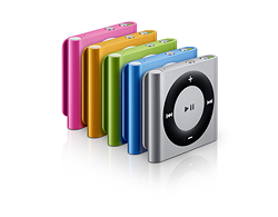
Always surprised that someone buys an iPod Shuffle . Who can listen to music without the ability to listen to her albums. Listening so that the songs go out of order. And in fact, someone wants to just listen to music and he does not give a damn how it is built there. And it's great that there is a player that can just play songs and just out of order. And I, I don’t listen to the radio, because I don’t see the logic, and it’s somehow inconvenient at all.
When you buy a house, would you like to get a free stable at the bargain if you hate horses? I wonder if there are people who hate horses? It's free, but why do you need this constant smell of manure. And this barn that obstructs a beautiful view of the lake. And now think, you want to introduce a new function just because it is cheap to introduce? Not only will you spend your time, but also complicate the life of the user.
I always thought that if there is a music catalog, it should be complete. There should be a window with a bunch of settings, complex search and listing on 600 pages with names in alphabetical order. In fact, the user will have enough10 recommendations. He will think that everything is there, because everything he needs is there.
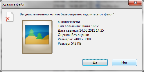
If the user wants to delete a file, then you must allow him to delete it. The pop-up dialogue is just annoying, it will not save you from unintended action at all. Everyone always clicks "OK." It is better to allow file recovery.
Why, when registering at an online store, immediately force you to enter the address, card number and other information that is not needed yet. Let him do it later, if he so wants. A bunch of required fields is just annoying.
Who will use your product? How old is he, that he wonders what he does? Alexander of Macedon and Aunt Glasha from the first entrance both can do their home accounting. But do they need the same interface? Can you make both happy? You need to choose your user, make for as narrow a group of people as possible and you can give them what they want.
Standards must be adhered to, but we must not forget about common sense. You can not create a drop-down list of "File" only in order to place the button "Exit" there. At the same time, it is impossible to transfer the cross from the close from the right to the left corner. Worse can be, only if you place a cross not close to the right corner. So that the window could not be closed without looking :-)
There are a lot of bad programs in the world. Bad programs are much more than bad cars. We so often criticize the “crafts” of the Russian car industry, but we do not notice that we ourselves are doing poorly our work. We give users unfinished, ill-conceived products and wonder that they are not used. I'm not saying that usability, interface, design is the task of the programmer. I say that someone should think about it. A product has the right to life only when every indent, every field, every pop-up window is justified.
Good sources:
For me, design is a device, an external device. Nobody thought to trust Picasso to develop a steering wheel for a racing car. Why do sites draw all and sundry? The word design, above all, should be associated with convenience. Functionality is the first task of design.
Design is at the intersection of professions, fields of activity. The designer must understand the internal device and at the same time he must have an artistic taste. But most importantly, it seems to me, the person who develops the design should understand what he is doing and for what. Faced with this topic, I made several conclusions that I think can be useful.
Most users are people and they are normal.
The programmer always takes into account the boundary conditions. The more extreme conditions the programmer provides, the better it is. Each programmer has the illusion that the messages of users only consist of quotes and each message is not less than 3000 characters long.
I was terribly surprised when I looked into the list of orders on one site, which I developed and saw that all sorts of messages in the messages, all heaps of apostrophes, html tags, and just symbols barely fit in the cell of the database - my handiwork. And users are accurate and fair. I do not urge to forget about security, I urge to remember that most users just want to use your program, do not interfere with them.
Not all people need to know how a device works.
If I look at the program and do not quite understand how it works, I feel like in a casino, standing in front of a one-armed gangster. And most users just do not care about how things work.
')
Users pursue different goals when using the product.
Always surprised that someone buys an iPod Shuffle . Who can listen to music without the ability to listen to her albums. Listening so that the songs go out of order. And in fact, someone wants to just listen to music and he does not give a damn how it is built there. And it's great that there is a player that can just play songs and just out of order. And I, I don’t listen to the radio, because I don’t see the logic, and it’s somehow inconvenient at all.
Everything superfluous interferes
When you buy a house, would you like to get a free stable at the bargain if you hate horses? I wonder if there are people who hate horses? It's free, but why do you need this constant smell of manure. And this barn that obstructs a beautiful view of the lake. And now think, you want to introduce a new function just because it is cheap to introduce? Not only will you spend your time, but also complicate the life of the user.
The user does not need everything, he only needs what he needs
I always thought that if there is a music catalog, it should be complete. There should be a window with a bunch of settings, complex search and listing on 600 pages with names in alphabetical order. In fact, the user will have enough
User is always right
If the user wants to delete a file, then you must allow him to delete it. The pop-up dialogue is just annoying, it will not save you from unintended action at all. Everyone always clicks "OK." It is better to allow file recovery.
If the user wants to do it later, let him do it.
Why, when registering at an online store, immediately force you to enter the address, card number and other information that is not needed yet. Let him do it later, if he so wants. A bunch of required fields is just annoying.
Typical user of your product - not you
Who will use your product? How old is he, that he wonders what he does? Alexander of Macedon and Aunt Glasha from the first entrance both can do their home accounting. But do they need the same interface? Can you make both happy? You need to choose your user, make for as narrow a group of people as possible and you can give them what they want.
Standards are just standards.
Standards must be adhered to, but we must not forget about common sense. You can not create a drop-down list of "File" only in order to place the button "Exit" there. At the same time, it is impossible to transfer the cross from the close from the right to the left corner. Worse can be, only if you place a cross not close to the right corner. So that the window could not be closed without looking :-)
There are a lot of bad programs in the world. Bad programs are much more than bad cars. We so often criticize the “crafts” of the Russian car industry, but we do not notice that we ourselves are doing poorly our work. We give users unfinished, ill-conceived products and wonder that they are not used. I'm not saying that usability, interface, design is the task of the programmer. I say that someone should think about it. A product has the right to life only when every indent, every field, every pop-up window is justified.
Good sources:
- Alan Cooper " Mental Hospital in the Hands of Patients"
- Jeff Raskin " Interface "
- Jacob Nielsen " Web Design "
- Tips
- Yesterday
Source: https://habr.com/ru/post/128807/
All Articles