External Rounding Tabs
Rounded corners today are made trivial with the help of border-radius. Thanks to border-radius, we can “trim” the blocks as needed, but what if we need to round the “outer” corner? The problem is easier to explain graphically:

The upper corners are not a problem to make, but the lower ones are more complicated. Under the cut explain how.
In the layouts of websites you can stumble on almost any visual effects. In the worst case, to achieve them you have to use images. Our task in this case, as always, is not to use them (as it loads quickly, is available, it is easy to update). Here is our markup:
')
The class name “active” indicates the active tab.
The reason why this is difficult is that we need to get a form that goes beyond the initial block. To achieve this without additional markup, we use pseudo-elements. If you need to refresh your memory about what these elements are, you can do this by reading this and this little article. Directly through css we can add additional stylized elements to the page. Each element can generate two additional using pseudo-selectors: before and: after. For each tab, we will use four. This is possible due to the fact that each tab consists of two elements: a list element and an anchor.
Let's visualize the process step by step, without looking at the code yet.
 List items are usually a block element, and anchor is a lowercase element. So we get this kind of layaut.
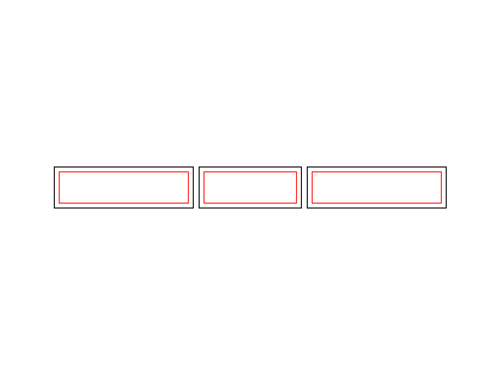 Assigning float: left elements to the list, we line them up and shorten them to the width of the anchor inside. In fact - up to the width of the content.
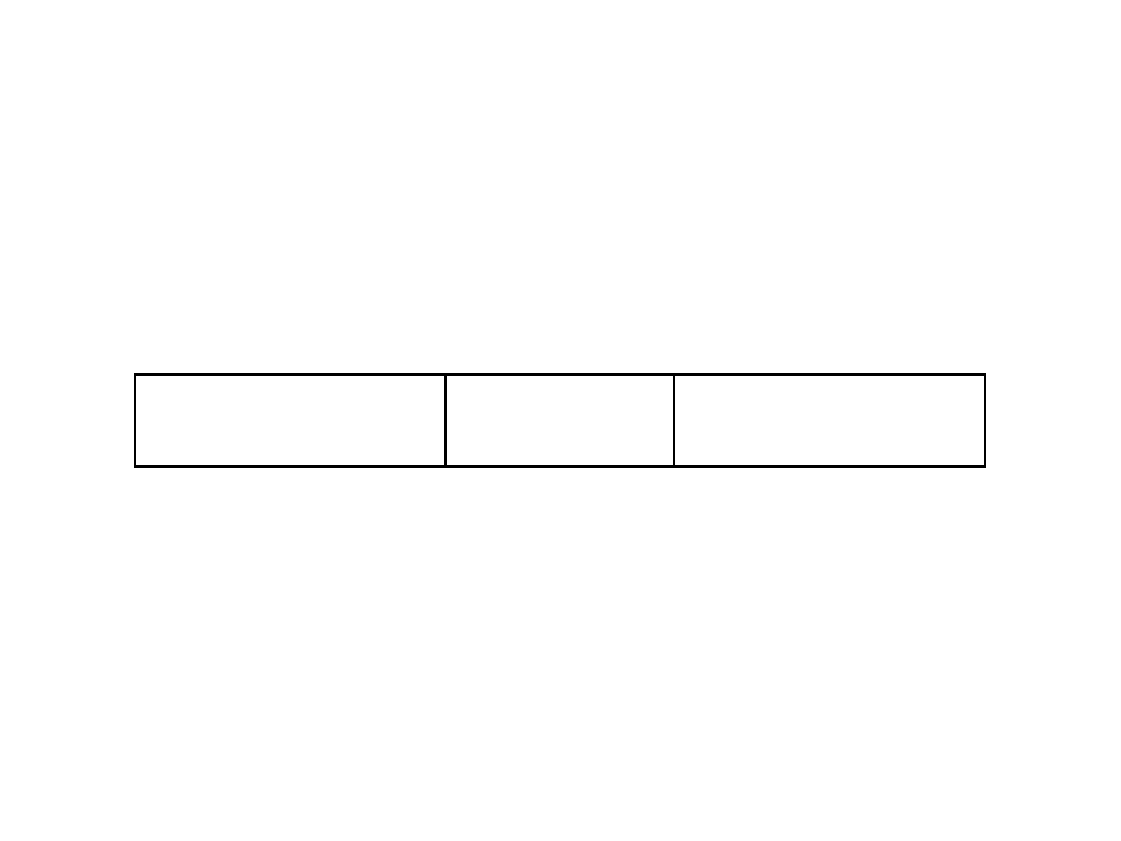 The elements of the list themselves do not have indents or margins (margin or padding), so the elements of the list and anchors nested in them have the same size.
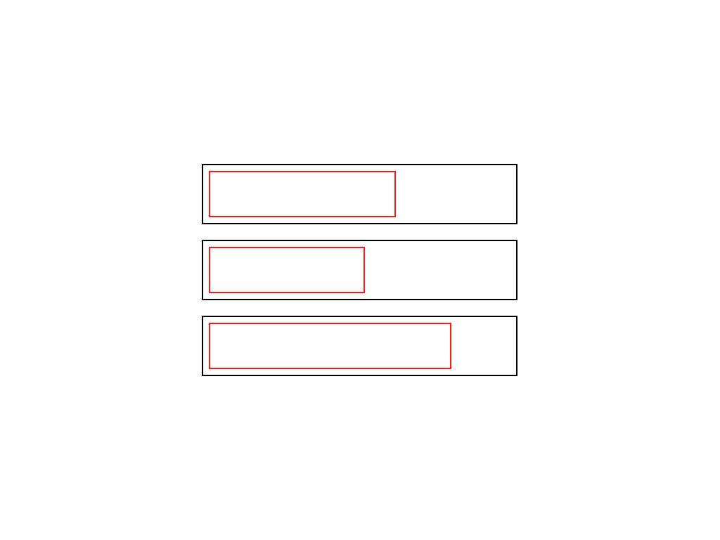
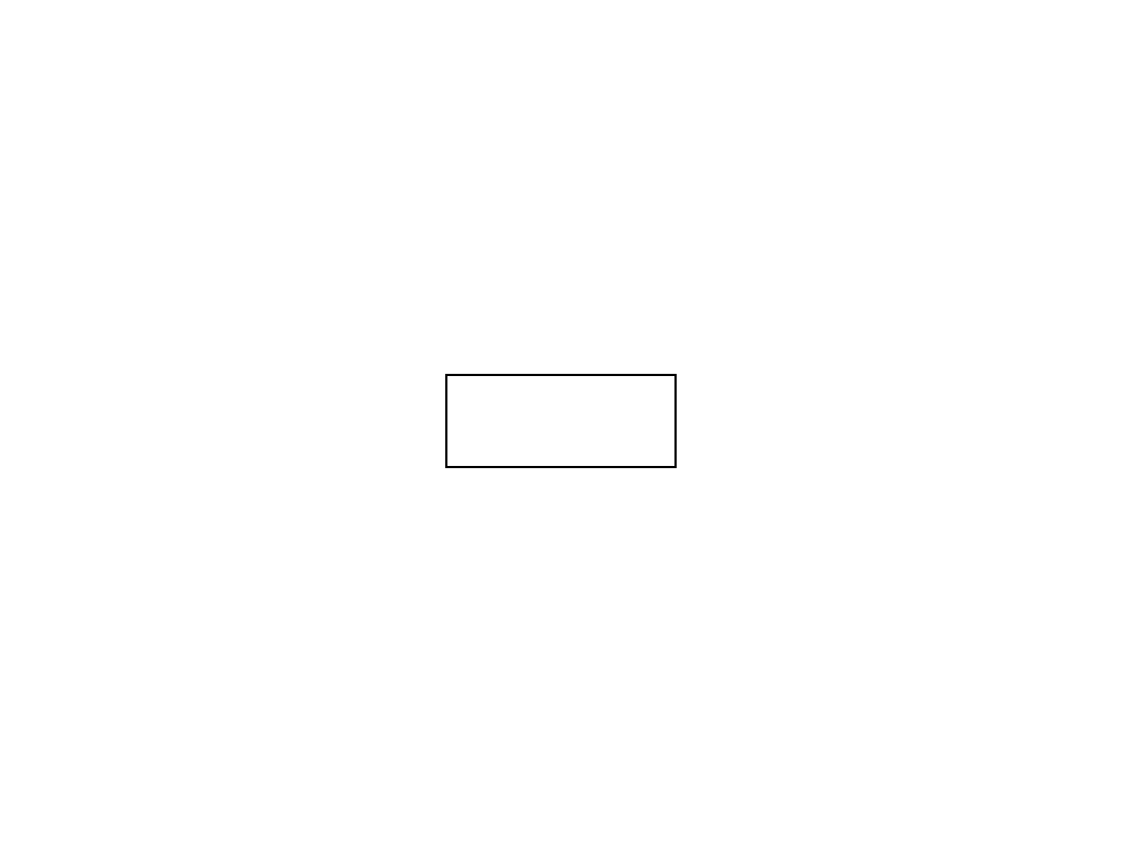 Let's take a closer look at one tab.
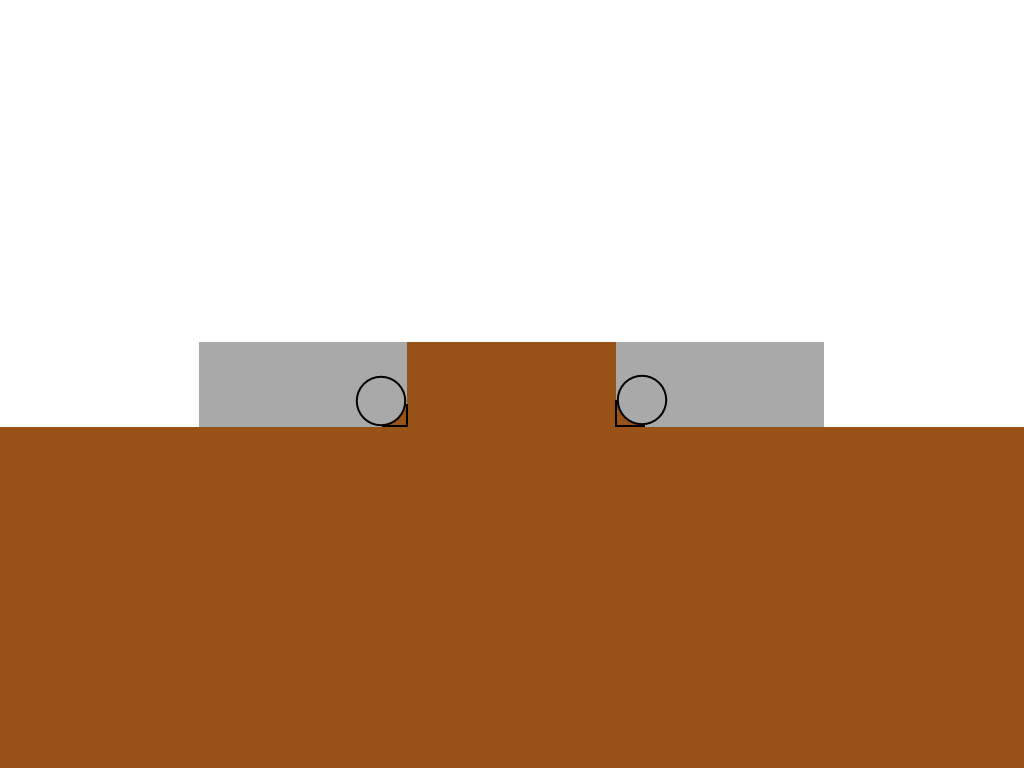
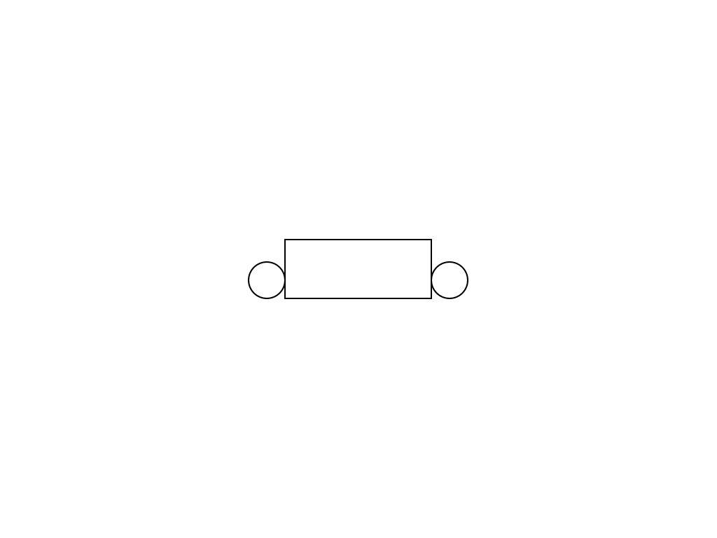 We use two of the four pseudo-elements to arrange the circles on the left and right of the bottom edge of the tab.
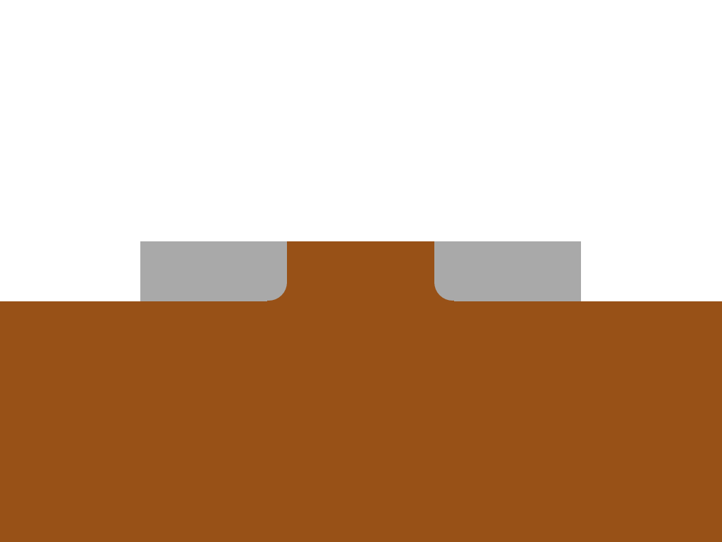
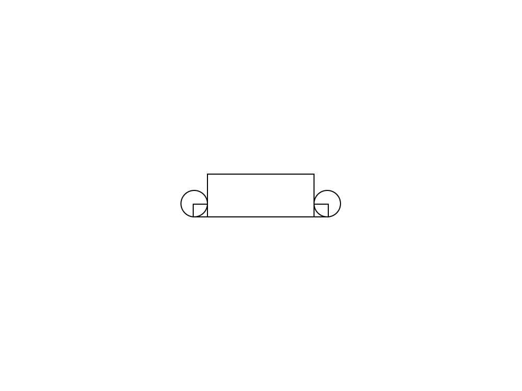 With the help of the remaining two pseudo-elements, we will create smaller rectangles.
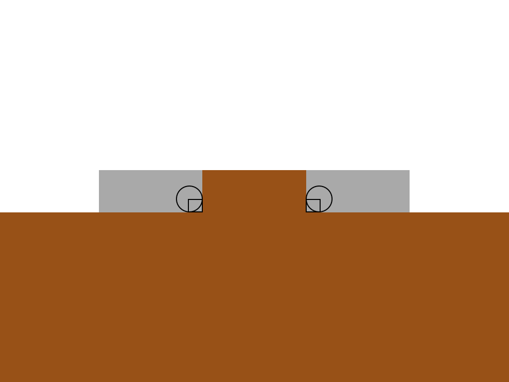 The active tab and content have a general background color.
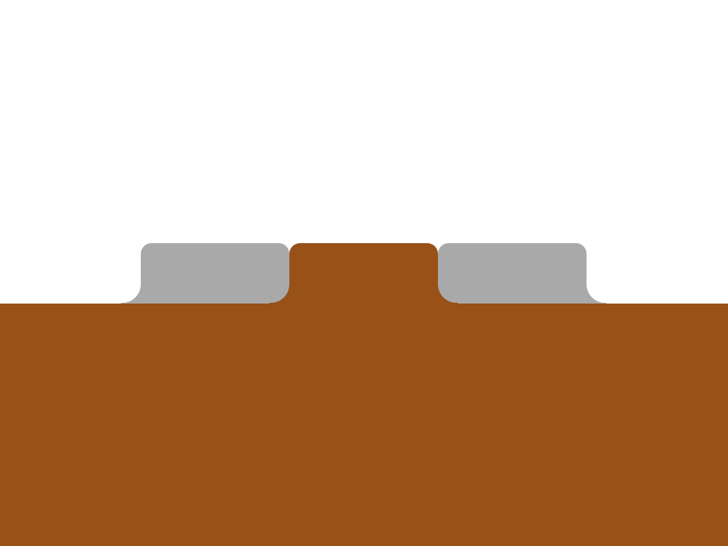
 The rectangles correspond to the color of the active tab, the circles correspond to the color of the background behind them.
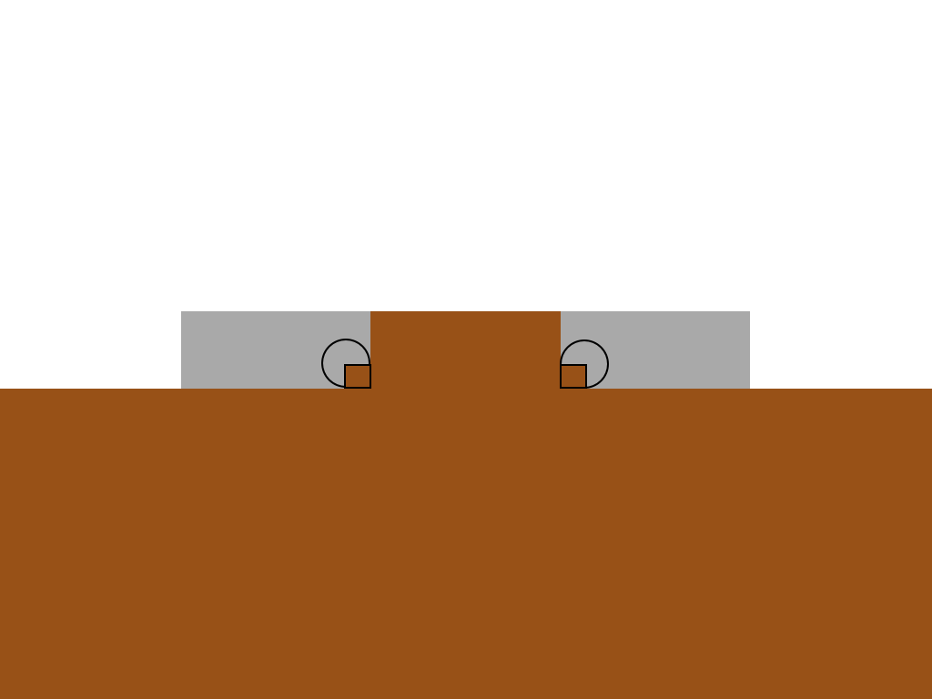
 With the help of z-index we provide overlapping of rectangles with circles.
 The frame was just an illustration, in fact, it will look somewhere like that.
 We apply the same principle for external tabs and round the top corners with the help of border-radius. Is done.
And this is a huge CSS block, but I commented on it in detail so that it would be understandable.
That's all!
Will work in all modern browsers including IE9 and higher. In older browsers degrades (there will be no rounded corners).
This chapter was written by a translator for those unfortunates who were not able to explain to the client that the lack of rounded corners in IE is not a personal insult from the typesetter. Let's improve soft degradation as much as possible.
Additional CSS:
For ie8, I had to move the CSS into a separate block, highlighted by conditional comments, since I could not find a hack that would work for ie8 and would not work for ie9. If someone knows this, please share.
I did not see the need to go into details, but if there is a need, I will willingly explain any moment that may cause questions.
I hope the addition will be useful.
The upper corners are not a problem to make, but the lower ones are more complicated. Under the cut explain how.
Clean html
In the layouts of websites you can stumble on almost any visual effects. In the worst case, to achieve them you have to use images. Our task in this case, as always, is not to use them (as it loads quickly, is available, it is easy to update). Here is our markup:
')
<ul class="tabs group"> <li class="active"><a href="#one">One</a></li> <li><a href="#two">Two</a></li> <li><a href="#three">Three</a></li> <li><a href="#three">Four</a></li> </ul> The class name “active” indicates the active tab.
How it works
The reason why this is difficult is that we need to get a form that goes beyond the initial block. To achieve this without additional markup, we use pseudo-elements. If you need to refresh your memory about what these elements are, you can do this by reading this and this little article. Directly through css we can add additional stylized elements to the page. Each element can generate two additional using pseudo-selectors: before and: after. For each tab, we will use four. This is possible due to the fact that each tab consists of two elements: a list element and an anchor.
Let's visualize the process step by step, without looking at the code yet.
1) Initial state
List items are usually a block element, and anchor is a lowercase element. So we get this kind of layaut.2) We line up in one row
Assigning float: left elements to the list, we line them up and shorten them to the width of the anchor inside. In fact - up to the width of the content.3) We bring to the same size
The elements of the list themselves do not have indents or margins (margin or padding), so the elements of the list and anchors nested in them have the same size.4) Consider one tab
Let's take a closer look at one tab.5) Circles
We use two of the four pseudo-elements to arrange the circles on the left and right of the bottom edge of the tab.6) Rectangles
With the help of the remaining two pseudo-elements, we will create smaller rectangles.7) Color the tab and content
The active tab and content have a general background color.8) Paint the pseudo-elements
The rectangles correspond to the color of the active tab, the circles correspond to the color of the background behind them.9) Overlapping elements
With the help of z-index we provide overlapping of rectangles with circles.10) Without frame
The frame was just an illustration, in fact, it will look somewhere like that.11) We finish
We apply the same principle for external tabs and round the top corners with the help of border-radius. Is done.CSS
And this is a huge CSS block, but I commented on it in detail so that it would be understandable.
.tabs li { /* */ float: left; /* */ position: relative; } .tabs a { /* */ float: left; padding: 10px 40px; text-decoration: none; /* */ color: black; background: #ddc385; /* */ -webkit-border-top-left-radius: 15px; -webkit-border-top-right-radius: 15px; -moz-border-radius-topleft: 15px; -moz-border-radius-topright: 15px; border-top-left-radius: 15px; border-top-right-radius: 15px; } .tabs .active { /* */ z-index: 3; } .tabs .active a { /* */ background: white; color: black; } .tabs li:before, .tabs li:after, .tabs li a:before, .tabs li a:after { /* */ position: absolute; bottom: 0; } /* , , */ .tabs li:last-child:after, .tabs li:last-child a:after, .tabs li:first-child:before, .tabs li:first-child a:before, .tabs .active:after, .tabs .active:before, .tabs .active a:after, .tabs .active a:before { content: ""; } .tabs .active:before, .tabs .active:after { background: white; /* */ z-index: 1; } /* */ .tabs li:before, .tabs li:after { background: #ddc385; width: 10px; height: 10px; } .tabs li:before { left: -10px; } .tabs li:after { right: -10px; } /* */ .tabs li a:after, .tabs li a:before { width: 20px; height: 20px; /* … … */ -webkit-border-radius: 10px; -moz-border-radius: 10px; border-radius: 10px; background: #222; /* */ z-index: 2; } .tabs .active a:after, .tabs .active a:before { background: #ddc385; } /* */ .tabs li:first-child.active a:before, .tabs li:last-child.active a:after { background: #222; } .tabs li a:before { left: -20px; } .tabs li a:after { right: -20px; } That's all!
Will work in all modern browsers including IE9 and higher. In older browsers degrades (there will be no rounded corners).
Improving soft degradation
This chapter was written by a translator for those unfortunates who were not able to explain to the client that the lack of rounded corners in IE is not a personal insult from the typesetter. Let's improve soft degradation as much as possible.
Additional CSS:
<style> /* */ /*ie 7*/ *+html .tabs li{ background: url("img/tabs.png") 0 -37px no-repeat; } *+html .tabs li a{ background: url("img/tabs.png") 100% -37px no-repeat; padding: 10px 40px 10px 20px; margin:0 0 0 20px; } *+html .tabs li.active{ background:url("img/tabs.png") 0 0 no-repeat; } *+html .tabs li.active a{ background:url("img/tabs.png") 100% 0 no-repeat; } *+html .tabs li{ zoom:expression(function(t) { t.runtimeStyle.zoom = 1; var before = document.createElement('span'); var after = document.createElement('span'); before.className = 'before-fix-for-ie'; after.className = 'after-fix-for-ie'; t.appendChild(before); t.appendChild(after); }(this)); } /*ie 6*/ * html .tabs li{ background:url("img/tabs.png") 0 -37px no-repeat; } * html .tabs li a{ background:url("img/tabs.png") 100% -37px no-repeat; padding: 10px 40px 10px 20px; margin:0 0 0 20px; } * html .tabs li.active{ background-position:0 0; } * html .tabs li.active a{ background:url("img/tabs.png") 100% 0 no-repeat; } * html .tabs li{ zoom:expression(function(t) { t.runtimeStyle.zoom = 1; var before = document.createElement('span'); var after = document.createElement('span'); before.className = 'before-fix-for-ie'; after.className = 'after-fix-for-ie'; t.appendChild(before); t.appendChild(after); }(this)); } /* */ .tabs li .before-fix-for-ie{ position:absolute; overflow:hidden; font-size:0; line-height:0; top:27px; left:-10px; width:10px; height:10px; background:url("img/left.png") 0 0 no-repeat; } * html .tabs li .before-fix-for-ie{ background:none; filter: progid:DXImageTransform.Microsoft.AlphaImageLoader( src='img/left.png', sizingMethod='image'); } .tabs li.active .before-fix-for-ie{ background:url("img/active-left.png") 0 0 no-repeat; } * html .tabs li.active .before-fix-for-ie{ background:none; filter: progid:DXImageTransform.Microsoft.AlphaImageLoader( src='img/active-left.png', sizingMethod='image'); } .after-fix-for-ie{ position:absolute; overflow:hidden; font-size:0; line-height:0; top:27px; right:-10px; width:10px; height:10px; background:url("img/right.png") 0 0 no-repeat; } * html .tabs li .after-fix-for-ie{ background:none; filter: progid:DXImageTransform.Microsoft.AlphaImageLoader( src='img/right.png', sizingMethod='image'); } .tabs li.active .after-fix-for-ie{ background:url("img/active-right.png") 0 0 no-repeat; } * html .tabs li.active .after-fix-for-ie{ background:none; filter: progid:DXImageTransform.Microsoft.AlphaImageLoader( src='img/active-right.png', sizingMethod='image'); } </style> <!--[if IE 8]> <style> /*ie 8*/ .tabs li{ background:transparent url("img/tabs.png") 0 -37px no-repeat; } .tabs li a{ background:transparent url("img/tabs.png") 100% -37px no-repeat; padding: 10px 40px 10px 20px; margin:0 0 0 20px; } .tabs li.active{ background:transparent url("img/tabs.png") 0 0 no-repeat; } .tabs li.active a{ background:transparent url("img/tabs.png") 100% 0 no-repeat; } body .tabs li:before{ content:"."; text-indent:-9000px; overflow:hidden; height:10px; width:10px; font-size:0; line-height:0; display:block; position:absolute; top:27px; left:-10px; z-index:10; zoom:1; background:transparent url("img/left.png") 0 0 no-repeat; } body .tabs li:after{ content:"."; text-indent:-9000px; overflow:hidden; height:10px; width:10px; font-size:0; line-height:0; display:block; position:absolute; top:27px; right:-10px; z-index:10; zoom:1; background:transparent url("img/right.png") 0 0 no-repeat; } body .tabs li.active:before{ content:"."; text-indent:-9000px; overflow:hidden; height:10px; width:10px; font-size:0; line-height:0; display:block; position:absolute; top:27px; left:-10px; z-index:10; zoom:1; background:transparent url("img/active-left.png") 0 0 no-repeat; } body .tabs li.active:after{ content:"."; text-indent:-9000px; overflow:hidden; height:10px; width:10px; font-size:0; line-height:0; display:block; position:absolute; top:27px; right:-10px; z-index:10; zoom:1; background:transparent url("img/active-right.png") 0 0 no-repeat; } </style> <![endif]--> For ie8, I had to move the CSS into a separate block, highlighted by conditional comments, since I could not find a hack that would work for ie8 and would not work for ie9. If someone knows this, please share.
I did not see the need to go into details, but if there is a need, I will willingly explain any moment that may cause questions.
I hope the addition will be useful.
Source: https://habr.com/ru/post/128210/
All Articles