Design applications for WP7. Metro approach
If you've seen Windows Phone 7, you've already seen Metro. Metro is a design language for applications, grown in the depths of Microsoft, whose elements are already penetrating different products and, of course, the soul of the WP7 platform. Metro is a start from scratch, a reset of design, a transition from a hard-to-support Windows Mobile language to a language with clear principles and objectives.
When several years ago the design team decided to try to start from scratch, instead of looking at what already exists on various, in general, monotonous platforms, it concentrated on what really inspires - the best design samples: from Josef Müller-Brockmann (Swiss designer known for his simple design with vivid use of typography, shape and color, inspired by his works of many modern graphic designers) and other pioneers of International Style , the Massimo Vignelli design system of the New York map whom the metro and famous brands like american airlines are up to the conceptual work of Experimental Jetset .
')

Similar sources of inspiration were used in the design of Windows Media Center, Zune and Xbox - and in this sense they are products of the same design idea.

The Windows Phone design team went further and developed a set of principles for directing interactive design, motion design and general impressions of working with the phone to the right direction.
(Honestly, it was difficult for me to literally translate all the principles, but I will try to preserve the substantive essence.)
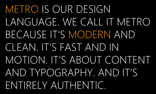
This principle could be called the total cleaning (Fierce Reduction), we strive to remove from the UI all the elements that seem to be unnecessary; and both visual elements and an excess of functionality. This encourages focusing on the priorities of the UI and makes the UI look smart, open, fast, and responsive.
The UI should allow the user to quickly grasp the very essence of the information and only if necessary plunge into the details. And at the same time, the offer for immersion and research can also be part of the UI, this is the purpose, for example, resolved by the panorama in Windows Phone.

Prioritize, highlighting the main tasks, try to achieve more with less means and remove all unnecessary. And, of course, free space is also one of the important components of the designed UI. Empty space is not to be afraid - we must be able to work with it. Filling all the available space with something should not be an end in itself. Many things can be simplified, to show schematically or obviously symbolic.
Think over the functionality of your application and build it in accordance with the importance and frequency of use, putting in the first place exactly what the user came to, and removing everything else to the background.
Metro-design is largely inspired by the best examples of high-quality typography. It seems the time has come for the user interface to be tied to typography too. Font is information. Beauty, clarity and correctness of the choice of font - the path to an open and understandable information design.

When thinking about using a font, keep in mind the thickness, size, case, and balance of the various UI elements. In particular, in different functional blocks, spelling of the text can be used in lowercase, uppercase letters or as in a sentence. In Windows Phone, the navigation hierarchy is built up by matching / physical / placing text blocks relative to each other and is underlined by font size and case. For example, the title of a section or application is written in Pivot in a smaller font and in upper case, and the title of the current tab is larger and in lower case.

For the WP7 platform, a modification of the Segoe font family — Segoe WP — was developed, available both in the design and development tools and on the device itself.
Metro is a living system in which movement, responsiveness and reaction, transitions are as important as the screens with which the user interacts. Movement gives character UI and at the same time helps to understand the navigation system, which helps to improve usability.
Movement gives a sense of depth and immersion in content, moving to detail or back to the top level. Jyzhenie relies on a sense of size and orientation in space. The live system responds to user actions, prompts where you can click and what you can interact with. At the intuitive level, it guides and helps to figure out what's what.
Responsive UI elements fill the interaction with the system. See also the many review videos on the Windows Phone channel on Youtube.
The user comes for information, and not to click on the buttons. Reducing non-content visual content will help you create an open and lightweight UI. Information should be located in such a way as to encourage the user to explore it and interact with it directly, and not through special buttons. Important information should be presented immediately, secondary and detailed go into the background, but be available in one action.

Content should not just be on its own, it is part of the UI — and even more: content is UI.

And unlike traditional iconographic systems:

Metro-design systems are more focused on infographics, in which even the elements on the start screen are filled with life and information, and in the internal content, priority is given to content, not design and buttons;)

If the first approach is filled with realistic metaphors from the real world - a kind of hyperrealism in design, in which analog content is transformed into digital counterparts and the work is built around the organization and manipulation of content, the second seeks to provide content as it is, remembering that digital form can provide additional benefits and opportunities, and not always a direct analogy is the best way. The infographic approach expands the objects (for example, people and places) with relevant available information, allows you to overlay information and interact directly with it.

This does not mean that photographic (media) content loses relevance in metro design. For example, it only gains importance, since content has absolute priority over UI elements. A photo is content, not a button background.
Finally, metro-design professes honesty in design. UI is created for pixels, so in Metro we try to avoid using analogies with the real world in the form of shadows and highlights used in some UI for mimicry for materials and objects of the real world (so-called skeuomorphic-design).
Honesty also implies a design under the form factor, consideration of the features of interaction with the device with the help of fingers and, of course, a direct presentation of information.

The UI should not be what it is not. Be honest with your users.
It’s not always a direct transfer of a solution from another platform to WP7 without considering the design features will be the best solution. Try to integrate into the platform and into the features of the design, which she lives.

Make the metro work for you.

Although the transition from Windows Mobile 6.5 to Windows Phone 7 is in itself a big step, the Metro design team is also looking to the future, suggesting a careful and thoughtful evolution. Metro is not something designed to be different from everything else. This is the foundation for future development over a long time, the starting point on the way there, which seems to us to be the next era in user interface design, focused more on content than on metaphors, information, not tools, and movement, not static. It is a language designed to clearly mark the information around us, removing the accompanying garbage.
Interfaces like those we all saw in science fiction like Avatar or Iron Man 2 are a matter of several years, but Metro already seems like a good starting point.
The ideas of metro-design are already fully applied in various projects (this does not even take into account the thousands of applications for Windows Phone 7).

Already today you can try MetroTwit , a metro-style Twitter client, or MetroTwit Show , an interesting application for showing tweets (for example, during a conference or just as a screen saver).

Special metro-theme is for applications made using Visual Studio LightSwitch .

And for a long time there is a metro theme for any Silverlight and WPF applications. And many of our partners (for example, telerik ), producing controllers for the Microsoft platform, also work to ensure that they are in the style of Metro UI . Here is another example of Alex Knight's Metro in Silverlight .

Another interesting example is the Windows Live Hotmail website . By the way, it uses HTML5.
Finally, you've probably already seen our updated MSDN site or P & P Summit site. Quite right, the metro-penetrates into the Saito structure no less than on the desktop or mobile platforms.
And, although, in the first place, in all these cases, recognizability of stylistics is striking, the most important thing is that the use of certain graphic elements does not lose the essence, that is, those principles that we spoke about from the very beginning:

Although we cannot tell any additional details today, you will surely
Already saw an overview of the interface of the next version of Windows. In the Building Windows 8 blog (by the way, there is a Russian version) you can find some additional details in the article Designing Metro style and the desktop .
See also my report on previous BizSpark Camp on Windows Phone.
And don't miss the broadcast from Windows Phone 7 Camp on September 5th.
When several years ago the design team decided to try to start from scratch, instead of looking at what already exists on various, in general, monotonous platforms, it concentrated on what really inspires - the best design samples: from Josef Müller-Brockmann (Swiss designer known for his simple design with vivid use of typography, shape and color, inspired by his works of many modern graphic designers) and other pioneers of International Style , the Massimo Vignelli design system of the New York map whom the metro and famous brands like american airlines are up to the conceptual work of Experimental Jetset .
')
Similar sources of inspiration were used in the design of Windows Media Center, Zune and Xbox - and in this sense they are products of the same design idea.
The Windows Phone design team went further and developed a set of principles for directing interactive design, motion design and general impressions of working with the phone to the right direction.
(Honestly, it was difficult for me to literally translate all the principles, but I will try to preserve the substantive essence.)
Principles of metro design
Easy, simple, open and fast.
This principle could be called the total cleaning (Fierce Reduction), we strive to remove from the UI all the elements that seem to be unnecessary; and both visual elements and an excess of functionality. This encourages focusing on the priorities of the UI and makes the UI look smart, open, fast, and responsive.
The UI should allow the user to quickly grasp the very essence of the information and only if necessary plunge into the details. And at the same time, the offer for immersion and research can also be part of the UI, this is the purpose, for example, resolved by the panorama in Windows Phone.
Prioritize, highlighting the main tasks, try to achieve more with less means and remove all unnecessary. And, of course, free space is also one of the important components of the designed UI. Empty space is not to be afraid - we must be able to work with it. Filling all the available space with something should not be an end in itself. Many things can be simplified, to show schematically or obviously symbolic.
Think over the functionality of your application and build it in accordance with the importance and frequency of use, putting in the first place exactly what the user came to, and removing everything else to the background.
High-quality typography
Metro-design is largely inspired by the best examples of high-quality typography. It seems the time has come for the user interface to be tied to typography too. Font is information. Beauty, clarity and correctness of the choice of font - the path to an open and understandable information design.
When thinking about using a font, keep in mind the thickness, size, case, and balance of the various UI elements. In particular, in different functional blocks, spelling of the text can be used in lowercase, uppercase letters or as in a sentence. In Windows Phone, the navigation hierarchy is built up by matching / physical / placing text blocks relative to each other and is underlined by font size and case. For example, the title of a section or application is written in Pivot in a smaller font and in upper case, and the title of the current tab is larger and in lower case.
For the WP7 platform, a modification of the Segoe font family — Segoe WP — was developed, available both in the design and development tools and on the device itself.
Alive on the move
Metro is a living system in which movement, responsiveness and reaction, transitions are as important as the screens with which the user interacts. Movement gives character UI and at the same time helps to understand the navigation system, which helps to improve usability.
Movement gives a sense of depth and immersion in content, moving to detail or back to the top level. Jyzhenie relies on a sense of size and orientation in space. The live system responds to user actions, prompts where you can click and what you can interact with. At the intuitive level, it guides and helps to figure out what's what.
Responsive UI elements fill the interaction with the system. See also the many review videos on the Windows Phone channel on Youtube.
Content first
The user comes for information, and not to click on the buttons. Reducing non-content visual content will help you create an open and lightweight UI. Information should be located in such a way as to encourage the user to explore it and interact with it directly, and not through special buttons. Important information should be presented immediately, secondary and detailed go into the background, but be available in one action.
Content should not just be on its own, it is part of the UI — and even more: content is UI.
And unlike traditional iconographic systems:
Metro-design systems are more focused on infographics, in which even the elements on the start screen are filled with life and information, and in the internal content, priority is given to content, not design and buttons;)
If the first approach is filled with realistic metaphors from the real world - a kind of hyperrealism in design, in which analog content is transformed into digital counterparts and the work is built around the organization and manipulation of content, the second seeks to provide content as it is, remembering that digital form can provide additional benefits and opportunities, and not always a direct analogy is the best way. The infographic approach expands the objects (for example, people and places) with relevant available information, allows you to overlay information and interact directly with it.
This does not mean that photographic (media) content loses relevance in metro design. For example, it only gains importance, since content has absolute priority over UI elements. A photo is content, not a button background.
Digital honesty
Finally, metro-design professes honesty in design. UI is created for pixels, so in Metro we try to avoid using analogies with the real world in the form of shadows and highlights used in some UI for mimicry for materials and objects of the real world (so-called skeuomorphic-design).
Honesty also implies a design under the form factor, consideration of the features of interaction with the device with the help of fingers and, of course, a direct presentation of information.
The UI should not be what it is not. Be honest with your users.
It’s not always a direct transfer of a solution from another platform to WP7 without considering the design features will be the best solution. Try to integrate into the platform and into the features of the design, which she lives.
Make the metro work for you.
Present and future
Although the transition from Windows Mobile 6.5 to Windows Phone 7 is in itself a big step, the Metro design team is also looking to the future, suggesting a careful and thoughtful evolution. Metro is not something designed to be different from everything else. This is the foundation for future development over a long time, the starting point on the way there, which seems to us to be the next era in user interface design, focused more on content than on metaphors, information, not tools, and movement, not static. It is a language designed to clearly mark the information around us, removing the accompanying garbage.
Interfaces like those we all saw in science fiction like Avatar or Iron Man 2 are a matter of several years, but Metro already seems like a good starting point.
Metro-approach in real projects
The ideas of metro-design are already fully applied in various projects (this does not even take into account the thousands of applications for Windows Phone 7).
Already today you can try MetroTwit , a metro-style Twitter client, or MetroTwit Show , an interesting application for showing tweets (for example, during a conference or just as a screen saver).
Special metro-theme is for applications made using Visual Studio LightSwitch .
And for a long time there is a metro theme for any Silverlight and WPF applications. And many of our partners (for example, telerik ), producing controllers for the Microsoft platform, also work to ensure that they are in the style of Metro UI . Here is another example of Alex Knight's Metro in Silverlight .
Another interesting example is the Windows Live Hotmail website . By the way, it uses HTML5.
Finally, you've probably already seen our updated MSDN site or P & P Summit site. Quite right, the metro-penetrates into the Saito structure no less than on the desktop or mobile platforms.
And, although, in the first place, in all these cases, recognizability of stylistics is striking, the most important thing is that the use of certain graphic elements does not lose the essence, that is, those principles that we spoke about from the very beginning:
- Easy, simple, open and fast.
- High-quality typography
- Alive on the move
- Content first
- Digital honesty
Windows 8
Although we cannot tell any additional details today, you will surely
Already saw an overview of the interface of the next version of Windows. In the Building Windows 8 blog (by the way, there is a Russian version) you can find some additional details in the article Designing Metro style and the desktop .
useful links
- Application Design for Windows Phone by Megan Donahue
- .toolbox design trainings
- Windows Phone Design Day Recordings
- WP7 UI Guide & Design Templates
- User Experience Design Guidelines for Windows Phone
- Designing for Windows Phone
- Updated free tools for development and design
- Windows Phone SDK 7.1 RC , including
Microsoft Expression Blend SDK for Windows Phone 7.1
See also my report on previous BizSpark Camp on Windows Phone.
And don't miss the broadcast from Windows Phone 7 Camp on September 5th.
Source: https://habr.com/ru/post/127650/
All Articles