Color techniques in web design
 The theory of color, mental processes of human perception, the distinctive behavior of people of different ages, the processes of thinking and memory - this interests me. I have to actively participate in the creation of layouts for web pages. At the same time trying to find answers to eternal important questions related to the convenience of the page and its goal setting.
I propose in the series of notes to highlight the theme of color for detailed consideration of different techniques with it. Unfortunately, I do not have enough time to prepare more voluminous publications. Please do not be upset. Over time, I will be able to post more materials if there is a sufficient need for them.
Technique number 1: highlighting grouped elements
There is an opinion that the color helps to notice the information blocks on the page, which are related by meaning.

On the left structure, blocks are marked more prominently than on the right structure.
Technique # 2: conditional expansion of the area by adding a color substrate
Psychologists say that during a quick search on the page of a necessary element, a person sees, first of all, large objects, and already from large ones “descends” to small ones. In a real situation, it is necessary to take into account not only the area, but also other criteria, such as the shape of the object, the color spectrum, the position on the screen, etc.
')
This example is more colorful and realistic. Taken from work on the mail interface.
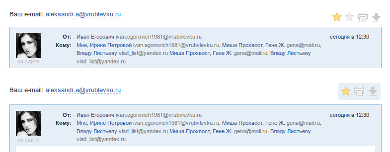
In the lower version, the same color substrate was added to the icons.
Source: https://habr.com/ru/post/127516/
All Articles