Google redesigned Google Docs editor
In early August, Google launched a new interface for the Google Docs management page, bringing it to the same style with Gmail and Google Calendar. Now it’s the turn of the Google Docs editor himself.
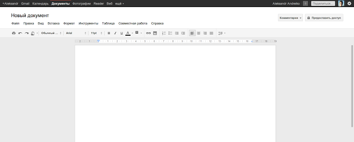
In the Google+-inspired new interface, all colors from icons and other interface elements have been removed, the Google Docs logo has been removed, new scroll bars and a new “Share” menu have been added, which includes all the features from the previous “Share” drop down menu.
As the author of the Google Operating System blog noted, consistency is great, but not when it makes an application more difficult to use.
')
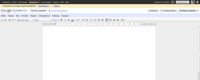
Because of the new gray buttons on the toolbar, it became somewhat more difficult to find the desired function. They are less intuitive, more difficult to distinguish and look like disabled buttons of inaccessible functions. You can compare with the old color version:
Unlike the new Gmail and Google Calendar interfaces, there is not much empty space in the new design of Google Docs. You can switch to the new interface by clicking the “Try Now” button in a small message about the changes that appears when you open the Google Docs document. To return to the old interface, select "Classic Interface" in the Help menu.
via The Next Web , Google Operating System Blog
Source: https://habr.com/ru/post/127390/
All Articles