Analysis of the Russian Post site and an attempt to make it better
Recently posted to the site of the Russian Post, delaying the parcel. This site has been scary for a long time, so I decided to analyze what is so terrible in it and tried to do better.
')
Studying
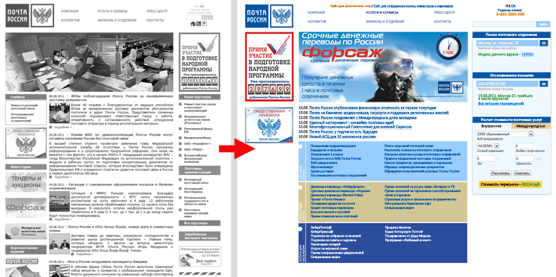
The main page is a vivid example of the sovok approach to information. The feeling that the information was turned inside out and carried to the main page all the most unnecessary for end users. And to make it even more fun, they made the page width strange - 820 pixels. Not under 800x600, nor under 1024x768, it is not clear.

The first thing that catches the eye on the page is a collage, which apparently in one frame wants to tell everything about the Russian Post. The picture, though a little lively site, still takes a useful place, which oh so need him.
Further right panel, section Our partners, postal administrations and foreign online stores. Why do you need it? Even if we assume that the Post of Russia receives something from these links, I think there are very few people who wanted to switch from the website of the post to Aeroflot OJSC. Postal administrations have the same story, and the section “Foreign online stores” is absurd.
In principle, the same goes for the left panel (3, 4, 5). It seems that the Russian Post is so poor that it asks for money from every corner of the main page. No, I am not a fool, and I understand that this is done for pot-bellied uncles who don’t want to poke around in sites, looking for necessary information. In my changes, I will not forget about them.
Finally we come to the part of the site that occupies the most space - the news of the Russian Post. Let us leave aside the usefulness of the news that the post has congratulated Obama. But to make news the central object of the main page, hiding the really useful information into the bowels of the site, is simply blasphemous. If you really want to bring the news home - a small block with the headlines of the most interesting news will be more than enough.
And the last thing that hooked me up is a couple of banners at the bottom of the page - about the Olympics of the staff and the Mailer boarding house, as well as the banner of the Popular Front. The first ones are clearly not needed on the main page, and the banner of the Popular Front is probably hanged and inviolable in an orderly manner.
Total that remains from the useful information for the consumer:
- Top Menu;
- Telephone hotline and search, which for some reason are hidden in the corner, as if afraid that they will be noticed.
- link to search for offices and tracking of mailings;
- Banner public reception;
- Advertising Fast and the Furious.
Let's remove too much and see what it looks like.

Funny, isn't it?
Think
One global problem catches the eye: too much corporate information, which can and is useful for employees and partners, but has no value for individuals and legal entities. Therefore, the main thing that needs to be done is to separate the two streams: internal and external. Make some corp.russianpost.ru, where there will be all internal information of the company. This site will link to the main page. And for everyone else, and more precisely for the most valuable audience that brings money to the mail - to finally make a convenient site.
Let's see what is generally useful information for customers? Fortunately there is a site map http://www.russianpost.ru/rp/index/ru/home/sitemap_all . Yeah, 95% of the information you need is in the Services section. In general, the page of this section is more similar to what should be the main page.
Let's determine why people come to the site mail? I did not conduct research, but in my opinion most go to find the branch index, find out the cost of the shipment and track the package. As one friend of mine put it: I track packages on prishlo.li because I’m angry with the Russian Post site (although both sites use the same base). Let's make sure that users return to their home site.
Immediately make a reservation, I prefer to spend twice as much time and make everything look close to reality than to draw abstract squares imitating blocks on a page. On the other hand, I can hardly be called a designer, so do not judge strictly the appearance of the page.
Do
So, first of all - we increase the width to at least 980 pixels. Why so little? Well, after all, the site for the whole of Russia, including the deepest hinterland, where LCD monitors are still a wonder. The rubber layout would be even better, because a lot of information. However, I made a fixed layout, assuming that Russia would hardly decide on a rubber post.
Let's start designing the page with the most useful:
1. Search for post offices. There are several search terms:
- by index
- at the delivery address
- at the address of the post office.
You can do, as now, divided into three fields with forms. But why, if there are combo boxes? We make one field where you can both type in the address and enter the index. Combobox works the same way as the city's VKontakte form, except that it stops at the city, and the street and the house have to be entered by yourself. After the user enters the data and clicks OK, the answer immediately appears at the bottom: either the branch number as a link to detailed information about it, or the branch address, also with reference to opening hours and telephones. Of course, the implementation of such a combo box is not easy, as a last resort, you can separate the index with the address.

2. Tracking the parcel.
There seems to be nothing to explain. Entered the parcel number, clicked OK and got the last action with the parcel. If you want to see the whole story - there is a corresponding link. The buzz is that you can track the package directly from the main page without going anywhere else.
3. With the calculation of the cost of mailing, too, everything is clear from the picture. I just took the forms from the relevant pages and compactly arranged them. By default, the calculation of the cost of domestic shipments is open; it is switched to international by clicking on the appropriate label (this is based on my assumptions that internal shipments are calculated more often). Everything is also considered in place and the result is displayed in the same window.
Further briefly about other changes.
1. At the very top of the page indicates the current version of the site and a link to a special site for partners, investors and mail employees.
2. The telephone hotline and the search bar did more to catch the eye.
3. Instead of a useless image, we put an advertising banner. Not necessarily such a great height, it was just the limit for Content-Aware reduction in Photoshop.
4. News is placed under the banner in the form of simple headlines.
5. The list of services, which is now in Services and Services, we bring to the main. So mail clients can immediately go to the necessary sections, bypassing the extra page. I do not claim that such a format is ideal, in my opinion it is worth leaving the most important services, adding explanatory pictures to them and making the link “All services” in the corner, which will lead to the corresponding page. But not all at once.
6. The left panel turned out to be almost empty; this is a reserve for other possible banners or functional menus.
Total
Something like this should look like the main page of the post, to at least somehow correspond to modern trends. Once again, I’m not really engaged in design, for the most part I’ve left the previous one, it’s clear what can be done a hundred times more beautiful.

The main profit is in three forms on the main page. With their help, millions of visitors will not need to go beyond the main page to get the necessary information, which is not only very convenient, but also saves server resources. In addition, those who considered it too confused and backward will start to enter the site and the Russian Post will rise in their eyes a little.
That's all. Thanks to everyone who was able to master this article! I will be glad to hear your opinions and suggestions.
')
Studying
The main page is a vivid example of the sovok approach to information. The feeling that the information was turned inside out and carried to the main page all the most unnecessary for end users. And to make it even more fun, they made the page width strange - 820 pixels. Not under 800x600, nor under 1024x768, it is not clear.
The first thing that catches the eye on the page is a collage, which apparently in one frame wants to tell everything about the Russian Post. The picture, though a little lively site, still takes a useful place, which oh so need him.
Further right panel, section Our partners, postal administrations and foreign online stores. Why do you need it? Even if we assume that the Post of Russia receives something from these links, I think there are very few people who wanted to switch from the website of the post to Aeroflot OJSC. Postal administrations have the same story, and the section “Foreign online stores” is absurd.
In principle, the same goes for the left panel (3, 4, 5). It seems that the Russian Post is so poor that it asks for money from every corner of the main page. No, I am not a fool, and I understand that this is done for pot-bellied uncles who don’t want to poke around in sites, looking for necessary information. In my changes, I will not forget about them.
Finally we come to the part of the site that occupies the most space - the news of the Russian Post. Let us leave aside the usefulness of the news that the post has congratulated Obama. But to make news the central object of the main page, hiding the really useful information into the bowels of the site, is simply blasphemous. If you really want to bring the news home - a small block with the headlines of the most interesting news will be more than enough.
And the last thing that hooked me up is a couple of banners at the bottom of the page - about the Olympics of the staff and the Mailer boarding house, as well as the banner of the Popular Front. The first ones are clearly not needed on the main page, and the banner of the Popular Front is probably hanged and inviolable in an orderly manner.
Total that remains from the useful information for the consumer:
- Top Menu;
- Telephone hotline and search, which for some reason are hidden in the corner, as if afraid that they will be noticed.
- link to search for offices and tracking of mailings;
- Banner public reception;
- Advertising Fast and the Furious.
Let's remove too much and see what it looks like.
Funny, isn't it?
Think
One global problem catches the eye: too much corporate information, which can and is useful for employees and partners, but has no value for individuals and legal entities. Therefore, the main thing that needs to be done is to separate the two streams: internal and external. Make some corp.russianpost.ru, where there will be all internal information of the company. This site will link to the main page. And for everyone else, and more precisely for the most valuable audience that brings money to the mail - to finally make a convenient site.
Let's see what is generally useful information for customers? Fortunately there is a site map http://www.russianpost.ru/rp/index/ru/home/sitemap_all . Yeah, 95% of the information you need is in the Services section. In general, the page of this section is more similar to what should be the main page.
Let's determine why people come to the site mail? I did not conduct research, but in my opinion most go to find the branch index, find out the cost of the shipment and track the package. As one friend of mine put it: I track packages on prishlo.li because I’m angry with the Russian Post site (although both sites use the same base). Let's make sure that users return to their home site.
Immediately make a reservation, I prefer to spend twice as much time and make everything look close to reality than to draw abstract squares imitating blocks on a page. On the other hand, I can hardly be called a designer, so do not judge strictly the appearance of the page.
Do
So, first of all - we increase the width to at least 980 pixels. Why so little? Well, after all, the site for the whole of Russia, including the deepest hinterland, where LCD monitors are still a wonder. The rubber layout would be even better, because a lot of information. However, I made a fixed layout, assuming that Russia would hardly decide on a rubber post.
Let's start designing the page with the most useful:
1. Search for post offices. There are several search terms:
- by index
- at the delivery address
- at the address of the post office.
You can do, as now, divided into three fields with forms. But why, if there are combo boxes? We make one field where you can both type in the address and enter the index. Combobox works the same way as the city's VKontakte form, except that it stops at the city, and the street and the house have to be entered by yourself. After the user enters the data and clicks OK, the answer immediately appears at the bottom: either the branch number as a link to detailed information about it, or the branch address, also with reference to opening hours and telephones. Of course, the implementation of such a combo box is not easy, as a last resort, you can separate the index with the address.
2. Tracking the parcel.
There seems to be nothing to explain. Entered the parcel number, clicked OK and got the last action with the parcel. If you want to see the whole story - there is a corresponding link. The buzz is that you can track the package directly from the main page without going anywhere else.
3. With the calculation of the cost of mailing, too, everything is clear from the picture. I just took the forms from the relevant pages and compactly arranged them. By default, the calculation of the cost of domestic shipments is open; it is switched to international by clicking on the appropriate label (this is based on my assumptions that internal shipments are calculated more often). Everything is also considered in place and the result is displayed in the same window.
Further briefly about other changes.
1. At the very top of the page indicates the current version of the site and a link to a special site for partners, investors and mail employees.
2. The telephone hotline and the search bar did more to catch the eye.
3. Instead of a useless image, we put an advertising banner. Not necessarily such a great height, it was just the limit for Content-Aware reduction in Photoshop.
4. News is placed under the banner in the form of simple headlines.
5. The list of services, which is now in Services and Services, we bring to the main. So mail clients can immediately go to the necessary sections, bypassing the extra page. I do not claim that such a format is ideal, in my opinion it is worth leaving the most important services, adding explanatory pictures to them and making the link “All services” in the corner, which will lead to the corresponding page. But not all at once.
6. The left panel turned out to be almost empty; this is a reserve for other possible banners or functional menus.
Total
Something like this should look like the main page of the post, to at least somehow correspond to modern trends. Once again, I’m not really engaged in design, for the most part I’ve left the previous one, it’s clear what can be done a hundred times more beautiful.
The main profit is in three forms on the main page. With their help, millions of visitors will not need to go beyond the main page to get the necessary information, which is not only very convenient, but also saves server resources. In addition, those who considered it too confused and backward will start to enter the site and the Russian Post will rise in their eyes a little.
That's all. Thanks to everyone who was able to master this article! I will be glad to hear your opinions and suggestions.
Source: https://habr.com/ru/post/127218/
All Articles