iPIF Margin notes about your second app
Idea.
How to choose an idea for a new app?
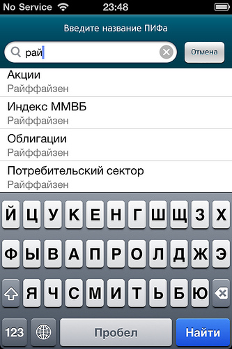
“Copying something old and very popular” is unlikely to work out now - everything that could have been copied under an win-cell for a long time on aytyuns, and to get into the stream, like unreal mojo with its series of banking applications, you need to put a huge amount of work into the beginning of the journey Three months ago, “spb.bridges” became such a start for me, and a month and a half later, when checking the course of deposits in Russian mutual funds, I was faced with the fact that there was not a single program that would be convenient to do this on an iPhone screen. Flash graphics from investfunds.ru and fincake.ru are not loaded into a mobile safari, and out of 600,000 depositors in mutual funds in Russia, many are likely to be iPhone users. I fired up to realize this idea.
')
It's funny that apps for iPhones can also be treated as a risky investment (no matter if you do everything yourself or “buy someone else's time”) - in case of failure, you will have a small loss (entry into this business costs 1,000 euros, to open your cafe not an example more expensive), in case of success - experience, connections, and a profitable deposit on the Apple Store. Who as lucky.
Implementation
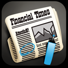
I always liked Apple Stokes - the default application for iPhone to view the course of its shares. Climbing out to the smallest detail, it has the only negative - the interest to “see” the stock price of Microsoft appears to me only under the same circumstances that many of my friends “look at the composition of the deodorant”. But if it comes to your own money - especially when you have the opportunity to monitor the growth of your share - it is quite another thing. I wanted to give her a little more than “informal look”: the pros have long had RBKs and bloomberg, but it seems no one has thought of those who want to check the quotes “once every few weeks”.
During my work on my applications, I made two discoveries for myself: first, it doesn’t matter how detailed and concise you wrote the Terms of Reference to the designers - an option that you will work with will not be what you intended, but in which There is a special highlight. Predicting where and how such a highlight will appear is almost impossible. Secondly, a great and “expensive” web designer can make a shaped disgrace; similarly, a designer with average abilities can make a “wow.” The rule is not universal, but statistically valid: if you only assemble your team, it is worth entrusting the “test page” to several designers at once, the application will be more expensive, but much better.
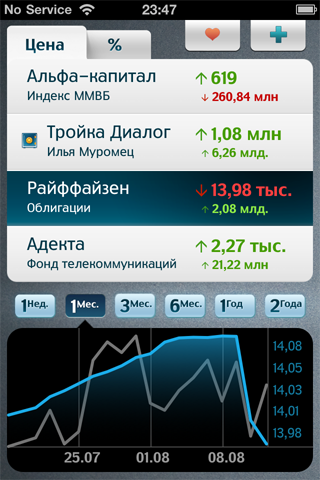
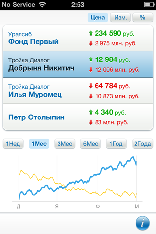
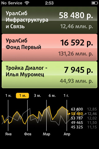
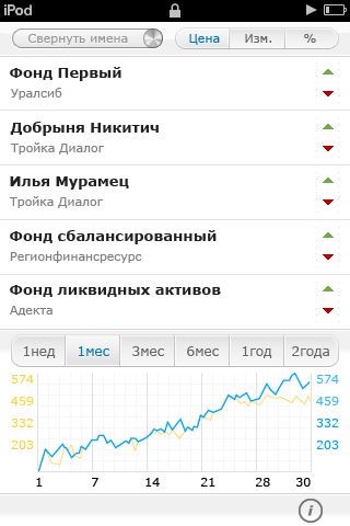
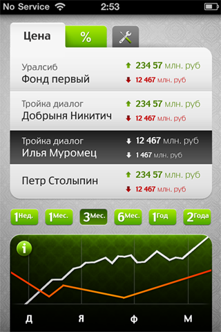
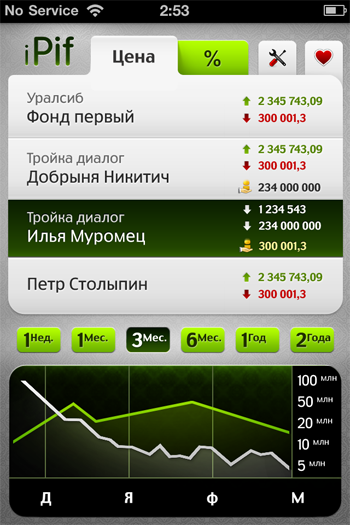
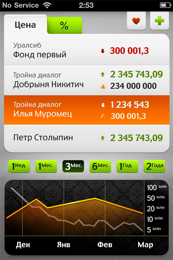
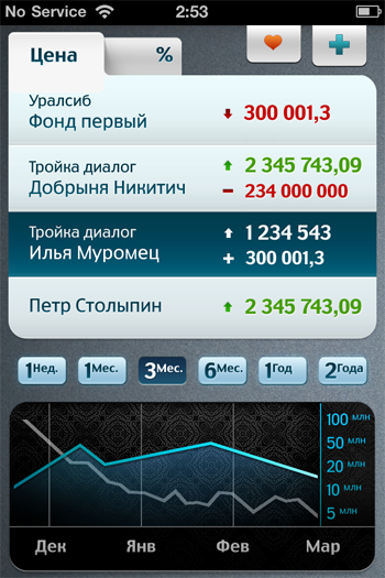
Stokes as reference; four designers, four pictures. Will your preferences match mine?
Design.
Choosing what you like, we begin to conjure over the details. The bottom of the screen is purely intuitive, I want to slide further, but since such functionality is not intended, the impression of "incompleteness" must be eliminated:
We conjure above the top icons to find a compromise between “originality” and “apple guidelines”. We make the decision to play with the flowers, but “leave the zest”:
We work on font size and secondary elements:
Icon.
There are almost no people on free-lance.ru to recommend; I advise you to start your search from the English-language dribbble.com. I was greatly amused by the fact that Californian iconchildren with a very strong portfolio asked only a little more than high-quality domestic designers.
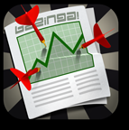
I associate charts of courses with a rolled up newspaper, which was left on a table in a cafe with an unfinished cup of coffee. I tell my designer about my idea and in a few days I get the first sketch:
We are trying to get rid of the "wild west" and redraw the icon in the colors of the application:

But we are moving in the wrong direction, turn around and start work from the beginning. I leaf through my monthly breinstorming:
and what if the newspaper does not lie on a certain green surface, but is attached to the wall with darts? or a few darts, as if bullet marks, and the graph “runs away” from them upwards? or is the zagagulina drawn down with a marker, but is the chart actually going up? or is the schedule tied up in a knot, as it does not happen in reality, but then it goes up? or some kind of “official” schedule, but a quasi-draw is drawn with a marker. or vice versa, with the marker "plan of attack", as on military maps. Or maybe money sticks out because of the newspaper, or in general the money is “wrapped in a newspaper” as smuggling, such as with our package? or, say, the left half in color, and on this half there is already a graph, and the right one “under the pencil” seems to be a sketch, and there is no graph on it?
We pack a couple of pages of text in 72x72 pixels and get the first sketch:

We work on the form and details:

Change the palette:

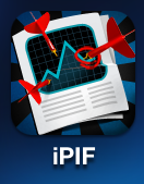
We get rid of extra details in smaller icons:
The final touches.
Fashionable marketing books often offer opposing advice: from “focus on the essentials” to “all attention to detail”. God knows how it really is, but when developing apps, one thing is fair: to postpone it for a couple of days, and come back again - better after a short holiday - but with a fresh, unfriendly look.
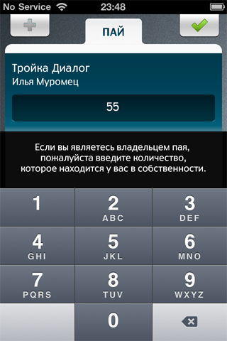
After a couple of days, we add the final touches: a small arrow “under OS Lion” to make the selection of periods more visual and polish the icon to leave only the main elements in it. We are finalizing the secondary screen: we have two active buttons in the header, but it is obvious that when entering the number of shares in the property, only one must be active - to confirm the input value. Yes, and the top buttons themselves should be highlighted with a finger: the designer forgot about it in his original sketch, but I should remember this before the release of the application.
My colleague Andrey Vinogradov, who is responsible for testing the application, not without reason believes that it is worth updating an already finished application a couple of times a month, so that users would “not forget” about it - a red circle against the App Store icon will remind you that installed on your phone and - maybe - make you recommend it to your friends. I hold the opinion that “it is worth building for centuries”, and after two dozen fixes, the twentieth (after the first alpha version) build goes to appstore. I added a “write to developers” button to purposefully collect feedback on the application in my mailbox: in a couple of weeks 1.1 will be released, which is supposed to be final.
Promo.
K7AMLRNY4PML
F43TWXXYHL7K
9K9WTKTMMFX4
KRKPHWP3LEXY
PR9XNPXYFE4T
Y6HJML6XWNAP
How to choose an idea for a new app?
“Copying something old and very popular” is unlikely to work out now - everything that could have been copied under an win-cell for a long time on aytyuns, and to get into the stream, like unreal mojo with its series of banking applications, you need to put a huge amount of work into the beginning of the journey Three months ago, “spb.bridges” became such a start for me, and a month and a half later, when checking the course of deposits in Russian mutual funds, I was faced with the fact that there was not a single program that would be convenient to do this on an iPhone screen. Flash graphics from investfunds.ru and fincake.ru are not loaded into a mobile safari, and out of 600,000 depositors in mutual funds in Russia, many are likely to be iPhone users. I fired up to realize this idea.
')
It's funny that apps for iPhones can also be treated as a risky investment (no matter if you do everything yourself or “buy someone else's time”) - in case of failure, you will have a small loss (entry into this business costs 1,000 euros, to open your cafe not an example more expensive), in case of success - experience, connections, and a profitable deposit on the Apple Store. Who as lucky.
Implementation
I always liked Apple Stokes - the default application for iPhone to view the course of its shares. Climbing out to the smallest detail, it has the only negative - the interest to “see” the stock price of Microsoft appears to me only under the same circumstances that many of my friends “look at the composition of the deodorant”. But if it comes to your own money - especially when you have the opportunity to monitor the growth of your share - it is quite another thing. I wanted to give her a little more than “informal look”: the pros have long had RBKs and bloomberg, but it seems no one has thought of those who want to check the quotes “once every few weeks”.
During my work on my applications, I made two discoveries for myself: first, it doesn’t matter how detailed and concise you wrote the Terms of Reference to the designers - an option that you will work with will not be what you intended, but in which There is a special highlight. Predicting where and how such a highlight will appear is almost impossible. Secondly, a great and “expensive” web designer can make a shaped disgrace; similarly, a designer with average abilities can make a “wow.” The rule is not universal, but statistically valid: if you only assemble your team, it is worth entrusting the “test page” to several designers at once, the application will be more expensive, but much better.
Stokes as reference; four designers, four pictures. Will your preferences match mine?
Design.
Choosing what you like, we begin to conjure over the details. The bottom of the screen is purely intuitive, I want to slide further, but since such functionality is not intended, the impression of "incompleteness" must be eliminated:
We conjure above the top icons to find a compromise between “originality” and “apple guidelines”. We make the decision to play with the flowers, but “leave the zest”:
We work on font size and secondary elements:
Icon.
There are almost no people on free-lance.ru to recommend; I advise you to start your search from the English-language dribbble.com. I was greatly amused by the fact that Californian iconchildren with a very strong portfolio asked only a little more than high-quality domestic designers.
I associate charts of courses with a rolled up newspaper, which was left on a table in a cafe with an unfinished cup of coffee. I tell my designer about my idea and in a few days I get the first sketch:
We are trying to get rid of the "wild west" and redraw the icon in the colors of the application:
But we are moving in the wrong direction, turn around and start work from the beginning. I leaf through my monthly breinstorming:
and what if the newspaper does not lie on a certain green surface, but is attached to the wall with darts? or a few darts, as if bullet marks, and the graph “runs away” from them upwards? or is the zagagulina drawn down with a marker, but is the chart actually going up? or is the schedule tied up in a knot, as it does not happen in reality, but then it goes up? or some kind of “official” schedule, but a quasi-draw is drawn with a marker. or vice versa, with the marker "plan of attack", as on military maps. Or maybe money sticks out because of the newspaper, or in general the money is “wrapped in a newspaper” as smuggling, such as with our package? or, say, the left half in color, and on this half there is already a graph, and the right one “under the pencil” seems to be a sketch, and there is no graph on it?
We pack a couple of pages of text in 72x72 pixels and get the first sketch:
We work on the form and details:
Change the palette:
We get rid of extra details in smaller icons:
The final touches.
Fashionable marketing books often offer opposing advice: from “focus on the essentials” to “all attention to detail”. God knows how it really is, but when developing apps, one thing is fair: to postpone it for a couple of days, and come back again - better after a short holiday - but with a fresh, unfriendly look.
After a couple of days, we add the final touches: a small arrow “under OS Lion” to make the selection of periods more visual and polish the icon to leave only the main elements in it. We are finalizing the secondary screen: we have two active buttons in the header, but it is obvious that when entering the number of shares in the property, only one must be active - to confirm the input value. Yes, and the top buttons themselves should be highlighted with a finger: the designer forgot about it in his original sketch, but I should remember this before the release of the application.
My colleague Andrey Vinogradov, who is responsible for testing the application, not without reason believes that it is worth updating an already finished application a couple of times a month, so that users would “not forget” about it - a red circle against the App Store icon will remind you that installed on your phone and - maybe - make you recommend it to your friends. I hold the opinion that “it is worth building for centuries”, and after two dozen fixes, the twentieth (after the first alpha version) build goes to appstore. I added a “write to developers” button to purposefully collect feedback on the application in my mailbox: in a couple of weeks 1.1 will be released, which is supposed to be final.
Promo.
K7AMLRNY4PML
F43TWXXYHL7K
9K9WTKTMMFX4
KRKPHWP3LEXY
PR9XNPXYFE4T
Y6HJML6XWNAP
Source: https://habr.com/ru/post/126947/
All Articles