Draw graphs (diagrams) in Django
From time to time, many web developers are faced with the need to visualize a relatively large amount of data using diagrams (I will call them graphs below, although this is not quite true). The task is not new, and there are many ready-made solutions on the network: server-side and client-side, using images, Canvas, SVG, Flash, Silverlight ...
In this article I will tell about django-google-charts and some features of using Google Chart Tools for plotting graphs on a site running Django.
Often, when you need to add a graph to a page, the developer follows the path of least resistance: copies the JavaScript from the example on the Internet and somehow outputs data from the application to it. It turns out something like:
')
var chart_data = [ {% for row in chart_data %} [{{ row.0 }}, {{ row.1 }}], {% endfor %} ]; Why is that bad?
- The code is hard to read, making it easy to make a mistake. Did you notice a mistake in my example? :)
- Difficult to scale. When you need to add a second graph to the page, they usually copy the same piece of code again and change the variable names. The result is unreadable porridge, debugging it and making changes is quite unpleasant.
- Strong binding to context. Reuse of this pattern is limited.
Formulation of the problem
A good solution for drawing graphs:
- Allows you to simply and clearly add new graphics to the site and remove unnecessary;
- Follows the DRY principle for defining common elements (for example, a color scheme);
- Can be reused;
- Does not invent a new API.
Solution
The django-google-charts graphing application has grown from a small set of hacks in my current project. Alarma: this is the first public release, bizarre bugs are possible. Corrections and comments are welcome.
Installation
$ pip install django-google-charts # $ easy_install django-google-charts Add
'googlecharts' to INSTALLED_APPS .How it works (general view)
{% load googlecharts %} {% googlecharts %} {% data " " %} {# () #} {% col "" "" %}...{% endcol %} {# #} {% col "" "" %}...{% endcol %} {# #} ... {% enddata %} {% options " " %} {# () #} ... {% endoptions %} {% graph "#id" "" "" %} {# #} {% endgooglecharts %} I'll tell you a little about the purpose of each tag.
{% googlecharts %}...{% endgooglecharts %}
Connects the necessary scripts, is a container for the whole structure. Nothing interesting.
{% data "" %}...{% enddata %}
Named dataset. The name can be not specified (it will turn out
"default" ).{% col "" "" %}...{% endcol %}
Format. The data types in the Google Visualization API are:
'string' 'number' 'boolean' 'date' 'datetime' 'timeofday' You can read more in the documentation .
A special variable
val is passed inside the tag, in this place it can be formatted: {% col "string" "Date" %}'{{ val|date:"M j" }}'{% endcol %} {# , #} {% col "number" %}{{ val|floatformat:2 }}{% endcol %} The result must match the declared type; quotes around the string will not be put.
Example. Suppose we have passed such a context variable to the
{% data %} block: [['foo', 32], ['bar', 64], ['baz', 96]] We need two tags
{% col %} , according to the number of elements in the input line. The first will get 'foo', 'bar' and 'baz' to the input; the second, respectively, 32, 64 and 96. The implementation (the simplest) may look like this: {% col "string" "Name" %}"{{ val }}"{% endcol %} {% col "number" "Value" %}{{ val }}{% endcol %} {% options "" %}...{% endoptions %}
Graphics options.
{% options %} kind: "LineChart", options: { width: 300, height: 240 // ... } {% endoptions %} Inside the javascript object tag, you can use global variables and call functions. Chart types and supported options for each type are listed here .
{% graph "id_" "" "" %}
We display the graph in the element on the page. The last two parameters can be omitted, you get
"default" "default" .Usage example
Suppose we have this model:
class Payment(models.Model): amount = models.DecimalField(max_digits=11, decimal_places=4) datetime = models.DateTimeField() You can use django-qsstats-magic to prepare the data for display in the form of a graph.
from qsstats import QuerySetStats def view_func(request): start_date = ... end_date = ... queryset = Payment.objects.all() # ... qsstats = QuerySetStats(queryset, date_field='datetime', aggregate=Count('id')) # ... values = qsstats.time_series(start_date, end_date, interval='days') return render_to_response('template.html', {'values': values}) The
time_series method returns data in the following form: [[date, value], [date, value], ...] In the template.html file:
{% load googlecharts %} <div id="count_graph"></div> {% googlecharts %} {% data values "count" %} {% col "string" "Date" %}"{{ val|date:"M j" }}"{% endcol %} {% col "number" "# of payments" %}{{ val }}{% endcol %} {% enddata %} {% options %} kind: "LineChart", options: { backgroundColor: "#f9f9f9", colors: ["#09f"], gridlineColor: "#ddd", legend: "none", vAxis: {minValue: 0}, chartArea: {left: 40, top: 20, width: 240, height: 180}, width: 300, height: 240 } {% endoptions %} {% graph "count_graph" "count" %} {# #} {% endgooglecharts %} Scaling
Now, to add another graph to the page, you need to do the following:
- Collect data (views.py):
# summary = qsstats.time_series(start_date, end_date, interval='days', aggregate=Sum('amount')) return render_to_response('template.html', {'values': values, 'summary': summary}) - Add to template.html:
<div id="count_sum"></div> ... {% data summary "sum" %} {% col "string" "Date" %}"{{ val|date:"M j" }}"{% endcol %} {% col "number" "Paid amount, USD" %}{{ val|floatformat:2 }}{% endcol %} {% enddata %} ... {% graph "count_sum" "sum" %} {# , #} Github
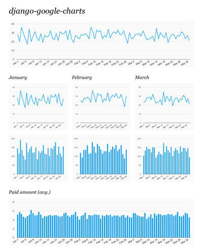
The django-google-charts source code also contains a sample project. To run it, just run:
$ python manage.py syncdb --noinput # sqlite /tmp $ python manage.py populatedb # $ python manage.py runserver The test project looks like this:
Limitations of the first public release (fly in the ointment)
- Only one
{% googlecharts %}tag per page; - (Almost) no error checking, especially in javascript;
- Disappearing little documentation.
Source: https://habr.com/ru/post/126704/
All Articles